





The Carousel Remote widget from The Plus Addons for Elementor lets you control another carousel, slider or switcher widget from anywhere else on the page.
With its Unique Connection ID field, you link the Carousel Remote to any matching widget and place Next/Prev buttons or dots exactly where your design needs them.
Requirement – This widget is a part of The Plus Addons for Elementor, make sure it’s installed & activated to enjoy all its powers.
Required Setup
- Elementor FREE Plugin installed & activated.
- You need to have The Plus Addons for Elementor plugin installed and activated.
- This widget needs the PRO version of The Plus Addons for Elementor.
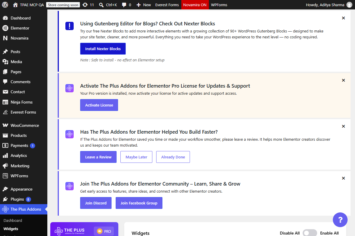
- Make sure the Carousel Remote widget is activated: go to The Plus Addons > Widgets, search for Carousel Remote and turn it on.
Learn via Video Tutorial

How to Activate the Carousel Remote Widget
Go to
- The Plus Addons > Widgets
- Search the widget name and turn on the toggle.
Key Features
- Unique Connection ID – links the Carousel Remote to another carousel, slider or switcher widget by a shared ID.
- Three Remote Types – Carousel, Switcher or Horizontal Scroll, matching what you are connecting to.
- Two Navigation Types – Next/Prev buttons and Dots, either one or both together.
How to Use the Carousel Remote Widget in Elementor
The Carousel Remote widget’s job is to sync with another carousel, slider or switcher widget and control its navigation.
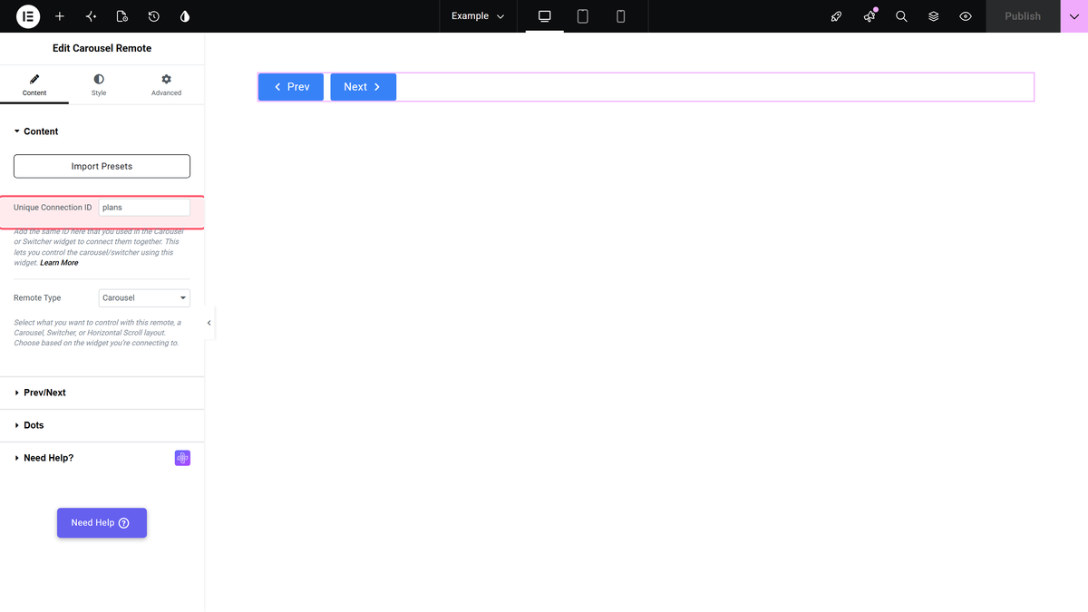
Once you add it to the page, the first field you see is Unique Connection ID. This is the id that has to match the partner widget’s own Unique Carousel ID (or, for the Switcher widget, its own connection id).
You can connect the Carousel Remote widget with:
- Carousel Anything
- Switcher
- Blog Posts
- Testimonials
- Woo Products
- Image Galleries
- Client Logos
- Team Members
- Dynamic Listing
- Magazine Slider
- Dynamic Categories
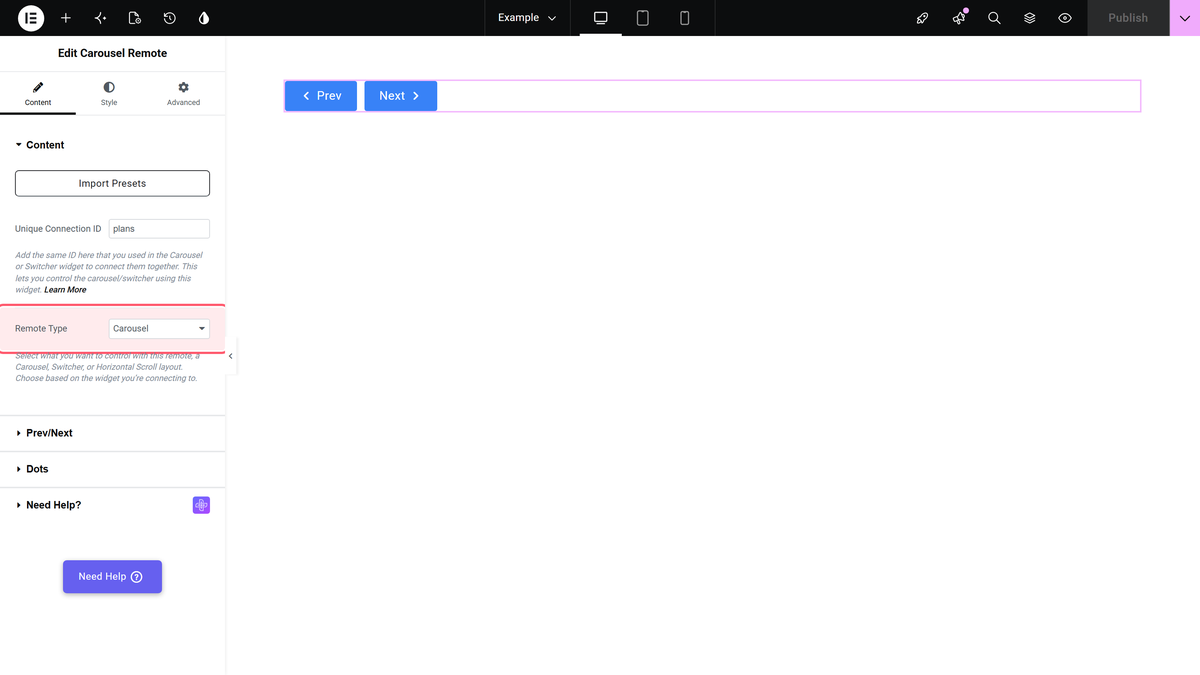
Under the Remote Type dropdown you’ll find three options:
- Carousel – for connecting with a carousel or slider type widget.
- Switcher – for connecting with The Plus Addons for Elementor’s Switcher widget.
- Horizontal Scroll – for connecting with the Horizontal Scroll widget.
Below that are two navigation options:
- Prev/Next – a Next and Previous button. Turn on Next/Prev Button (on by default) to choose a style, customise the text and set alignment.
- Dots – dot navigation. Turn on Dots (off by default) and add one dot per slide in the carousel or slider you are connecting to.
Keep the number of dots equal to the number of items in the connected carousel. In our test, a dot with no matching slide stayed inactive and a slide with no matching dot left the previous dot active.
You can usually keep just one navigation type on, though both can run together if your design calls for it.
How to Style the Carousel Remote Widget
The Style tab has separate sections for each navigation type you have enabled:
- Prev/Next – button style (typography, colours, background) and icon style (size, space, colour).
- Dots – dot size, gap, icon size and image size.
- Paginate – an optional pagination counter alongside the navigation, with its own style options once turned on.
- On Scroll View Animation – the shared entrance-animation extension available on all of The Plus Addons for Elementor’s widgets.
Learn more about On Scroll View Animation.
The Advanced tab is shared across all The Plus Addons for Elementor widgets.
