


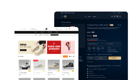
Are you looking to create an app like sticky bottom mobile menu in Elementor? This menu stays fixed at the bottom of the screen as the user scrolls, making it easily accessible and providing a smooth navigation experience.
With the Mobile Menu widget from The Plus Addons for Elementor, you can easily create a sticky bottom mobile menu in Elementor.
To check the complete feature overview documentation of The Plus Addons for Elementor Mobile Menu widget, click here.
Requirement – This widget is a part of The Plus Addons for Elementor, make sure its installed & activated to enjoy all its powers.
Create a Sticky Bottom Mobile Menu
This is a pro feature, upgrade to The Plus Addons for Elementor Pro for full functionality, plus 120+ other widgets.
To do this, add the Mobile Menu widget to the header template and follow the steps –
Note: To create the header template, you can use the free Nexter Builder or you can use Elementor Pro if you are already using it.
1. After selecting the appropriate style from the Style section, select Fixed from the Position dropdown.
2. Then, from the Fixed Position dropdown, select Bottom.
3. Add your desired screen width in the Open Mobile Menu section so the menu is only visible on mobile.
4. Finally, create the menu from Menu 1 and Menu 2 tab based on your selected style in the Mobile Menu tab.
Now, your mobile menu will stick at the bottom as you scroll.
Unlock Premium Mobile Menu Features (Pro Only)
Tap into advanced mobile navigational control with The Plus Addons for Elementor Pro and the enhanced Mobile Menu widget—ideal for building sleek, mobile-first menus without extra plugins or custom CSS.
Swipe-Enabled Swiper Menu & Column Layouts
Choose between swiper-style horizontal menus or column-mode layouts for mobile navigation. Customize touch-sensitive scrolling, pagination indicators, and spacing.
Extra Floating Toggle Button & Active Page Indicator
Add a central floating button to open your mobile menu or highlight the current menu item visually. This is designed for better usability and engagement.
Off Canvas Menu Panel
Design slide-in off-canvas menus that open on click or hover, ideal for compact mobile menus or embedded content panels. Customize entry animations, positions, width, and overlay settings in Elementor.
Performance-Tuned Design with Icon & Style Control
Control icons, labels, colors, spacing, and fixed position settings for menu items across devices. Pro ensures responsive adaptation and high performance without loading unnecessary styles.
Why Upgrade?
With The Plus Addons for Elementor Pro, you gain full mobile menu design and behavior control natively in Elementor—no coding required. Sticky bottom menus, swiper styles, floating toggles, and visual customization help deliver intuitive navigation experiences for mobile users. Upgrade gives you access to this feature plus 120+ widgets and a 60-day money-back guarantee.
Also, read How to Create a Swiper Mobile Menu in Elementor.