


The user experience is a critical component of any website, and it plays a critical role in the success of the website, one way to provide a better user experience is by having collapsible sections on a page.
It can be a great way to save space and create an organised and easy to navigate page. This enables users to quickly and easily minimise, hide, or expand sections of their page with the click of a button.
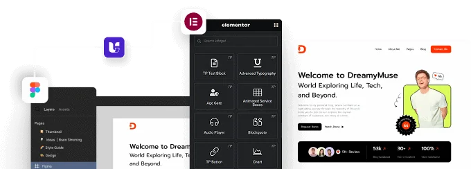
The Unfold widget from The Plus Addons for Elementor allows you to easily create different types of expandable sections in Elementor.
Required Setup
- Elementor FREE Plugin installed & activated.
- You need to have The Plus Addons for Elementor plugin installed and activated.
- This is a Premium widget, and you need the PRO version of The Plus Addons for Elementor.
- Make sure the Unfold widget is activated, to verify this, visit The Plus Addons → Widgets → and Search for Unfold and activate.
Learn via Video Tutorial:
How to Activate the Unfold Widget?
Go to
- The Plus Addons → Widgets
- Search the widget name and turn on the toggle.

Key Features
- Multiple ways to add content – There are multiple ways to add content, such as Custom Content, Elementor Template, Inner Section and Flexbox Container.
- Two types of expand buttons – You can use an icon or a Lottie file as the expand button.
- Extra button – You can add an extra button to the expanded section.
- Flexible button placement – You can place the collapsible buttons above or below the content.
How to add content to the Unfold widget?
Once you add the Unfold widget on the page, you’ll find an option to add a title. If you want to add a title to your collapsible section, you can add it in the Title field.

Then you have to select the content source of the expandable section from the Select Source dropdown. Here you’ll find four options –
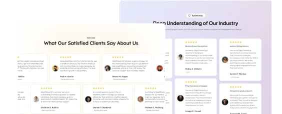
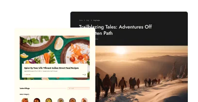
Custom Content – You can add the content directly using the editor in this option.
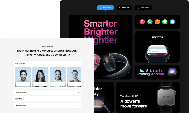
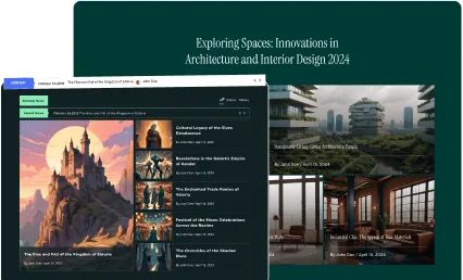
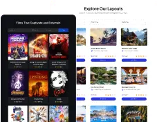
Template – In this option, you can use the Elementor template for the collapsible section and show different types of content. Learn more.
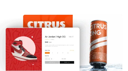
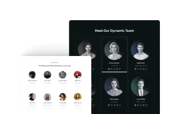
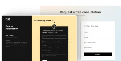
Inner Section Based – With this option, you can create any layout inside an inner section widget and turn it into a collapsible section. Check the process.
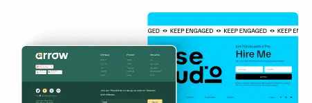
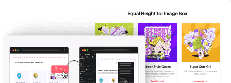
Container Based – If you are using the Elementor Flexbox container, you can turn it into a collapsible container with this option. Learn more about it.
Once you’ve added your content, you have to select the expand button type from the Icon Type dropdown. Here you’ll find two options –
Icon – You can use standard buttons with icons and text in this option.
Lottie – In this option, you can use Lottie icons with text.
You can add an expand button text in the Expand Button Text field.
From the Icon Position dropdown, you can place the icon before or after the button text.
Depending on your icon type selection, you’ll get an option to add icon or Lottie file.
In the Collapse Button Text field, you can add text for the collapse button.
You can turn on the Extra Button toggle if you want to add an extra button when the panel is expended.

In the Text field, you can add a button text.
You can link the button from the Link field to an external link or a page.
You can also add an icon to the button from the Extra Button Icon section.
Content Options
In the Content Options tab, you’ll find more customisation options.

Content Expand Direction – You can place the buttons above or below the content.
Max Height – You can set the initial height of the collapsible container for different devices.
Custom Opacity – From here, you can adjust the height and colour of the content overlay.
Transition Duration – You can adjust the panel open and collapse speed from here.
Toggle Alignment – You can align the buttons for different devices separately.
How to style the Unfold widget?
If you want to style the Unfold widget, you’ll find all the options under the Style tab.
Title – From here, you can style the collapsible section title. You can set different HTML tags for the title, and adjust its typography, colour, alignment and margin.

Description – You can add some margin to the collapsible panel content. But for Custom Content, you can adjust the typography, colour and alignment as well.
Toggle Button – To style the toggle buttons, you can use this panel. Here you’ll find all the styling options for the button, like padding, margin, typography, colour, background, button icon size, placement, colour, etc.
Lottie – If you’ve selected Lottie as the button icon type, then you’ll see this option. You can adjust the width, height, speed, and margin for different devices from here. You can turn the animation into a loop animation or make it play on hover.
Extra Button – If you use the extra button feature, you can style it from here. You can manage the button typography, colour, border, background and button icon size, placement, colour etc.
On Scroll View Animation – This is our global extension available for all our widget, this adds scrolling animation as the widget comes in viewport.
Learn more about On Scroll View Animation
Advanced options remain common for all our widget, you can explore all it options from here.