





A long container full of specifications or FAQs makes visitors scroll past content they did not ask for.
With the Container Based source, the Unfold widget from The Plus Addons for Elementor cuts the container next to it to a set height and adds a Read More / Read Less button.
To check the complete feature overview documentation of The Plus Addons for Elementor Unfold widget, click here.
Requirement – This widget is a part of The Plus Addons for Elementor Pro, make sure it’s installed & activated to enjoy all its powers.
Before You Start
- Edition: Pro — Unfold is a Pro widget. In the free plugin it appears in the Elements panel with a lock icon, and a page that already holds an Unfold widget shows nothing of it while Pro is inactive.
- Widget to enable: Unfold, switched on under The Plus Addons > Widgets.
- A layout built with Elementor containers.
How to Make a Container Collapsible
- Build the content you want to collapse inside its own container.
- Add a separate container directly above that container (or directly below it), at the same level, and drag the Unfold widget straight into it. Don’t place the widget in a container nested inside that one.
- In Content > Unfold, add a Title if you want one and set Select Source to Container Based.
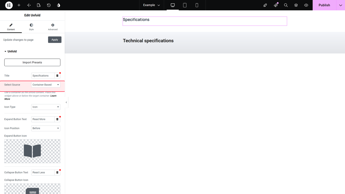
- Set Expand Button Text, Collapse Button Text and the button icons in the same section.
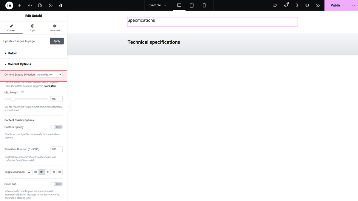
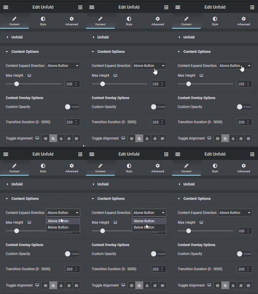
- Open Content Options and choose Content Expand Direction: Above Button when the Unfold widget’s container is directly above the container to collapse, Below Button when it is directly below.
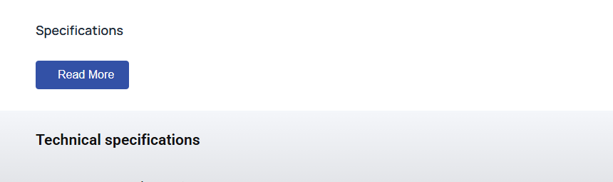
The direction dropdown in motion:
- Set Max Height, the height the container is cut to (default 100 px), then publish the page and click the button to test it.
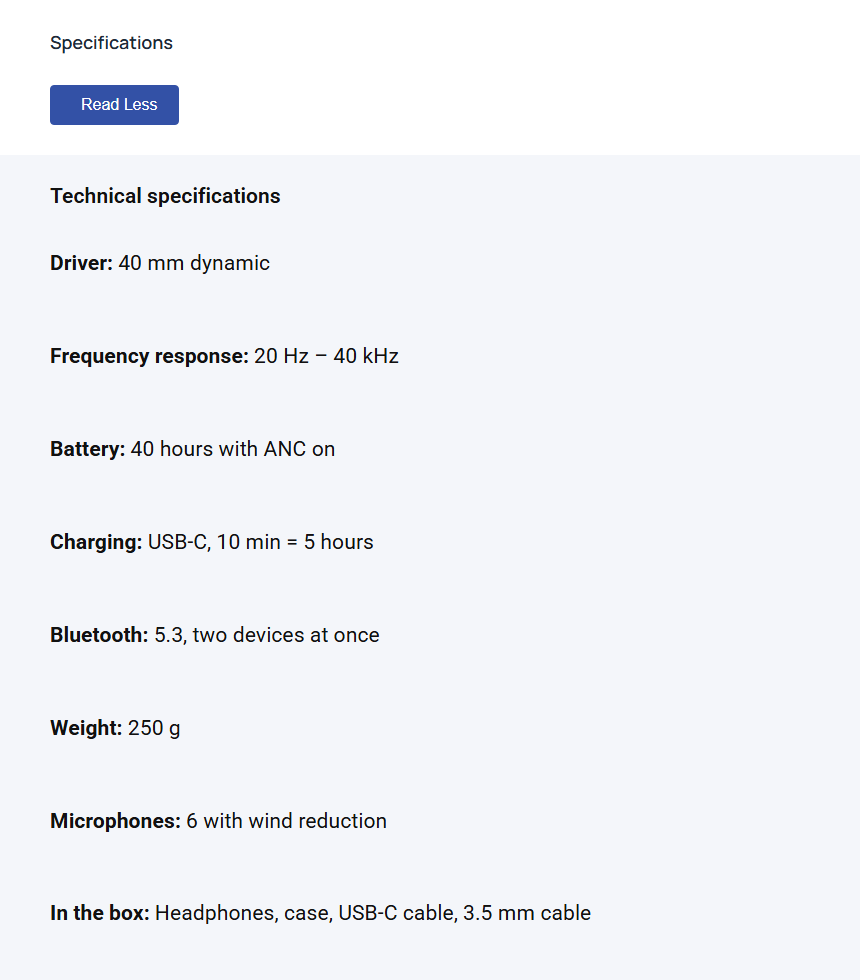
After Read More the whole container opens:
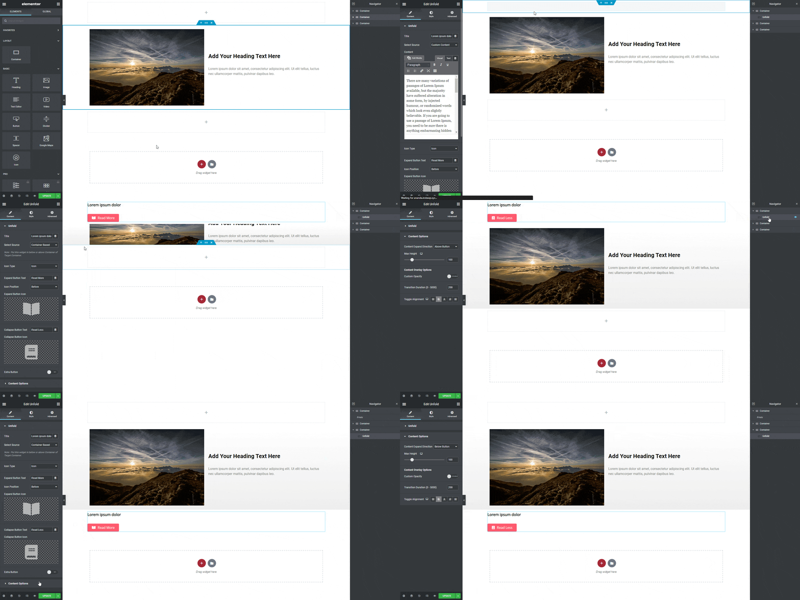
Here is the complete setup, from the layout to the result:
How It Behaves
- Only the container right next to the Unfold widget’s container is used: the next one for Above Button, the previous one for Below Button.
- Collapsed, the container is cut to Max Height with a light grey fade. With Custom Opacity on, the fade covers only the bottom Opacity Height and fades to Opacity Color.
- Max Height can differ per device: the tablet value applies from 1024 px wide down, the mobile value from 767 px down.
- Read Less closes the container to the Max Height of the current device.
Limitations
- If the direction does not match the layout, or the widget sits in a nested container, nothing collapses, but the button still switches between Read More and Read Less.
- A container shorter than Max Height gets no button and is still stretched to Max Height.
- Turning on Custom Opacity without choosing an Opacity Color removes the fade completely.
- The default button icons do not show on the page. Choose your own icons and set their size in Style > Toggle Button > Toggle Icon Options.
Troubleshooting
Nothing collapses on the published page
Check that the Unfold widget’s container sits directly above or below the target container at the same level, that the widget is not inside a nested container, and that Content Expand Direction matches the order.
The button does not appear
The container is shorter than Max Height on that device. Lower Max Height.
The fade is gone
If Custom Opacity is on, choose an Opacity Color.
