Do you want to add a hamburger toggle menu for mobile in Elementor? A hamburger toggle menu is the three-line icon that collapses your full navigation into a compact button on smaller screens, giving mobile visitors a clean header while keeping all your menu items accessible with one tap. The Navigation Menu Lite widget in The Plus Addons for Elementor lets you enable this mobile menu with configurable toggle styles, alignment controls, and a breakpoint width you set yourself.
Best Used For:
- Business and agency websites that need a clean mobile header without removing navigation links
- E-commerce stores where the full desktop menu is too wide to display on smaller screens
- Multi-page WordPress sites with five or more navigation items that do not fit on a mobile viewport
To check the complete feature overview documentation of The Plus Addons for Elementor Navigation Menu Lite widget, click here.
Requirement – This widget is a part of The Plus Addons for Elementor, make sure its installed & activated to enjoy all its powers.
To use the Navigation Menu Lite widget, you need to create a menu in WordPress.
Then, add the Navigation Menu Lite widget to the header template and follow the steps –
Note: To create the header template, you can use the free Nexter Theme Builder or you can use Elementor Pro if you are already using it.
1. From the Navigation Bar tab, select the appropriate Menu Direction and the menu you want to display.
2. Go to the Mobile Menu tab and enable the Responsive Mobile Menu toggle. This activates the hamburger button on screens below the breakpoint width you configure next.
In the Open Mobile Menu section, set the minimum screen width in pixels at which the mobile menu activates. Use this when you want the full navigation to appear on desktop and tablet but collapse into a hamburger button on phones.
From the Toggle Style section, select the visual style for the mobile menu toggle button. Choose the style that matches the look of your header so the button feels consistent with your site design.
From the Toggle Alignment section, align the hamburger button to the left, center, or right of its container. Align it to the right when you want it to sit on the opposite side of the header from your site logo.
From the Mobile Navigation Alignment section, align the menu items that expand when the toggle button is tapped. Use center alignment when you want the open menu to feel more prominent across the full screen width.
If you want a slide-in panel or full-screen overlay instead of an inline dropdown, see How to Add an Off-Canvas Popup Menu in Elementor for an alternative approach using The Plus Addons for Elementor.
3. From the Menu Content dropdown, select Normal Menu. This tells the widget to display a standard WordPress menu when the toggle is tapped.
4. From the Select Menu dropdown, select the menu you want to display on mobile.
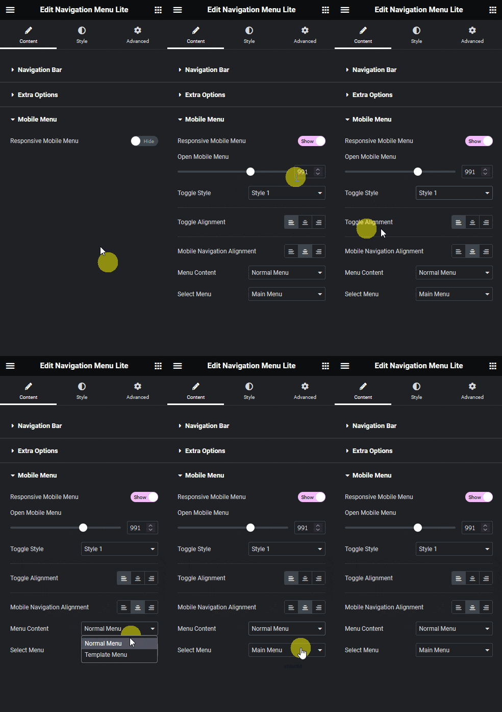
You will now see a hamburger toggle button in the header that opens the menu when tapped on mobile.

For a dedicated mobile navigation widget with additional display controls and panel options, see the Mobile Menu widget settings overview in The Plus Addons for Elementor.

