






Navigation Menu Lite turns a menu you have already built under Appearance > Menus into an Elementor widget, so you can place it in a header template, a sidebar or a page and style it there.
It is the free navigation widget in The Plus Addons for Elementor. It covers a horizontal or vertical bar, dropdown submenus that open on hover or on click, and a hamburger menu below a breakpoint you choose.
Requirement – This widget is a part of The Plus Addons for Elementor, make sure it’s installed & activated to enjoy all its powers.
Before You Start
- Edition: Free — Navigation Menu Lite is part of the free The Plus Addons for Elementor plugin. Every setting described here, including Menu Content > Template Menu, works without the Pro plugin; this was checked with Pro deactivated.
- Not the same widget as Navigation Menu: Navigation Menu is a separate widget in The Plus Addons for Elementor Pro. It is the one with mega menus, a sticky header menu, off-canvas and swiper mobile menus and per-item icons and labels. Navigation Menu Lite has none of those. If the panel header says Edit Navigation Menu Lite, this is the free widget. The LIVE WIDGET button above opens the Pro Navigation Menu demo, since the Lite widget has no demo page of its own.
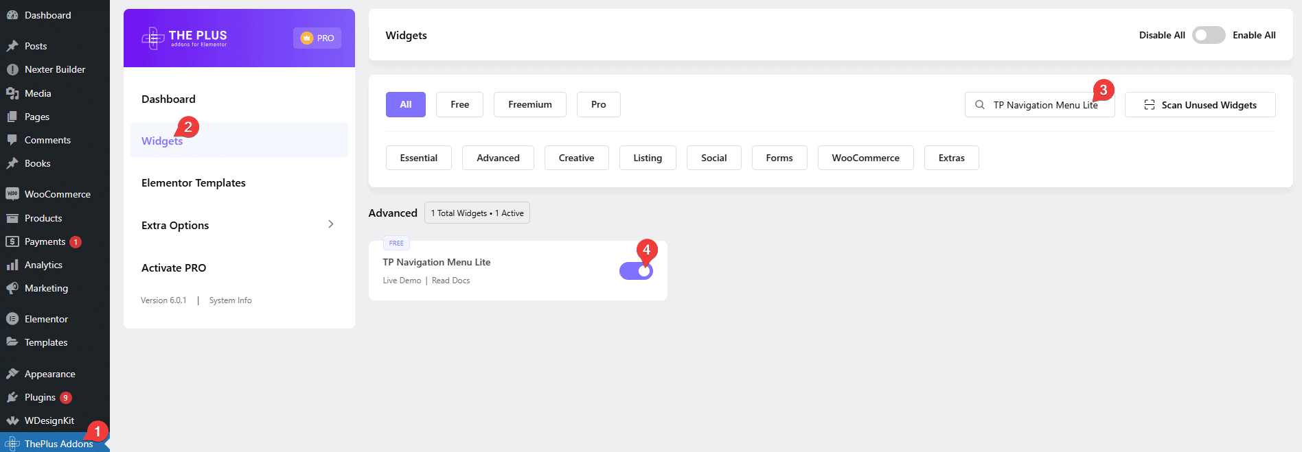
- Widget to enable: TP Navigation Menu Lite, switched on under The Plus Addons > Widgets. In the Elementor panel it appears as Navigation Menu Lite.
- You need a WordPress menu: build it first under Appearance > Menus. The widget does not hold menu items of its own, it renders a menu you have already created. On a block theme (such as Twenty Twenty-Five) WordPress hides Appearance > Menus; open /wp-admin/nav-menus.php directly, or use a classic theme, or build the menu in the Site Editor instead.
What This Widget Can and Cannot Do
Two widgets in The Plus Addons for Elementor have almost the same name. This is the free one. Check the panel header before you follow any step: it reads Edit Navigation Menu Lite.
| Navigation Menu Lite (free) | Navigation Menu (Pro) |
|---|---|
| Horizontal or vertical bar | Horizontal, vertical, vertical side panel |
| Dropdown submenus, hover or click | Same, plus mega menu panels built from Elementor templates |
| Inline hamburger menu below a breakpoint | Hamburger, off-canvas, swiper and full-screen mobile menus |
| Two submenu reveal effects | Sticky header menu, scroll-up sticky and shrink-on-scroll |
| Styling for main menu, submenu and mobile menu | All of that, plus per-item icons, images, labels and descriptions |
If you need any of the right-hand column, you need the Pro Navigation Menu widget instead.
Turn the Widget On
Go to The Plus Addons > Widgets, search for TP Navigation Menu Lite and switch the toggle on. Without this the widget does not appear in the Elementor panel.
Build the Menu
- Add the Navigation Menu Lite widget to your header template, sidebar or page. To build a header template you can use the free Nexter Builder, or Elementor Pro if you already have it.
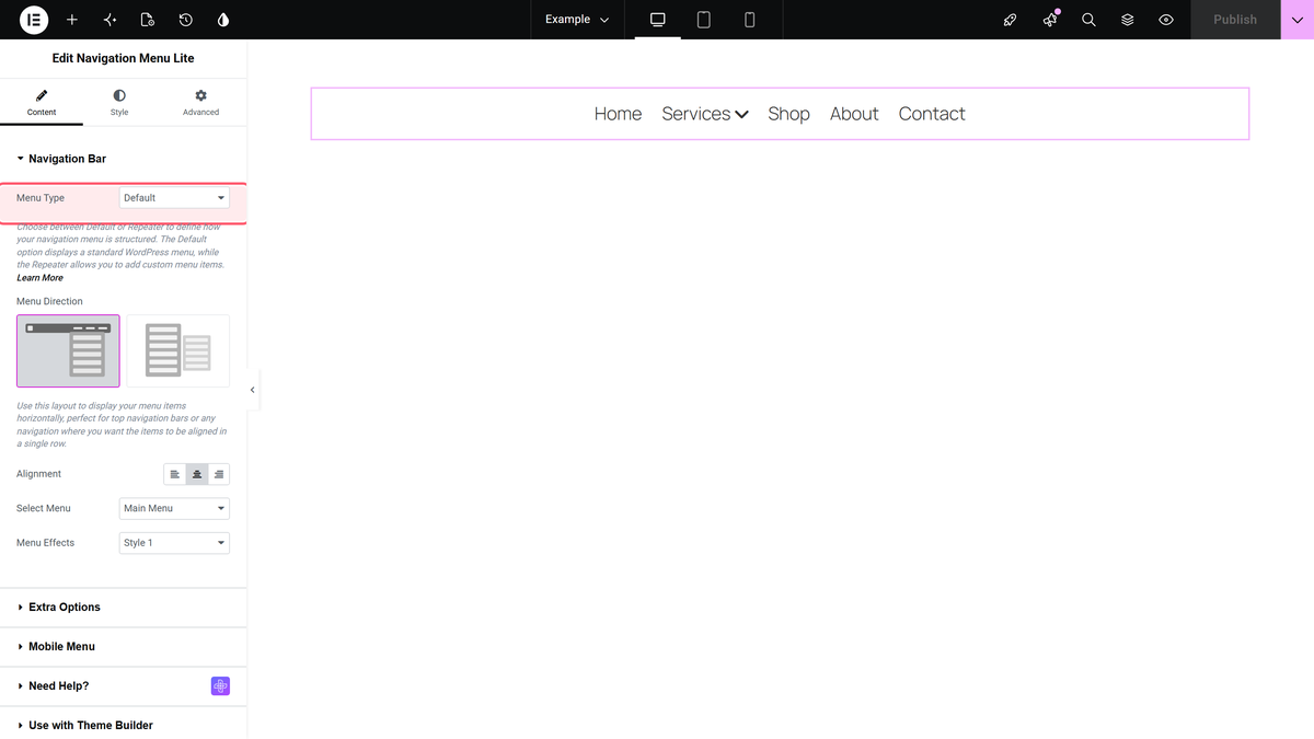
- Leave Menu Type on Default. This control does not pick your menu — it chooses whether the widget renders a WordPress menu (Default) or a list of items you type into the widget itself (Repeater).
- Pick your menu in Select Menu. This lists the menus from Appearance > Menus. Until you pick one the canvas stays empty.
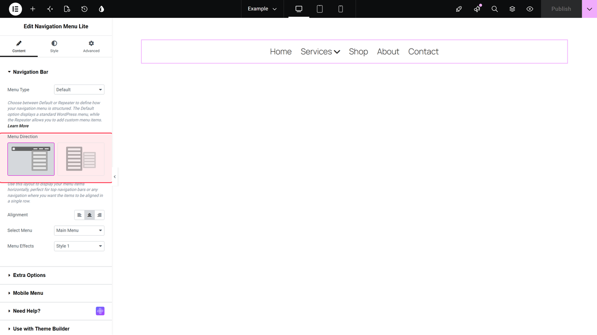
- Choose Menu Direction. It is a picture control with two choices, not a dropdown: the left picture is Horizontal Menu (items in a row, the default) and the right picture is Vertical Menu (items stacked).
- Set Alignment to move the whole menu left, centre or right inside its container. It defaults to Center.
- Pick a Menu Effects style for how a dropdown appears. There are two: Style 1 slides the panel open, Style 2 fades it in.
The menu now renders on the front end, and hovering a parent item opens its submenu.

Choose How Submenus Open
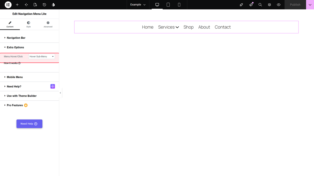
Open the Extra Options section. Menu Hover/Click has two settings and applies to the whole widget, not to individual items.
| Setting | What it does | Default |
|---|---|---|
| Hover Sub-Menu | The submenu opens when the cursor enters the parent item and closes when it leaves. | Yes |
| Click Sub-Menu | The submenu opens on a click and stays open until you click it again or click elsewhere on the page. | — |
Step-by-step versions of both: open submenus on hover and open submenus on click.
Set Up the Mobile Menu
Open the Mobile Menu section. Responsive Mobile Menu is already set to Show on a new widget.
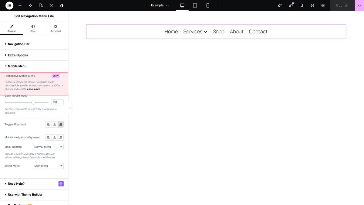
| Setting | What it does | Default |
|---|---|---|
| Responsive Mobile Menu | Swaps the bar for a hamburger toggle on small screens. | Show |
| Open Mobile Menu | The widest screen that still gets the mobile menu. At 991 the hamburger shows at 991 px and below, and the bar returns at 992 px. | 991 px |
| Toggle Alignment | Where the hamburger button sits in its container. | Right |
| Mobile Navigation Alignment | How the menu links line up once the panel is open. | Left |
| Menu Content | Normal Menu shows a WordPress menu. Template Menu shows an Elementor template instead, so you can put a button, contact details or an image in the panel. | Normal Menu |
| Select Menu (in this section) | The menu the mobile panel shows. It is a separate setting from the desktop Select Menu. | none |
The mobile Select Menu starts empty. Because Responsive Mobile Menu is on by default, a widget where you only filled in the desktop Select Menu shows a hamburger on phones that opens an empty panel. Set both.
Full walkthrough: create a hamburger toggle menu for mobile.
Style the Menu
The Style tab has three sections.
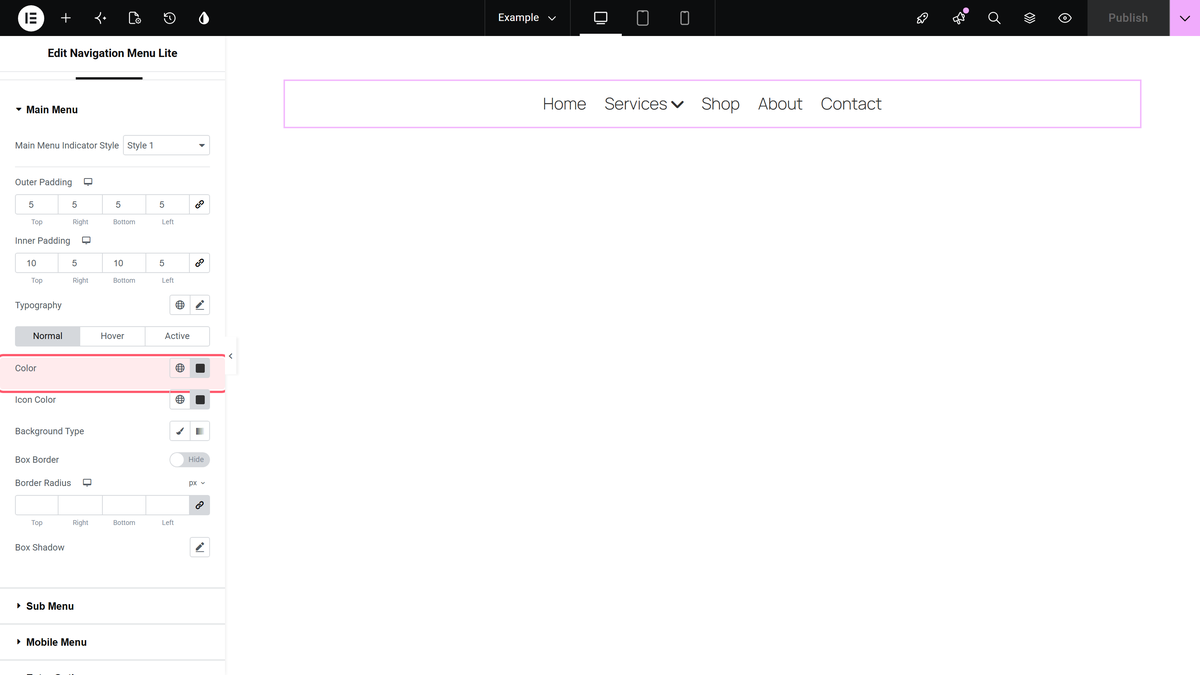
- Main Menu — padding, typography, colours and borders for the top-level items, with separate Normal, Hover and Active tabs. Main Menu Indicator Style is here, and it starts at None: set it to Style 1 if you want an arrow next to items that have a submenu.
- Sub Menu — width, padding, borders and colours for the dropdown panel, plus its own Sub Menu Indicator Style.
- Mobile Menu — only shown while Responsive Mobile Menu is on. Toggle height, spacing, toggle colour and the typography of the open panel.
Motion effects, custom CSS, positioning and visibility live on the Advanced tab, the same as any Elementor widget.
How It Behaves
- The widget never stores menu items of its own in Default mode. Edit the menu under Appearance > Menus and every widget using it updates.
- Open Mobile Menu is a maximum, and it includes the number you type. At the default 991 the mobile menu is shown at 991 px and the desktop bar returns at 992 px.
- Menu Effects only changes how the dropdown appears in Hover Sub-Menu mode. In Click Sub-Menu mode the panel always slides open over about 0.4 seconds whichever style is selected.
- The hamburger toggle is two lines, and its shape is fixed — the Style tab changes its height, spacing and colour but not the icon itself.
Limitations
- No mega menu. Dropdown panels hold menu links only; Elementor templates inside a dropdown are a Pro Navigation Menu feature.
- No sticky, off-canvas, swiper or full-screen mobile menu, and no per-item icons, images, badges or descriptions in Default mode. Those are Pro.
- Menu Hover/Click is one setting for the whole widget. You cannot mix hover-opening and click-opening items in one menu.
- Submenus do not stay expanded on the page a child item points to. There is no setting for that.
- If you lower Open Mobile Menu below 991 px, dropdown submenus do not open at all between your value and 991 px — see Troubleshooting.
Troubleshooting
The canvas is empty after adding the widget
Select Menu is still unset, or there is no menu yet. Create one under Appearance > Menus, then choose it. On a block theme that screen is hidden — open /wp-admin/nav-menus.php directly.
No arrow next to items that have a submenu
Main Menu Indicator Style on the Style tab defaults to None. Set it to Style 1. Do the same with Sub Menu Indicator Style for nested levels.
The hamburger opens an empty panel on phones
The Select Menu inside the Mobile Menu section is a second, separate setting and it starts empty. Choose a menu there as well.
Submenus do not open on a narrow laptop or a tablet
This happens when you set Open Mobile Menu lower than 991 px. Between your value and 991 px the desktop bar is shown but the script that opens dropdowns has not started, so nothing happens on hover or on click. Keep Open Mobile Menu at 991 or higher until this is fixed.
Clicking a parent item does not go to its page
In Click Sub-Menu mode a parent item that has children only opens and closes its submenu; its own link is never followed. Add the parent page as the first item inside its own submenu if visitors need to reach it.
