






The navigation menu is how visitors find their way around your site. A clear menu that works the same on desktop and mobile keeps people moving to the pages you want them to see.
The Navigation Menu widget in The Plus Addons for Elementor builds horizontal, vertical and side menus, mega menus, sticky headers and three kinds of mobile menu, all from one widget.
Requirement – This widget is a part of The Plus Addons for Elementor, make sure it’s installed & activated to enjoy all its powers.
Before You Start
- Edition: Pro — the Navigation Menu widget is part of The Plus Addons for Elementor Pro.
- Widget to enable: Navigation Menu, switched on under The Plus Addons > Widgets.
- A header template. Add the widget to your site’s header so the menu shows on every page. Build the header with the free Nexter Builder or with Elementor Pro’s Theme Builder.
- A WordPress menu under Appearance > Menus, if you use the Default menu type.
- Free alternative: the free plugin has Navigation Menu Lite. It has horizontal and vertical menus, hover or click dropdowns, the Repeater menu with mega menu templates and a toggle mobile menu. It has no Vertical Side Menu, no sticky options and no Swiper or Off Canvas mobile menu.
Learn via Video Tutorial

How to Activate the Navigation Menu Widget
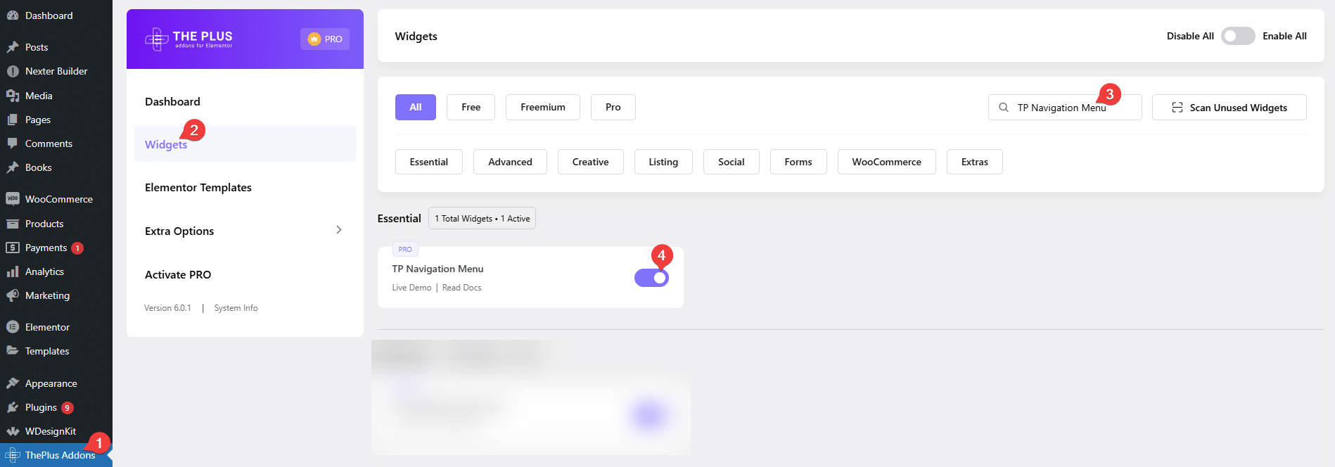
Go to The Plus Addons > Widgets, search for Navigation Menu and turn on its switch.
Where to Use It
Put the widget in your header template so the menu appears on every page. You can build the header with the free Nexter Builder or with Elementor Pro’s Theme Builder.
Layout
Menu Type decides where the menu items come from:
- Default — a WordPress menu from Appearance > Menus.
- Repeater — items you add inside the widget, each with its own level, icon, label and optional mega menu template. See how to create a menu with the repeater.
Menu Direction is a row of three pictures — Horizontal Menu, Vertical Menu and Vertical Side Menu, in that order. Hover over a picture to see its name.
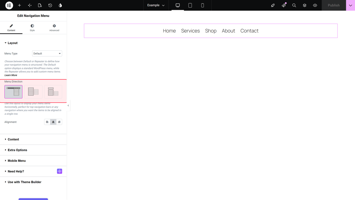
- Horizontal Menu — items in a row, dropdowns open below.
- Vertical Menu — items in a column, dropdowns open to the side.
- Vertical Side Menu — a column with an optional title bar that can open the menu on hover or click.
Alignment places the menu left, centre or right.
Content
What you see here depends on the menu type.
- Select Menu (Default type) — the WordPress menu to show.
- Navigation Menu (Repeater type) — the list of items.
- Menu Hover/Click — Hover Sub-Menu (default) or Click Sub-Menu.
- Menu Effects — how dropdowns appear: Slide Up/Down (JS), Fade In/Out (JS), Fade Up/Down or Fade In/Out. A Vertical Menu only uses the first two.
- Open Direction, Vertical Side Title Bar and the title bar settings — Vertical Side Menu only.
Extra Options
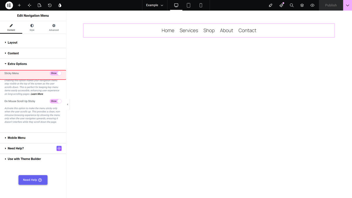
Sticky Menu keeps the header at the top of the screen while visitors scroll. On Mouse Scroll Up Sticky then hides it on the way down and brings it back on the way up. Sticky Menu fixes the container (or outer section) that holds the Navigation Menu widget, not just the widget. Everything in that container sticks with it, so keep your logo and buttons in the same container.
Mobile Menu
Responsive Mobile Menu is on by default. Its Menu Type has three options:
- Toggle — a button that opens the menu as a dropdown panel.
- Swiper — no button; the top-level items sit in a row visitors swipe sideways. Submenus are not shown.
- Off Canvas — a button that slides the menu in from the side.
Open Mobile Menu (default 991px) is the widest screen that gets the mobile menu. At that width and narrower, visitors see the mobile menu; wider screens get the normal menu.
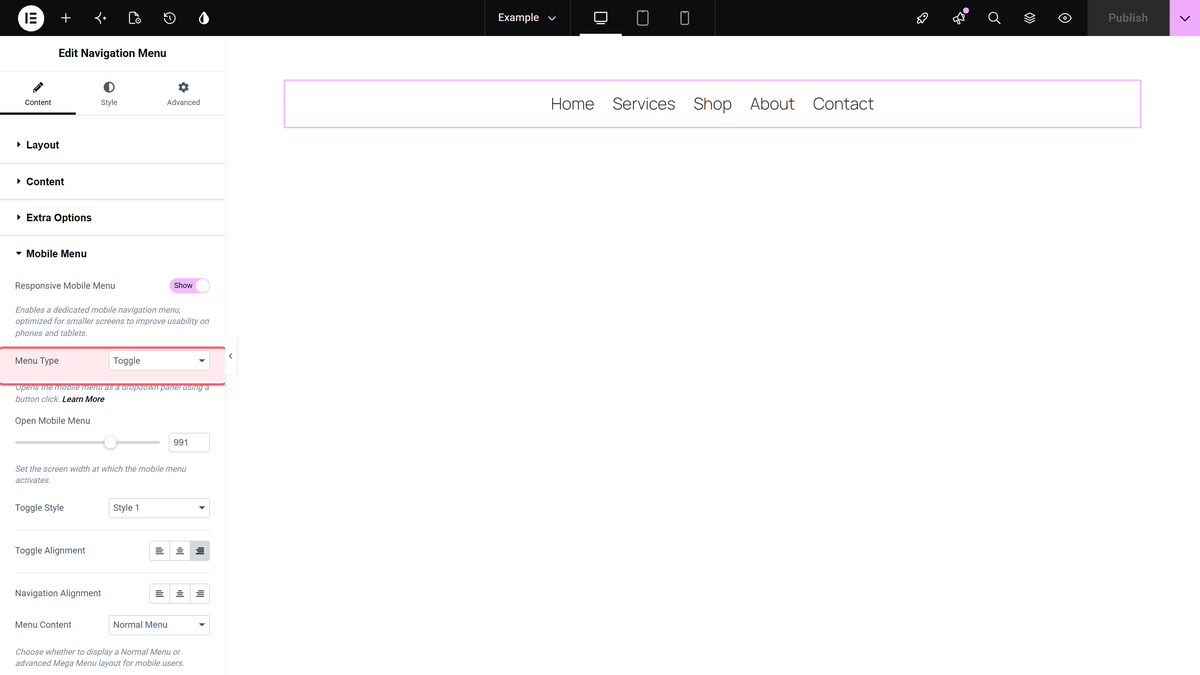
Menu Content chooses Normal Menu (a WordPress menu, picked in Select Menu) or Template Menu (an Elementor template). The template picker is not available for Off Canvas. Mobile Click Close Menu is meant to close the open menu when visitors tap elsewhere; see Limitations.
How to Style the Navigation Menu Widget
The Style tab has these sections:
| Section | What it styles |
|---|---|
| Outer Navigation | Padding, minimum width, background, radius and shadow of the whole menu |
| Vertical Side Title Bar | The title bar of a Vertical Side Menu |
| Main Menu | Top-level items: padding, typography, indicator, Normal / Hover / Active colours |
| Sticky Main Menu | Top-level items and the header background while the header is stuck. Only shown when Sticky Menu is on |
| Sub Menu | Dropdown items and the dropdown box |
| Description | Item descriptions |
| Mobile Menu | The toggle button and the mobile menu |
| Sticky Mobile Menu | Mobile menu colours while stuck, and Scroll Overflow |
| Main & Sub Menu Label | Labels added to Repeater items |
| Mobile Menu Label | Labels in the mobile menu |
| Extra Options | Hover effects, the hover inverse effect, and opening the last items’ submenus to the left |
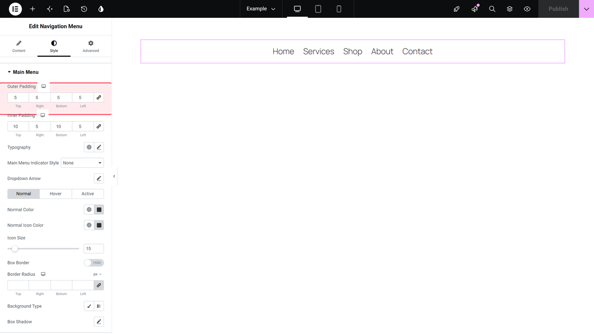
The Advanced tab is the same as on other widgets. See the Advanced tab tutorial.
Limitations
- Pro only. The free plugin has the smaller Navigation Menu Lite instead.
- Hover dropdowns need a screen wider than 991px. The hover script only runs above 991px. If you lower Open Mobile Menu, tablets between that width and 991px see the desktop menu, but hover dropdowns do not open there. Use Click Sub-Menu, or keep Open Mobile Menu at 991px.
- Mobile Click Close Menu only closes the menu when the tap lands on the header around the menu, not on the page content below it.
- The dropdown arrows and the Off Canvas close button use Font Awesome 5. If nothing else on the page loads Font Awesome, they show as empty boxes, or not at all.
Troubleshooting
Appearance > Menus is missing
Block themes such as Twenty Twenty-Five hide the Menus screen. Use the Repeater menu type, or a classic theme such as Nexter or Hello Elementor.
The menu is empty
With the Default type, pick a menu in Content > Select Menu. With Repeater, add items. For the mobile menu, also pick a menu in Mobile Menu > Select Menu.
