


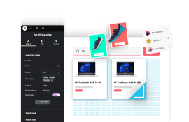
Are you looking to add a swiper mobile menu to your Elementor website? If you have lots of menu items on mobile then the swiper menu is a perfect option.
With the Mobile Menu widget from The Plus Addons for Elementor, you can easily make a swiper mobile menu on your Elementor website.
To check the complete feature overview documentation of The Plus Addons for Elementor Mobile Menu widget, click here.
Requirement – This widget is a part of The Plus Addons for Elementor, make sure its installed & activated to enjoy all its powers.
To do this, add the Mobile Menu widget to the header template and follow the steps –
Note: To create the header template, you can use the free Nexter Builder or you can use Elementor Pro if you are already using it.
1. From the Style section, select Style 1.
Then select the appropriate menu position.
2. Add your desired screen width in the Open Mobile Menu section so the menu is only visible on mobile.
3. Then in Menu 1 tab, add menu items. Make sure to add enough menu items so it goes beyond the visible screen.
4. Finally, go to the Extra Options tab and select Swiper from the Display dropdown.
Now you’ll see a beautiful swiper mobile menu which users can swipe left and right to navigate the menu.

Also, read How to Create a Popup Mobile Menu with Elementor Template.