






A peel-off card turns a discount into a small piece of theatre: the visitor drags a corner of the card away and the code underneath appears.
The Coupon Code widget builds one with two panels of settings – what is on the front, and what is underneath.
For the full settings tour of the Coupon Code widget, see Coupon Code Widget: Settings Overview.
Requirement – This widget is a part of The Plus Addons for Elementor Pro, make sure it’s installed & activated to enjoy all its powers.
Before You Start
- Edition: Pro — Coupon Code ships only in The Plus Addons for Elementor Pro. The free plugin contains no coupon widget at all, so there is nothing to fall back to.
- Prerequisite: Elementor (free) installed and active.
- Widget to enable: go to The Plus Addons > Widgets, search for Coupon Code and turn its toggle on. This is the Widgets screen, not Extensions.
Build the card
- Edit the page with Elementor and drag the Coupon Code widget onto it.
- In Content > Layout, choose Peel under Coupon Type. The Standard settings disappear and the card settings take their place.
- In Content > Content, set Width and Height. Both are sliders in pixels and both are responsive; Width is applied as a maximum, so the card can be narrower on a small screen but never wider.
- Open Content > Front Side. Leave Content Type on Default, put the teaser in Content and pick the heading level in Content Tag (H3 by default).
- Open Content > Back Side and fill in Title (the code itself reads well here), Title Tag and Description.
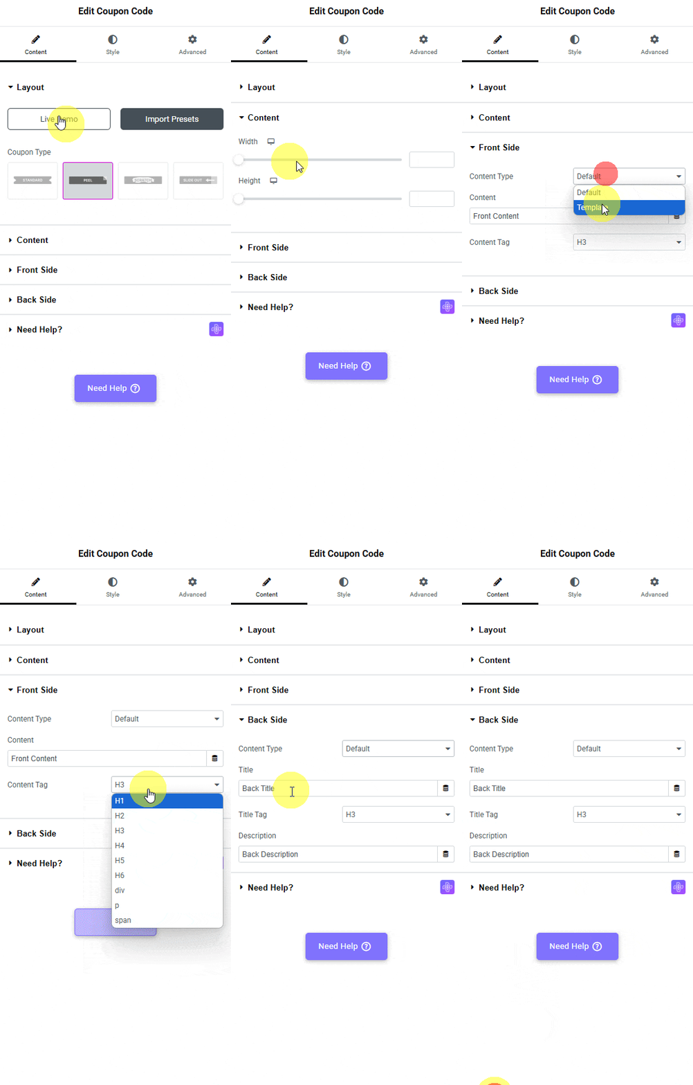

The fields
| Setting | Where | Default |
|---|---|---|
| Coupon Type | Layout | Standard – change it to Peel |
| Width | Content | empty (the card takes its column’s width) |
| Height | Content | empty |
| Content Type | Front Side and Back Side | Default; the other option is Template |
| Content | Front Side | Front Content |
| Content Tag | Front Side | H3; H1-H6, div, p and span are available |
| Title | Back Side | Back Title |
| Description | Back Side | Back Description |
How It Behaves
- Both sides exist from the start. The back side is already on the page, underneath the front side, at exactly the same size and position.
- Dragging from a corner peels the front away. On a published page, dragging from the top-right corner towards the bottom-left removed the front side from the page entirely, leaving the back side’s title and description on screen.
- It is one-way. Once peeled, the front side is gone until the page is reloaded.
- The styling is split. Style > Front Side Content, Style > Back Side Content and Style > Box Content cover the two faces and the card’s own background.


Limitations
- The card has no style presets. Unlike the Standard type, Peel has no Standard Style picker. Everything visual comes from the Style tab.
- There is no copy button on a card. Copying to the clipboard is a feature of the Standard type’s popup only, so put the code somewhere the visitor can select it easily.
- Icons can render as empty boxes. The widget’s scissors icon and the Close Icon use Font Awesome, which The Plus Addons does not load by itself. On a page with no other Font Awesome icon they can come out blank.
Not verified
So you know exactly what has and has not been checked:
- Touch devices. The peel, scratch and slide-out gestures were driven with a mouse on a desktop viewport. The widget binds touch events too, but a real touch device was not used.
- The Style tab. Standard Style 1 and Style 3 were rendered; no colour, typography, border or popup-styling control was exercised.
- How far you have to drag. One drag, from the top-right corner to the opposite corner, was enough. No threshold was measured, and there is no setting for one.
Troubleshooting
The card is a thin strip
Height is empty, so the card is only as tall as its content. Set a height in Content > Content.
Nothing happens when I drag
Check it on the published page rather than in the Elementor preview – the peel is set up by front-end JavaScript. Start the drag on the card itself, not on the space around it.
The back side is showing before anyone peels
The front side has no content, or its text is the same colour as the card. Fill in Front Side > Content and check Style > Front Side Content.
