






A coupon only works if the visitor can see the code and use it without friction. The Coupon Code widget gives you four ways to hand one over: a button that reveals the code, a popup with a copy button, and three cards the visitor peels, scratches or slides open.
This page is the tour of every setting. The step-by-step pages for each type are linked at the bottom.
Requirement – This widget is a part of The Plus Addons for Elementor Pro, make sure it’s installed & activated to enjoy all its powers.
Before You Start
- Edition: Pro — Coupon Code ships only in The Plus Addons for Elementor Pro. The free plugin contains no coupon widget at all, so there is nothing to fall back to.
- Prerequisite: Elementor (free) installed and active.
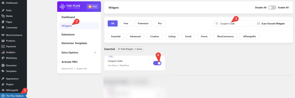
- Widget to enable: go to The Plus Addons > Widgets, search for Coupon Code and turn its toggle on. This is the Widgets screen, not Extensions.
Pick a coupon type
Everything else in the panel depends on this one control. Open Content > Layout and choose a picture under Coupon Type.
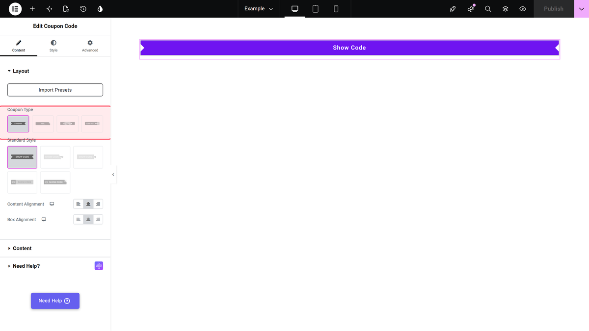
| Coupon Type | What the visitor does | Where the code lives |
|---|---|---|
| Standard | Clicks a button. | Shown in place, or in a popup – your choice. |
| Peel | Drags a corner of the card away. | On the back of the card. |
| Scratch | Scratches the front of the card. | On the back of the card. |
| Slide Out | Drags the front of the card aside. | On the back of the card. |
Standard is the default. The three card types share one set of settings and are covered on their own pages.
Settings for the Standard type
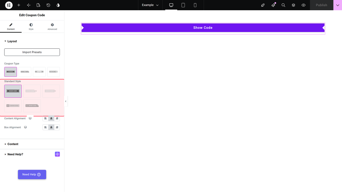
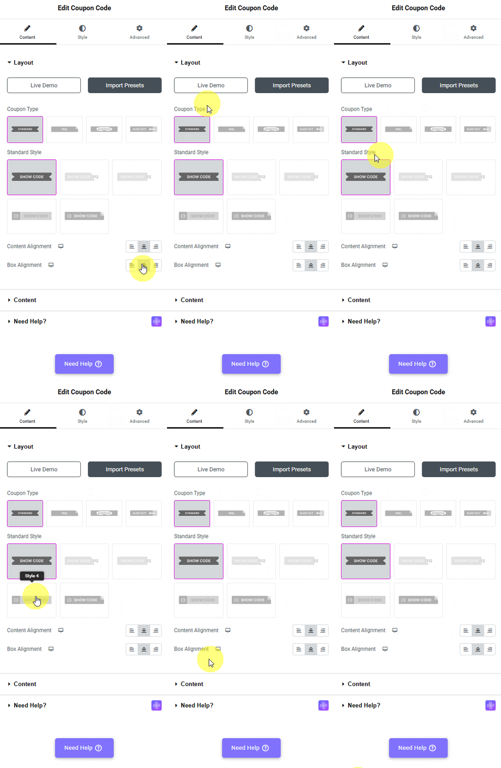
Standard Style offers five pictures, three per row. It is a picture picker, not a dropdown. Content Alignment and Box Alignment line the coupon up inside its column, and both are responsive.
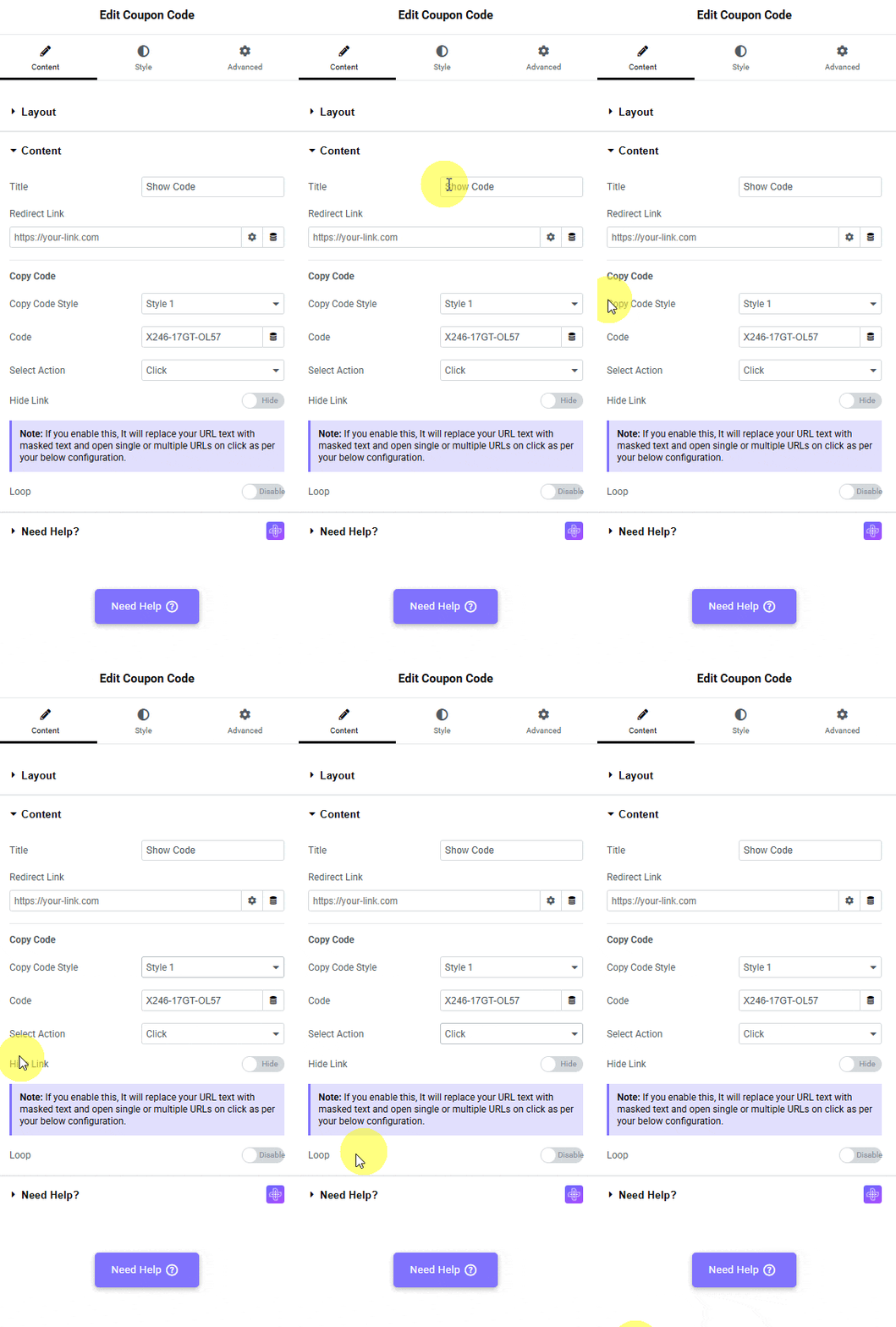
Content > Content holds the coupon itself.
| Setting | What it does | Default |
|---|---|---|
| Title | The text on the button before the code is revealed. | Show Code |
| Redirect Link | Where the visitor is sent. With Click it opens in a new tab; with Popup it is what the Visit Site button uses. | empty |
| Copy Code Style | How the revealed code is drawn. This one is a dropdown. | Style 1 of five |
| Code | The coupon code itself. | X246-17GT-OL57 |
| Select Action | Click shows the code in place. Popup opens a modal with a copy button. | Click |
| Hide Link | Masks the link behind text of your own and lets you open several URLs at once. Only appears with Click. | off |
| Tab Reverse | Sends the Redirect Link to the current tab and the popup to a new one. Only appears with Popup. | off |
| Loop | Gives every rendered copy of the widget a page-unique id, which is what makes the widget behave inside a listing. It is also what reveals Popup Background Image. | off |
Settings for the popup
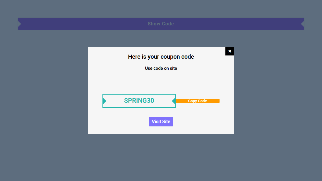
Set Select Action to Popup and the panel adds Title (Here is your coupon code), Description (Use code on site), Copy Button (Copy Code), After Copy (Copied!), Visit Button (Visit Site), Close Icon and Code Alignment. Content > Extra Options then adds Popup Width and On Scroll with its own Height.
Settings for the card types
Choose Peel, Scratch or Slide Out and the Standard settings are replaced by card settings. Width and Height are responsive sliders (1-1000px; Width is applied as a maximum). Scratch adds Fill Percent For Reveal, and Slide Out adds Slide Out Direction (Left, Right, Top, Bottom) and Direction Hint Icon.
Front Side and Back Side each take a Content Type of Default or Template. Default gives you plain fields – Content and Content Tag on the front, Title, Title Tag and Description on the back. Template swaps them for a Template dropdown listing your saved Elementor templates.
The Style tab
Which sections you see depends on the type you picked.
| Coupon Type | Style sections |
|---|---|
| Standard, action Click | Standard |
| Standard, action Popup | Standard, Popup Close Icon, Popup Title/Description, Popup Copy Code, Popup Copy Button, Popup Visit Button, Popup Scroll Bar, Popup Modal Box and Extra Options (Overlay Color and Overlay Backdrop Filter) |
| Peel, Scratch, Slide Out | Front Side Content, Back Side Content and Box Content |
How It Behaves
- Click reveals, it does not copy. On a published page the Show Code button was replaced in place by the code, and nothing was written to the clipboard. The copy button only exists in the popup.
- The popup really does copy. Clicking Copy Code put the code on the system clipboard and the button changed to Copied! for two seconds.
- Click with a Redirect Link opens exactly one new tab and reveals the code in the tab the visitor is still looking at.
- All three card types were driven with a mouse and all three revealed the back side. Peel removes the front side from the page; Scratch draws a canvas over the card and removes it once enough has been scratched; Slide Out moves the front side off to the side.
- A template on the back side renders as a real template, with its own Elementor styling, not as plain text.

Limitations
- The Click action reveals the code; it does not copy it. Only the Popup action has a Copy Code button. With Click the code is simply printed in place and the visitor has to select it by hand.
- The reveal cannot be undone. Once the code is shown, the button that said Show Code is replaced by the code itself. There is no way back to the button without reloading the page.
- Closing the popup rewrites the address bar. The close handler strips the query string from the URL, so a visitor who arrived on
?utm_source=…or on any filtered or paginated address loses it the moment they close the popup. Measured: a page opened at/?page_id=4610showed/after the popup was closed. - Put one coupon popup on a page, not several. The popup’s open and close handlers, and the Popup Width setting, are written against every coupon popup on the page rather than the one widget, so two popup coupons on the same page interfere with each other. Only one popup coupon per page was measured.
- Fill Percent For Reveal is a percentage shown with a px unit. The slider reads px but the number is the share of the card that has to be scratched. Leave the unit alone and set the number.
- The scratch surface is a canvas drawn from your front-side content. It is generated in the browser after the page loads, so it appears a moment late, and the front side is rendered as a flat picture – links, videos or anything interactive in it stop being interactive.
- Icons can render as empty boxes. The widget’s scissors icon and the Close Icon use Font Awesome, which The Plus Addons does not load by itself. On a page with no other Font Awesome icon they can come out blank.
Not verified
So you know exactly what has and has not been checked:
- The Style tab. Standard Style 1 and Style 3 were rendered; no colour, typography, border or popup-styling control was exercised.
- Touch devices. The peel, scratch and slide-out gestures were driven with a mouse on a desktop viewport. The widget binds touch events too, but a real touch device was not used.
- Popup Background Image. The field’s condition was confirmed (Standard + Popup + Loop enabled) but no image was set and the rendered popup background was not observed.
- On Scroll and its Height slider, and the Popup Scroll Bar style section. Labels, defaults and conditions only.
Troubleshooting
The widget is not in the Elementor panel
Open The Plus Addons > Widgets, search Coupon Code and turn its toggle on, then reload the editor. It is the Widgets screen, not Extensions.
Half the settings I read about are missing
Almost every setting is conditional on Coupon Type, and the popup settings need Select Action set to Popup as well. Hide Link only exists with Click, and Tab Reverse only with Popup.
The scissors icon is an empty box
Font Awesome is not loaded by the widget. Add any Elementor icon to the page, or load Font Awesome from your theme.
Popup Background Image is nowhere to be found
It needs three things at once: Coupon Type Standard, Select Action Popup and Loop enabled.
Learn via Video Tutorial

