






Instead of dropping a flat screenshot into a device frame, the Dynamic Device widget can put a real Elementor template inside it — headings, buttons and links all still working.
That means the mockup on your page is the design itself, so when you change the template the mockup changes with it, and visitors can click what is inside the screen.
Requirement – This widget is a part of The Plus Addons for Elementor Pro, make sure it’s installed & activated to enjoy all its powers.
Before You Start
- Edition: Pro — Dynamic Device ships only in The Plus Addons for Elementor Pro. With Pro deactivated the widget does not render at all, and there is no free version of it.
- Prerequisite: Elementor (free) installed and active.
- Widget to enable: go to The Plus Addons > Widgets, search for Dynamic Device and turn its toggle on.
- Prerequisite: an Elementor template saved and published first, under Templates > Saved Templates or with the Create Template button inside the widget’s Elementor Templates control.
Put a template inside a mockup
- Edit your page with Elementor and drag the Dynamic Device widget onto the layout.
- In Content > Content, leave Layout on Normal. The Template content type is not available in the Special Carousel layout.
- Pick a Type — Mobile, Tablet, Laptop, Desktop or Custom — then choose a frame in the dropdown that appears below it, for example iPhone X Black (320px x 672px).
- Set Content to Template.
- In the Elementor Templates dropdown, choose the template you saved. The Edit Template and Create Template buttons beside it take you to that template, or make a new one, without leaving the widget.
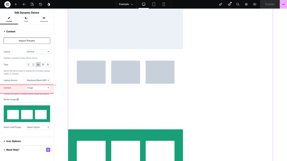
The template renders inside the device screen straight away. Design the template to the proportions of the frame you picked — each frame’s option label carries its pixel size.
Settings that matter here
| Setting | Where | What it does |
|---|---|---|
| Content | Content > Content | Set it to Template. The default is Image. |
| Elementor Templates | Content > Content | Which saved template renders inside the screen. Nothing is selected by default. |
| Show Icon | Content > Icon Options | Off by default. Turn it on to reveal Upload Icon and place a small badge on the mockup. This section is available with Template content. |
| Width Adjust(%) | Style > Device Layout | Scales the whole mockup down from 100% to as little as 10%. |
| Alignment | Style > Device Layout | Left, Center or Right. The default is Center. |
| On Hover Scroll | Style > Template | A hover scroll for template content, with its own Transition Duration. See Not verified below. |
How It Behaves
- The template renders live, not as a picture. A test template containing a heading and a button was placed inside an iPhone X Black frame; the real heading text and the real button appeared inside the screen, and the button was clickable.
- It updates with the template. Because the widget renders the saved template itself, editing that template changes every mockup that uses it.
- It is a Normal-layout feature. The Content dropdown, and so the Template option, only exists while Layout is Normal.
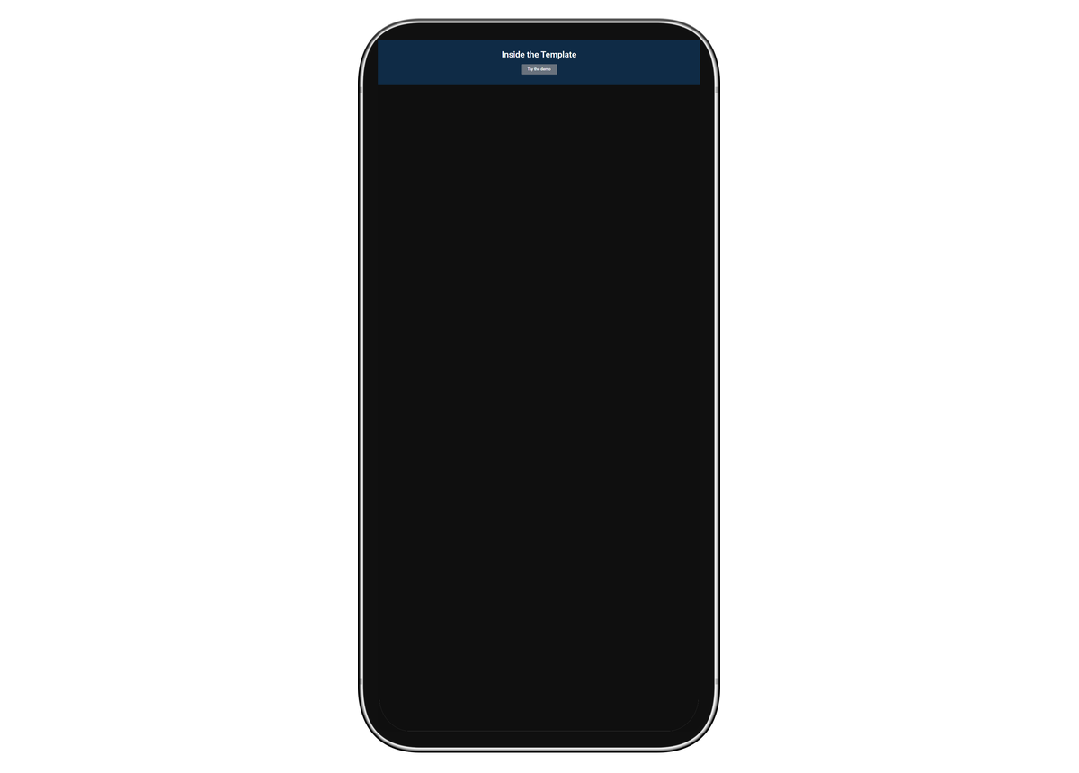
Here is the same idea on the front end, as a visitor sees it:
Limitations
- You must save the template first. The Elementor Templates dropdown lists templates that already exist; there is nothing to pick on a fresh site until you save one.
- The widget tells you when the template is missing. With no template chosen it renders a Select Template notice in place of the content, and a template that is not published renders an Unauthorized Access message instead.
- The template has to fit the screen you picked. The frame does not reflow your template — a wide desktop template inside a phone frame will be cramped. Match the template’s design to the pixel size in the frame’s name.
- A Custom mockup hides your content unless its screen area is transparent. The frame image is drawn over the content, so an ordinary opaque JPEG shows only itself — the image, template or page behind it is completely invisible. Use a PNG with the screen cut out. Nothing in the editor warns you about this.
- Desktop has exactly one frame. Desktop Device offers iMac Minimal (1000px x 565px) and nothing else, so there is no choice to make there.
Not verified
So you know exactly what has and has not been checked:
- On Hover Scroll for Template content. The template equivalent of the image scroll effect was not exercised.
- Show Icon and Upload Icon. The icon overlay was not exercised on the front end.
- Responsive behaviour. Nothing was measured at tablet or mobile breakpoints, and the responsive Width Adjust(%) and Transition Duration values were not exercised.
- The Select Template and Unauthorized Access messages. These come from the widget’s code; only the working case, with a published template selected, was rendered and checked.
Troubleshooting
The screen says Select Template
No template is chosen. Open Content > Content and pick one in the Elementor Templates dropdown, or use Create Template to make one.
The screen says Unauthorized Access
The template you chose is not published. Open it from Templates > Saved Templates and publish it, then reload the page.
The Template option is missing from the Content dropdown
Layout is set to Special Carousel. Switch it back to Normal — the carousel takes a gallery of images, not a template.
