---
title: "How to show a live website in a mockup using iframes in Elementor?"
url: https://theplusaddons.com/docs/live-website-in-mockup-using-iframes-in-elementor/
date: 2023-02-21
modified: 2026-09-19
lang: en
author: "Aditya Sharma"
description: "The IFrame content type of the Dynamic Device widget loads a real web page inside the device screen, so the mockup shows the live site rather than a screenshot of..."
image: https://theplusaddons.com/wp-content/uploads/2020/10/How-to-show-a-live-website-in-a-mockup-using-iframes-in-Elementor-1024x536.jpg
word_count: 925
---

# How to show a live website in a mockup using iframes in Elementor?

## 

- Dynamic Device loads a real web page inside the device screen when Content is set to IFrame, so the mockup shows the live site instead of a screenshot.
- The Plus Addons for Elementor Pro ships Dynamic Device only in Pro, and Elementor free must be installed and active before the widget renders.
- IFrame URL accepts a page address that loads inside the device screen, and the field shows https://www.demo-link.com as its placeholder by default.
- Limitations include blocked embedding through X-Frame-Options or Content-Security-Policy, no icon options for IFrame content, and Desktop Device offering only iMac Minimal (1000px x 565px).

The **IFrame** content type of the **Dynamic Device** widget loads a real web page inside the device screen, so the mockup shows the live site rather than a screenshot of it.

It is the quickest way to show a client's site, a demo or a landing page in a laptop or phone frame and keep it up to date without ever retaking a screenshot.

***Requirement - This widget is a part of The Plus Addons for Elementor Pro, make sure it's installed & activated to enjoy all its powers.***

[LIVE WIDGET LINK](https://theplusaddons.com/elementor-widget/dynamic-device-mockups/?utm_source=tpae&utm_medium=docs&utm_campaign=text)

## Before You Start

- **Edition:** **Pro** — **Dynamic Device** ships only in The Plus Addons for Elementor Pro. With Pro deactivated the widget does not render at all, and there is no free version of it.- **Prerequisite:** [Elementor](https://wordpress.org/plugins/elementor/) (free) installed and active.- **Widget to enable:** go to **The Plus Addons > Widgets**, search for **Dynamic Device** and turn its toggle on.- **Prerequisite:** a URL whose site **allows being framed**. A site that refuses to be embedded shows an empty frame — that is the browser, not the widget.

## Load a live page into the mockup

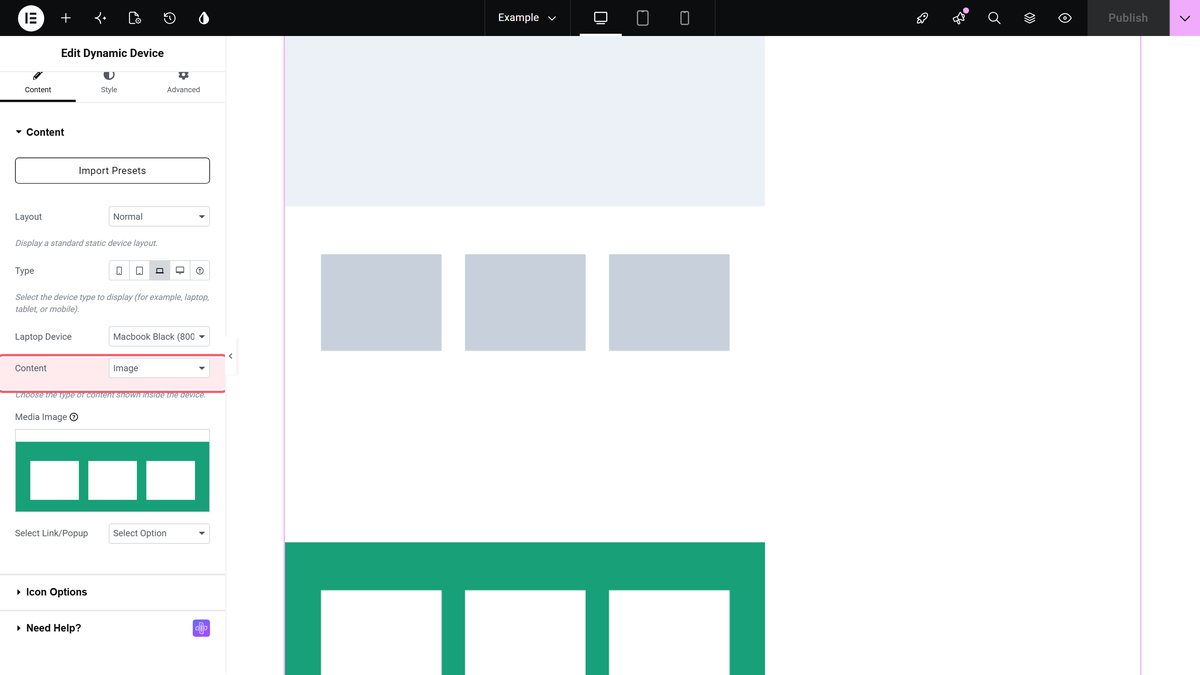
- Edit your page with Elementor and drag the **Dynamic Device** widget onto the layout.- In **Content > Content**, leave **Layout** on **Normal**. The **IFrame** content type does not exist in the **Special Carousel** layout.- Choose a **Type** and then a frame in the dropdown below it. A wide frame such as **Macbook Black (800px x 500px)** suits a desktop site; a phone frame suits a mobile-first page.- Set **Content** to **IFrame**.- Put the address of the page you want to show in **IFrame URL**. The field is empty by default and shows **https://www.demo-link.com** as its placeholder.

![The Dynamic Device widget&apos;s Content section: Layout, Type, the device dropdown and the Content type.](https://theplusaddons.com/wp-content/uploads/2026/09/dynamicdevice-content.webp)

The widget then renders an iframe sized to fill the device screen, and the page loads inside it.

## Settings that matter here

| Setting | Where | What it does |
| ------- | ----- | ------------ |
| **Content** | Content > Content | Set it to **IFrame**. The default is **Image**. |
| **IFrame URL** | Content > Content | The page that loads inside the device screen. Empty by default. |
| **Width Adjust(%)** | Style > Device Layout | Scales the whole mockup, 10% to 100%. The default is 100. |
| **Alignment** | Style > Device Layout | Left, Center or Right. The default is **Center**. |
| **Box Shadow** | Style > Device Background | X, Y, Blur and Color for the shadow under the device, with Normal and Hover tabs. |

## How It Behaves

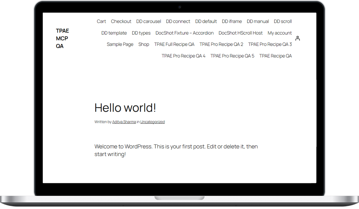
- **The page really loads inside the frame.** With **IFrame URL** set to a page on the test site, the widget rendered an iframe filling the device screen and that page appeared inside the mockup.- **The iframe fills the screen area.** It is written out at 100% width and height of the device screen with no border, so it follows whatever frame and **Width Adjust(%)** you set.- **There are no icon options with IFrame.** The **Icon Options** section is hidden as soon as **Content** is set to **IFrame**; it is only offered for Image and Template content.- **The scrolling effects do not apply.** **Scroll Image** and **Manual Scroll** belong to the Image content type. An iframe scrolls the way the framed page itself allows.
![A live page loaded inside the laptop mockup through the IFrame content type.](https://theplusaddons.com/wp-content/uploads/2026/09/dynamicdevice-result-iframe.webp)

On the front end it behaves as a small live window onto the other page:

![Dynamic Device widget live website iframe demo in The Plus Addons for Elementor](https://theplusaddons.com/wp-content/uploads/2023/02/dynamic-device-iframe-demo.gif)

## Limitations

- **Not every site can be framed.** A site can tell browsers to refuse being embedded, with an **X-Frame-Options** header or a restrictive **Content-Security-Policy**. When it does, the mockup shows an empty frame. That is the browser enforcing the other site's rules, and no widget setting can override it. If you do not control the target site, test the URL before you ship the page.- **You are loading a whole page inside your page.** Everything the framed site loads — its scripts, fonts and images — loads with your page, so a heavy target site makes your page heavier.- **The framed page is not resized for you.** A desktop layout squeezed into a phone frame is shown at the frame's size, not redesigned for it.- **A Custom mockup hides your content unless its screen area is transparent.** The frame image is drawn over the content, so an ordinary opaque JPEG shows only itself — the image, template or page behind it is completely invisible. Use a PNG with the screen cut out. Nothing in the editor warns you about this.- **Desktop has exactly one frame.** **Desktop Device** offers **iMac Minimal (1000px x 565px)** and nothing else, so there is no choice to make there.

## Not verified

So you know exactly what has and has not been checked:

- **Third-party sites in the IFrame.** Only a page on the same site was loaded inside the mockup. Whether a particular external site renders or comes up blank was not tested.- **Responsive behaviour.** Nothing was measured at tablet or mobile breakpoints, and the responsive **Width Adjust(%)** and **Transition Duration** values were not exercised.- **Framing refusals.** No site that blocks embedding was tried, so the exact appearance of a blocked frame in this widget is not documented here.

## Troubleshooting

### The mockup is empty

First check the URL in **IFrame URL** — a typo or a missing **https://** leaves the frame blank. If the address is right, the target site is very likely refusing to be embedded. Open your browser's console on the published page; a refusal is reported there. Use a site you control, or fall back to the **Image** content type with a screenshot.

### There is no IFrame option in the Content dropdown

**Layout** is set to **Special Carousel**. Switch it back to **Normal**.

### The Icon Options section disappeared

That is expected. **Icon Options** is hidden for **IFrame** content and comes back when you choose **Image** or **Template**.

## Related Docs

- [Dynamic Device Elementor Widget Settings Overview](https://theplusaddons.com/docs/dynamic-device-elementor-widget-settings-overview/)- [How to show Elementor Templates inside a Device Mockup?](https://theplusaddons.com/docs/elementor-templates-inside-a-device-mockup/)- [How to add website scrolling device mockup in Elementor?](https://theplusaddons.com/docs/website-scrolling-device-mockup-in-elementor/)

## Frequently Asked Questions

**Q: What do I need before showing a live website in a mockup with iframes in Elementor?**
A: The setup depends on three things: Elementor free installed and active, the Dynamic Device widget enabled under The Plus Addons &gt; Widgets, and The Plus Addons for Elementor Pro active. The page also needs a URL that allows framing. If the target site blocks embedding, the mockup shows an empty frame because the browser enforces the other site’s rules. That makes URL choice the main gotcha before you publish.

**Q: Why is my live website mockup showing an empty frame?**
A: An empty frame usually means the target site is refusing to be embedded, often through an X-Frame-Options header or a restrictive Content-Security-Policy. A typo in IFrame URL or a missing https:// can also leave it blank. The useful distinction is that browser refusal and bad URLs look similar at first, so checking the published page’s console helps separate a broken link from an embedding block.

**Q: What is the best frame size for a desktop site versus a mobile page?**
A: A wide frame such as Macbook Black (800px x 500px) fits a desktop site better, while a phone frame suits a mobile-first page. The reason matters is that the iframe itself fills the device screen area, but it does not redesign the page for you. A desktop layout squeezed into a phone frame still appears at the frame’s size, so pick the mockup that matches the page’s intended layout.

**Q: Can I use any website inside the Dynamic Device iframe mockup?**
A: Only if that site allows being framed. The page says some sites refuse embedding through X-Frame-Options or Content-Security-Policy, and those will show an empty frame. That means this works best for sites you control or can test first. It is also worth remembering that every script, font, and image from the framed page loads with your page, so heavier targets make your page heavier too.

**Q: Why did the Icon Options section disappear when I switched to IFrame?**
A: That behavior is expected because Icon Options is hidden as soon as Content is set to IFrame. The section only appears for Image and Template content types. In practice, that means IFrame is meant for loading a real web page inside the device screen, not for icon-based variations. If you need icon controls back, switch away from IFrame.

**Q: What happens if I use a custom mockup image with a live iframe inside it?**
A: A custom mockup hides the content unless its screen area is transparent. The frame image sits on top of whatever is behind it, so an ordinary opaque JPEG will cover everything underneath and make the live page invisible. The practical fix is to use a PNG with the screen cut out. That detail matters because nothing in the editor warns you when the overlay blocks your iframe.