


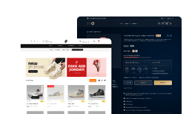
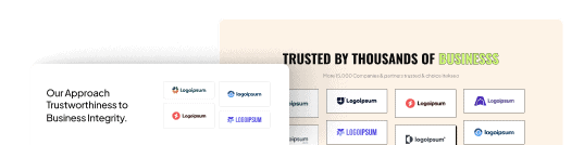
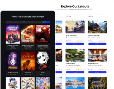
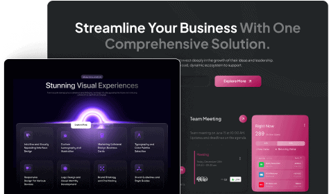
Looking to showcase your brand’s logos in an impressive and visually appealing way? A logo showcase is a fantastic way to display the logos of your clients, partners, or brands you have worked with, creating a sense of credibility and professionalism.
With the Clients Listing Widget from The Plus Addons for Elementor, you can easily create beautiful client logo sections in Elementor that capture attention and leave a lasting impression on your website visitors.
Required Setup
- Elementor FREE Plugin installed & activated.
- You need to have The Plus Addons for Elementor plugin installed and activated.
- Make sure the Clients Listing widget is activated. To verify this, visit The Plus Addons → Widgets → and search for Clients Listing and activate.
- This is a Freemium widget; to unlock the extra features, you need the PRO version of The Plus Addons for Elementor.
How to activate the Clients Listing Widget?
Go to
- The Plus Addons →Widgets
- Search the widget name and turn on the toggle.

Key Features
- Two Source Types – You can use a custom post type or an inbuilt repeater as the source.
- 3 Layouts – You can choose from three layout types: Grid, Masonry, and Carousel (Pro).
- Order Posts by Different Parameters – You can order posts by different parameters like id, date, author, title, and more.
- Category Filter (Pro) – You can easily add category filters to your logo showcase (except for the carousel layout).
- More Post Loading Options (Pro) – You can choose from different types of more post loading options, such as Pagination, Load More, and Lazy Load.
- Unique Carousel ID (Pro) – With the Unique Carousel ID, you can easily connect and control the logo carousel with the Carousel Remote widget.
How to Add Logo Showcase in Elementor with Repeater Mode [Recommended]?
To add a logo showcase, add the Clients Listing widget on the page
Layout
From the Layout section, you can select different layout types for your logos. Here you’ll find three options –
- Grid – For creating a grid layout.
- Masonry – For creating a masonry grid layout.
- Carousel – For creating a logo carousel slider.
Select the appropriate layout option that fits your needs.
From the Select Source dropdown, you have to select the source of your logo showcase. Here you’ll find two options –
- Post Type – With this option, you can use the default client’s custom post type of The Plus Addons for Elementor, or you can use your own custom post type as the source of the listing. Learn more.
- Repeater – With this option, you can directly add content to the widget.
Here we’ll select the Repeater option.
With the Repeater option selected, you’ll find a Manage Clients section. From here, you can directly add the content, open the first item.
Client Name – Here, you can add the client name.
Client URL – Here, you can add the client website URL.
Client Logo – Here, you have to add the client’s logo.
Category (For Filter) – Here, you can manually create categories for the logo. This can be used to filter client logos by categories. Learn the process.
Note: You can add multiple categories separated by a comma (,).
You can repeat the process on the other items.
Click on the +ADD ITEM button to add more client logos.
Content Source
From the Content Source tab, you can select categories as the source of your member list.
Select Category – From here, you can select different categories as the source.

In the Maximum Posts Display field, you can set a maximum number of posts to be displayed on a page.
From the Offset Posts field, you can hide posts from the beginning of the member list.
Then, from the Order By dropdown, you can order the member posts. Here you’ll find multiple options –
- None – This will keep the list in its default order.
- ID – With this, you can order the member posts by their ID.
- Author – With this, you can order the member posts by post author name.
- Title – With this, you can order the member posts by title (alphabetical order).
- Name (slug) – With this, you can order the member posts by their slug (URL).
- Date – With this, you can order the member posts by date. This option can be used to show the latest member posts, learn the process.
- Modified – With this, you can order the member posts based on the last modified date.
- Random – This will show member posts in a random order. So every time the pages load, the member’s posts will show in a different order.
- Comment Count – With this, you can order the member posts based on the number of comments.
- Default Menu Order – With this option, you can order member posts by menu order number. However menu order option is available for pages only. If you want to use the menu order feature for member posts, you have to add some special code to your website’s files. This will allow you to give each member’s post an order number, just like you can for pages.
Then, from the Order dropdown, you can arrange the posts in ascending or descending order based on the option selected in the Order By dropdown.
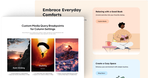
Columns Manage
From the Columns Manage tab, you can manage the number of columns of your logo showcase on desktop, tablet, and mobile separately.

You can also manage the column gap from here.
Category Wise Filter
Category Wise Filter – With this option, you can add a beautiful category filter in logo showcase.
Note: Category Wise Filter option is not available in the Carousel layout.
By enabling the Category Wise Filter toggle, you’ll see all the filtered options displayed here.

From the Filter Type dropdown, you have to select the filter type. Here you’ll find two options –
- Normal – You’ll see your client list with the default filter.
- AJAX – You’ll see your client list with the Ajax-based filter. Learn Process.
From the Search Type dropdown, you have to select the search type. Here you’ll find two options –
- ID – You’ll see your client list filtered by post ID.
- Slug – You’ll see your client list filtered by post slug.
By enabling the All Filter toggle, you’ll see all the filter category text options here.
You can edit the filter label from the All Filter Category Text field.
Category Filter Style – From here, you can select different styles for the categories.
Filter Hover Style – From here, you can select different styles for the categories that you’ll see on hover.
From the Filter Alignment section, you can align the filter.
More Post Options
More Post Loading Options – This option is available for the Post Type source. From here, you can add different types of options to load more client logos (except in Carousel layout). Here you’ll find three options –
- Pagination – With this, you can add pagination in Elementor logo showcase.
- Load more – With this, you can add a load more button in Elementor logo showcase.
- Lazy Load – With this option, you can add an infinite loading option in Elementor logo showcase.

Extra Options
Then, in the Extra Options tab, you’ll find some additional options.
Title Tag – From here, you can set different HTML tags for your client’s name.

Display Client Title – From here, show or hide the client’s name from the logo showcase.
Disable Link – From here, you can disable the client logo URL.
Display Image Size – From here, you can select different image sizes of the client’s logo
Loading Options – With this option, you can choose between two styles for your post layout:Default: The standard layout showing all content, like the title, post date, and author name.Skeleton: A minimalist style that shows placeholders for content while it loads, creating a cleaner, modern look. i.e. gray boxes
URL Enable – By enabling the URL Enable option, when you share the URL of a client list or category you’ve already selected, others will see that specific category.
Note: The URL Enable option will be visible when you select the AJAX option from the Filter Type tab under the Category Wise Filter tab.
How to Style Elementor Client Logos?
To style the Clients Listing widget, you’ll find all the styling options under the Style tab.
Title – From here, you can manage the client’s name typography and colour.

Client Logo Style – From here, you can add a border and apply different CSS filters on the client logos for normal and hover states.
Individual Client Background – From here, you can manage padding, margin, border, background, etc., for each client logo item.
Carousel Options – This option will be visible when you use the Carousel layout. Here you’ll find many options to control the carousel.
- Unique Carousel ID – With the Unique Carousel ID, you can easily connect and control the logo carousel with the Carousel Remote widget.
- Slider Mode – From here, you can choose your slider orientation, Horizontal or Vertical.
- Slide Direction – From here, you can choose the slider’s slide direction, Right to Left or Left to Right.
- Slide Speed – Control your slide transition speed from here.
Now you’ll find various device-dependent options.
- Columns – You can set the number of columns for the slide for desktop, tablet, and mobile separately.
- Next Previous – You can set the behaviour of your next/previous slide movement from here. You can move one column at a time or all visible columns (depending on the number of columns set in the Columns dropdown).
- Slide Padding – From here, you can adjust the padding of your slider.
- Draggable – Make your carousel draggable or non-draggable from here.
- Multi Drag – With this option, you can allow users to drag multiple slides at once.
- Infinite Mode – From here, you can turn your carousel into an infinite loop slider.
- Pause On Hover – Allow the users to pause the slider on mouse hover.
- Adaptive Height – If you have slides with uneven height, with this option, the carousel navigation will adjust its position automatically according to the height of the slide.
- Animation Type – From here, you can choose the animation type for your slider.
- Autoplay – Make your carousel slider autoplay from here and adjust its speed as well.
- Show Dots – From here, you can add dots, slider navigation, and you can style them as well.
- Show Arrow – You can also add arrow navigation for your carousel slider and style it from here.
- Center Mode – From here, you can highlight the center slide by adding padding, scale effect, or opacity.
- Number Of Rows – From here, you can set the number of rows for your slider.
Post Not Found Options – This option is only available when Post Type is selected as the source type. From here, you can style the post not found message. You can manage the message typography, colour, background, border, etc.
Extra Options – From here, you can make a unique column alignment. Turn on the Messy Columns toggle you’ll get options to move columns up and down up to 6 columns individually for different devices.
On Scroll View Animation – This is our global extension available for all our widgets, which adds scrolling animation as the widget comes into the viewport.
Learn more about On Scroll View Animation
Advanced options remain common for all our widgets; you can explore all their options from here.