




Client logos are rarely the same shape. A masonry grid lets each one keep its own height and closes the gaps that an even grid leaves behind.
The Clients widget from The Plus Addons for Elementor has that layout built in.
To check the complete feature overview documentation of The Plus Addons for Elementor Clients Listing widget, click here.
Requirement – This widget is a part of The Plus Addons for Elementor, make sure it’s installed & activated to enjoy all its powers.
Before You Start
- Edition: Free — the Clients widget is part of the free The Plus Addons for Elementor plugin.
- Widget to enable: Clients, under The Plus Addons > Widgets. Elementor shows it in the Listing group.
- Prerequisite: a few client entries to list — either posts in Tp Clients, each with a featured image as its logo, or rows in the widget’s Manage Clients repeater.
Switch to the masonry layout
- Edit the page with Elementor and drag the Clients widget onto it.
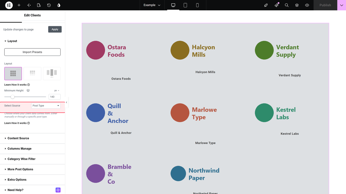
- In Layout, click the second picture button — the one with offset rectangles. That is Masonry.
- Leave Minimum Height empty. It sets a floor for every box, which flattens the masonry effect back into an even grid.
- Leave Select Source on Post Type, or switch it to Repeater and add the logos by hand.
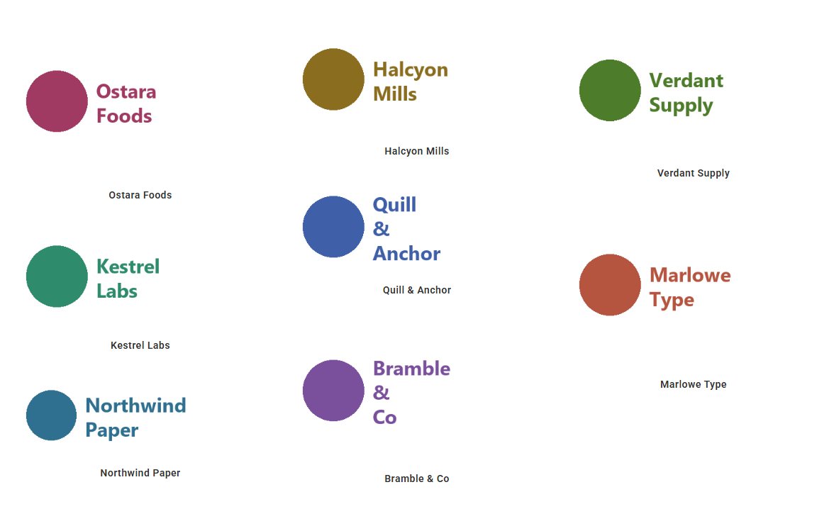
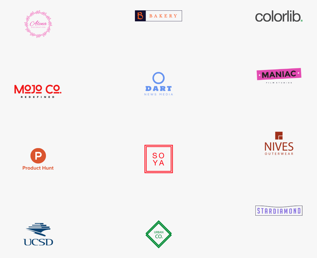
With logos of different heights the columns stagger:
Set the columns
Open Columns Manage and set Desktop Column, Tablet Column and Mobile Column. They offer 2, 3, 4, 5, 6 and 12, and default to 3, 4 and 6. Columns Gap/Space Between sets the spacing around each logo.
How It Behaves
- Each logo box keeps its own height and the next one starts right below it, so the columns end at different points.
- If all your logos are the same height, masonry and grid look identical — the effect only shows when the heights differ.
- Setting Minimum Height makes every box at least that tall, which removes the staggering.
Limitations
- The masonry columns are laid out in the browser, so the logos settle into place a moment after the page loads.
- Pagination, Load More, lazy loading and the category filter are Pro.
- There is no Style dropdown to pick before the layout; older guides that mention one are out of date.
Troubleshooting
It looks exactly like the grid
Either your logos are all the same height, or Minimum Height is set. Clear Minimum Height and use logos of different heights.
The logos overlap for a moment on load
That is the masonry layout being calculated. Giving the container a background or a fixed padding makes the shift less obvious.
Only eight logos appear
Maximum Posts Display under Content Source defaults to 8.
