


Are you looking to add eye-catching and engaging buttons on your Elementor website? With the Button widget from The Plus Addons for Elementor, you can easily add a variety of stylish and attention-grabbing call-to-action buttons to your Elementor website.
Required Setup
- Elementor FREE Plugin installed & activated.
- You need to have The Plus Addons for Elementor plugin installed and activated.
- Make sure the Button widget is activated, to verify this visit The Plus Addons → Widgets → and Search for Button and activate.
Learn via Video Tutorial:

How to Activate the Button Widget?
Go to
- The Plus Addons → Widgets
- Search the widget name and turn on the toggle.

Key Features
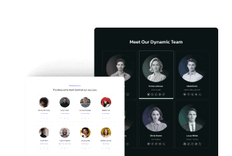
- Multiple button styles – You can choose from multiple unique pre-designed styles to the free Elementor button.
- Change button text on hover – With some button styles, you can change button text on hover.
How to Use the Button Widget?
Add the Button widget to the page.
Layout
From the Button Style dropdown, you can select a button style.

From the Alignment section, you can align the button for the responsive device.
In the Text field, you have to add the button text.
On some button styles, you’ll see a Hover Text field to show a different text on hover.
For the Style 23 button, you can add an extra text on the button from the Button Tag Text section, like this –

Then, in the Link field, you can add a link for the button.
You can add a custom attribute to the button by enabling the Add Custom Attributes group control.
Icon Settings
From the Icon Font dropdown, you can select and add an icon to the button based on the chosen Icon Type. Here you’ll find three options:
- FontAwesome – To add classic icons, from the FontAwesome icon library.
- FontAwesome 5 – To add modern icons, from the FontAwesome 5 collection.
- Icons Mind –To add clean and minimal icons, from the Icons Mind library.
Based on your selection, you’ll find different group controls for an Icon Type.
From the Icon Position section, you can set the icon position either before or after the button text.
From the Icon Spacing section, you can set the space between the icon and the content for responsive devices.
From the Icon Size section, you can set the icon for responsive devices.
From the Alignment section, you can align the content to the top, center, or bottom for responsive devices to the button.
Extra Option
In the Button ID field, you can add an ID to the button, which can be used to directly redirect visitors to the button or it can be used in JavaScript to add custom interactivity.

How to Style the Button Widget?
You can style the Button from the Style tab.
Background Option – From here, you can manage the button padding, margin, typography, color, icon size, etc.

Special – Here you’ll find some options to add special effects to the button for free.
- Magic Scroll – From here, you can add a magic scroll effect to the button.
- Tooltip – From here, you can add a tooltip to the button.
- Special Effect – From here, you can add an overlay effect to the button.
- Mouse Move Parallax – From here, you can add a mouse move parallax effect to the button.
- Continuous Animation – From here, you can add a continuous animation to the button.
- Full-Width Button – From here, you can make a full-width button.
- Button Hover Effects – From here, you can add a button hover effect.
- Interval Shake Animate – From here, you can add an interval shake animation to a button.
On Scroll View Animation – This is our global extension available for all our widgets, which adds scrolling animation as the widget comes into the viewport. You can learn more about this from here.
Advanced options remain common for all our widgets; you can explore all their options from here.
Read more about how to add post next & previous button in elementor blog post.