A well-structured website with easy navigation can improve the user experience. One essential feature that can significantly improve a website’s navigation is the breadcrumb trail. Breadcrumbs are a series of links that show the user their location on a website and allow them to navigate back to previous pages quickly. Breadcrumbs can improve the usability of a website, particularly for complex sites with many pages and sub-pages.
With the Breadcrumbs Bar widget from The Plus Addons for Elementor, you can easily add beautiful breadcrumbs to your Elementor website.
Required Setup
- Elementor FREE Plugin installed & activated.
- You need to have The Plus Addons for Elementor plugin installed and activated.
- This is a Premium widget, and you need the PRO version of The Plus Addons for Elementor.
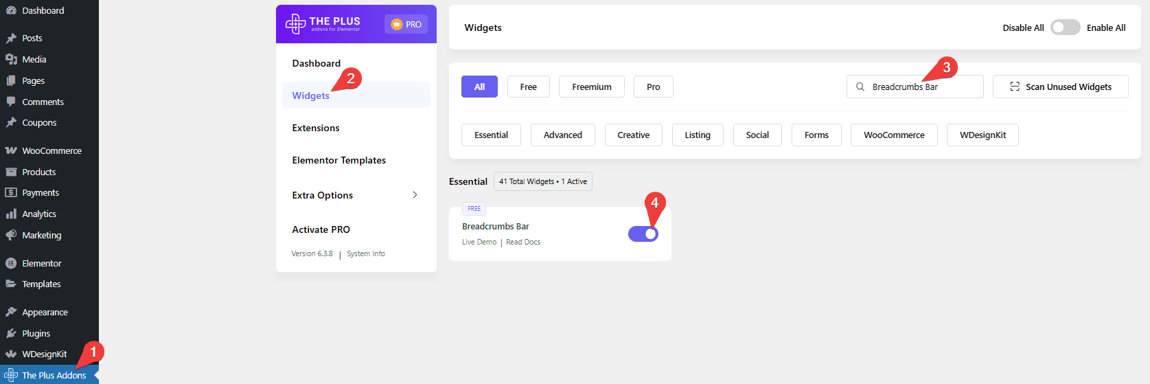
- Make sure the Breadcrumbs Bar widget is activated. To verify this, visit The Plus Addons → Widgets → and search for Breadcrumb and activate.
Learn via Video Tutorial:
How to Activate the Breadcrumbs Bar Widget?
Go to
- The Plus Addons → Widgets
- Search the widget name and turn on the toggle.
Key Features
- Two Styles – You can choose from two unique breadcrumb styles.
- Fullwidth Breadcrumb – You can easily make a full-width breadcrumb.
- Home Title/Icon – You can easily add an icon or title to the home link.
- Extra Option – You can easily show or hide the home page, parent page, or the current page from the breadcrumb trail.
How to Add a Breadcrumb in Elementor?
To add a breadcrumb to your Elementor website, you should add the Breadcrumbs Bar widget to the header template so it can be accessible throughout the website.
To create the header template, you can use the free Nexter Builder, or you can use Elementor Pro if you are already using it.
Breadcrumbs Style
In the Breadcrumbs Style section, you’ll find two pre-defined style options; you can select the suitable option.
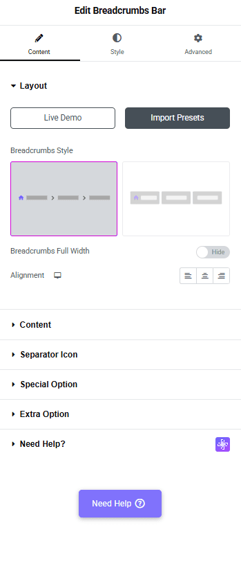
If you select Style-1, you’ll see the Breadcrumbs Full Width toggle; with this, you can make a full-width breadcrumb bar.
Then, from the Alignment section, you can manage the breadcrumb links alignment for different devices.
Content
From the Home Title field, you can change the home text of the breadcrumb.
Then, from the Select Icon dropdown, you can add an icon to the home text in the breadcrumb. Here you’ll find two options –
- None – To display the home text without any icon.
- Icon – you can add an icon or image to the home text in the breadcrumb.
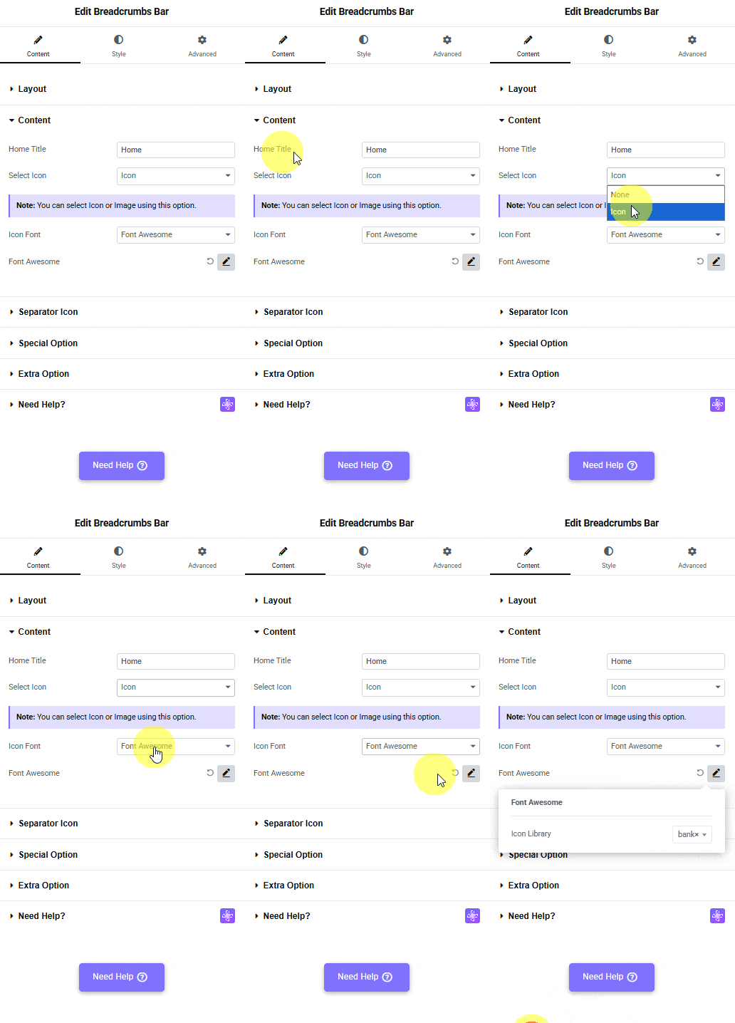
Based on your selection, you’ll find different icon options to add the home text in the breadcrumb.
From the Icon Font dropdown, you can select and add an icon based on the chosen Icon Type. Here you’ll find three options:
- FontAwesome – To add classic icons, from the FontAwesome icon library.
- Icons Mind –To add clean and minimal icons, from the Icons Mind library.
- Icon Image –To add an image for the home text, select an image and set its size using the Image Resolution dropdown.
Based on your selection, you’ll find different group controls for an Icon Type.
Separator Icon
From the Select Icon dropdown, you can add an icon or image as a separator in the breadcrumb. Here you’ll find two options –
- None – To display the separator without any icon.
- Icon – you can add an icon or image as a separator in the breadcrumb.
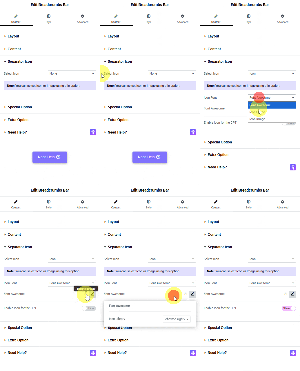
Based on your selection, you’ll find different icon options to add as a separator in the breadcrumb.
From the Icon Font dropdown, you can select and add an icon based on the chosen Icon Type. Here you’ll find three options:
- FontAwesome – To add classic icons, from the FontAwesome icon library.
- Icons Mind –To add clean and minimal icons, from the Icons Mind library.
- Icon Image –To add an image as a separator, select an image and set its size using the Image Resolution dropdown.
Based on your selection, you’ll find different group controls for an Icon Type.
By enabling the Enable Icon for CPT toggle, you will see an icon for CPT (Custom Post Types).
Special Option
Letter Limit – From here, you can limit the parent and current title by words separately. This can be a useful feature if you have long titles in the breadcrumb.
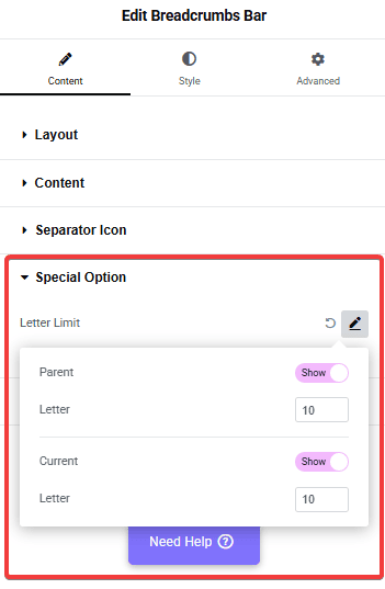
Parent – From here, you can show or hide the parent page link from the breadcrumb.
Current – From here, you can show or hide the current page link from the breadcrumb.
Extra Option
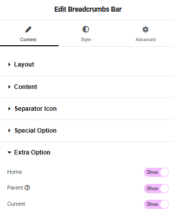
In the Extra Option tab, you’ll find three options –
Home – From here, you can show or hide the home link from the breadcrumb.
Parent – From here, you can show or hide the parent page link from the breadcrumb.
Current – From here, you can show or hide the current page link from the breadcrumb.
How to Style the Breadcrumbs Bar Widget?
To style the Breadcrumbs Bar widget, you’ll find all the styling options under the Style tab.
Breadcrumbs Text – From here, you can manage the breadcrumb typography, color, and border.
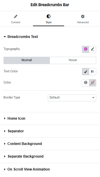
Home Icon – From here, you can manage the home icon padding, size, and color.
Separator – From here, you can manage the separator icon padding, size, and color.
Content Background – This option is only available for Style 1. From here, you can manage the breadcrumb bar background, border, box shadow, etc.
Separate Background – From here, you can manage the breadcrumb item padding, border radius, and background color separately.
On Scroll View Animation – This is our global extension available for all our widgets. This adds a scrolling animation as the widget comes into the viewport.
Learn more about On Scroll View Animation
Advanced options remain common for all our widgets; you can explore all their options from here.
Suggested reading, how to add breadcrumbs on custom post types single page.

