






A follow circle cursor keeps the visitor’s pointer and adds a soft circle that trails it.
The Mouse Cursor widget builds it in three shapes: a plain Border Cursor, a Progress Cursor (Body) ring and a Blend Cursor that inverts what is behind it.
To check the complete feature overview documentation of The Plus Addons for Elementor Mouse Cursor widget, click here.
Requirement – This widget is a part of The Plus Addons for Elementor Pro, make sure it’s installed & activated to enjoy all its powers.
Before You Start
- Edition: Pro — Mouse Cursor is only in The Plus Addons for Elementor Pro. With the Pro plugin switched off the widget is not in the editor at all, and a page that already uses it shows no cursor effect and no notice.
- Widget to enable: Mouse Cursor, switched on under The Plus Addons > Widgets.
- Where to drop it: anywhere inside the container whose cursor you want to change. The widget itself is invisible, so its position on the page does not matter — only which container it sits in.
- Check it on the published page: the widget draws nothing in the Elementor editor. The panel says so too: This widget works only at frontend.
- Desktop only: every cursor effect is switched off when the browser window is 991px wide or narrower, so nothing happens on phones and most tablets.
Add a Follow Circle Cursor
- Drag the Mouse Cursor widget into the container you want the effect in.
- Set Cursor Area — Body for the whole page, Container for one band of it.
- In Type, click the Follow Circle picture (fourth in the row).
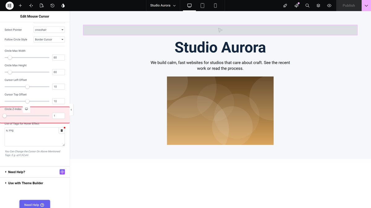
- In Pointer Type, choose Predefined for the built-in circle styles, or Custom to build your own shape.
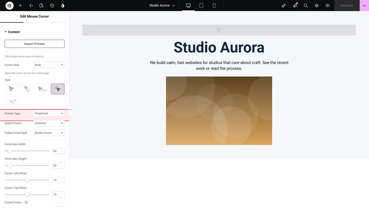
- With Predefined chosen, pick the pointer the visitor sees underneath in Select Pointer — the default is crosshair.
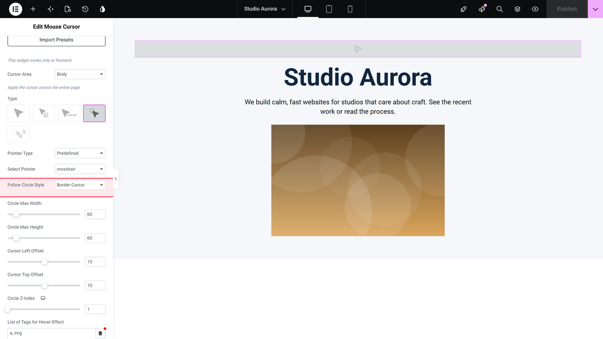
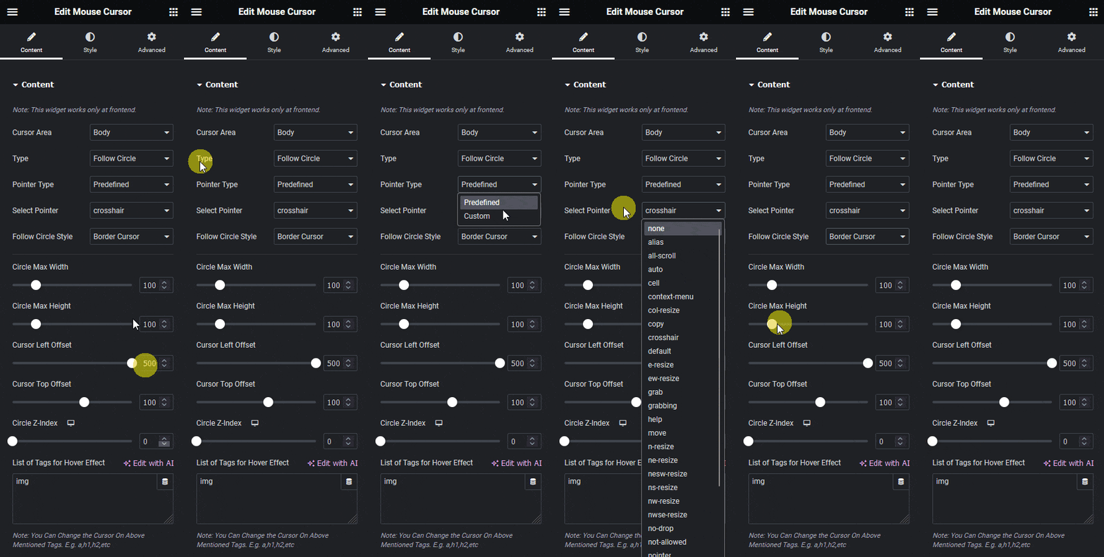
- Pick a shape in Follow Circle Style.
| Style | What it draws |
|---|---|
| Border Cursor | A plain filled circle you colour yourself. The usual choice. |
| Progress Cursor (Body) | A ring built from two SVG circles. It only works with Cursor Area set to Body — see the progress cursor page. |
| Blend Cursor | A circle with a CSS blend mode, so it inverts or tints whatever is under it — see the blend cursor page. |
Size and Position
| Setting | What it does | Default |
|---|---|---|
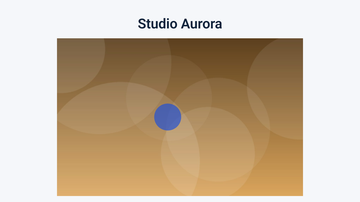
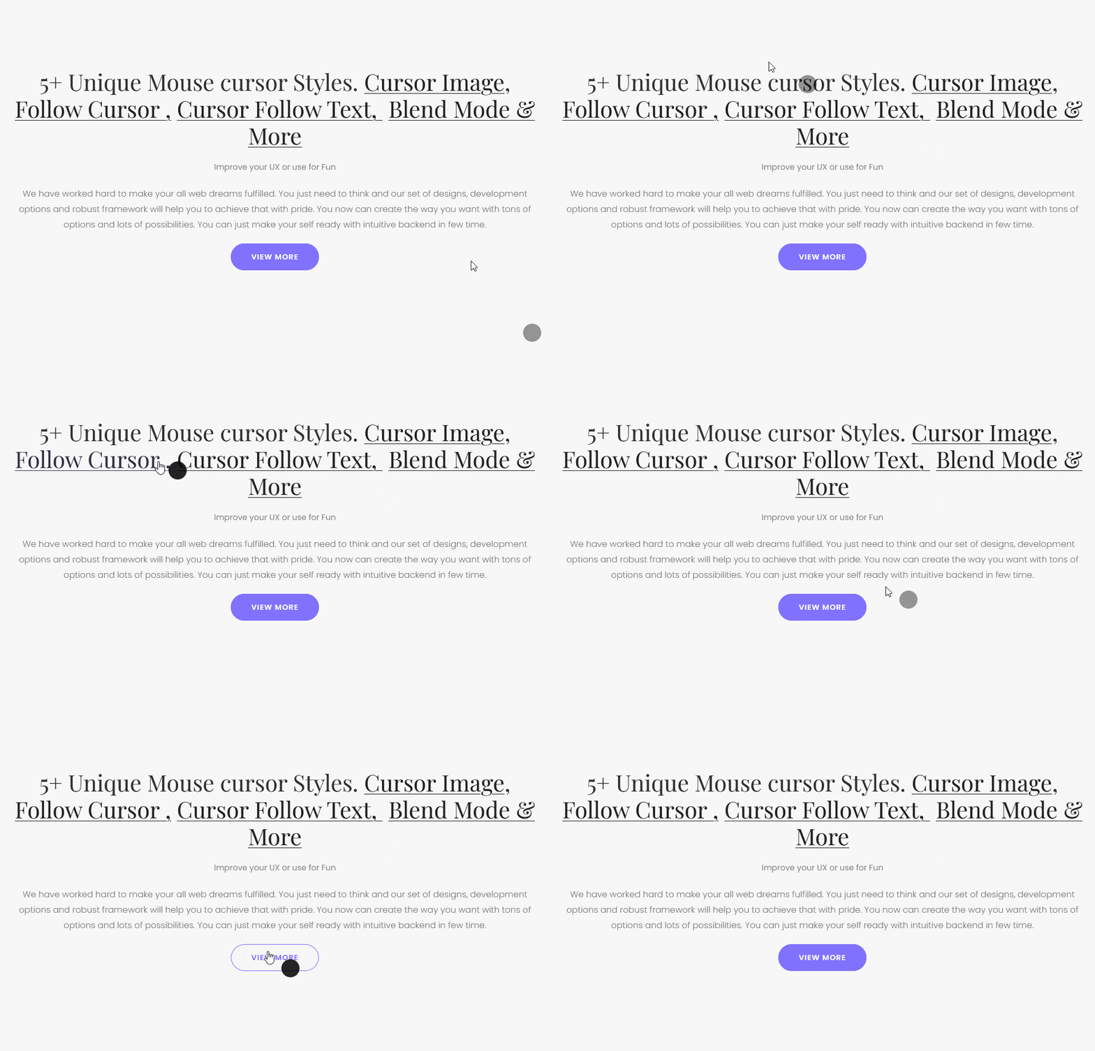
| Circle Max Width / Circle Max Height | The circle’s size. Both are needed for a true circle. | 100px each (0–500) |
| Cursor Left Offset / Cursor Top Offset | Move the circle away from the pointer. | 10px each |
| Circle Z-Index | How high the circle sits in the stacking order. Raise it if the circle disappears behind page content. | 1 (0–99999) |
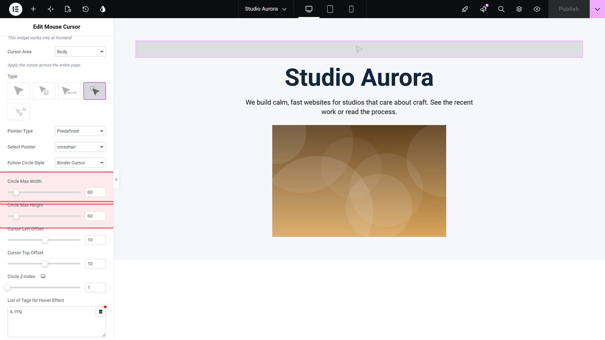
Circle Z-Index really does start at 1, which is low enough that almost any positioned element on the page will cover the circle. If the circle vanishes over part of your layout, this is the setting to raise.
Building Your Own Circle
Set Pointer Type to Custom and you get a Content Type choice of Image or Color.
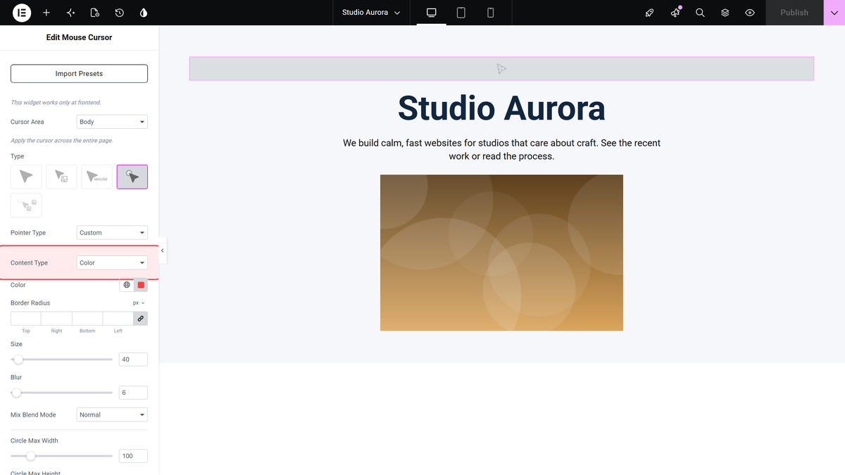
Color gives you Color, Size (default 20px), Border Radius, Blur (default 0) and Mix Blend Mode, and the shape is drawn click-through so it never blocks links. This is the option to use for a soft glow or a squashed blob.
Styling for Normal and Hover
The Style tab has a Follow Circle section with Normal and Hover tabs.
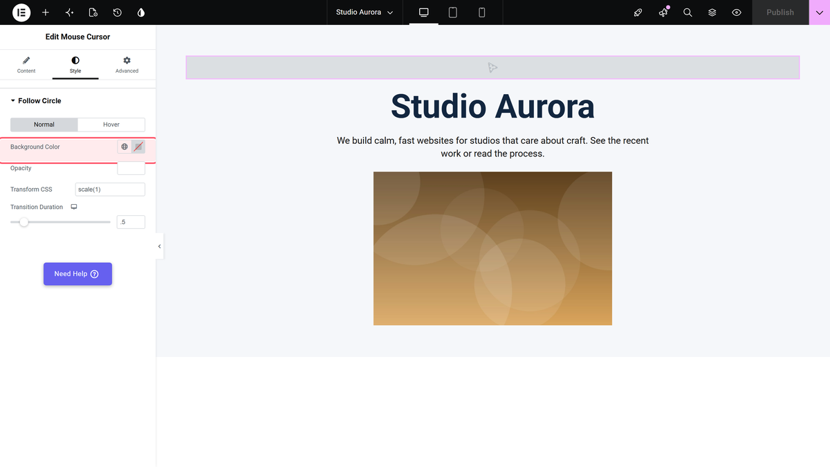
- Background Color fills the circle.
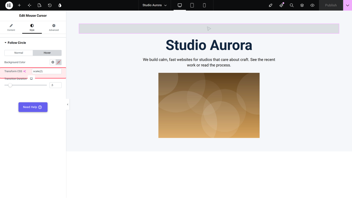
- Transform CSS takes any CSS transform — the panel suggests
rotate(10deg) scale(1.1). - Transition Duration sets how long the change takes (default 0.5s, 0.1–3).
- The Hover tab repeats those with the values used while the pointer is over a matching element.
Which Elements Count as Hover
List of Tags for Hover Effect in the Content section decides that. It takes a CSS selector, and the panel note says so: You Can Change the Cursor On Above Mentioned Tags. E.g. a,h1,h2,etc. The default is a, so links.
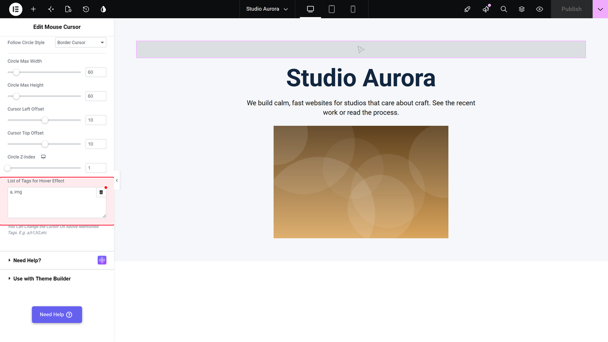
Separate several with commas, with or without spaces — a,img and a, img both worked. Use real CSS selectors only. An invalid one, such as a|img, broke the whole cursor in testing: the circle never appeared and never followed the pointer.
How It Behaves
- The circle is hidden until the pointer first enters the area, then follows every move.
- Select Pointer changes the ordinary pointer under the circle, not the circle itself.
- With Pointer Type set to Custom and Content Type set to Color, the shape is click-through.
- The effect is switched off entirely below 992px of window width.
Limitations
- The widget is Pro only. With the Pro plugin switched off there is no circle and no notice.
- Nothing happens at 991px of window width or below.
- With Pointer Type set to Predefined the circle is not click-through. It sits between the pointer and the page, which is why the hover transform can be erratic: in repeated tests the circle sometimes kept its hover transform while the pointer was nowhere near a matching element, and sometimes stayed on the normal transform while it was. Treat Transform CSS on the Hover tab as decoration, not as a reliable signal.
- Circle Z-Index starts at 1, so the circle disappears behind most positioned content until you raise it.
- An invalid selector in List of Tags for Hover Effect stops the whole cursor from working, with no message.
- With Pointer Type Custom and Content Type Image, the pointer image is applied and the stock translucent grey circle keeps following the pointer as well. Use Cursor Icon in Type instead if you only want an image pointer.
Troubleshooting
The circle does not appear at all
Move the pointer into the area first, and check List of Tags for Hover Effect holds a valid CSS selector — a bad one stops the circle being drawn.
The circle goes behind my sections
Raise Circle Z-Index. It starts at 1.
It is an oval, not a circle
Circle Max Width and Circle Max Height are separate. Set them to the same number.
There is a grey blob next to my custom image pointer
That is the stock circle, which stays on screen with Pointer Type Custom and Content Type Image. Switch Type to Cursor Icon and use Icon Type Custom instead.
