






The Mouse Cursor widget replaces the visitor’s pointer inside the part of the page you choose — with an image, a word, a circle or a trail of pictures.
This page covers every setting in the widget, what each one actually changes on the published page, and where the effect stops working.
Requirement – This widget is a part of The Plus Addons for Elementor Pro, make sure it’s installed & activated to enjoy all its powers.
Before You Start
- Edition: Pro — Mouse Cursor is only in The Plus Addons for Elementor Pro. With the Pro plugin switched off the widget is not in the editor at all, and a page that already uses it shows no cursor effect and no notice.
- Widget to enable: Mouse Cursor, switched on under The Plus Addons > Widgets.
- Check it on the published page: the widget draws nothing in the Elementor editor. The panel says so too: This widget works only at frontend.
- Desktop only: every cursor effect is switched off when the browser window is 991px wide or narrower, so nothing happens on phones and most tablets.
Watch the Video

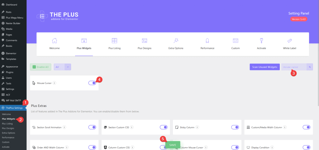
Turn the Widget On
- Go to The Plus Addons > Widgets.
- Search for Mouse Cursor and switch the toggle on.
Pick the Cursor Area
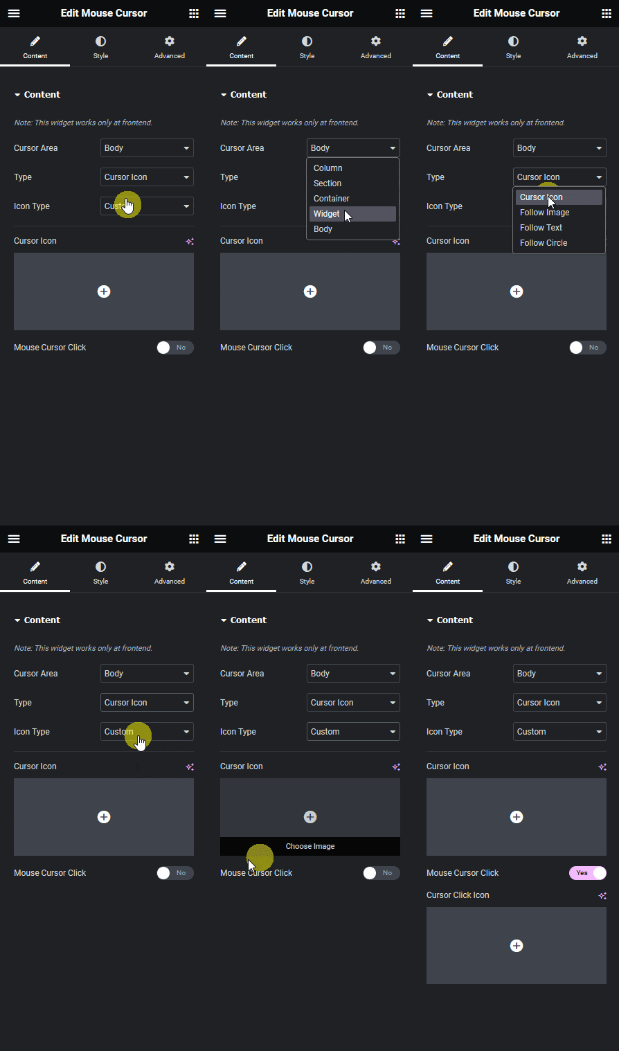
Drag the Mouse Cursor widget onto the page and open the Content section. Cursor Area decides how much of the page the new cursor covers.
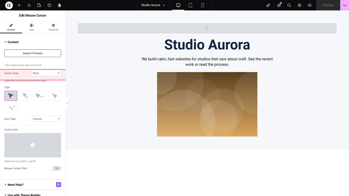
| Option | What it covers | Tested result |
|---|---|---|
| Body | The whole page. | The widget tags the page body and the cursor applies everywhere. |
| Container | The container the widget sits in. | The effect showed while the pointer was inside that container and disappeared outside it. |
| Widget | The widget directly above the Mouse Cursor widget. | The effect showed only over that one widget. With nothing above it, nothing is created at all. |
| Column / Section | The old Elementor column and section layout. | On a container-based page neither ever became visible. Use these only on pages still built with sections and columns. |
The widget draws nothing itself, so it does not matter where in the container you drop it.
Choose the Cursor Type
Type is a row of pictures, not a dropdown. There are five:
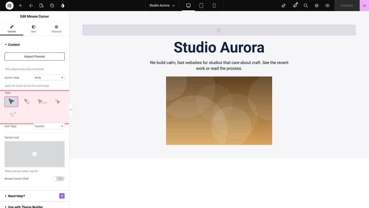
| Type | What the visitor sees |
|---|---|
| Cursor Icon | The pointer itself is replaced — either with a built-in CSS cursor or with your own image. |
| Follow Image | The normal pointer stays, and an image trails it. |
| Follow Text | The normal pointer stays, and a word or phrase trails it. |
| Follow Circle | A circle trails the pointer. Three styles: Border Cursor, Progress Cursor (Body) and Blend Cursor. |
| Mouse Move Image | Pictures are dropped behind the pointer as it moves and fade out. |
Cursor Icon
With Cursor Icon selected, Icon Type chooses between Predefined and Custom.
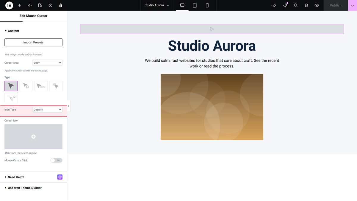
- Predefined shows a Select list of standard browser cursors — crosshair, grab, move, help, none and so on. The default is crosshair.
- Custom shows a Cursor Icon media field. Pick a small image with a transparent background.
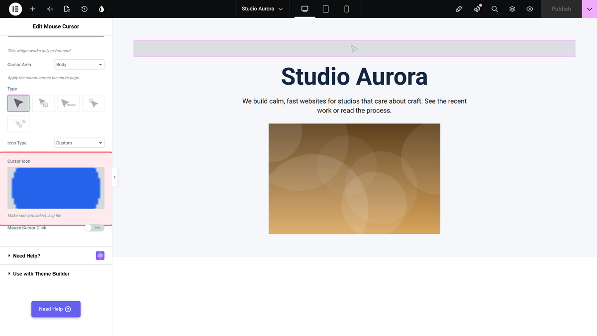
Whichever you pick applies to everything inside the area, including links and images. A link’s usual pointing hand is replaced too.
Mouse Cursor Click
Switch Mouse Cursor Click on and add a second image in Cursor Click Icon to show a different cursor over links.
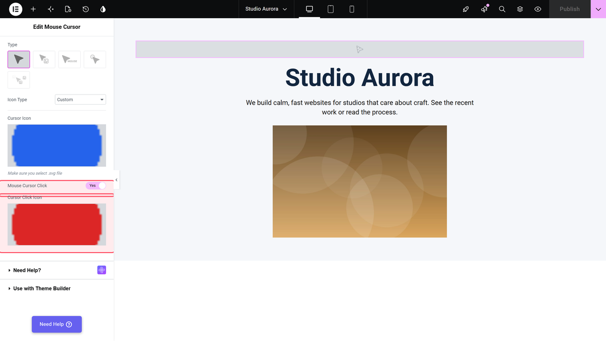
Despite the name this is a hover swap, not a click one. In testing the second image appeared while the pointer was over an <a> element and the first image came back everywhere else. Leaving the toggle on without choosing a second image changes nothing.
The Follow Types
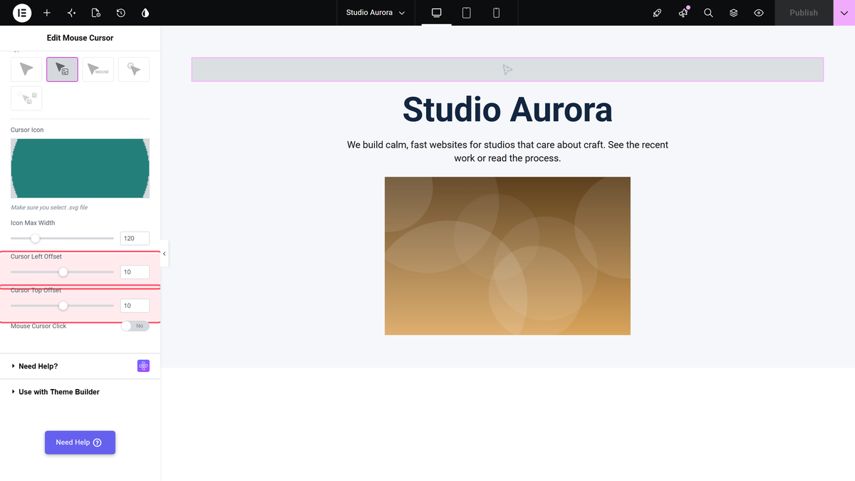
Follow Image, Follow Text and Follow Circle all keep the visitor’s normal pointer and add something that trails it. Each has its own page:
They share three settings: Cursor Left Offset and Cursor Top Offset (both default 10px, range −500 to 500), and Mouse Cursor Click, which again swaps the image or the text while the pointer is over a link.
Mouse Move Image
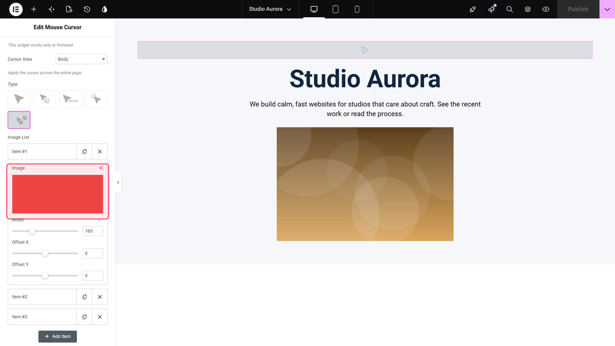
Mouse Move Image drops pictures behind the pointer as it moves. Add one row per picture in Image List; each row has its own Width, Offset X and Offset Y.
| Setting | What it does | Default |
|---|---|---|
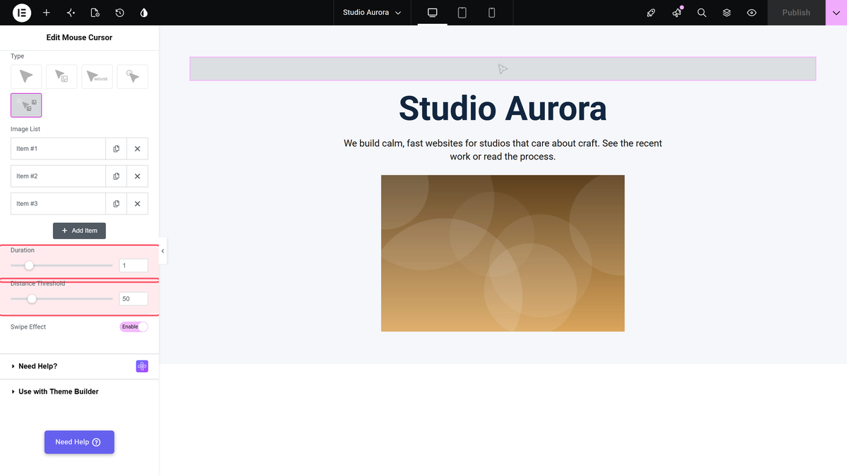
| Duration | How long each picture takes to fade away, in seconds. | 1 (0.1–5) |
| Distance Threshold | How far the pointer must travel before the next picture is dropped. A higher number means fewer pictures. | 50px (10–200) |
| Swipe Effect | Starts each picture slightly behind the pointer, in the direction it came from. | No |
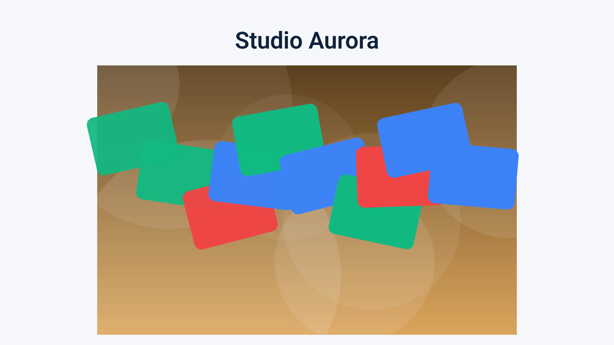
With three pictures in the list, nine quick pointer jumps left seventeen pictures on screen at once, each one picked at random from the list; after three and a half seconds of stillness they had all been removed. Twelve five-pixel nudges with Distance Threshold at 200 produced none at all.
Styling
The Style tab changes depending on the Type you picked.
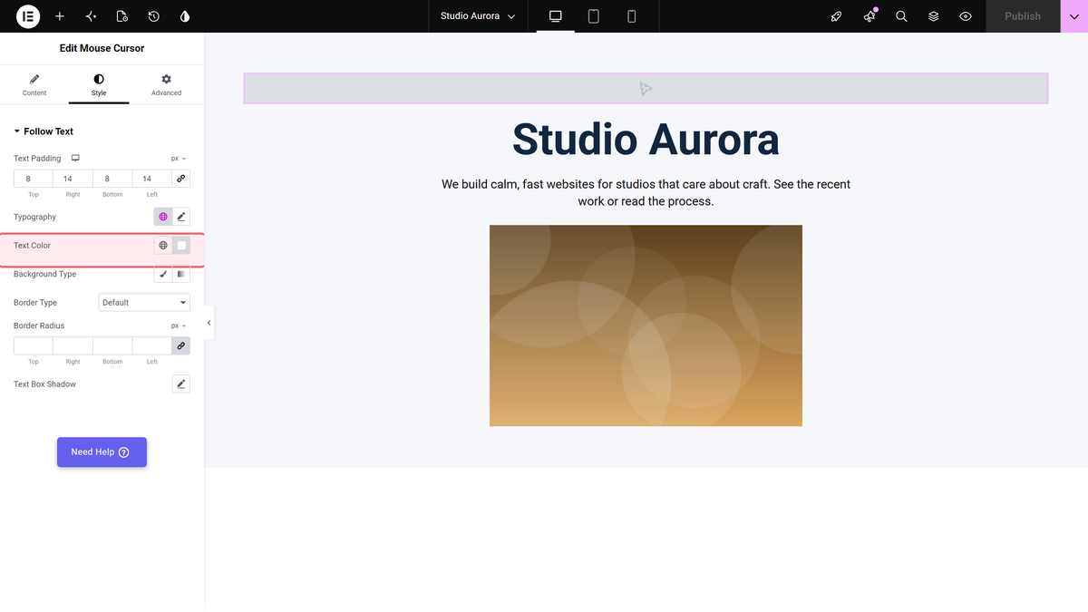
- Follow Text — Text Padding (10/15/10/15px), Typography, Text Color, Background, Border, Border Radius and Text Box Shadow.
- Follow Text with Cursor Area set to Widget — a shorter section with only Text Size and Text Color.
- Follow Circle — Normal and Hover tabs with colours, stroke widths, Transform CSS and Transition Duration.
How It Behaves
- The widget renders nothing in the Elementor editor. Preview or publish the page to see the cursor.
- Everything is switched off when the browser window is 991px or narrower. At 992px and wider it works. The check runs once on load and is not repeated when the window is resized.
- The test is the window width, not the device. A 1,200px-wide touch device still got the effect; a 390px phone got nothing.
- The widget loads one stylesheet and one script, and only on pages that use it. Mouse Move Image also needs GSAP.
Limitations
- The widget is Pro only. With the Pro plugin switched off it disappears from the editor, and a page that already uses it simply has no cursor effect — there is no notice.
- Nothing happens at 991px wide or below, so phone and most tablet visitors never see the effect. Do not use it to carry information.
- Mouse Cursor Click swaps the cursor when the pointer is over a link, not when the visitor clicks.
- Column and Section only work on pages still built with the old Elementor sections and columns. On a container page they do nothing.
- Progress Cursor (Body) draws its ring but the ring never fills as you scroll in this build. See the progress cursor page for what it does do.
- A custom cursor image replaces the pointer everywhere in the area, so visitors lose the usual visual clue that something is a link. Keep the image small and keep your links obvious in other ways.
Troubleshooting
Nothing happens in the editor
That is expected. The panel note says This widget works only at frontend. Use Preview Changes or open the published page.
It works on my laptop but not on my phone
Also expected. Every effect is disabled at 991px and below.
The cursor applies to the whole page when I only wanted one section
Change Cursor Area from Body to Container, and make sure the widget is inside the container you mean.
My custom cursor image does not show
Keep the image small — a large one may be ignored by the browser — and use a format with transparency so it sits cleanly over your content.
