



---
title: "How to Create a Polar Area Graph in Elementor?"
url: https://theplusaddons.com/docs/polar-area-graph-in-elementor/
date: 2024-02-05
modified: 2026-04-09
lang: en
author: "Aditya Sharma"
description: "Are you looking to create a polar chart from your data in Elementor? A polar area graph is a powerful visual tools that display multiple data points in a circular..."
image: https://theplusaddons.com/wp-content/uploads/2024/02/How-to-Create-a-Polar-Area-Graph-in-Elementor_-1024x536.jpg
word_count: 233
---

# How to Create a Polar Area Graph in Elementor?

## 

- Creates a polar area graph using the Chart widget from The Plus Addons for Elementor.
- Selects Polar Area from the Select Chart section under the Chart tab to configure the graph.
- Customizes the chart further using options available in the Special Option tab, similar to those in the Line chart.

Are you looking to create a polar chart from your data in Elementor? A polar area graph is a powerful visual tools that display multiple data points in a circular format.

With the Chart widget from The Plus Addons for Elementor, you can easily create a polar chart from your data on your Elementor website.

*To check the complete feature overview documentation of The Plus Addons for Elementor Chart widget, [click here.](https://theplusaddons.com/docs/chart-widget-settings-overview/)*

***Requirement  - This widget is a part of The Plus Addons for Elementor, make sure its installed & activated to enjoy all its powers.***

[LIVE WIDGET LINK](https://theplusaddons.com/elementor-widget/elementor-advanced-charts/?utm_source=tpae&utm_medium=docs&utm_campaign=text)

To do this, add the Chart widget to the page and follow the steps - 

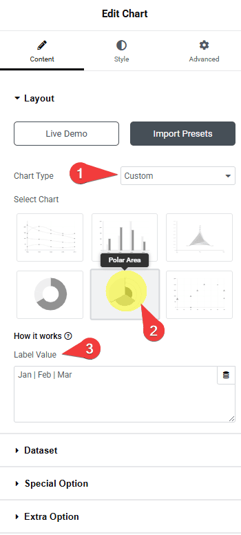
1. You can select **Custom **from the **Chart** **Type **dropdown under the **Layout **tab.

2. You have to select **Polar Area** from the **Select Chart** section under the **Chart** tab.

3. After that, in the **Label Value** field, you have to add chart labels separated by a pipe sign (**|**).

![](https://theplusaddons.com/wp-content/uploads/2024/02/tpae-chart-type-polar-area.png)

4. Then, in the **Dataset** tab, you have to add the data for the chart. Here, you’ll find the same settings available in the Pie chart.

You can customize the chart further from the **Special Option** tab. Here you’ll find the same options that are available for the Line chart.

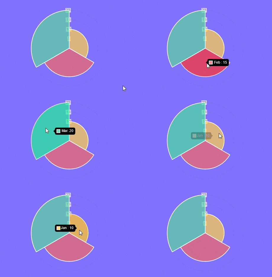
Now you should have an interactive polar area graph.
![Polar area demo](https://theplusaddons.com/wp-content/uploads/2024/02/polar-area-chart-demo.gif)

Suggested Read: [How to create a radar chart in Elementor.](https://theplusaddons.com/docs//radar-chart-in-elementor/)