Do you want to create a bubble chart in Elementor? Bubble charts are a visually appealing and effective way to display data. They are often used in presentations, reports, and dashboards to showcase relationships and trends between multiple variables.
With the Chart widget from The Plus Addons for Elementor, you can easily create a bubble chart to show comparisons between multiple data sets on your Elementor website.
To check the complete feature overview documentation of The Plus Addons for Elementor Chart widget, click here.
Requirement – This widget is a part of The Plus Addons for Elementor, make sure its installed & activated to enjoy all its powers.
To do this, add the Chart widget to the page and follow the steps –
1. You can select Custom from the Chart Type dropdown under the Layout tab.
2. You have to select Bubble from the Select Chart section under the Chart tab.
3. After that, in the Label Value field, you have to add chart labels separated by a pipe sign (|).
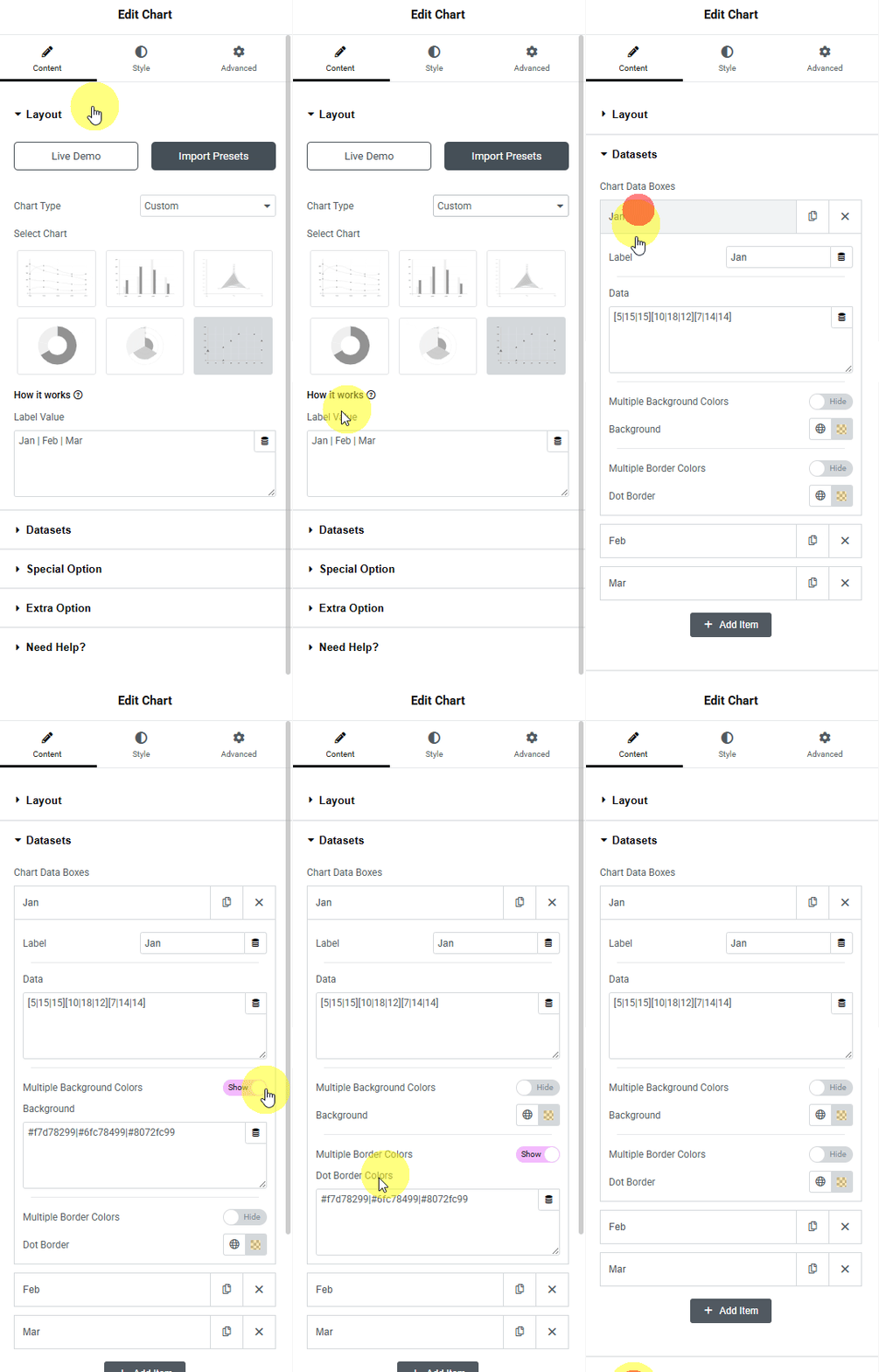
4. Then, in the Dataset tab, you have to add the data for the chart. By default, you’ll find three items open, one item –
In the Label field, you can add the dataset label.
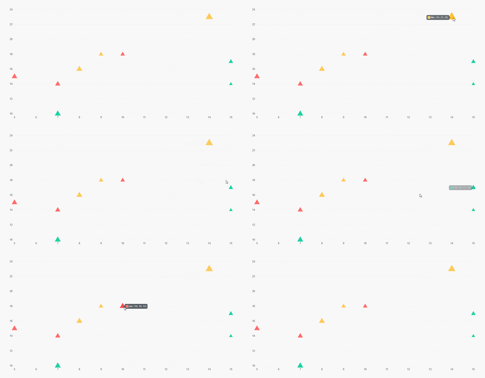
Then, in the Data field, you have to add 3 values separated by a pipe sign (|) inside square brackets. For example, [4|15|20], where 4 is the x-axis value, 5 is the y-axis value, and 20 is the size value. You can add multiple sets of values.
By enabling the Multiple Background Colors toggle, you can change the individual dataset dot background color. To do so, you have to add the color hex codes in the Background field, separated by a pipe sign (|). Make sure that the number of colors added matches the number of datasets in the Data field.
But if the Multiple Background Colors toggle is disabled, you can change all the dot background colors at once from the Background section.
Similarly, from the Multiple Border Colors toggle, you can change the individual dataset dot border color. In the Dot Border Colors field, you have to add the color hex codes separated by a pipe sign (|).
But you can change all the dataset dot border colors at once from the Dot Border field by disabling the Multiple Border Colors toggle.
Following this process, you can edit the other items.
Then you can click on the + Add Item button to add more items.
You can customize the chart further from the Extra Options tab. Here you’ll find the same options that are available for the Line chart.
Now you should have an interactive bubble chart.
Suggested Read: How to create a pie chart in Elementor

