




Your newest article is only as useful as the number of people who find it. On most sites, older posts sink below the fold within a week, and the homepage shows one lonely “Latest News” block that nobody scrolls to. A post carousel fixes that in a small space: four or five posts sit side by side, the row slides on its own, and readers can swipe through the rest.
This guide shows you how to build an Elementor post carousel with the Blog Listing widget in The Plus Addons for Elementor. You will choose the posts, set the columns for desktop, tablet and mobile, tune the autoplay, add dots and arrows, and then turn the same carousel into a related posts slider for your single post template. One thing to know up front: the Carousel layout of the Blog Listing widget is part of The Plus Addons for Elementor Pro. The free plugin gives you the same widget with the Grid, Masonry and Metro layouts, and we point out every free and Pro split as we go.
The setting names below come from our documentation and the widget code, checked on 17 November 2026.
What Is a Post Carousel in Elementor?
A post carousel is a slider that pulls its slides from your WordPress posts instead of from images you place by hand. Each slide is a post card with the featured image, title, meta and a link. When you publish a new article, it joins the carousel automatically, because the widget runs a query every time the page loads.
That makes it different from an image carousel, where you pick each slide yourself. If you want a slider of hand-picked photos, our guide on creating an image carousel in Elementor is the better fit. If the slides should always reflect what you have published, a post carousel is the right tool.
Good places for one:
- Homepage “From the Blog” row: shows fresh content without pushing other sections down.
- Category landing pages: a carousel per category, such as Guides, News or Case Studies.
- End of every article: a related posts slider keeps readers on the site.
- Sidebars and narrow columns: a one-column carousel takes the room of a single card.
What You Need Before You Start
| You need | Why |
|---|---|
| Elementor (the free version works) | The page builder the widget runs in |
| The Plus Addons for Elementor (free) | Adds the Blog Listing widget with Grid, Masonry and Metro layouts |
| The Plus Addons for Elementor Pro | Adds the Carousel layout, the Carousel Options, related posts, exclude filters and the Carousel Remote widget |
| A few published posts with featured images | The cards look empty without images, and a carousel needs more posts than it shows at once |
Step 1: Turn On the Blog Listing Widget
The Plus Addons for Elementor lets you switch widgets on and off so you only load what you use. In your WordPress dashboard, open The Plus Addons, go to Widgets, search for Blog Listing and turn on its toggle. If the widget is off, it does not show up in the Elementor panel.
If you plan to use custom navigation later in this guide, switch on the Carousel Remote widget in the same list while you are there.
Step 2: Add the Widget and Choose the Carousel Layout
Open the page in Elementor, search the widget panel for Blog Listing and drag it into a container. On the Content tab, the Layout section holds three choices that shape everything else:
- Post Listing Types (Pro) decides where the posts come from: Normal Page (a regular query), Archive Page or Single Page Related Posts. Keep Normal Page for now.
- Style sets the card design.
- Layout sets the arrangement: Grid, Masonry, Metro or Carousel. Click the Carousel icon.
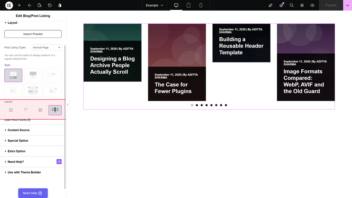
As soon as you pick Carousel, the preview changes into a slider and a new Carousel Options section appears on the Style tab. In the free plugin the option reads Carousel (PRO) and shows an upgrade notice instead of the settings.
Carousel, Grid, Masonry or Metro: Which Layout Fits?
Before you style anything, it is worth checking that a carousel is really the right layout. A carousel hides most of its posts until someone swipes or waits, so it suits “here is a taste” sections. A grid shows everything at once, which suits blog index pages.
| Layout | How posts appear | Best for | Plan |
|---|---|---|---|
| Grid | Equal cards in rows | Blog index pages and archives | Free |
| Masonry | Equal width, natural height | Posts with mixed image shapes | Free |
| Metro | Mixed tile sizes | Magazine-style feature sections | Free |
| Carousel | A sliding row of cards | Homepage teasers, related posts, narrow spaces | Pro |
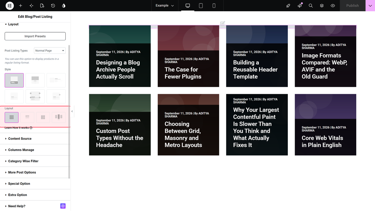
If you are not sure, start with a grid on the blog page and a carousel on the homepage. Our doc on showing blog posts in a grid layout covers the grid settings.
Step 3: Choose Which Posts Appear
Open Content > Content Source. These settings decide which posts the carousel holds:
- Maximum Post Display is the total number of posts in the carousel. It defaults to 8.
- Select Category and Select Tags limit the carousel to certain WordPress categories or tags. Leave them empty to include all posts.
- Exclude Category and Exclude Tags remove posts, for example an internal announcements category. These two fields are part of Pro.
- Offset Posts skips posts at the start of the list. Handy when your hero section already shows the newest post and the carousel should start with the second one.
- Order By and Order set the sort. The defaults are date and descending, so the newest post comes first.
Select Category, Select Tags, Offset Posts and the exclude fields only show for the Normal Page listing type. A related posts carousel picks its own posts, as you will see below.
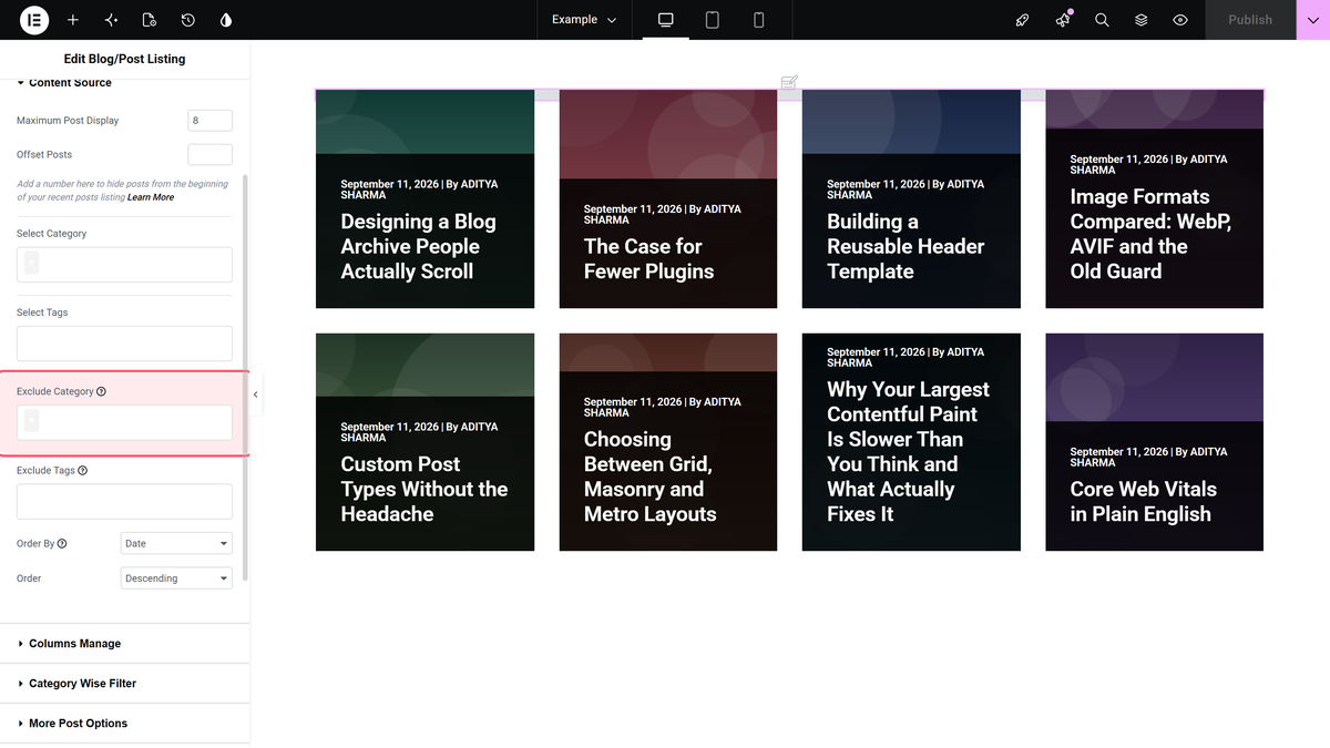
One detail catches people out: when you fill in both exclude fields, a post is hidden if it matches either one. Our doc on excluding blog posts by category and tags has a small table that shows how the two fields combine.
Keep Maximum Post Display sensible. The carousel layout loads all of its posts with the page, because pagination, Load More and Lazy Load are not available on it. Eight to twelve posts is plenty for a teaser row.
Step 4: Pick a Card Style
Back in Content > Layout, the Style pictures set how each post card looks. The Pro plugin has Style 1 to Style 5 plus Smart Loop Builder. In the free plugin, Style 1, Style 5 and Smart Loop Builder are available, and Styles 2, 3 and 4 are marked as Pro.
Smart Loop Builder (labelled beta in the widget) is the option for a fully custom card. You write the card markup in HTML and CSS and the widget fills in each post. Our doc on creating a custom post loop skin with Smart Loop Builder walks through it, and the guide to Elementor custom loop skins compares the different ways to design a card.
Other card details live in their own sections. Extra Option holds Display Post Meta, Display Content and the Button, and the Title Limit setting trims long titles. Trimming titles matters more in a carousel than in a grid, because cards of very different heights make the row look jumpy.
Step 5: Set the Columns for Each Device
Switch to the Style tab and open Carousel Options. Slider Mode, Slide Direction and Slide Speed sit at the top. Below them, the settings are split into Desktop, Tablet and Mobile tabs, so the carousel can show four cards on a laptop and one on a phone.
| Setting | Desktop default | What it does |
|---|---|---|
| Desktop Columns | 4 | How many cards are visible at once |
| Tablet Columns | 3 | Visible cards on tablets |
| Mobile Columns | 2 | Visible cards on phones |
| Next Previous | One Column | Moves one card per click, or all visible cards with All Visible Columns |
| Slide Padding | Set per device | Space around each card |
Two columns on a phone is often too tight for a card with an image, title and excerpt. Try one column on mobile and check the result in Elementor’s responsive mode before you publish.
Step 6: Control the Motion
Still in Carousel Options, these settings decide how the carousel moves. Slider Mode, Slide Direction and Slide Speed sit above the device tabs; the rest are in the Desktop tab. To set them separately for tablets or phones, switch on Responsive Tablet or Responsive Mobile in those tabs.
| Setting | Default | Tip |
|---|---|---|
| Slider Mode | Horizontal | Vertical stacks the slides top to bottom |
| Slide Direction | Left to Right | Right to Left suits right-to-left languages |
| Slide Speed | 1500 | How long one slide change takes |
| Autoplay | On | Turn off if visitors should move it themselves |
| Autoplay Speed | 3000 | The pause between slides |
| Infinite Mode | On | Loops back to the first post |
| Pause On Hover | Off | Turn on so readers can stop on a card |
| Draggable | On | Lets visitors drag with a mouse or swipe |
| Adaptive Height | Off | Resizes the carousel to the current slide |
| Animation Type | With Hold | Continuous gives a steady ticker-like scroll |
For a blog carousel, we suggest turning on Pause On Hover. Readers need time to read a title, and a card that slides away under the cursor is frustrating. If you choose Continuous, test it with real titles, since a constant scroll is harder to read than a slide that stops.
Step 7: Add Dots and Arrows
Navigation helps visitors understand there is more to see. Show Dots is on by default and offers seven dot styles. Show Arrows is off by default, so turn it on if you want previous and next buttons, and pick one of six arrow styles. For arrow styles 3 and 4, a second setting lets you place the arrows at the top right, bottom left, bottom center or bottom right.
Three smaller switches change when navigation appears: On Hover Dots, On Hover Arrow and Outer Content Arrow. The colour settings for dots and arrows sit right next to them, so you can match your brand colours without custom CSS.
Step 8: Try Center Mode and Multiple Rows
Center Mode highlights the middle card and leaves its neighbours partly visible at the edges. Turn it on, set Center Padding to control how much of the side cards shows, and choose Scale or Shadow in Center Slide Effects to make the middle card stand out. Scale adds size controls for the center and side slides, and both effects let you set the opacity of the side slides.
Number Of Rows lets one carousel hold 1, 2 or 3 rows of cards, with Row Top Space setting the gap between them. Two rows work well for short cards without excerpts. With long excerpts, one row is easier to read.
Use Case: A Related Posts Carousel for Every Article
The same widget can show related posts at the end of each article, which is one of the simplest ways to get readers to a second page. Open your single post template and drag the Blog Listing widget below the post content. In Content > Layout, set Post Listing Types to Single Page Related Posts and choose Carousel as the Layout.
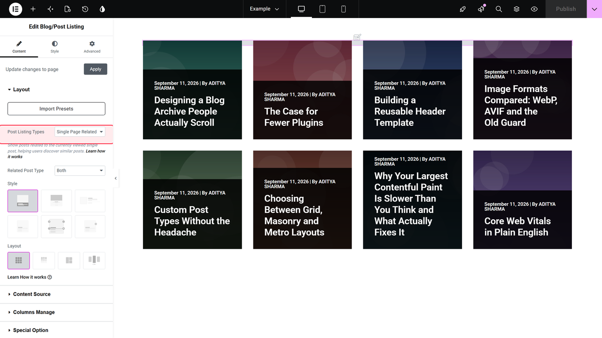
A Related Post Type setting appears below it with three options: Based on Category, Based on Tags or Both. Both is the default and gives the closest matches: a related post must share a category and, if the current post has tags, a tag. If the carousel comes up empty, switch to Based on Category. The post being read is never shown in its own related list.
You need a single post template for this. You can build one with Elementor Pro’s Theme Builder or with the free Nexter Builder, and our guide to creating a custom Elementor blog post template shows the full setup. The step-by-step doc on showing related blog posts on the single page covers the widget side.
Use Case: Put the Navigation Anywhere with Carousel Remote
Sometimes the design calls for the arrows somewhere else: next to the section heading, under a short intro, or in a sidebar. The Carousel Remote widget in The Plus Addons for Elementor Pro gives your post carousel separate Prev and Next buttons and dots that you can place anywhere on the page.
- In the Blog Listing widget, open Style > Carousel Options and type an ID into Unique Carousel ID, for example
latest-posts. Use letters, numbers, dashes or underscores, without spaces. - Drag the Carousel Remote widget to where the controls should appear.
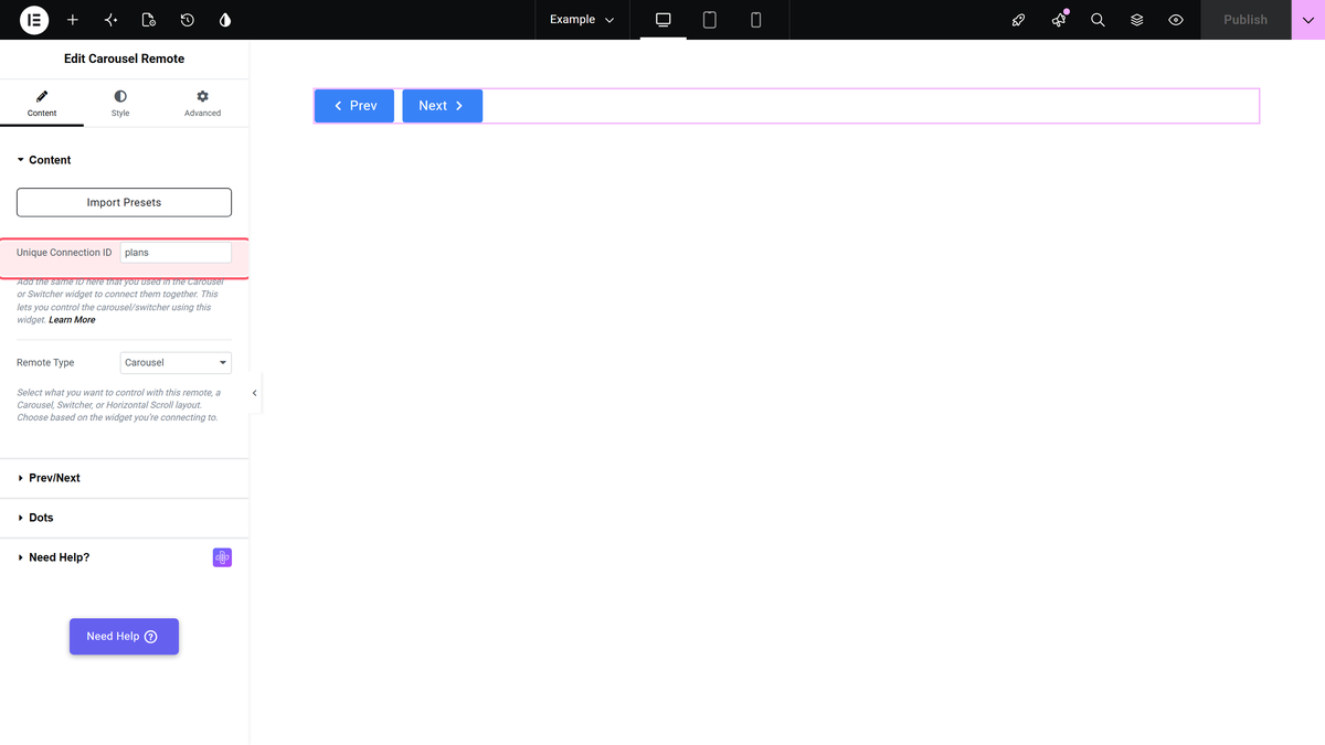
- In its Content section, type the same ID into Unique Connection ID and leave Remote Type on Carousel.
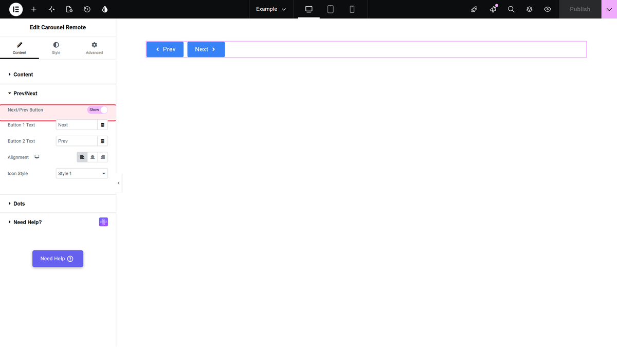
- Open Prev/Next. The Next/Prev Button switch is on by default. Open Dots and turn on Dots if you want them too.
If the buttons do nothing, check that both IDs match exactly. Also make sure the carousel holds more posts than it shows at once, otherwise there is nowhere to move. The doc on syncing Carousel Remote with a blog posts carousel has the full troubleshooting list, and the Carousel Remote widget page shows live examples.
What the Carousel Layout Does Not Do
It is better to know the limits before you build than after. Per our docs and the widget code:
- No loading options. Pagination, Load More and Lazy Load are hidden for Carousel. Every post in it loads with the page.
- No category filter. The filter bar works on the other layouts, not on Carousel.
- No Preloader. The Preloader setting has no effect on the Carousel layout.
- Pro only. In the free plugin the Carousel option is visible but locked.
If you need filters and Load More on a long list of posts, use a grid on your blog page and keep the carousel for teaser rows.
Tips for a Fast, Readable Post Carousel
- Keep the post count modest. Since every post loads with the page, eight to twelve posts is a good ceiling for a teaser row.
- Use lighter images. Featured images in WebP are usually smaller than JPG or PNG. Our comparison of AVIF vs WebP helps you pick a format.
- Give readers control. The W3C guidance on Pause, Stop, Hide explains why moving content that starts on its own and runs longer than five seconds needs a way to pause it. Pause On Hover, arrows and dots all help.
- Write short titles. Long titles wrap differently on each card. The Title Limit setting keeps cards even.
- Check Core Web Vitals. Large sliders near the top of the page can affect loading scores. Our guide to Elementor Core Web Vitals covers what to measure.
Troubleshooting Common Post Carousel Problems
- The widget is missing from the Elementor panel. Turn on Blog Listing in The Plus Addons > Widgets, then reload the editor.
- The Carousel option says PRO. The Carousel layout needs The Plus Addons for Elementor Pro installed and activated.
- There are no arrows. Show Arrows is off by default. Turn it on in Style > Carousel Options.
- The carousel never stops moving. Autoplay is on by default. Turn it off, or turn on Pause On Hover.
- More Post Options disappeared. That is expected: the carousel holds a fixed set of posts, so the loading options are hidden.
- The related posts carousel is empty. With Related Post Type set to Both, a related post must share a category and a tag with the current post. Switch to Based on Category for more results.
- The layout looks broken after an update. Clear your cache plugin and browser cache, then regenerate files from Elementor > Tools.
Free vs Pro: Post Carousel Features at a Glance
| Feature | Free | Pro |
|---|---|---|
| Blog Listing widget with Grid, Masonry and Metro | Yes | Yes |
| Carousel layout and Carousel Options | No | Yes |
| Style 1, Style 5 and Smart Loop Builder | Yes | Yes |
| Styles 2, 3 and 4 | No | Yes |
| Exclude Category and Exclude Tags | No | Yes |
| Single Page Related Posts and Archive Page listings | No | Yes |
| Carousel Remote widget | No | Yes |
The free plugin is a good way to try the Blog Listing widget in a grid and get the content settings right. When you need the slider, related posts or custom navigation, see the full free vs Pro comparison or the pricing page. The Blog Listing settings overview lists every control in the widget, and the blog carousel doc is a short reference to keep open while you build.
Frequently Asked Questions
Can I Create a Post Carousel in Elementor for Free?
The Carousel layout of the Blog Listing widget is part of The Plus Addons for Elementor Pro. The free plugin includes the same widget with the Grid, Masonry and Metro layouts, and it works with the free version of Elementor.
How Do I Show Only One Category in an Elementor Post Carousel?
Open Content > Content Source in the Blog Listing widget and choose the category in Select Category. Only posts from that category appear in the carousel.
How Many Posts Can an Elementor Post Carousel Show?
Maximum Post Display sets the total and defaults to 8. Because the carousel loads all of its posts with the page, a teaser row of eight to twelve posts is a sensible limit.
How Do I Change the Number of Visible Posts on Mobile?
Go to Style > Carousel Options, open the Mobile tab and set Mobile Columns. The defaults are 4 on desktop, 3 on tablet and 2 on mobile.
Can I Make a Related Posts Carousel in Elementor?
Yes. In a single post template, set Post Listing Types to Single Page Related Posts and the Layout to Carousel. Choose whether posts are matched by category, tags or both. This needs The Plus Addons for Elementor Pro.
Why Are the Carousel Arrows Not Showing?
Show Arrows is off by default. Turn it on in Style > Carousel Options and choose an arrow style. If you use the Carousel Remote widget, check that its Unique Connection ID matches the carousel’s Unique Carousel ID.