Testimonials tend to get built twice. The first version is three quotes typed straight into a text widget, which looks fine until someone asks to add a fourth, reorder them, or show them on two more pages. The second version is the one that should have been built first: a component that pulls its content from one place, adapts to the space it sits in, and rotates on its own if the list gets long.
This walkthrough builds that second version with the Testimonial widget from The Plus Addons for Elementor. It covers what Elementor already gives you without any addon, choosing between grid, masonry and carousel, the two ways to feed the widget content, responsive columns, and the carousel controls that decide whether a slider feels considered or irritating.
What Elementor Gives You Without An Addon
Worth being precise here, because this gets misstated often. Elementor’s free version ships a Testimonial widget. It renders a single testimonial: quote, image, name and title. It is genuinely fine for one featured quote in a section, and if that is all you need, you do not need anything else.
Elementor Pro adds two more: a Testimonial Carousel widget and a Reviews widget. So rotating testimonials are not something Elementor cannot do. The practical questions are narrower than “can it”: can the testimonials come from a post type instead of being retyped into every page, how much control do you get over columns at each breakpoint, and how much styling is exposed without writing CSS. Those are the gaps a dedicated listing widget fills, and they are the reason this guide exists.
Adding The Widget And Picking A Layout
Search for “Testimonial” in the Elementor widget panel and drag it into a container. The Content tab opens on a Layout section with two decisions stacked together: a Style row of four design presets, and a Layout row with three options for how the testimonials are arranged.
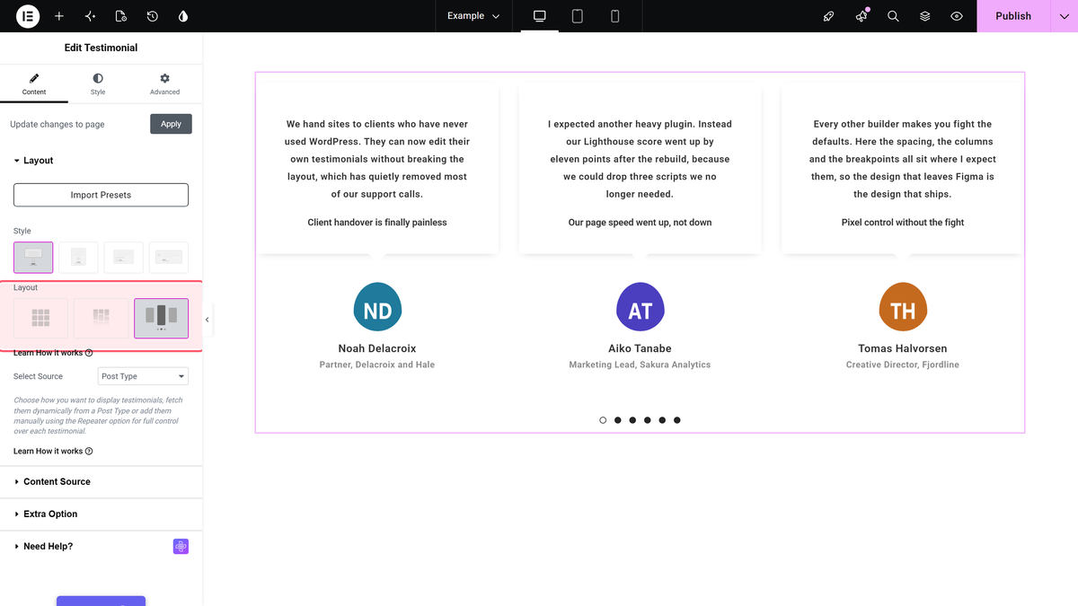
The three layout options behave quite differently once you have real content in them.
| Layout | Behaviour | Best when |
|---|---|---|
| Grid | Equal-height cards in a fixed column count | Testimonials are similar in length and you want a tidy block |
| Masonry | Cards keep their natural height and pack together | Quote lengths vary a lot and grid leaves ugly gaps |
| Carousel | A rotating slider with arrows and dots | You have more testimonials than you want to show at once |
Choose masonry over grid more often than instinct suggests. Grid forces every card to the height of the tallest one, so a single long testimonial adds white space to every other card in the row. Masonry avoids that entirely. The same trade-off shows up in any card layout, and it is the reason masonry grids keep coming back into fashion.
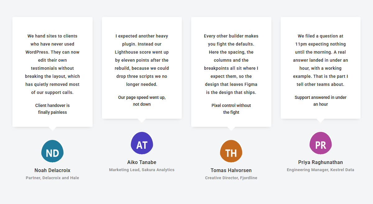
Where The Testimonials Come From
This is the setting that decides whether you built the throwaway version or the maintainable one. Under the Layout section, Select Source offers two routes, and the widget’s own help text spells out the difference: choose how you want to display testimonials, fetch them dynamically from a post type, or add them manually using the repeater option for full control over each testimonial.
Pick the repeater when the testimonials live on exactly one page and are unlikely to move. Pick the post type route when they appear in more than one place, when someone other than you will edit them, or when you expect the list to grow. The second option costs five extra minutes now and saves the rebuild later.
Adding Testimonials By Hand
With the repeater route selected, Manage Testimonials holds one repeating item per testimonial. Each item exposes the fields you would expect: Testimonial Content for the quote itself, Testimonial Title for a short headline above it, Author Name, Author Designation for the role and company, a Show Author Image toggle with an Author Image picker, and a Company Logo slot.
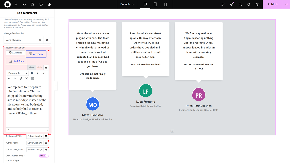
Two things worth getting right while you are in here. Fill Author Designation properly, because a role and company does more for credibility than the quote itself in most cases. And crop author images to a square before uploading rather than relying on the layout to do it, since round avatars built from rectangular source images crop unpredictably across breakpoints.
Pulling Testimonials From A Post Type
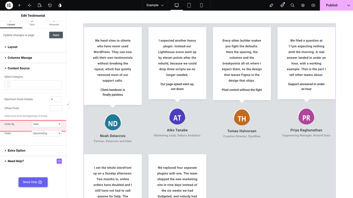
Switch Select Source to the post type route and a Content Source section appears with the query controls: Select Category to limit which testimonials appear, Maximum Posts Display to cap the count, Offset Posts to skip the first few, plus Order By and Order.
The combination worth knowing is Select Category with Maximum Posts Display. Categorise testimonials by service or industry, then drop the same widget on several pages with a different category selected on each. One content source, several tailored sliders, and adding a testimonial later updates every page at once. Offset Posts exists for the case where you feature the top two elsewhere on the page and want the slider to start from the third.
Setting Columns For Each Breakpoint
The Columns Manage section carries three separate controls, Desktop Column, Tablet Column and Mobile Column, plus Columns Gap/Space Between for the spacing.
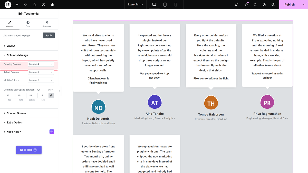
A reliable starting point is three columns on desktop, two on tablet and one on mobile. Four on desktop works when quotes are short, but it squeezes each card to roughly a quarter of the container, and long testimonials turn into tall thin columns of text. Always set mobile to one. A two-column mobile layout leaves each quote around 150px wide, which is unreadable at any sensible font size.
Carousel Options That Matter
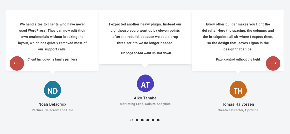
Selecting the carousel layout opens a Carousel Options section, and it is a long one. The controls that change how the slider actually feels are Autoplay and Autoplay Speed, Pause On Hover, Show Arrows and Show Dots, Infinite Mode, Slide Speed, Draggable, and Adaptive Height. There are separate Desktop Columns, Tablet Columns and Mobile Columns values here too, which govern how many slides are visible at once.
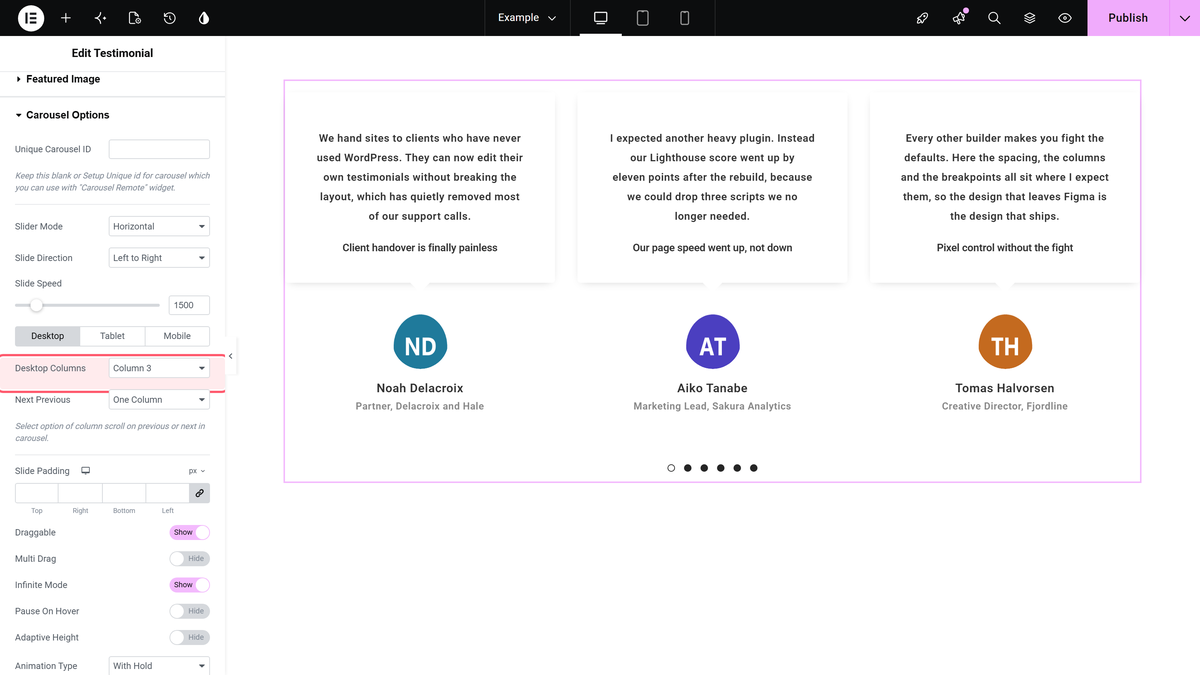
Three recommendations that are really accessibility points in disguise. If you turn Autoplay on, set Autoplay Speed to at least 5000ms, because a testimonial that slides away before it can be read is worse than no rotation. Leave Pause On Hover enabled, so someone reading a quote is not fighting the slider. And keep Show Arrows on even when dots are visible, since arrows give a much larger click target than dots on touch devices. If a slider has no manual control at all, autoplay stops being a convenience and becomes the only way to see the content.
Handling Testimonials Of Very Different Lengths
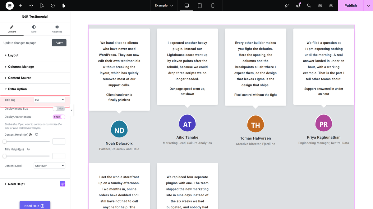
Real testimonials never arrive at a uniform length. One client writes two sentences, another writes six paragraphs. The Extra Option section handles this with Content Limit By, which caps a quote by character or word count using Maximum Letters/Words, and a Read More and Read Less pair for expanding it in place. Content Scroll is the alternative, keeping the card at a fixed height and scrolling the overflow inside it.
Truncation usually beats scrolling. A scroll area inside a card is easy to miss entirely, particularly on touch devices where it competes with the page scroll. The same section also holds Title Tag, which is worth setting deliberately: testimonial titles should not be H2 elements competing with your real page headings, so H3 or H4 is normally the right answer.
What About Star Ratings
A fair question, and the honest answer is that this widget does not have one. There is no rating or star field anywhere in the Testimonial widget’s controls, so if you want five stars above each quote, it does not come from here.
You have two straightforward routes. Elementor’s free version includes a Star Rating widget you can place next to the testimonial section for an overall score. Or, if you need a rating attached to each individual quote, build the stars in CSS and attach them to the testimonial markup, which is covered in detail in the CSS star rating guide. What you should not do is put a decorative five stars on every testimonial regardless of what the client actually said.
Styling Without Writing CSS
The Style tab splits controls by element. Title, Designation and Excerpt/Content each get their own Typography and colour settings, with Normal and Hover tabs where hover states apply. Card-level appearance sits under Content Background, Inner Padding, Border Radius and Box Shadow Options. If your chosen style shows a speech-bubble pointer, Down Arrow Color controls it, and it needs to match the card background or the bubble looks broken.
Rather than setting colours per widget, define them once as site-wide values and reference them here, so a brand change is one edit instead of forty. That approach is covered in the guide to CSS custom properties.
Free And Pro Differences
The Testimonial widget is part of the free version of The Plus Addons for Elementor, and that includes all three layouts. Grid, masonry and carousel are all available without a licence, as are the repeater, the post type source, the responsive column controls and the carousel options.
The difference shows up in the Style row at the top of the Layout section. One of the four design presets is labelled Style-3 (PRO) in the editor, so that particular preset needs the Pro version. The other three are free. In other words the functional side of a testimonial slider is fully available in free, and Pro adds a design option on top.
Five Problems And Their Causes
The carousel shows nothing. Almost always an empty source. If Select Source is set to the post type route but no testimonials exist in that post type yet, or the chosen category is empty, the widget renders an empty track rather than an error.
Cards have wildly different heights. You are on grid with uneven quote lengths. Switch to masonry, or cap the text with Content Limit By.
Only one slide shows on desktop. The Carousel Options section has its own Desktop Columns value, separate from Columns Manage. Setting the latter alone does not change how many slides are visible.
Autoplay does not start. Check Autoplay Speed has a value alongside the toggle, and remember that Pause On Hover keeps it paused while the cursor rests on the slider, which in a short viewport can be most of the time.
It looks right in the editor and wrong live. Sliders initialise with JavaScript after the page loads, so an aggressive optimisation plugin that defers or combines scripts can break initialisation. Clear the cache first, then test with script optimisation temporarily off to confirm the cause.
Frequently Asked Questions
Can I build a testimonial slider with free Elementor alone?
Elementor’s free Testimonial widget shows one testimonial at a time and does not rotate. A rotating slider needs either Elementor Pro, which includes a Testimonial Carousel widget, or a third-party widget such as this one, which offers the carousel layout in its free version.
Should testimonials autoplay?
Only with care. Set the speed to 5000ms or slower, keep Pause On Hover on, and always leave arrows or dots visible so a visitor can control it. Fast autoplay with no manual navigation actively hides your content.
How many testimonials should a slider hold?
Six to twelve is a sensible range. Fewer than four rarely justifies a slider over a static row. Far more than a dozen means most will never be seen, so use Maximum Posts Display to cap what appears and rotate the selection by category instead.
Does the widget add review schema?
No. It renders the testimonials visually and does not emit Review or AggregateRating structured data. Review schema also carries eligibility rules about self-serving reviews, so it is worth reading Google’s guidance before adding it by another route.
Can different pages show different testimonials?
Yes, and this is the strongest reason to use the post type source. Categorise your testimonials, then set Select Category differently on each page. Every page pulls from the same library while showing only the relevant quotes.
Why is my mobile layout unreadable?
Mobile Column is almost certainly set above one. Two columns on a phone gives each testimonial roughly 150px of width. Set Mobile Column to one, and set Mobile Columns in Carousel Options to one as well if you are using the carousel layout.