




Rounded corners were the last easy way to change the shape of a web element. Anything else, a triangle, a hexagon, a diagonal edge, a cut corner, used to mean an image, an SVG or a fragile border trick. The clip-path property turns all of that into a single line of CSS applied to any element.
This guide explains how clipping works, walks through each shape function with real renders, shows practical patterns such as diagonal sections and cut-corner buttons, covers the shadow and click-area surprises that catch people out, and ends with how to get the same results in Elementor. The renders below were made in Chrome.
What clip-path Does
MDN describes clip-path as creating a clipping region that sets what part of an element is shown. Parts inside the region are visible and parts outside are hidden. The element still occupies its original box in the layout. Only its painted area changes.
MDN lists clip-path as Baseline widely available, with support across browsers since January 2020, so the basic shape functions are safe to use in production today.
The Basic Shape Functions
The value is either a reference to an SVG clip path or a basic shape, optionally combined with a reference box. MDN lists these basic shapes:
| Function | What it defines | Typical use |
|---|---|---|
| inset() | An inset rectangle, optionally with rounded corners | Reveal effects, trimmed edges |
| circle() | A circle from a radius and a position | Avatars, spotlight reveals |
| ellipse() | An ellipse from two radii and a position | Oval crops |
| polygon() | A shape from a list of vertices | Triangles, hexagons, diagonals, cut corners |
| path() | A shape from an SVG path definition | Organic curves |
| rect() and xywh() | A rectangle from edge distances or from position and size | Precise rectangular crops |
| shape() | A shape from lines, curves and arcs commands | Responsive curved shapes |
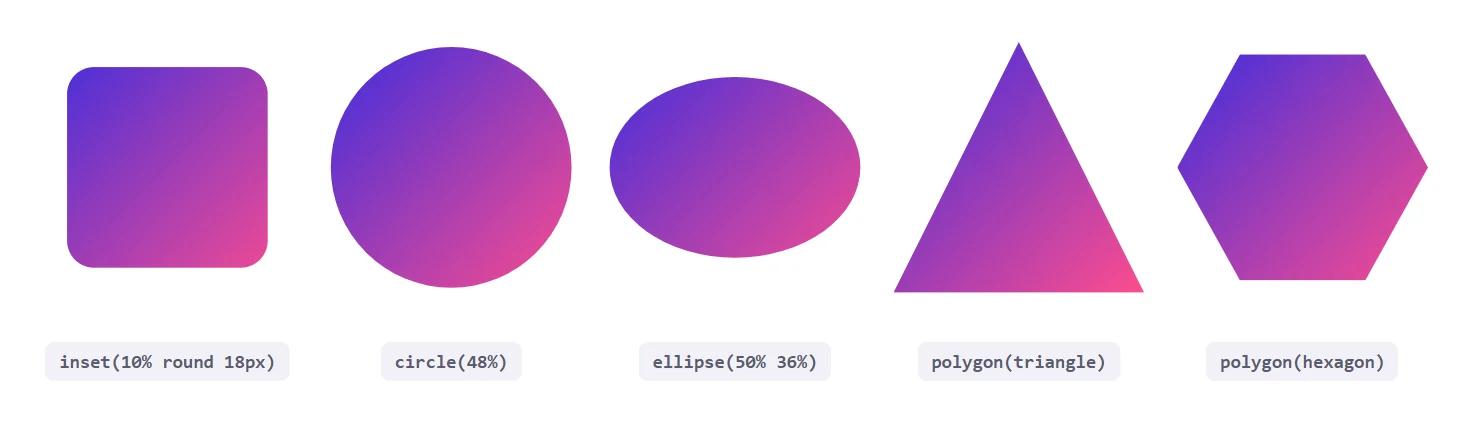
clip-path: inset(10% round 18px);
clip-path: circle(48%);
clip-path: ellipse(50% 36%);
clip-path: polygon(50% 0, 100% 100%, 0 100%);   /* triangle */
clip-path: polygon(25% 5%, 75% 5%, 100% 50%, 75% 95%, 25% 95%, 0 50%);   /* hexagon */
Coordinates inside polygon() are pairs of x and y, usually percentages of the reference box, listed in order around the shape. The browser closes the shape automatically. A handy habit is to sketch the shape on paper with the box as a square from 0% to 100% and read the points off clockwise.
Choosing The Reference Box
Percentages are measured against a reference box. If you give none, MDN says the border-box is used, so 0% and 100% sit on the outside edge of the border. You can add a geometry box after the shape to change that:
.badge { clip-path: circle(50%) content-box; }
.card  { clip-path: inset(0 round 24px) padding-box; }
The available boxes include margin-box, border-box, padding-box and content-box, plus fill-box, stroke-box and view-box for SVG content. For ordinary HTML elements you will mostly use the first four.
Pattern One: Diagonal Section Edges
A slanted bottom edge is the most common use on marketing pages. A polygon with the last two points at different heights does it with no extra markup.
.hero {
  background: #12122a;
  color: #fff;
  padding: 70px 60px 120px;
  clip-path: polygon(0 0, 100% 0, 100% 78%, 0 100%);
}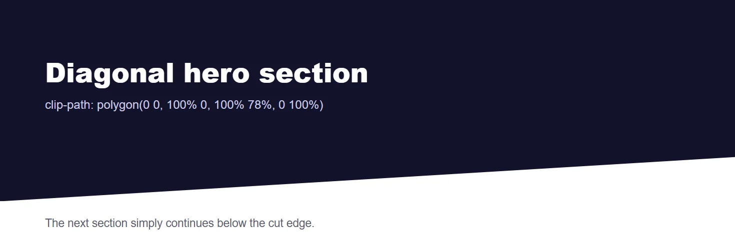
Remember that the clipped-away corner still takes up layout space. Give the section extra padding at the bottom, or pull the next section up with a negative top margin, so the slant does not leave an empty wedge.
Pattern Two: Cut-Corner Buttons
Mixing calc() inside polygon() lets you keep a fixed corner size while the element grows. That makes cut corners reusable across buttons of any width.
.btn {
  clip-path: polygon(
    0 0, calc(100% - 18px) 0, 100% 18px,
    100% 100%, 18px 100%, 0 calc(100% - 18px)
  );
}
Pattern Three: Reveal Effects With circle()
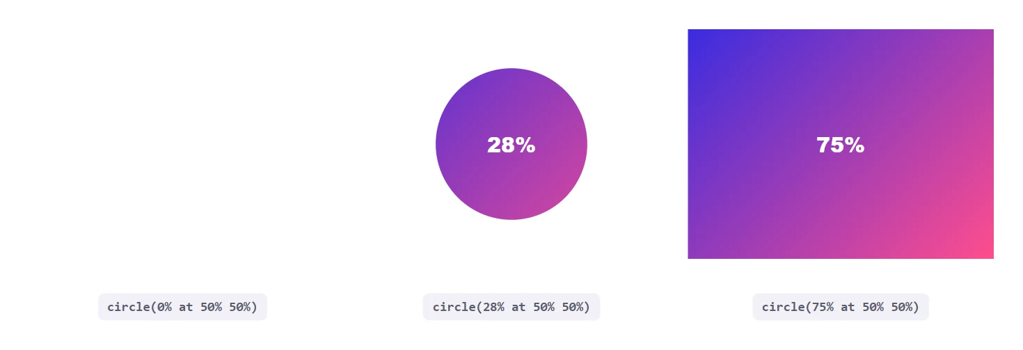
Because the shape functions are animatable when the point count matches, you can transition between two values for a reveal. A circle that grows from zero is a popular image reveal.
.reveal {
  clip-path: circle(0% at 50% 50%);
  transition: clip-path .6s ease;
}
.reveal:hover,
.reveal.is-visible {
  clip-path: circle(75% at 50% 50%);
}
For scroll-triggered reveals, add the is-visible class when the element enters the viewport. If you are working in Elementor, our guide to scroll, parallax and mask effects for images covers a no-code route to similar results.
The Shadow Problem
A common surprise is that box-shadow disappears on a clipped element. The shadow is painted outside the element’s box, which is exactly the region the clip removes. The fix is to apply the shadow to a wrapper using filter: drop-shadow(), which follows the visible shape of what is inside.
.shape-wrap { filter: drop-shadow(0 14px 14px rgba(0, 0, 0, .55)); }
.shape      { clip-path: polygon(50% 0, 100% 100%, 0 100%); }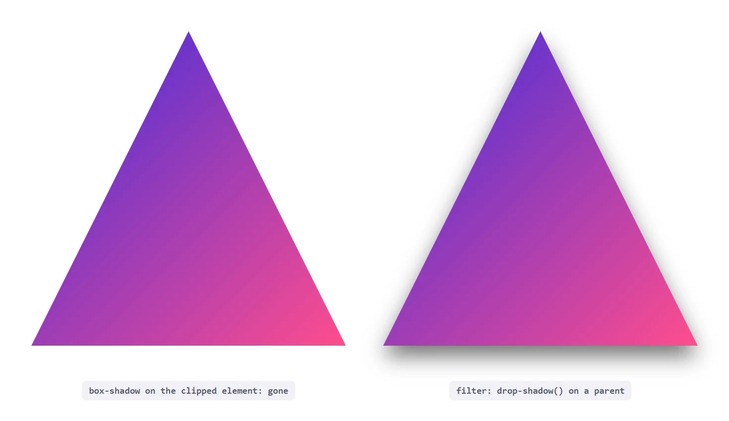
Click Areas, Focus Rings And Accessibility
Clipping affects what the user sees and also where pointer events land. Areas outside the clip region do not receive hover or clicks, which is usually what you want for a triangle button. It also means a focus outline drawn outside the box can be clipped. Check keyboard focus on every clipped interactive element, and add an inner outline offset or a visible background change on :focus-visible so keyboard users can still see where they are.
Also avoid clipping text so tightly that letters are cut off at larger font sizes. Test with browser zoom at 200 percent and with the largest text size your design supports.
clip-path Compared With mask And border-radius
| Property | Best for | Limitation |
|---|---|---|
| border-radius | Rounded corners and pills | Only rounded rectangles and ellipses |
| clip-path | Hard-edged geometric shapes | Cuts off shadows and outlines, edges are not soft |
| mask-image | Soft fades and image-based shapes | Needs an image or gradient to define the mask |
If you need a fade rather than a hard edge, a mask is the better tool. Our glassmorphism guide, Glassmorphism in 2026, shows how layered effects combine with other CSS properties.
Responsive Clipping
Percentages make polygons scale with the element, but a fixed corner size needs calc() as shown earlier. For a diagonal edge whose angle should stay constant at any width, store the slant in a custom property and change it at breakpoints. Our guide to CSS custom properties explains the inheritance that makes this work.
:root { --slant: 78%; }
@media (max-width: 767px) { :root { --slant: 90%; } }
.hero { clip-path: polygon(0 0, 100% 0, 100% var(--slant), 0 100%); }
Using clip-path In Elementor
Whatever controls a widget offers, a short custom CSS rule gives you any shape you can describe. Elementor documents custom CSS on its help page for custom CSS. You can also place the rule in your theme’s Additional CSS. The steps below work for any widget or container.
- Select the widget or container you want to shape and open the Advanced tab.
- Add a CSS class, for example
diag-hero, in the CSS Classes field. - Add the rule to your site stylesheet or the page custom CSS:
.diag-hero { clip-path: polygon(0 0, 100% 0, 100% 78%, 0 100%); }. - Add extra bottom padding to the element so the content is not cut off by the slant.
- Check the result at tablet and mobile widths and tweak the percentage in a media query if needed.
If you would rather avoid writing CSS, The Plus Addons for Elementor includes widgets and effects for shapes, masks and animated image reveals that you configure with controls. That route also keeps the styling visible in the editor instead of hidden in a stylesheet.
Animating clip-path
Clip paths can be transitioned, which is what makes reveal effects possible. The rule to remember is that the start and end values should use the same shape function with the same number of points. A polygon() with four points morphs smoothly into another four-point polygon(). Switching from circle() to polygon() usually jumps instead of animating.
.tile {
  clip-path: polygon(0 0, 100% 0, 100% 100%, 0 100%);
  transition: clip-path .5s ease;
}
.tile:hover {
  clip-path: polygon(0 0, 100% 0, 85% 100%, 0 100%);
}

@media (prefers-reduced-motion: reduce) {
  .tile { transition: none; }
}
Always include a prefers-reduced-motion rule for decorative animation. Clipping changes are large visual movements, and some users find them uncomfortable. Because clipping repaints the element, test long lists of animated tiles on a mid-range phone before shipping.
Image Crops And Hover Effects
Clip-path works well on images because it crops the painted area without altering the file. A card image can be trimmed into a rounded or angled shape, and a hover state can grow the visible area. Pair it with object-fit so the picture fills the shape properly. Our guide to CSS object-fit explains how to stop images stretching when the box changes shape.
.card-img {
  width: 100%;
  aspect-ratio: 4 / 3;
  object-fit: cover;
  clip-path: polygon(0 0, 100% 0, 100% 88%, 0 100%);
}
The same approach gives you angled image strips, ticket shapes and badge outlines without exporting a separate asset for each one. Because the shape is CSS, you can change it per breakpoint or per state with a class.
Using An SVG As The Clip Source
MDN lists a url() reference to an SVG clipPath element as a valid value. This is the route for shapes too complex to describe with a polygon, such as a logo silhouette or a wavy edge drawn in a vector editor. You define the shape once in an inline SVG and reference it by id.
<svg width="0" height="0" aria-hidden="true">
  <clipPath id="blob" clipPathUnits="objectBoundingBox">
    <path d="M0.1,0.2 C0.2,0 0.8,0 0.9,0.2 C1,0.5 0.9,0.9 0.5,1 C0.1,0.9 0,0.5 0.1,0.2Z"/>
  </clipPath>
</svg>

.photo { clip-path: url(#blob); }
Using objectBoundingBox units keeps the path scaling with the element. For simpler shapes the path() and shape() functions listed earlier let you stay in CSS without inline SVG.
How Clipping Interacts With The Rest Of The Page
A clipped element is still a normal element for layout. Its box takes the same space, its children are laid out as usual, and its neighbours do not move. Only the painted result and the pointer hit area change. Three consequences follow from that, and each one explains a common complaint.
- Overflow is clipped too. Anything that sticks out of the element, such as a tooltip, a badge positioned outside the corner or a dropdown, disappears if it falls outside the clip region. Move those children outside the clipped element or clip a background layer instead of the whole component.
- Stacking changes. Applying a clip path creates a new stacking context in current browsers, which can alter how
z-indexvalues compare between siblings. If an overlay suddenly appears behind a clipped card, check the stacking order first. - Backgrounds and borders are cut together. A border drawn on a clipped element is trimmed at the edge of the shape, so a border on a triangle only shows along the sides that stay inside the clip. Draw outlines with a layered pseudo-element or an SVG if you need a clean outline.
A reliable structure is a wrapper that handles layout and shadows, an inner element that carries the clip, and any floating extras placed on the wrapper. That keeps the clipped region simple and the interactive extras intact.
Practical Ideas You Can Use Today
Once the mechanics are clear, the same few functions cover a long list of design needs. These are the combinations that come up most often on real sites:
- Angled section dividers between a dark hero and a light content block, using a four-point polygon.
- Circular avatars with
circle(50%)when you cannot change the markup to add a border radius. - Ticket and badge shapes with notches cut by a polygon, used for pricing labels or event cards.
- Arrow-shaped tabs and breadcrumbs where each item points toward the next one.
- Spotlight hovers that grow a circle from the cursor side of an image.
- Image mosaics where several photos share one grid and each is trimmed into a different angled shape.
Keep each of these simple. A shape that needs more than eight or ten points is usually better drawn as an SVG and referenced with url(), which is easier to maintain and easier for a designer to adjust in a vector tool.
Fallbacks And Progressive Enhancement
The basic shapes are widely available, so a fallback for current browsers is rarely needed. The advice changes for the newer functions. MDN lists shape(), rect() and xywh() among the basic shapes, but newer additions have narrower support than polygon() and circle(). Wrap them in a feature query and keep a simpler shape as the default.
.element { clip-path: polygon(0 0, 100% 0, 100% 90%, 0 100%); }

@supports (clip-path: xywh(0 0 100% 90%)) {
  .element { clip-path: xywh(0 0 100% 90% round 24px); }
}
This pattern gives every browser a sensible shape and upgrades the ones that understand the newer syntax. Always check the compatibility table on MDN for the exact function you plan to use before relying on it for something critical.
Common clip-path Mistakes
| Symptom | Likely cause | Fix |
|---|---|---|
| Shadow vanished | box-shadow is clipped with the rest | Use filter: drop-shadow() on a wrapper |
| Empty wedge below a diagonal | The clipped area still takes layout space | Add padding or a negative margin on the next section |
| Animation jumps | Different shape functions or point counts | Keep the same function and number of points |
| Focus ring cut off | Outline lies outside the clip region | Use an inner indicator for :focus-visible |
| Shape looks stretched | Percentages follow a non-square box | Use calc() with fixed lengths for fixed features |
Putting It Together
Start with the simplest function that works: inset() with a radius for trimmed boxes, circle() for avatars and reveals, and polygon() for everything angular. Use a wrapper with a drop shadow when you need depth, add padding to absorb diagonal cuts, and keep keyboard focus visible. With those habits clip-path replaces a surprising number of images and SVG hacks.