






A gallery is often the first thing a visitor judges. A photographer’s portfolio, a café’s food wall, a builder’s finished projects: people scroll the pictures before they read a word. When the grid is ragged, the images load at odd sizes or every click jumps to a new tab, the work looks weaker than it is.
This guide shows how to build an image gallery in Elementor with the Gallery Listing widget in The Plus Addons for Elementor. You will set up a clean grid first, then switch the same images to masonry or metro, and finally add the extras that turn a photo wall into a real portfolio: category filters, per-image links and a carousel. Each feature notes whether it is in the free plugin or needs Pro, so you know up front what you can build today.
The setting names below come from our documentation and the current widget code of The Plus Addons for Elementor, checked on 16 November 2026.
What You Need Before You Start
| You need | Why |
|---|---|
| Elementor (the free version works) | The page builder the widget runs in |
| The Plus Addons for Elementor (free) | Adds the Gallery Listing widget with the Grid, Masonry and Metro layouts |
| The Plus Addons for Elementor Pro (optional) | Adds the Carousel layout, the Repeater and ACF Gallery sources, category filters, per-image links, fixed image sizes and the option to switch off the lightbox |
| Your images in the media library | The widget picks images straight from WordPress media |
Start by switching the widget on. In your WordPress dashboard, open The Plus Addons, go to Widgets, search for Gallery Listing and turn on its toggle. A widget that is switched off does not appear in the Elementor panel.
Pick the Right Gallery Layout First
The Gallery Listing widget has four layouts, and the choice changes how your photos are cropped and how the page reads. It helps to decide before you add a single image.
| Layout | Tile sizes | Use it when | Plan |
|---|---|---|---|
| Grid | All the same | Every image carries equal weight: products, logos, team photos | Free |
| Masonry | Equal width, natural height | Photography with a mix of portrait and landscape shots | Free |
| Metro | Deliberately mixed | A few images should stand out above the rest | Free (3 columns), Pro (4 to 6 columns) |
| Carousel | Slides | You have more images than the page has room for | Pro |
A quick rule of thumb: if the bottom edge of the gallery must be straight, use Grid. If you never want a photo cropped, use Masonry. If you want a magazine feel with a few hero images, use Metro.
Step 1: Add the Gallery Listing Widget to Your Page
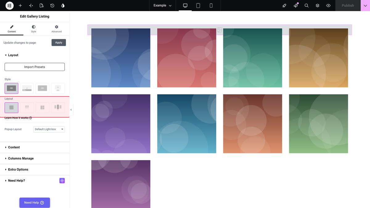
Open the page in Elementor, search the widget panel for Gallery Listing and drag the widget into a container. On the Content tab you will see the Layout section at the top, with a row of Style pictures and a row of Layout pictures.
Style sets the look of each tile. Style 1 and Style 2 are free, while Style 3 and Style 4 are marked as Pro. If you would rather start from a finished design, the Import Presets button in the same section loads a ready-made layout that you can then change.
Step 2: Add Your Images
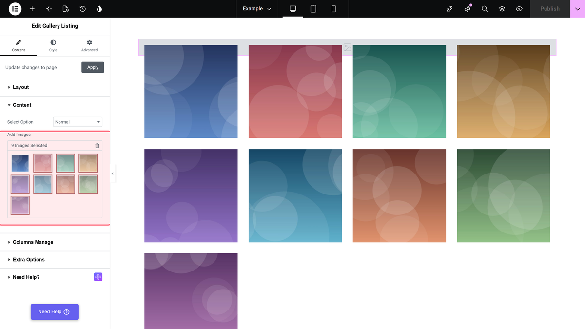
Open the Content section. Select Option decides where the images come from, and it starts on Normal. Leave it there for now and click Add Images to choose photos from the media library. You can drag the thumbnails inside the picker to set their order.
Normal is the quickest source: one multi-select and you are done. It stores images only, which is all a simple photo wall needs. In Normal mode the image name is used as the title, so give your files clear names before you upload them.
Step 3: Set the Columns for Desktop, Tablet and Mobile
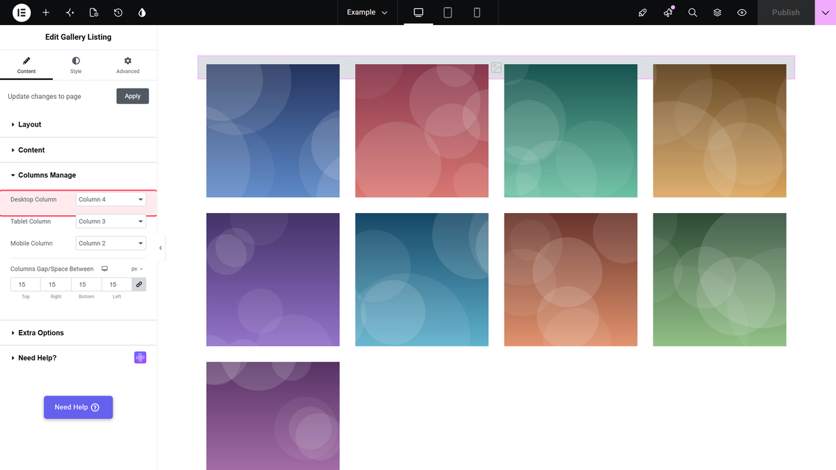
Open Content > Columns Manage. Desktop Column, Tablet Column and Mobile Column each take a value from Column 1 to Column 6. The defaults are four columns on desktop, three on tablet and two on mobile, so a gallery already steps down neatly on smaller screens without any CSS.
The same section has Columns Gap/Space Between, which sets the space around each tile. It starts at 15px on every side. A smaller gap feels tighter and more modern; a larger one gives each photo more room to breathe.
Use Elementor’s responsive mode at the bottom of the panel to preview tablet and mobile. If the gallery shows one image per row when you expected more, you are probably previewing a smaller breakpoint than you think.
Step 4: Choose What a Click Does
In the free plugin, clicking an image opens it full size in Elementor’s lightbox, and visitors can move through the rest of the gallery from there. That is right for most photo galleries.
With The Plus Addons for Elementor Pro, the Layout section also shows Popup Layout, with two choices: Default Light-box and No. Default Light-box groups every image into one slideshow. No drops that slideshow, so visitors only see the single image they clicked.
Step 5: Show or Hide Titles and Captions
Content > Extra Options holds the text settings. Display Title shows the image title on each tile, and Title Tag sets its HTML tag, H3 by default. Display Excerpt/Content shows the caption. Both are on by default and both are in the free plugin.
For a pure photo wall you may want to turn both off and let the images speak. For a portfolio, short titles help visitors and give screen readers more context. Be aware there are two sections called Extra Options, one on the Content tab and one on the Style tab, with different settings in each. Text and image settings live on the Content one.
How to Build a Masonry Gallery in Elementor
Masonry keeps the columns even but lets each image keep its own height, so tall and wide photos sit together without being cropped. It is free, and you only change one setting: pick Masonry, the second picture under Layout.

Masonry needs two things to look like masonry. First, a real mix of portrait and landscape images; a set of identical squares just looks like a grid with gaps. Second, at least two columns; at one column it is simply a vertical stack.
Because masonry fills the columns as images load, the reading order is not strictly left to right. If the order of your images matters, for example in a step-by-step project story, a grid is the safer choice. Our doc on creating an Elementor masonry image gallery covers the details, and the post on masonry grid in CSS vs Elementor explains the layout itself.
Want a looser, more editorial feel? Messy Columns, in the Style tab’s Extra Options, offsets alternate columns vertically. It is a Pro setting.
How to Build a Metro Gallery in Elementor
Metro mixes tile sizes in one arrangement, so a few images sit large while the rest fill in around them. Pick Metro, the third picture under Layout.
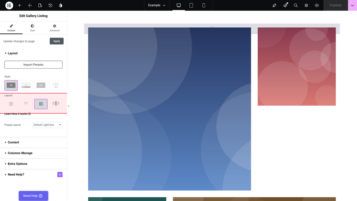
Metro has its own column setting. In Content > Columns Manage, the usual desktop, tablet and mobile settings are replaced by Metro Column, which offers 3, 4, 5 or 6 columns. Three columns are free; four to six are Pro. Metro Style, below it, chooses the tile pattern.
The key thing to know: you do not choose which image is large. Metro assigns tile sizes by position, so the images you put first in the Add Images picker get the prominent tiles. Drag your strongest photos to the front, and place landscape images where the wide tiles fall so they crop less. Metro reads best with a short, curated set, because the pattern repeats with long lists. See how to create an image gallery in metro layout for the settings reference.
Make Every Grid Image the Same Size
Photos from a camera or a phone come in different sizes, and a grid built from them ends up with tiles of different heights. The Plus Addons for Elementor Pro fixes this in the widget itself.
Open Content > Extra Options, turn on Display Image Size, and pick a size under Image Resolution. The Plus Addons registers a square size for this called Tp-image-grid, at 700 x 700 pixels, and every tile then uses it.
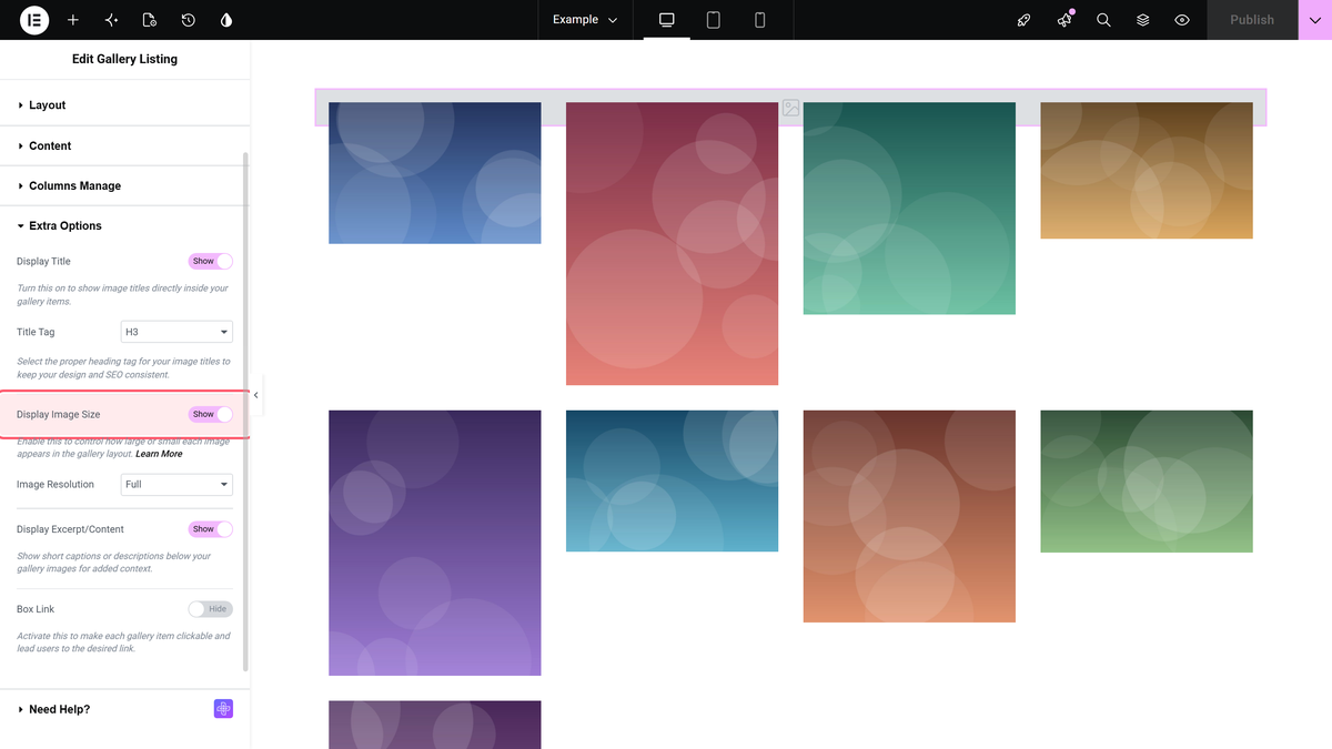
Two practical notes. WordPress does not upscale images, so source photos smaller than the chosen size stay at their own dimensions. And images uploaded before a size was registered have no file at that size until you regenerate thumbnails, for example with the Regenerate Thumbnails plugin. Do not use this setting with masonry: forcing one size on every image removes the only thing masonry is for. The full walkthrough is in making every gallery image the same size.
Turn Your Gallery Into a Filterable Portfolio
A filter bar is useful the moment a gallery covers more than one kind of work. Visitors click Nature or Architecture and the gallery filters in place, with no page reload. This needs the Repeater source, which is part of The Plus Addons for Elementor Pro.
- In Content > Content, set Select Option to Repeater. The image picker is replaced by a list of rows, one per image.
- Open each row. Set Choose Image, then fill in Title, Caption and Category. You can give one image several categories, separated by commas.
- Open Content > Extra Options and turn on Category Wise Filter. The filter bar appears above the gallery, built from the categories you typed.
- Change All Filter Category Text if you want the reset button to say something other than All.
- Pick a look with Category Filter Style and Filter Hover Style, and set Filter Alignment.
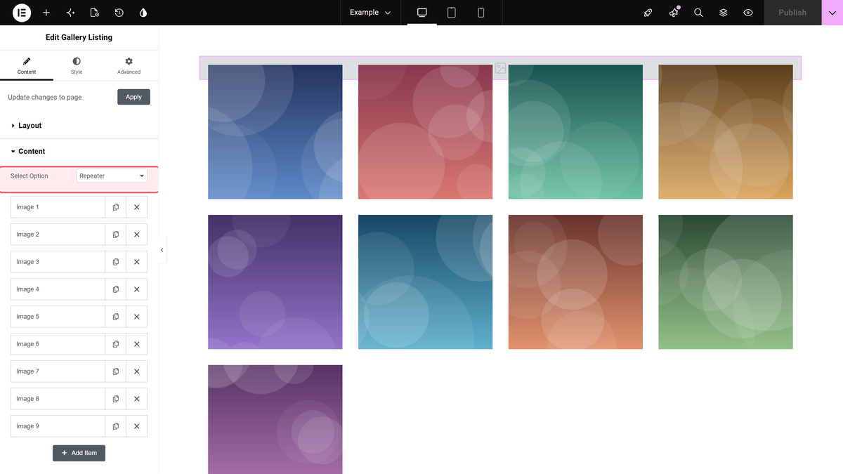
Categories are free text, not a list you pick from. “Nature”, “nature” and “Nature ” with a trailing space become three separate filter buttons, so keep the spelling identical in every row. The filter also knows nothing about WordPress categories or tags; the labels exist only inside this gallery. The filter does not work with the Carousel layout.
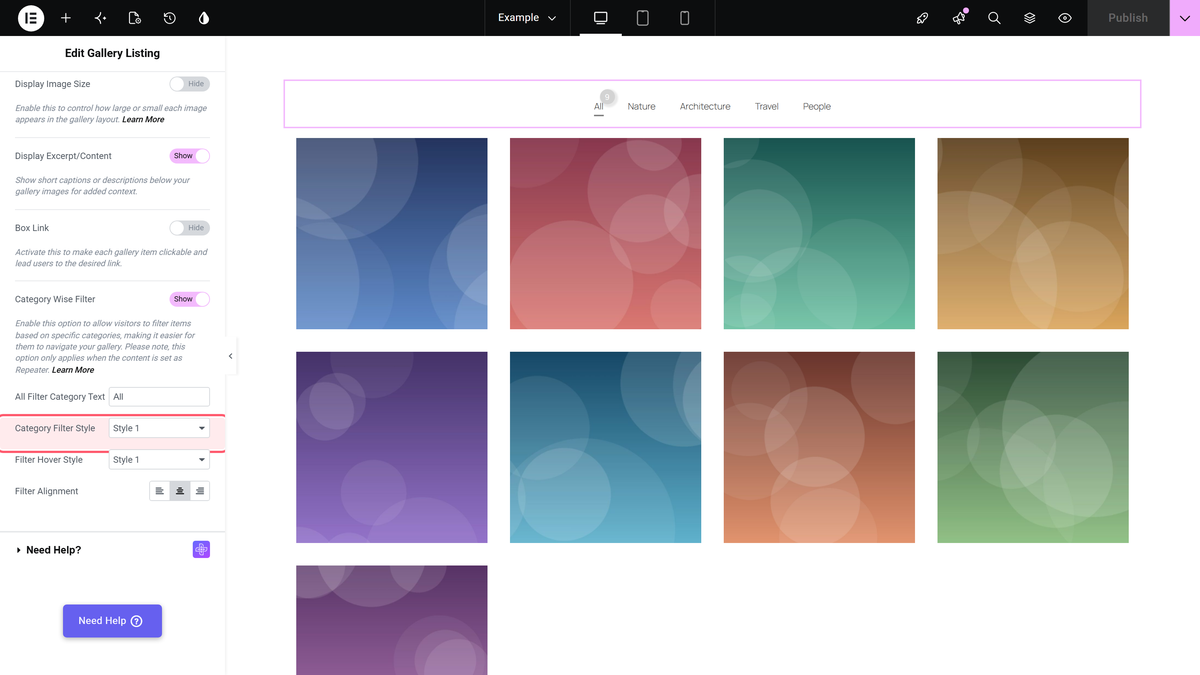
Every image still loads with the page, whatever filter is active, so a very large filterable gallery is heavy. Split it into several pages if it grows past what a visitor would scroll in one go. Our doc on creating a filterable image gallery lists every filter setting.
Link Each Image to Its Own Page
A portfolio, a shop or a team page usually needs each tile to go somewhere different. With the Repeater source, every row has a Custom URL field with the usual new tab and nofollow switches.
The step people miss: open Content > Extra Options and turn on Box Link. It is off by default, and until it is on the URLs are stored but nothing is clickable. If a click still opens the lightbox instead of following your link, turn on Force Custom URL just below it. Box Link makes every tile clickable, so fill in a URL for every row. The steps are in adding a custom link to each gallery image.
Show Your Gallery as a Carousel
When you have more photos than the page has room for, the Carousel layout shows a few at a time and lets visitors move through the rest. It uses the same images as a grid; it is a layout choice, not a different widget. Carousel is a Pro layout, and in the free plugin it is marked Carousel (PRO).
Pick Carousel, the fourth picture under Layout. Then switch to the Style tab and open Carousel Options: Desktop Columns sets how many slides show at once, with separate tablet and mobile values, and Slider Mode switches between horizontal and vertical sliding. For slides of the same height, set Featured Image Type to Custom Size in Content > Extra Options, then pick a fixed Image Resolution.
A word of caution: images past the first slide are seen by fewer visitors. If every image matters, a grid shows them all. Read how to create an image carousel slider, and our post on image carousels in Elementor for design ideas.
Build a Different Gallery on Every Post With ACF
Running a portfolio post type, a property listing or a recipe site? Store the images on each post with an ACF Gallery field and let one Elementor template show whatever that post holds. In the template, set Select Option to ACF Gallery and type the field name into Gallery Field Name. Use the field name, not its label: a label “Project Photos” usually has the name project_photos.
This needs The Plus Addons for Elementor Pro and a plugin that provides the ACF Gallery field, which is part of ACF PRO. It only works where there is a current post, such as a single post template. Our doc on creating an Elementor gallery with an ACF gallery field walks through it, and the guide to ACF repeater fields in Elementor covers the related repeater setup.
Free vs Pro: What You Get in the Gallery Listing Widget
| Feature | Free | Pro |
|---|---|---|
| Grid, Masonry and Metro layouts | Yes | Yes |
| Carousel layout | No | Yes |
| Normal source (pick images from media) | Yes | Yes |
| Repeater and ACF Gallery sources | No | Yes |
| Category filter | No | Yes |
| Box Link (per-image links) | No | Yes |
| Fixed image size (Display Image Size) | No | Yes |
| Turn off the gallery slideshow (Popup Layout) | No | Yes |
| Messy Columns and 3D tilt effects | No | Yes |
| Metro with 4 to 6 columns | No | Yes |
The free plugin covers a good-looking photo grid, masonry or metro gallery. Pro is worth it once the gallery has to work as a portfolio, with filters, links and consistent image sizes. Compare every feature on our free vs Pro page.
Tips for a Fast, Accessible Image Gallery
- Resize large originals before you upload. A photo straight from a camera is often far bigger than any gallery tile, and smaller files load faster on phones.
- Use modern formats. WebP files are usually smaller than JPG or PNG at similar quality. Our comparison of AVIF vs WebP helps you choose.
- Write alt text in the media library. Describe what the photo shows, not the file name. It helps screen reader users and image search.
- Name files clearly. In the Normal source the image name becomes the title, so “oak-kitchen-renovation” beats “IMG_4821”.
- Keep metro and filterable galleries curated. Twelve strong images beat sixty average ones, and the page stays light.
Troubleshooting Common Gallery Problems
- The widget is missing from the Elementor panel. Switch on Gallery Listing in The Plus Addons widget settings, then reload the editor.
- The grid has tiles of different heights. Your images have different proportions. Use Display Image Size with a fixed Image Resolution (Pro), or crop the images to one shape before uploading, or switch to Masonry.
- Masonry columns overlap or bunch up. Masonry places tiles once the images have loaded. Clear any page cache and regenerate Elementor files from Elementor > Tools > Regenerate CSS & Data. A plugin that delays image loading can also upset the measurement.
- The wrong image gets the big metro tile. Metro sizes tiles by position. Reorder the images in Add Images.
- The filter bar does not appear. Check that Select Option is Repeater, that Category Wise Filter is on, and that the rows have categories typed in.
- Images are not clickable as links. Turn on Box Link in Content > Extra Options, not the Style tab’s section of the same name.
- The gallery looks broken after an update. Clear your cache plugin and browser cache, then regenerate Elementor files from Elementor > Tools > Regenerate CSS & Data.
Frequently Asked Questions
Can I Create an Image Gallery in Elementor for Free?
Yes. The free version of The Plus Addons for Elementor includes the Gallery Listing widget with the Grid, Masonry and Metro layouts and the Normal image source, and it works with the free version of Elementor.
How Do I Make a Masonry Gallery in Elementor?
Add the Gallery Listing widget, choose Masonry under Layout and add a mix of portrait and landscape images. Masonry is included in the free plugin.
How Do I Add Category Filters to an Elementor Gallery?
Set Select Option to Repeater, type a category into each row, then turn on Category Wise Filter in Content > Extra Options. The Repeater source and the filter are part of The Plus Addons for Elementor Pro.
Why Are My Gallery Images Different Sizes?
The images keep their original proportions. Turn on Display Image Size and choose a fixed Image Resolution such as Tp-image-grid (Pro), crop the photos to one shape before uploading, or use Masonry, which is designed for mixed sizes.
Can Each Gallery Image Link to a Different Page?
Yes, with the Repeater source in Pro. Fill in Custom URL for each row and turn on Box Link. If clicks still open the lightbox, turn on Force Custom URL.
Can I Show a Different Gallery on Each Post?
Yes. Use the ACF Gallery source in a single post template and enter the ACF field name. This needs The Plus Addons for Elementor Pro and the ACF Gallery field from ACF PRO.