---
title: "How to Show Blog Posts in Grid Layout in Elementor?"
url: https://theplusaddons.com/docs/show-blog-posts-in-grid-layout-in-elementor/
date: 2023-05-04
modified: 2026-09-11
lang: en
author: "Aditya Sharma"
description: "Do you want your blog posts in a tidy grid of cards? A grid gives every post the same size and lets readers scan a lot of titles at once...."
image: https://theplusaddons.com/wp-content/uploads/2023/05/How-to-Show-Blog-Posts-in-Grid-Layout-in-Elementor_-1024x536.jpg
word_count: 373
---

# How to Show Blog Posts in Grid Layout in Elementor?

## 

- The Plus Addons for Elementor Blog/Post Listing widget uses Grid as the default layout, with separate column counts for Desktop, Tablet, and Mobile.
- Blog/Post Listing style options include Style 1, Style 5, and Smart Loop Builder in the free plugin, while Styles 2, 3, and 4 are Pro.
- Content Source limits Maximum Post Display to 8, and Title Limit plus excerpt Count help keep cards from becoming uneven when titles and excerpts vary in length.

Do you want your blog posts in a tidy grid of cards? A grid gives every post the same size and lets readers scan a lot of titles at once.

Grid is the default layout of the Blog/Post Listing widget in The Plus Addons for Elementor, with separate column counts for each device.

*To check the complete feature overview documentation of The Plus Addons for Elementor Blog Listing widget, [click here](https://theplusaddons.com/docs/blog-listing-widget-settings-overview/).*

***Requirement - This widget is a part of The Plus Addons for Elementor, make sure it's installed & activated to enjoy all its powers.***

[LIVE WIDGET LINK](https://theplusaddons.com/elementor-listing/?utm_source=tpae&utm_medium=docs&utm_campaign=text#blog-post-wgts)

## Before You Start

- **Edition:** Free — available in both The Plus Addons for Elementor (Free) and Pro.- **Widget to enable:** Blog/Post Listing, switched on under **ThePlus Settings > Widgets**.

## Step 1: Add the widget and choose Grid

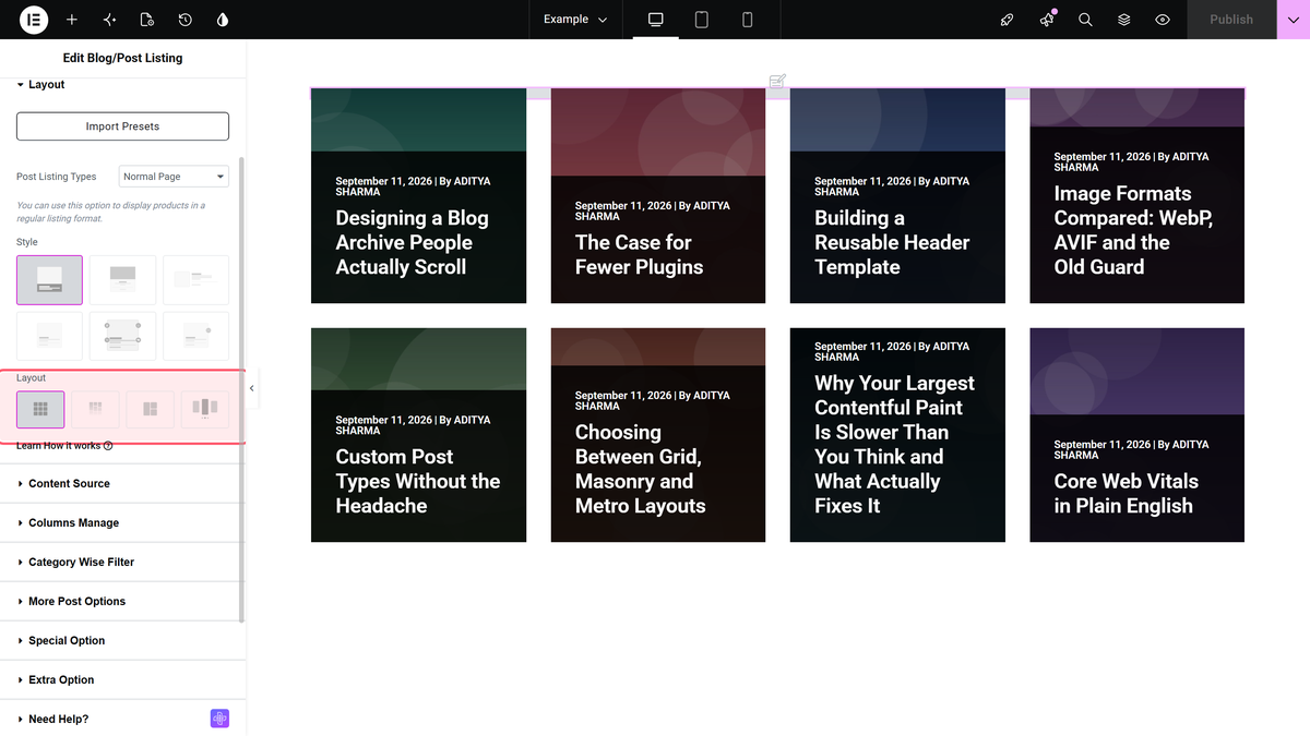
Drag the **Blog/Post Listing** widget onto the page. In **Content > Layout**, **Layout** is already **Grid**.

![The Layout control in the Blog Listing panel with Grid selected](https://theplusaddons.com/wp-content/uploads/2026/09/tp-blog-listout-layout-wide-grid.webp)

## Step 2: Pick a style

**Style**, in the same section, sets the card design. The free plugin includes Style 1, Style 5 and Smart Loop Builder; Styles 2, 3 and 4 are Pro.
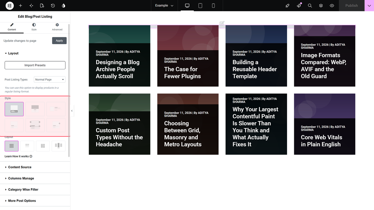
![The Style picker in Content > Layout](https://theplusaddons.com/wp-content/uploads/2026/09/tp-blog-listout-style-wide-grid.webp)

## Step 3: Set the columns

Open **Content > Columns Manage**. **Desktop Column** defaults to **Column 4**, **Tablet Column** to **Column 3** and **Mobile Column** to **Column 2**. Each offers 1, 2, 3, 4, 5 or 6 columns.
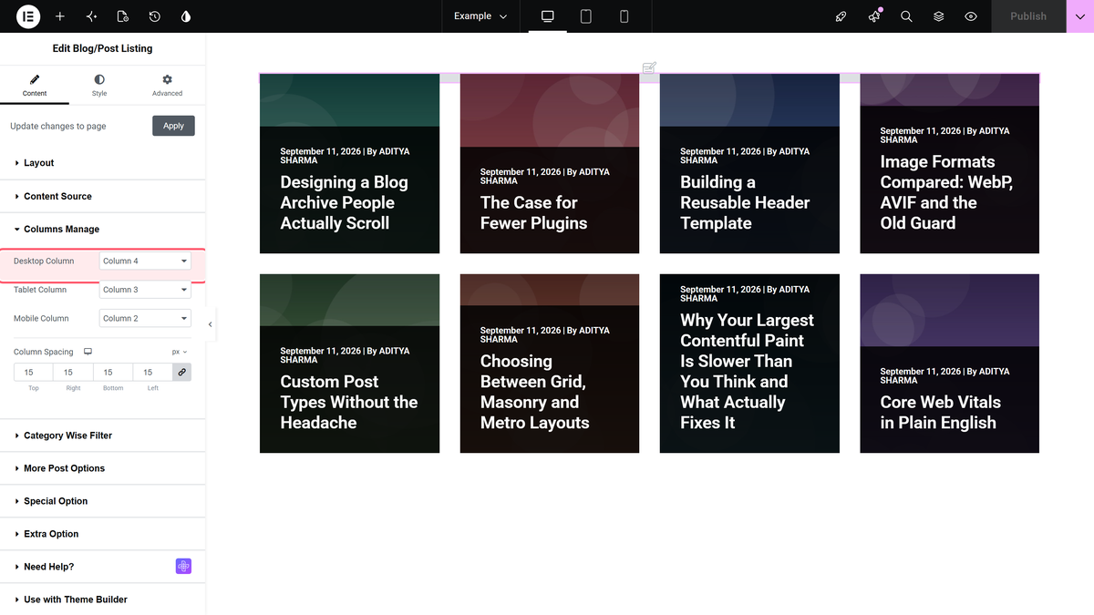
![The Desktop Column dropdown in Content > Columns Manage](https://theplusaddons.com/wp-content/uploads/2026/09/tp-blog-listout-desktop-column-wide-grid.webp)

![Blog posts shown in a grid layout](https://theplusaddons.com/wp-content/uploads/2023/05/blog-listing-grid-layout-demo.png)

## Settings Reference

| Setting | Where | Options | Default |
| ------- | ----- | ------- | ------- |
| Layout | Content > Layout | Grid, Masonry, Metro, Carousel (Pro) | Grid |
| Style | Content > Layout | Style 1 to 5, Smart Loop Builder | Style 1 |
| Desktop Column | Content > Columns Manage | Column 1 to 6 | Column 4 |
| Tablet Column | Content > Columns Manage | Column 1 to 6 | Column 3 |
| Mobile Column | Content > Columns Manage | Column 1 to 6 | Column 2 |
| Maximum Post Display | Content > Content Source | Number | 8 |

## Limitations

- **Even cards, uneven content.** Different title and excerpt lengths still make cards different heights. Limit them with [Title Limit](https://theplusaddons.com/docs/limit-blog-post-title-in-elementor/) and the excerpt [Count](https://theplusaddons.com/docs/limit-post-excerpt-in-elementor-blog-posts/).- **Column counts are fixed choices,** from one to six.

## Troubleshooting

### The grid shows one post per row

You may be previewing tablet or mobile. Check **Tablet Column** and **Mobile Column**, and use Elementor's device switcher.

### The column settings are missing

The Layout is Metro or Carousel, which use their own column settings.

## Related Docs

- [Blog Listing widget: settings overview](https://theplusaddons.com/docs/blog-listing-widget-settings-overview/) — every control in the widget.- [Show blog posts in a masonry grid](https://theplusaddons.com/docs/show-blog-posts-in-masonry-grid-layout-in-elementor/)- [Show blog posts in a metro layout](https://theplusaddons.com/docs/show-blog-posts-in-metro-layout-in-elementor/)- [Show blog posts in a carousel slider](https://theplusaddons.com/docs/show-blog-posts-in-carousel-slider-in-elementor/)

## Frequently Asked Questions

**Q: Why is my blog listing showing one post per row instead of a grid?**
A: That usually means you are previewing the tablet or mobile layout, where the column count is different from desktop. The Blog/Post Listing widget in The Plus Addons for Elementor uses separate column counts for each device, so a narrow preview can make the grid look like a single column. Check Tablet Column and Mobile Column, then use Elementor's device switcher to confirm the active breakpoint.

**Q: What do I need before using the blog posts grid in Elementor?**
A: The Blog/Post Listing widget has to be installed and activated inside The Plus Addons for Elementor, and the widget must be switched on under ThePlus Settings &gt; Widgets. The page also notes that this feature is available in both Free and Pro editions. If the widget is not enabled, the grid layout controls will not matter because the listing widget itself will not be available.

**Q: Which style should I use for a blog posts grid in Elementor?**
A: Style choice changes the card design, not the grid structure. The free plugin includes Style 1, Style 5, and Smart Loop Builder, while Styles 2, 3, and 4 are Pro. If you want a simple starting point, Style 1 is the default in the settings reference, so it is the safest option when you want a predictable card layout before fine-tuning columns.

**Q: How many columns can I set for blog posts in a grid layout?**
A: The grid supports fixed column choices from 1 to 6 on desktop, tablet, and mobile. By default, Desktop Column is 4, Tablet Column is 3, and Mobile Column is 2. That matters because the same post list can look dense on desktop but still stay readable on smaller screens if you keep fewer columns there.

**Q: Can I use a masonry or carousel layout instead of a grid for blog posts?**
A: The Blog/Post Listing widget supports Grid by default, and its layout options also include Masonry, Metro, and Carousel. Carousel is marked Pro in the settings reference. If your goal is evenly sized cards that are easy to scan quickly, Grid is the better fit; masonry or metro change how cards flow visually.

**Q: How do I keep blog cards from looking uneven in a grid?**
A: Uneven card heights usually come from different title and excerpt lengths, even when every post uses the same grid column count. The page recommends limiting titles with [Title Limit](https://theplusaddons.com/docs/limit-blog-post-title-in-elementor/) and trimming excerpts with [Count](https://theplusaddons.com/docs/limit-post-excerpt-in-elementor-blog-posts/). That keeps the cards visually aligned instead of letting long text stretch some posts taller than others.