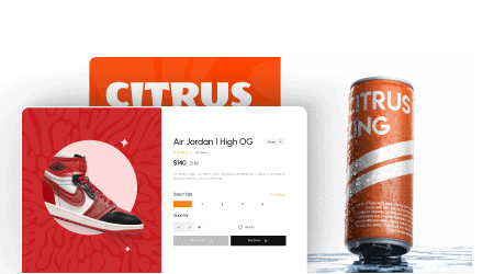
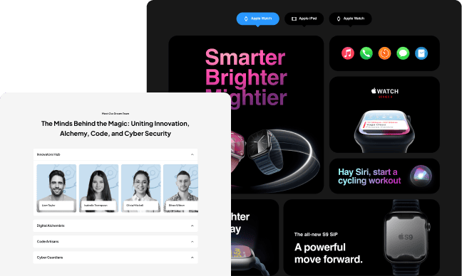
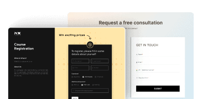
Want to make your website more eye-catching and highlight important content? The Info Box widget from The Plus Addons for Elementor allows you to easily create stunning, interactive boxes that convert visitors.
With the Info Box, you can showcase promotions, testimonials, featured services, and more. This versatile widget helps you add beautiful, functional boxes that boost engagement across your site.
Required Setup
- Elementor FREE Plugin installed & activated.
- You need to have The Plus Addons for Elementor plugin installed and activated.
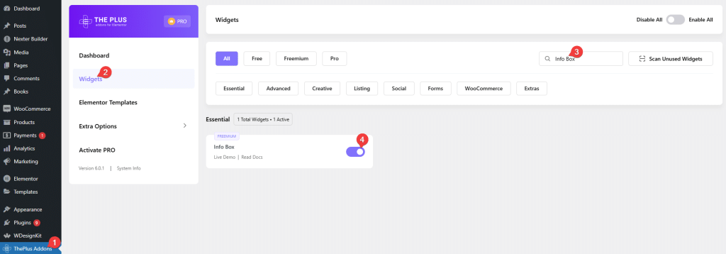
- Make sure the Info Box widget is activated, to verify this visit The Plus Addons → Widgets → and Search of Info Box and activate.
- This is a Freemium widget to unlock the extra features, you need the PRO version of The Plus Addons for Elementor.
Learn via Video Tutorial:
How to Activate the Info Box Widget?
Go to
- The Plus Addons → Widgets
- Search the widget name and turn on the toggle.
Key Features
- Info Box Carousel (Pro): You can add an info box carousel.
- Link Info Box: With this, you can add a link to the whole info box.
- Remote Carousel Info Box (Pro): With the Unique Carousel ID, you can easily connect and control the Carousel info box listing with the Carousel Remote widget.
- Carousel Anything Info Box: You can make a connection between your info box and the Carousel Anything widget with a unique ID.
How to Add Info Box in Elementor?
Add the Info Box widget to the page.
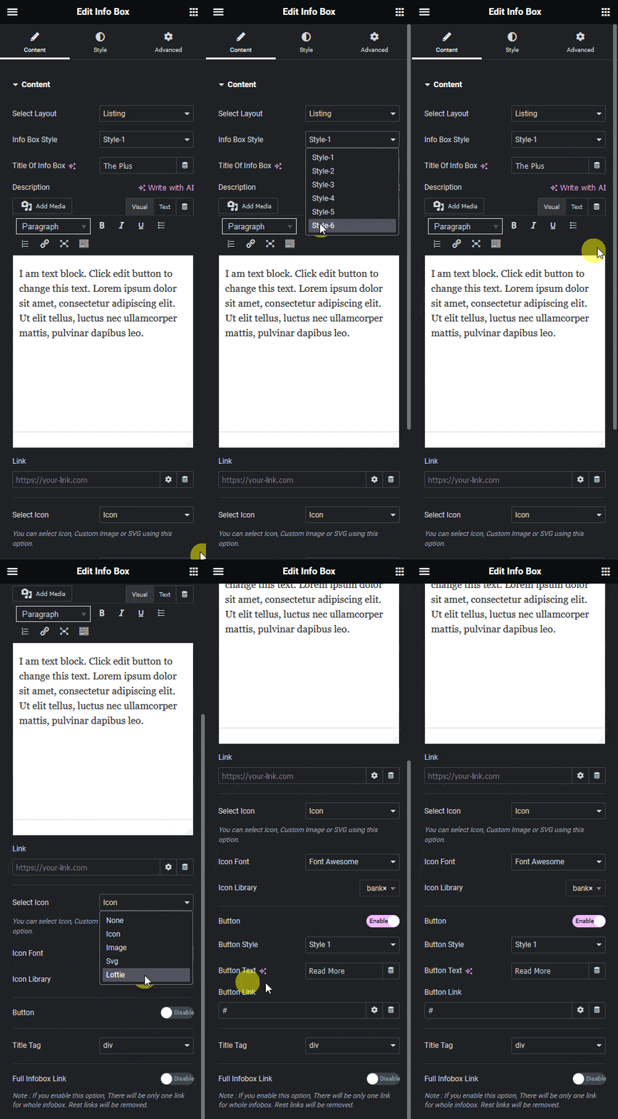
From the Select Layout dropdown, you can select Listing or Carousel.
Listing – You can create a list of info boxes.
Carousel – You can create a carousel of info boxes.
Let’s select Listing here.
Note: You can directly use The Plus Addon for Elementor’s All info box designs that you can copy & paste into your website.
In the Info Box Style, you’ll find six different style options.
Style 1: In this style, the icon is placed inline with the title & description in the left position.
Style 2 (Pro): In this style, the icon is placed inline with the title & description in the right position.
Style 3: In this style, the icon is placed at the top and below the title & description in the center position.
Style 4: In this style, the icon is placed inline with the title, and below the description, with the left position.
Style 5 (Pro): In this style, the icon is placed with the title & description in the left position.
Style 6 (Pro): This style will give interactive hover animation for the Info box.
Then in the Title Of Info Box field, you can add a title.
In the Description section, you can add the info box’s description.
In the Link field, you can add a link to the Info box title.
From the Select Icon dropdown, you can select the icon type. Here you’ll find five options –
- None – With this, no icon will be added to the info box.
- Icon – To add a standard icon to the info box.
- Image – To add an image to the info box.
- Svg (Pro) – To add a custom SVG to the info box
- Lottie – To add a Lottie animation to the info box.
Based on your selection, you’ll find different icon options to add to the info box.
From the Icon Font dropdown, you can select and add an icon based on the chosen Icon Type. Here you’ll find four options:
- FontAwesome – To add classic icons, from the FontAwesome icon library.
- FontAwesome 5 – To add modern icons, from the FontAwesome 5 collection.
- Icons Mind (Pro) –To add clean and minimal icons, from the Icons Mind library.
- Icons Image (Pro) –To add icons using your own images for a more custom look.
Based on your selection, you’ll find different options for an Icon Type.
From the Button toggle, you can add a button to the info box.
When enabled, you can select a button style from the Button Style dropdown.
From the Button Text field, you can edit the button text.
Then in the Button Link field, you can add a link to the button.
From the Title Tag dropdown, you can change the HTML tag of the info box’s title.
From the Full Infobox Link toggle, you can make the entire info box clickable
How to Style the Info Box Widget?
To style the Info box, you’ll find all the options in the Style tab.
Title Style – From here, you can manage the main title style. You can change the title style’s typography, title color, and title top & bottom space.
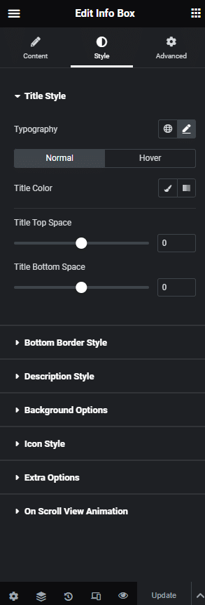
Bottom Border Style – From here, you can add an underline under the title.
Description Style – From here, you can customize the description’s typography and color.
Background Option – From here, you can customize the info box background border and add an image background, etc.
Icon Style – From here, you can manage the icon style. You can change the icon style, size, and color.
Extra Options – From here, you can customize box padding, center icon, minimum height section, box hover effects (Freemium), and responsive visibility.
On Scroll View Animation – This is our global extension available for all our widgets. This adds scrolling animation as the widget comes into the viewport. You can learn more about this from here.
Advanced options remain common for all our widgets. You can explore all its options from here.


