


A services box is the small card that names one thing you do, says it in a sentence, and offers a way to read more. Three or four of them side by side is how most service pages open.
The Info Box widget makes one in a few clicks, and the parts you need for a standard services box are all in the free plugin.
To check the complete feature overview documentation of The Plus Addons for Elementor Info Box widget, click here.
Requirement – This widget is a part of The Plus Addons for Elementor, make sure it’s installed & activated to enjoy all its powers.
Before You Start
- Edition: Free — this part of the Info Box works in the free plugin and in Pro.
- Widget to enable: Info Box, switched on under The Plus Addons > Widgets. In the Elementor panel it appears under Plus Essential.
- Planning a row of them? Build one container with three or four columns and drop an Info Box widget into each, rather than looking for a repeat setting.
Build the Box
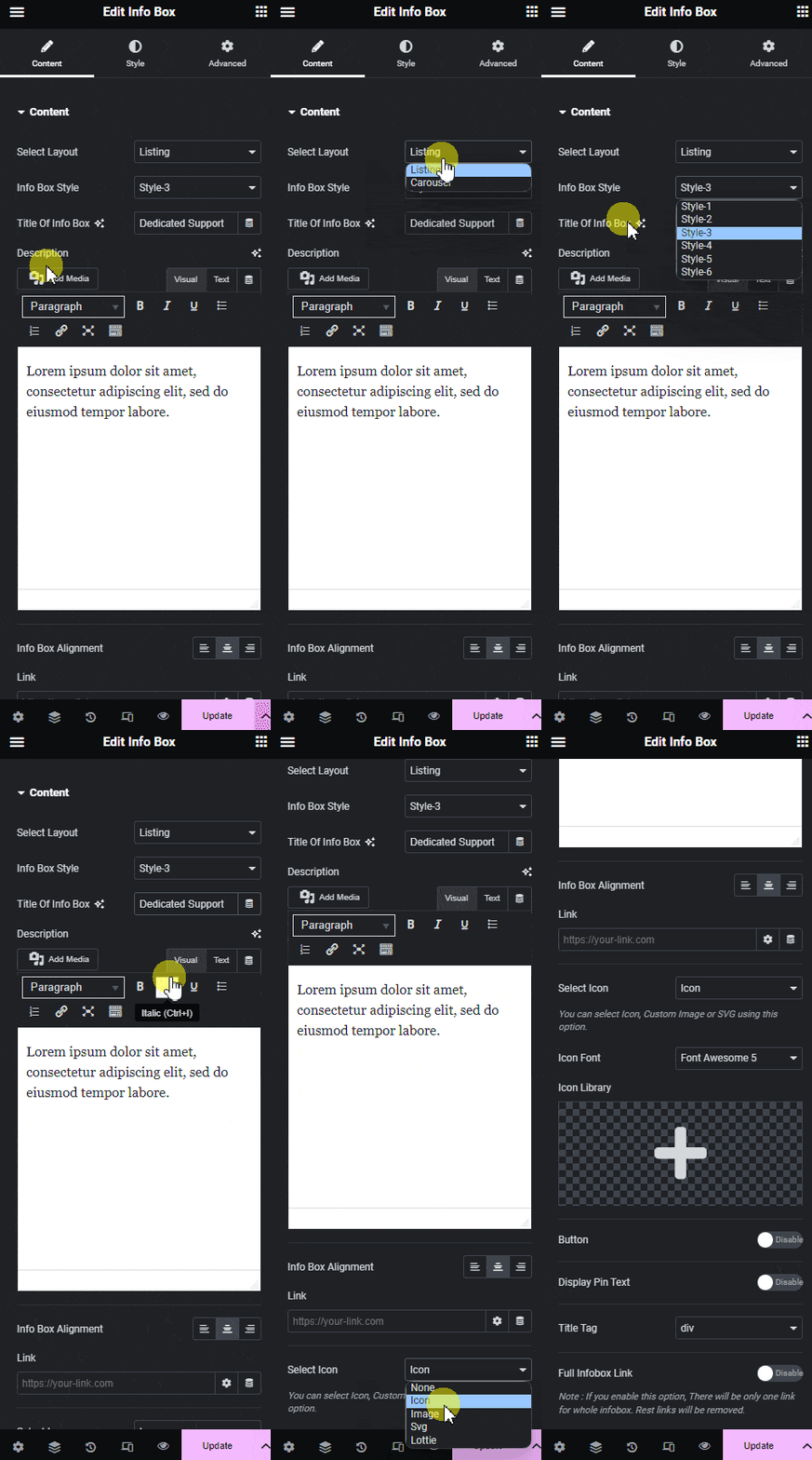
- Edit your page with Elementor and drag Info Box from the Plus Essential group onto the canvas.
- Leave Select Layout on Listing.
- Choose Style-1, Style-3 or Style-4 in Info Box Style. These three are free; the other three need Pro.
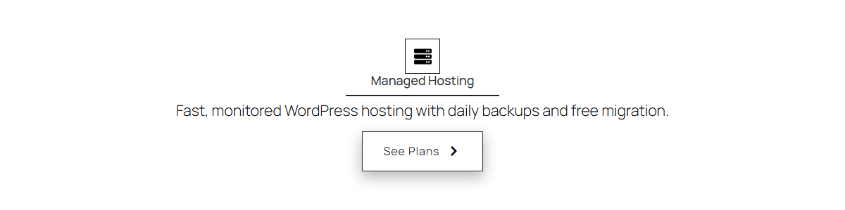
- Replace Title Of Info Box with the name of the service, and the Description with a sentence about it.
- Leave Select Icon on Icon and pick a glyph, or switch it to Image and choose a picture.
Add the Button
Switch Button on. It is off by default.
- Button Text starts as Read More.
- Button Link takes the page the button should open.
- Button Style offers Style 1, Style 2 (the default) and Style 3.
- Button Type stays on Basic unless you want the button to follow a global button style.
Which Icon Types You Can Use
| Select Icon | Edition |
|---|---|
| None, Icon, Image, Text | Free |
| Svg | Pro |
| Lottie | Pro — the option is not in the free dropdown |
With Icon selected, Icon Font lets you choose Font Awesome or Font Awesome 5 free. Icons Mind and Icon Image need Pro.
Finish the Look
Open the Style tab and work through the sections you need: Title and Description for typography and colour, Icon for the glyph size and its frame, Background Options for the card background including its hover state, and Button for the button itself.

How It Behaves
- The button is a real link, so it works with an anchor such as
#pricingas well as a full URL. - Title Tag defaults to div. If each box heads a real section of the page, set it to H3 so the page outline is correct.
- Font Awesome 5 glyphs are output as inline SVG, so they render even on pages that do not load the Font Awesome stylesheet.
Limitations
- One widget is one box. The free plugin has no repeat option in the Listing layout — a row of four services means four widgets. The Carousel layout does repeat, and it is Pro.
- Choosing a Pro style leaves you with an empty card. Style-2, Style-5 and Style-6 render nothing at all without Pro — no icon, no title, no text.
- The boxes do not equalise their own heights. If one description is longer, use Elementor’s container alignment, or the Equal Height extension.
Troubleshooting
The card is empty on the front end
You have selected a Pro style. Switch Info Box Style to Style-1, Style-3 or Style-4.
The button does not appear
Button is off by default. Switch it on in the Content tab, then fill in Button Text and Button Link.
My boxes are different heights
That is normal flow. Trim the descriptions to a similar length, or switch on the Equal Height extension under The Plus Addons > Extensions.
