A few weeks ago I watched a designer on our team rebuild the same photo wall three times in one afternoon. She had a clean CSS Grid, but every row lined up like brickwork, with awkward empty space under the shorter images. What she actually wanted was the staggered, gap free look you see on Pinterest, where tall and short cards nest together and nothing floats in a dead zone. CSS Grid on its own would not give her that, at least not without a pile of JavaScript bolted on top.
That exact problem is why people have been searching for “masonry grid” for years, and why 2026 is the first year the answer genuinely changed. Native CSS masonry finally shipped in a real browser. The catch is that it works in almost none of the browsers your visitors actually use yet. This guide walks through what a masonry grid is, what changed this year with native CSS, why you still cannot rely on it in production, and the three honest ways to build a masonry layout in Elementor today.
What a Masonry Grid Actually Is
A standard CSS Grid places items into a strict matrix. Every cell in a row shares the same height, so when your content has different heights, like images with mixed aspect ratios or cards with different amounts of text, the shorter items leave a visible gap below them. It looks tidy in a mockup and clumsy with real content.
A masonry grid solves that. It keeps the columns a consistent width, then stacks each new item into whichever column is currently shortest. Instead of aligning to invisible rows, items pack tightly by height, so the vertical gaps disappear. This is the Pinterest style layout, also called a waterfall or cascade layout, and it is the natural fit for image galleries, portfolios, blog feeds, and testimonial walls where content heights vary.
The 2026 Update: Native CSS Masonry Is Finally Real
For most of the last decade, the only reliable way to get a masonry layout was a JavaScript library. As the WebKit team put it, these layouts “were made popular by sites like Pinterest and attainable with JavaScript libraries like masonry.js.” Those libraries measure every item after the page loads, then position each one with absolute coordinates. They work, but they add weight, they can shift content around as images load, and they run outside the browser’s own layout engine.
The CSS Working Group spent years debating how to make masonry a native feature, and specifically whether it should be folded into CSS Grid or become its own separate layout mode. The answer that finally shipped is a new display value. In the words of the WebKit release notes, “this capability is available in CSS with display: grid-lanes,” and “Safari 26.4 adds support for Grid Lanes.” That makes Safari the first browser to ship native masonry in a stable release. The syntax looks like this:
.gallery {
  display: grid-lanes;
  grid-template-columns: repeat(auto-fill, minmax(200px, 1fr));
}
You define your columns exactly as you would in CSS Grid, and the browser packs items of different heights into them automatically. Grid Lanes “provides a way to pack content of different aspect ratios into either columns or rows,” so it works in both directions. It also addresses two things JavaScript masonry always struggled with. Users “can tab through all the visible content,” and “new content can be lazy-loaded at the end,” which matters for keyboard accessibility and long feeds. There is even a flow-tolerance property that controls how much consecutive items shift back and forth, described as “a particularly important consideration for accessibility.”
The Catch: Why You Still Cannot Ship It in Production
Here is the part most tutorials skip. A feature existing in the specification is not the same as a feature you can use on a live website. As of this writing, global browser support for CSS Grid Lanes sits at roughly 10.55 percent, according to caniuse. Safari 26.4 and later is the only browser shipping it in a stable release. Chrome and Edge have it in version 140 and up, but disabled by default behind an experimental flag. Firefox is the same story, behind a flag that ordinary visitors will never turn on.
Think about what that means for a real audience. The majority of your visitors on Chrome, Edge, and Firefox would not see the masonry layout at all. They would see whatever the browser falls back to, which for an unsupported display value is usually a plain block stack. So if you write raw grid-lanes today and ship it, you are building for about one in ten browsers and quietly breaking the layout for the rest. You would still need a fallback, and a way to detect support, which puts you right back into extra code. Native masonry in 2026 is a progressive enhancement you can experiment with, not a layout you can depend on.
How to Build a Masonry Grid in Elementor Today
If you build WordPress sites with Elementor, you do not have to wait for browser support to catch up. There are three realistic routes to a masonry layout right now, and they suit different kinds of people. Here is the honest tradeoff for each.
Route 1: Hand Coded CSS With a Fallback
If you are comfortable writing custom CSS, you can use display: grid-lanes for browsers that support it and wrap it in a feature query so older browsers get a sensible fallback, often a simple column-count layout. This is the most future proof option, because the day Chrome and Firefox ship stable support, your site upgrades automatically. The downside is that it is not a no code solution, you own the fallback logic, and the CSS column-count fallback reads content top to bottom in each column rather than left to right, so the visual order differs. For a content team that just wants to publish, that is friction.
Route 2: The Elementor Pro Gallery Widget
Elementor Pro includes a Gallery widget with three layout options: Grid, Justified, and Masonry. Elementor describes the masonry option as one that keeps “the same image width and varying heights,” which is exactly the masonry behavior. It works across all browsers because it does not rely on grid-lanes, and it is genuinely no code. The limitation is scope. The Pro Gallery masonry layout is built for image galleries only. If you want a masonry layout for blog posts, WooCommerce products, testimonials, or a custom post type, the Pro Gallery widget will not cover it, and it is a Pro only feature, so the free version of Elementor does not include it.
Route 3: The Plus Addons for Elementor
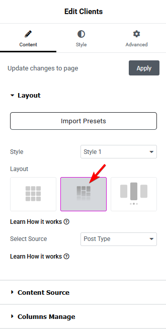
This is the route we build for. The Plus Addons for Elementor ships an Image Gallery widget that offers “Grid, Metro, Masonry, and Carousel layouts” in a single widget, all controlled from the Elementor editor with no code. Because it renders masonry the same way in every browser, you do not care whether the visitor is on Safari 26.4 or an old copy of Chrome. It just works.

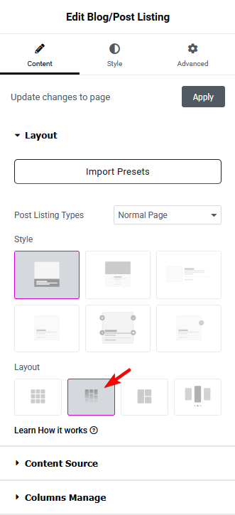
Where this approach really separates from the others is content type. Native grid-lanes works on any markup but reaches too few browsers, and the Elementor Pro Gallery reaches every browser but only handles images. The Plus Addons brings a masonry option to almost everything through its Dynamic Listing tools and its Post Layout Manager, which lists Masonry alongside Grid, Metro, Magazine, and Carousel formats. In practice that means masonry for blog posts, WooCommerce products, testimonials, team members, client logos, and custom post types, without touching a line of CSS.
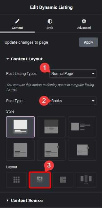
The same masonry option carries across the listing widgets. Product grids can cascade by height instead of snapping to a rigid row, which suits catalogs where images and titles differ in length.

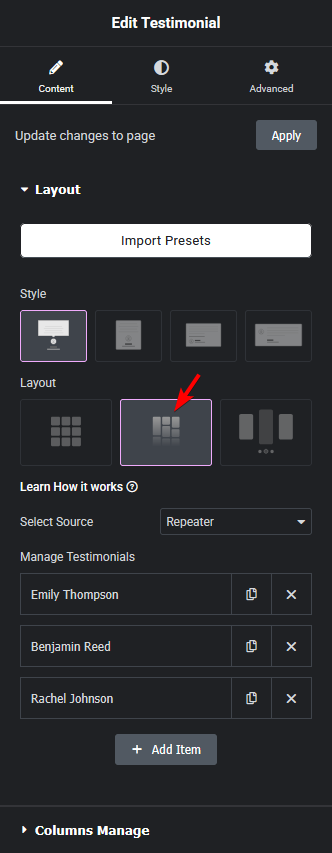
Testimonial walls are another natural fit, since quotes are never the same length. A masonry layout keeps short and long testimonials packed together instead of stretching every card to match the tallest one.
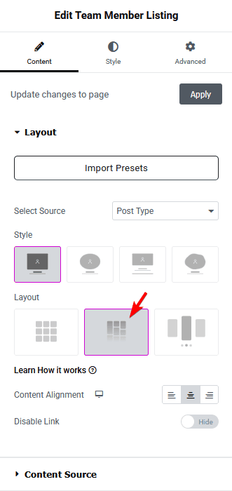
The same holds for team member grids and client logo walls. If you are laying out a team page, a masonry arrangement gives it a more editorial, less rigid feel. For more ideas on that specific layout, our roundup of the best meet the team page examples is worth a look, and if you are building a brand strip, see how to add a logo slider in WordPress.
Native CSS Grid Lanes vs Elementor: Which Should You Use?
The right choice comes down to who is building the site and what content needs the masonry treatment. Here is how the three routes compare on the things that actually matter.
| Factor | Native CSS Grid Lanes | Elementor Pro Gallery | The Plus Addons for Elementor |
|---|---|---|---|
| Browser support today | About 10% (Safari 26.4 only, stable) | All modern browsers | All modern browsers |
| No code | No, you write CSS | Yes | Yes |
| Content types | Any HTML you style | Image galleries only | Posts, products, images, testimonials, team, logos, custom post types |
| Fallback needed | Yes, for most visitors | No | No |
| Best for | Developers future proofing a build | Simple image galleries on Elementor Pro | Dynamic content masonry across a whole site |
If you are a developer building for the long term and you are happy owning a fallback, experiment with grid-lanes now so your site is ready the moment support arrives. If you only need an image gallery and you already own Elementor Pro, the Pro Gallery masonry layout is enough. If you want masonry across posts, products, testimonials, and custom content, with no code and no browser guessing, that is where a listing focused addon earns its place. For a wider view of what these widgets can do, our guide to the best free Elementor blog widgets and our list of Instagram feed plugins for Elementor both cover related listing patterns.
Frequently Asked Questions
Is masonry part of CSS Grid?
It is now, in a way. After years of debate, native masonry shipped in 2026 as a new display value, display: grid-lanes, which extends CSS Grid with masonry style packing. It defines columns the way Grid does, then stacks items by height. Safari 26.4 is the first browser to support it, and global support is still only around 10 percent.
Does Elementor have a masonry layout?
Elementor Pro includes a masonry layout in its Gallery widget for image galleries. The free version of Elementor does not include a native masonry option. Addons like The Plus Addons for Elementor extend masonry to posts, products, testimonials, team members, logos, and custom post types.
Is display: grid-lanes production ready?
Not yet. As of 2026 it works in Safari 26.4 and is behind experimental flags in Chrome, Edge, and Firefox. That is roughly 10 percent of browsers. Treat it as a progressive enhancement with a fallback, not a layout you can ship to everyone.
Will grid-lanes replace masonry plugins?
Eventually it may reduce the need for JavaScript masonry libraries once support is broad. For now, a builder based solution still wins on browser coverage, no code editing, and support for content types beyond plain image galleries.