






Do you want a metro-style image gallery in Elementor? Metro mixes tile sizes inside one arrangement, so a few images sit large while the rest fill in around them. It is the layout to reach for when some images deserve more weight than others.
The Gallery Listing widget in The Plus Addons for Elementor has Metro built in, in the free plugin, with no CSS grid to hand-write.
To check the complete feature overview documentation of The Plus Addons for Elementor Gallery Listing widget, click here.
Requirement – This widget is a part of The Plus Addons for Elementor, make sure it’s installed & activated to enjoy all its powers.
Before You Start
- Edition: Free — available in both The Plus Addons for Elementor (Free) and Pro.
- Widget to enable: Gallery Listing, switched on under ThePlus Settings > Widgets.
Which layout do you actually want?
| Layout | Tile sizes | Use it when |
|---|---|---|
| Grid | All identical | Every image carries equal weight |
| Masonry | Equal width, natural height | Photography with mixed proportions |
| Metro | Deliberately mixed | Some images should dominate |
| Carousel (Pro) | Slides | Space is tight and images can scroll |
Step 1: Add the widget and choose the Metro layout
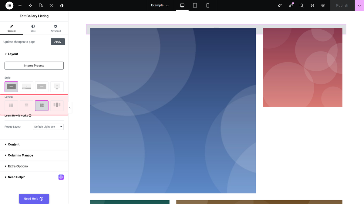
Drag the Gallery Listing widget onto the page. On the Content tab, open the Layout section and pick Metro, the third of the four layout tiles.
Step 2: Add your images, in the order you want them
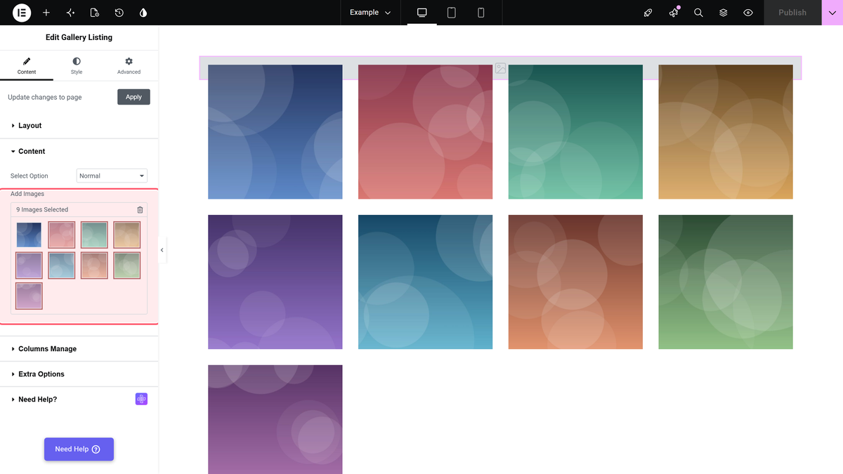
Open the Content section, leave Select Option on Normal, and click Add Images. Order matters more here than in any other layout — metro assigns tile sizes by position, so the images you put first get the prominent tiles. Drag to reorder inside the picker.
Step 3: Set the columns
Metro has its own column control. In Content > Columns Manage, the usual Desktop, Tablet and Mobile Column settings are hidden and Metro Column takes their place: 3, 4, 5 or 6, default 3. In the free plugin 4 to 6 are marked PRO. Metro Style, below it, picks the tile pattern for that column count, and Tablet Responsive gives tablets their own metro setting.
Settings Reference
| Setting | Where | Options | Default |
|---|---|---|---|
| Layout | Content > Layout | Grid, Masonry, Metro, Carousel (Pro) | Grid |
| Select Option | Content > Content | Normal, Repeater (Pro), ACF Gallery (Pro) | Normal |
| Add Images | Content > Content | Media library picker | Empty |
| Metro Column | Content > Columns Manage | 3, 4 (Pro), 5 (Pro), 6 (Pro) | 3 |
| Metro Style | Content > Columns Manage | Preset patterns, or Custom | Style 1 |
| Popup Layout | Content > Layout | Default Light-box, No | Default Light-box |
Limitations
- You do not choose which image is large. Metro assigns tile sizes from a fixed pattern based on position, so the only control you have is the order of the images.
- Large tiles crop hardest. A tile that is wide and short will crop a portrait photo heavily. Put landscape images in the positions that get the big tiles.
- The pattern repeats. With a lot of images the arrangement cycles, so metro reads best with a smaller, curated set.
- Three columns in the free plugin. Four, five and six metro columns are Pro.
Troubleshooting
Every tile is the same size
Check the layout really is Metro and not Grid — they sit next to each other in the Layout control. Then try another Metro Style in Content > Columns Manage.
The wrong image is getting the big tile
Metro assigns sizes by position, so reorder the images in Add Images. Drag the one you want featured earlier in the list.
Images look badly cropped
Metro tiles have fixed proportions and crop to fill. Move portrait images to positions that get tall tiles, or switch to Masonry, which never crops.
