






Do you want the next and previous images to peek in at the edges of your Elementor carousel? A half-cut slide is a strong signal that there is more to see — far stronger than arrows alone — and it centres attention on the middle slide.
The Gallery Listing widget in The Plus Addons for Elementor does it with two controls: Center Mode and Center Padding.
To check the complete feature overview documentation of The Plus Addons for Elementor Gallery Listing widget, click here.
Requirement – This widget is a part of The Plus Addons for Elementor, make sure it’s installed & activated to enjoy all its powers.
Before You Start
- Edition: Pro — the Carousel layout is part of The Plus Addons for Elementor Pro. In the free plugin the option is visible but shows an upgrade notice instead of its settings.
- Widget to enable: Gallery Listing, switched on under ThePlus Settings > Widgets.
Best Used For
- Photography and portfolio sites showing a full-width slider with a peek of the adjacent images.
- WooCommerce product showcases where the active image is centred and flanked by partial views.
- Agency and event sites leading visitors through a visual collection in place.
Step 1: Add the widget and choose the Carousel layout
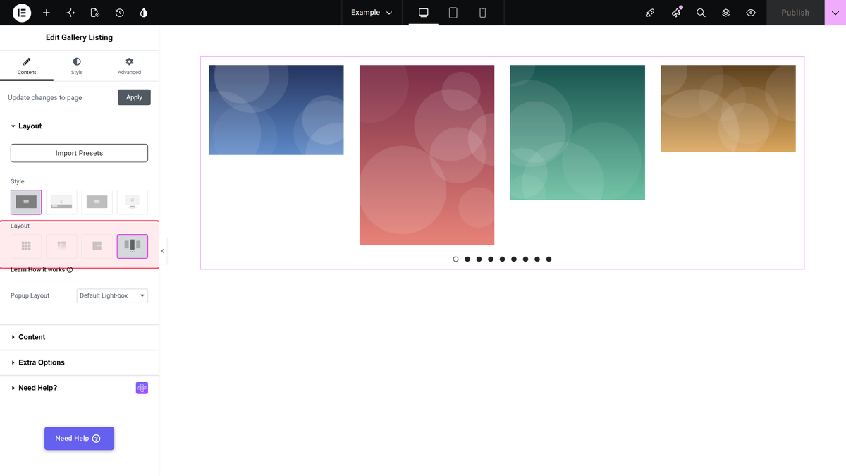
Drag the Gallery Listing widget onto the page. On the Content tab, open Layout and pick Carousel. Choose a Popup Layout in the same section if you want a lightbox.
Step 2: Add your images
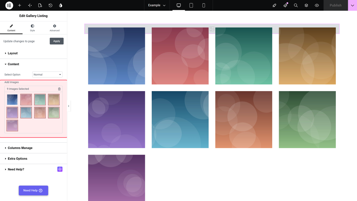
Open the Content section, leave Select Option on Normal, and click Add Images.
Step 3: Turn on Center Mode
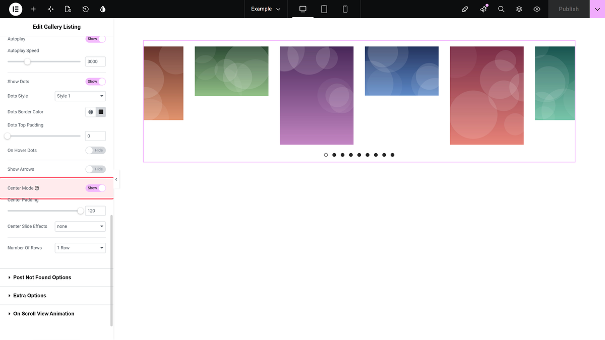
Go to Style > Carousel Options and turn on Center Mode. It is off by default. The active slide moves to the middle and the neighbouring slides start to show at the edges.
Step 4: Set how much of the neighbours shows
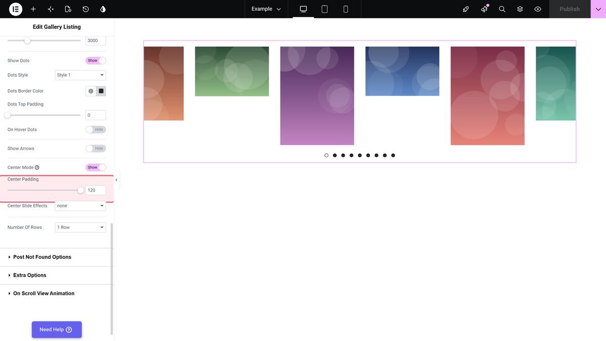
Center Padding, directly underneath, controls how much of the adjacent slides is visible. A larger value shows more of them and makes the centre slide narrower. Somewhere around 60 to 120px reads as a deliberate peek; much more and the middle slide stops dominating.
Center Mode and Center Padding are both responsive. There are separate desktop, tablet and mobile values, which matters here more than most settings — a padding that looks right on a wide screen can leave almost no centre slide on a phone.
What It Looks Like
Settings Reference
| Setting | Where | Type | Default |
|---|---|---|---|
| Layout | Content > Layout | Grid, Masonry, Metro, Carousel (Pro) | Grid |
| Center Mode | Style > Carousel Options | Switcher, responsive | No |
| Center Padding | Style > Carousel Options | Slider, responsive | Not set |
| Desktop Columns | Style > Carousel Options | 1 to 12 | 4 |
| Popup Layout | Content > Layout | Default Light-box, No | Default Light-box |
Limitations
- Carousel is Pro. The free plugin shows the layout as Carousel (PRO).
- It works best at odd column counts. Center Mode has a centre slide to centre; with an even number of columns there is no true middle.
- Padding eats the centre slide. The peek is taken from the middle slide’s width, so a large value on a narrow screen leaves very little of it.
- Half-cut images are cropped by the viewport, not by the image size. Setting a fixed Image Resolution does not stop the edges being clipped — that is the effect.
Troubleshooting
Nothing peeks at the edges
Center Padding is still at zero. Center Mode positions the slide; the padding is what actually reveals the neighbours.
It looks right on desktop and broken on mobile
Both controls are responsive. Switch to the mobile view with Elementor’s device selector and set a smaller Center Padding there, or reduce Mobile Columns to 1.
I cannot find Center Mode
It is on the Style tab, under Carousel Options, and it only exists when the layout is Carousel. You may need to scroll — the section is long.
