






Do you want an Elementor image carousel where every slide is the same height? Upload photos straight from a camera or a phone and they arrive at different sizes, so the carousel ends up with a ragged top and bottom edge and the arrows jump as it slides.
The Gallery Listing widget in The Plus Addons for Elementor fixes this with one dropdown. It renders every image at a fixed size, so the carousel keeps a straight edge no matter what you uploaded.
To check the complete feature overview documentation of The Plus Addons for Elementor Gallery Listing widget, click here.
Requirement – This widget is a part of The Plus Addons for Elementor, make sure it’s installed & activated to enjoy all its powers.
Before You Start
- Edition: Pro — the Carousel layout is part of The Plus Addons for Elementor Pro. In the free plugin the option is visible but shows an upgrade notice instead of its settings.
- Widget to enable: Gallery Listing, switched on under ThePlus Settings > Widgets.
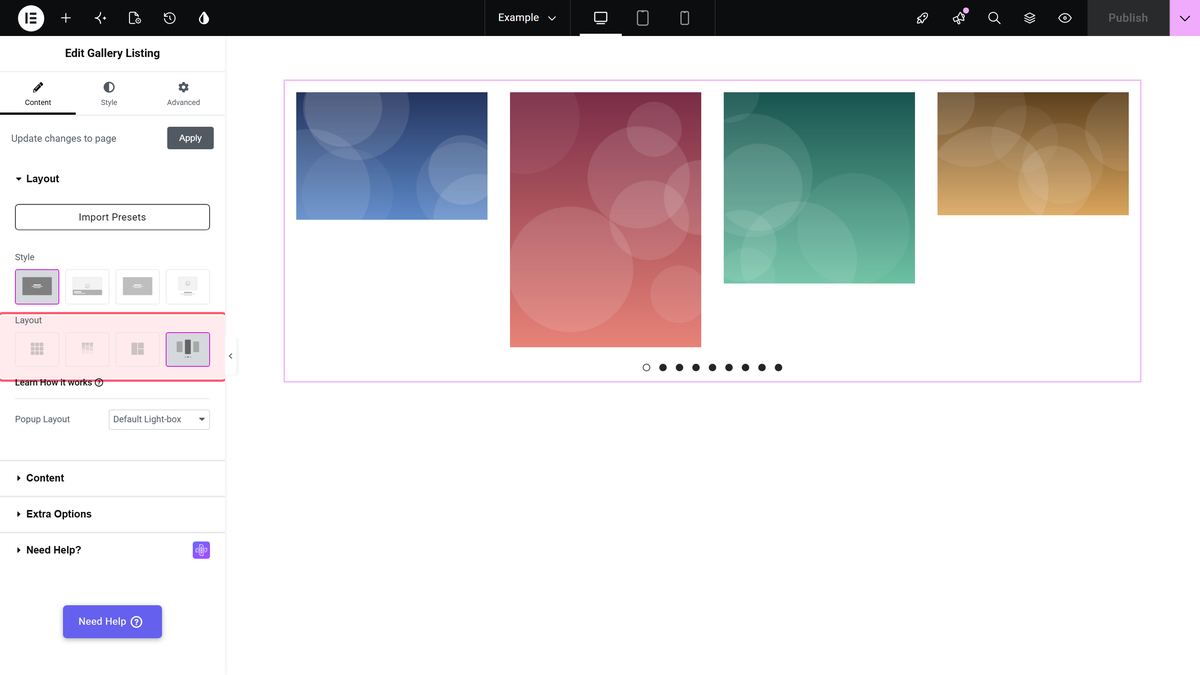
In the free plugin the Layout control shows this option as Carousel (PRO). Selecting it reveals an upgrade notice rather than the carousel settings. If you are on Free and want uniform images in a grid instead, see make an Elementor image gallery the same size in a grid, which works on the free Grid layout.
Step 1: Add the widget and choose the Carousel layout
Drag the Gallery Listing widget onto the page. On the Content tab, open the Layout section and pick Carousel. The section also has a Popup Layout dropdown, which controls the lightbox that opens when a visitor clicks a slide.
Step 2: Add your images
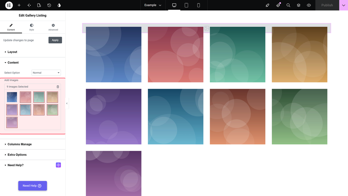
Open the Content section, leave Select Option on Normal, and click Add Images to pick your photos from the media library. Deliberately mixed sizes are fine — that is what the next step is for.
Step 3: Set Featured Image Type to Custom Size
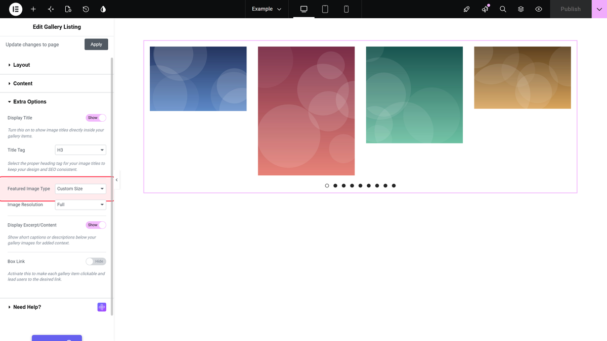
Open Content > Extra Options and set Featured Image Type to Custom Size. It starts on Full Image, which is what lets the original dimensions through and produces the ragged edge.
Featured Image Type only appears on the Carousel layout. On Grid, Masonry and Metro the equivalent control is a Display Image Size toggle instead. Same goal, different control — the widget shows you whichever one applies.
Step 4: Pick the size every slide will use
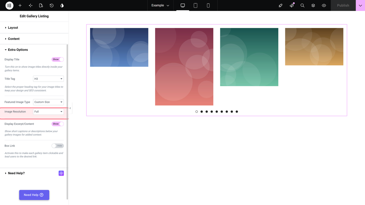
Image Resolution appears directly underneath. Choose Tp-image-grid — 700 x 700, a square size that The Plus Addons registers for exactly this job. Every slide is then rendered at 700 x 700 and the carousel edge is straight.
Your source images should be at least 700 x 700. WordPress will not upscale a smaller image, so anything below that size is served at its own dimensions and stays the odd one out.
Step 5: Set how many slides show at once
Desktop Columns, under Style > Carousel Options, sets how many slides are visible. It defaults to 4. Fewer columns means bigger slides, which suits portfolio work; more suits thumbnails.
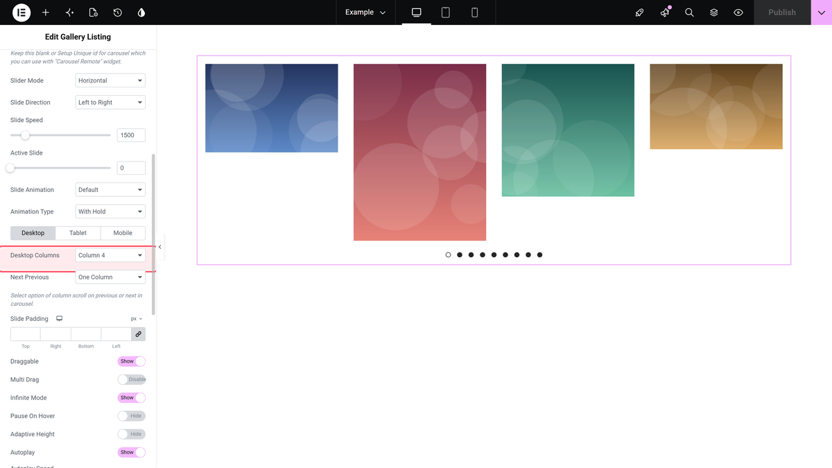
What It Looks Like
Settings Reference
| Setting | Where | Options | Default |
|---|---|---|---|
| Layout | Content > Layout | Grid, Masonry, Metro, Carousel (Pro) | Grid |
| Select Option | Content > Content | Normal, Repeater, ACF Gallery | Normal |
| Add Images | Content > Content | Media library picker | Empty |
| Featured Image Type | Content > Extra Options | Full Image, Grid Image, Custom Size — carousel only | Full Image |
| Image Resolution | Content > Extra Options | Any registered size, including Tp-image-grid 700×700 | Full |
| Desktop Columns | Style > Carousel Options | 1 to 12 | 4 |
| Popup Layout | Content > Layout | Default Light-box, No | Default Light-box |
There are two sections called Extra Options — one on the Content tab and one on the Style tab — and they hold different controls. Everything in this guide is on Content > Extra Options, except Desktop Columns, which is under Style.
Limitations
- Carousel is a Pro layout. The free plugin lists it but shows an upgrade notice.
- WordPress does not upscale. An image smaller than the chosen size is served at its own dimensions, so one small photo still breaks the line.
- Fixed sizes crop. A square size applied to a tall portrait photo crops it to a square. If cropping is unacceptable, use Masonry, which is built for uneven heights.
- The setting is per widget. There is no global option that makes every gallery on the site use one image size.
- New sizes need regenerating. Images uploaded before a size was registered do not have that size on disk; regenerate thumbnails so the file exists.
Troubleshooting
I cannot find Featured Image Type
It only exists on the Carousel layout, in Content > Extra Options. On Grid, Masonry or Metro you want the Display Image Size toggle in the same place instead.
The slides are still different heights
Check that Image Resolution is set to a fixed size and not left on Full, and that every source image is at least as large as that size. Then regenerate thumbnails so the cropped files actually exist on disk.
My images look cropped or squashed
A fixed square size crops rectangular photos. Either pick a size whose ratio matches your photos, or switch to Masonry, which keeps every image’s own proportions.
Related Docs
Suggested read: how to create an image carousel slider in Elementor.
- Gallery Listing widget: settings overview — every control in the widget.
- Make an Elementor image gallery the same size in a grid — the free, grid equivalent of this doc.
- Show half-cut images in an Elementor carousel slider
- Create an Elementor masonry image gallery — when you want to keep uneven heights.
