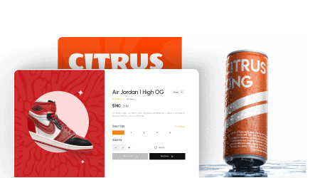
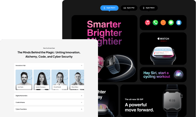
Adding a horizontal scroll section is an excellent option for website owners looking to add a unique touch to their Elementor site. Horizontal scrolling allows visitors to scroll through content from left to right instead of the traditional top to bottom approach. This feature can create a more engaging and interactive website experience and make it easier to display large amounts of content.
The Horizontal Scroll widget from The Plus Addons for Elementor allows you to create beautiful horizontal scrolling sections in Elementor easily.
Required Setup
- Elementor FREE Plugin installed & activated.
- You need to have The Plus Addons for Elementor plugin installed and activated.
- This is a Premium widget, and you need the PRO version of The Plus Addons for Elementor.
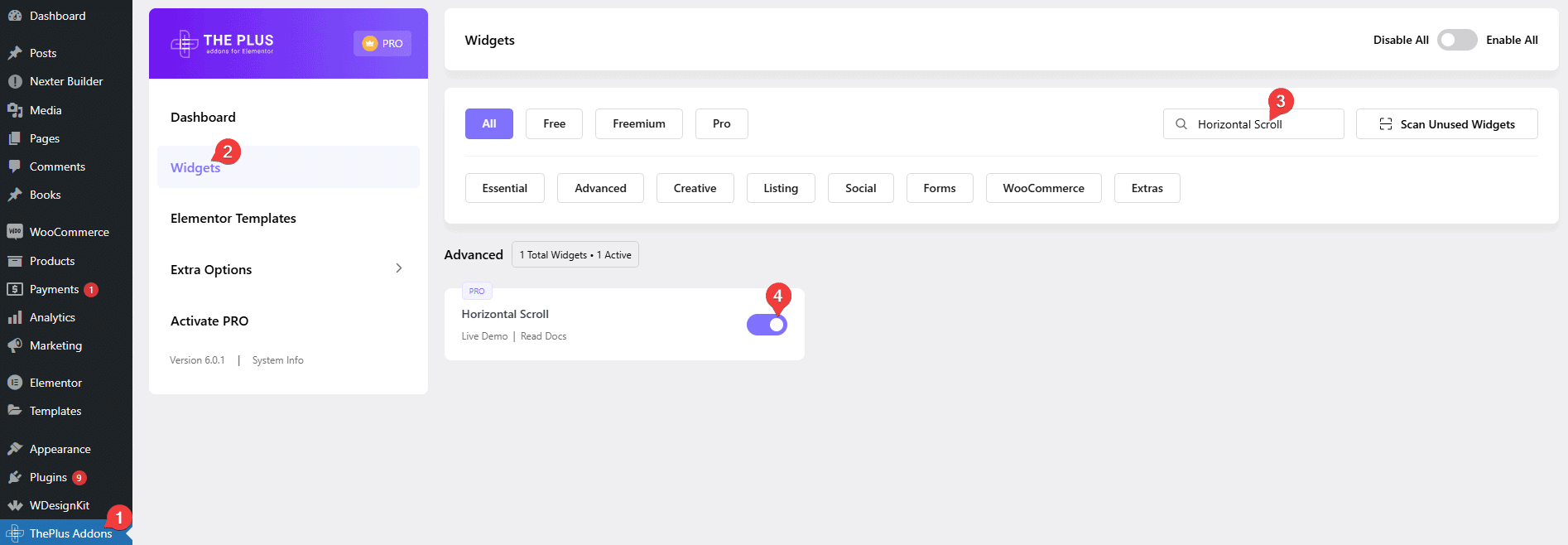
- Make sure the Horizontal Scroll widget is activated, to verify this, visit The Plus Addons → Widgets → and Search for Horizontal Scroll and activate.
How to Activate the Horizontal Scroll Widget?
Go to
- The Plus Addons → Widgets
- Search the widget name and turn on the toggle.
Key Features
- Use Elementor Template – You can use Elementor templates to create beautiful horizontal scrolling sections.
- Different scroll effects – You can use different scroll effects in your horizontal scroll section.
- Background transition – You can add a smooth background transition for the horizontal scroll.
- RTL Compatibility – You can make your section scroll right to the left.
- Unique Connection ID – Using a unique id, you can easily control the horizontal scroll with the Carousel Remote widget.
- URL Parameter – You can directly link to a specific section of the horizontal scrolling section.
- Responsive Visibility– You easily turn the horizontal scroll to a vertical scroll for a responsive view.
How to add content in the Horizontal Scroll widget?
Add the widget on the page.
Note: By clicking on the Import Presets button, you can import a ready-made design and customize it as per your requirements.
From the Select Existing Template dropdown, you have to select an Elementor template.
You can click the Create Template button to create one if you don’t have any existing template.
Once you click the button, a new Elementor editor will open in a popup, where you can create your template.
At the top, you can name the template and click on the Update Title button to update it.
Note: This option will save the template as a page.
Now while creating the template, treat one section as one slide of the horizontal scroll.
You can add some height to the section or to make the section height full screen, set the Min Height to 100vh.
Once you’ve created one section, just duplicate it to create a new section and change the content.
When you are done with your template, just click on the Update button to save the template.
Click the X (cross) button at the top to close the popup.
Then you’ll see your template in the Horizontal Scroll widget.
You can click on the Edit Template button to edit the template again.
Once you’ve selected a template, it will show on the page.
For a better user experience, you should make the section containing the Horizontal Scroll, Content Width to Full Width and set Padding to 0 in the Advanced tab.
Scrolling Options
You’ll find some additional scrolling options under the Scrolling Options tab.

Scroll Effect – You can add different scrolling effects to the horizontal scrolling section from this dropdown. Learn the process.
Background Transition – From here you can change the section background colour or section background image on horizontal scroll.
Sticky Section – From here, you can select a template as a sticky section while scrolling.
Opacity Based Scroll – If you turn on this toggle, you can add opacity to the next slide of your horizontal scroll.
Full Slide Scroll – This will allow you to change the slide on a single mouse scroll.
RTL Compatibility – If you want to make a right to left horizontal scrolling section, turn on this toggle.
Scroll Speed – From here, you can control the scroll speed for different devices.
Extra Options
Under the Extra Options tab, you’ll find some options.
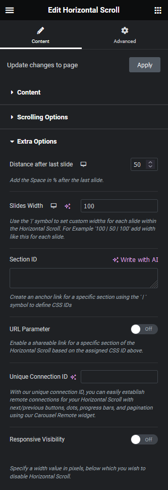
Distance after last slide – With this option, you can add an additional scrolling area after the last slide, so you can add a little pause before you move to the next section of your page.
Note: This option is not available with RTL Scroll.
Slides Width – From here, you can set custom widths for different slides for responsive devices. You can use a pipe separator (|) without any space to set the width of multiple slides like this: 100|50|100.
Note: When you set different slide widths, the opacity based scroll, full slide scroll, background transition options and remote carousel connection via unique connection ID will not work.
Section ID – From here, you can assign an id to each section of the horizontal scroll. You have to use a pipe separator (|) without any space to add the id for each section.
Example: slide1|slide2|slide3
This can be used to connect with the Dots navigation of the Carousel Remote widget. Learn the process.
URL Parameter – This option allows you to add anchor links in the URL, which can be used to link to a specific section of the horizontal scroll directly.
Unique Connection ID – This unique feature of The Plus Addons for Elementor widgets allows you to interconnect widgets. With the Unique Connection ID, you can control the Horizontal Scroll widget navigation with the Carousel Remote widget.
How does this Work?
To create the connection, you have to use the same id on both the Horizontal Scroll and Carousel Remote widgets.
And for the Carousel Remote dots navigation, the number of dot items should be the same as the number of slides/sections in the Horizontal Scroll.
And once the connection is established, you can control the Horizontal Scroll navigation from any part of the page.
Some common use cases with our Carousel Remote ID Sync with Horizontal Scroll.
- Add Paginations in Elementor Horizontal Page Scroll.
- Add Progress Bar in Elementor Horizontal Page Scroll.
- Add Next /Previous Button in Elementor Horizontal Page Scroll.
- Add Dots navigation in Elementor Horizontal Page Scroll.
How to Disable Horizontal Scroll on Mobile?
While having horizontal scrolling sections on relatively large screens like desktop, tablet is excellent for user experience, but on smaller screens like mobile, it can be hard for users to scroll horizontally. So the horizontal scrolling section must be responsive on mobile to offer a better user experience.
The Horizontal Scroll widget lets you easily make your horizontal scrolling section mobile responsive.
From the Extra Options tab, go to Responsive Visibility and turn on the toggle.

Then, in the Responsive Visibility input field, add the maximum screen width below which the horizontal scrolling section will turn to normal vertical scrolling.
Advanced options remain common for all our widget, you can explore all it options from here.
Expand Your Scroll Possibilities
If you love the flexibility of the Horizontal Scroll widget, you’ll be thrilled by these other scroll and animation tools available with Pro – each designed to take your site interaction to the next level:
Page Scrolling (Multi Scroll and Page Pilling Effect)
Split the viewport into two panels (e.g. image on one side, text on the other) and scroll them at different speeds or directions or stack full‑screen sections and scroll from one to the next—ideal for one‑page sites or bold presentations.
Pro users get prebuilt 30/70 and 50/50 templates, plus full control over panel sizes and scroll ratios, along with vertical, horizontal, and diagonal piling modes.
Want to try it? Check the demos and explore the Page Scroll widget.
Scroll Sequence (Create amazing image scrolling animation)
Animate a sequence of images as the user scrolls — just like Apple’s product reveal animations.
Upload your image frames or use sprite sheets, control frame rate, trigger points, scroll offset, and loop settings.
Want to try it? Check the demos and explore the Scroll Sequence widget.
Why Upgrade to Pro?
With The Plus Addons for Elementor Pro, you unlock:
- A complete scroll & motion design toolkit: From horizontal scroll to cinematic Scroll Sequences.
- 120+ free and premium widgets.
- Blazing-fast performance with modular scripts that only load what you use.
- Regular updates, priority support, and a 60-day satisfaction guarantee.

