


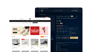
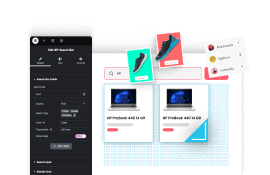
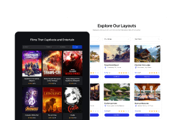
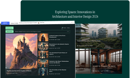
Do you want to add interactive Elementor banners to highlight important sections on your website? These banners not only enhance the aesthetic of the website but also provide an interactive experience for users.
With the Advertisement Banner widget from The Plus Addons for Elementor, you can create advertisement banners with different interactive styles.
Required Setup
- Elementor FREE Plugin installed & activated.
- You need to have The Plus Addons for Elementor plugin installed and activated.
- This is a Premium widget, and you need the PRO version of The Plus Addons for Elementor.
- Make sure the Advertisement Banner widget is activated, to verify this visit The Plus Addons → Widgets → and Search for Advertisement Banner and activate.
Learn via Video Tutorial:

How to Activate the Advertisement Banner Widget?
Go to
- The Plus Addons → Widgets
- Search the widget name and turn on the toggle.

Key Features
- Multiple Styles – You can select from multiple pre-designed styles.
- Multiple Background Hover Styles – You can choose from multiple background hover styles.
- Button – You can easily add a button on the banner.
- Multiple Content Hover Effects – You can add different content hover effects.
How to Use the Advertisement Banner in Elementor?
Add the Advertisement Banner widget to the page.
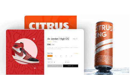
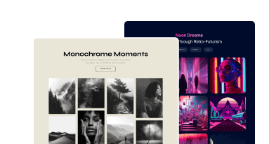
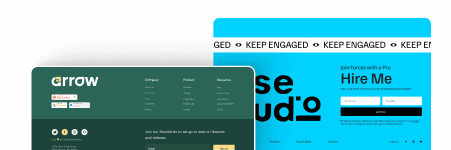
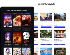
Advertisement Banner
From the Styles section, you can select a pre-defined style.
Note: By clicking on the Import Presets button, you can import a ready-made design and customize it as per your requirements.

In the Banner Image section, you can add a background image to the banner.
Then from the Image Resolution dropdown, you can set the image size.
In the Title field, you can add a title to the advertisement banner.
Then in the Sub Title field, you can add a subtitle to the banner.
From the Hover Styles dropdown, you can add different background hover effects to the banner. Here you’ll find four options –
- Blur Effect – This will add a blur effect to the background image on hover.
- Simple – This will not add any effect.
- Vertical – This will add a zoom or grow effect to the background image on hover.
- Parallax – This will add a 3d parallax effect to the background image on hover.
Note: The Hover Styles is not available for the Style 8.
Button
By enabling the Button toggle, you can add a button on the banner. When enabled you’ll see different options to customize the button.

From the Button Style dropdown, you can select from different pre-defined styles for the button.
Then from the Button Text field, you can edit the button text.
Note: For some button styles you’ll find an additional field to add different button text on hover.
You can add a URL to the button and title from the Button Link field.
From the Icon Font dropdown, you can select the icon library.
Then based on the selected icon library you’ll get an option to select an icon.
From the Icon Position dropdown, you can place the icon before or after the button text.
You can adjust the icon spacing from the button text from the Icon Spacing section.
Then from the Icon Size section, you can manage the icon size.
Note: For some button styles you’ll not find the icon options.

How to Style the Advertisement Banner Widget?
You’ll find all the styling options in the Style tab to style the Advertisement Banner widget.
Title Style – From here, you can manage the title typography and color for normal and hover states.

Subtitle Style – From here, you can manage the subtitle typography and color for normal and hover states.
Button Style – You’ll see this option only when the Button toggle is enabled from the Content tab. From here you can manage the button style.
Animation Settings – From the Content Hover Effects dropdown, you can add different hover effects to the advertisement banner. Here you’ll find 8 effects –
- Grow – This will add a grow or zoom effect to the banner on hover.
- Push – This will add a push effect to the banner on hover.
- Bounce In – This will add a bounce effect to the banner on hover.
- Float – This will add a floating effect to the banner on hover.
- Wobble Horizontal – This will add a horizontal wobble effect to the banner on hover.
- Wobble Vertical – This will add a vertical wobble effect to the banner on hover.
- Float Shadow – This will add a floating effect with a shadow at the bottom of the banner on hover.
- Grow Shadow – This will add a grow effect with a shadow at the bottom of the banner on hover.
- Shadow Radial – This will add a shadow at the bottom and top of the banner on hover.
Background Setting – From here you can add border radius and box shadow for normal and hover states on the background.
On Scroll View Animation – This is our global extension available for all our widget, this adds scrolling animation as the widget comes in viewport. You can learn more about this from here.
Advanced options remain common for all our widgets, you can explore all its options from here.