


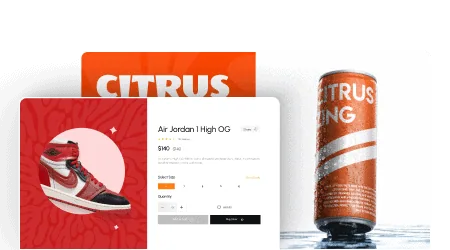
Do you want to add interactive Elementor banners to highlight important sections on your website? These banners pair a background image with hover effects, overlaid text, and a call-to-action button to capture visitor attention.
The Advertisement Banner widget in The Plus Addons for Elementor lets you create advertisement banners with multiple pre-designed styles and interactive hover effects.
Best Used For:
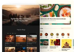
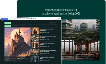
- SaaS and landing pages promoting a feature, offer, or product launch with a visual banner section
- Agency and portfolio sites highlighting services with image-backed interactive cards
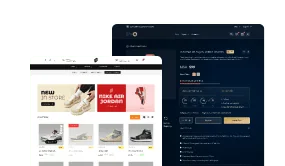
- WooCommerce stores using promotional banners with CTA buttons to drive category or product clicks
Required Setup
- Elementor FREE Plugin installed & activated.
- You need to have The Plus Addons for Elementor plugin installed and activated.
- This is a Premium widget, and you need the PRO version of The Plus Addons for Elementor.
- Make sure the Advertisement Banner widget is activated, to verify this visit The Plus Addons → Widgets → and Search for Advertisement Banner and activate.
Learn via Video Tutorial:
How to Activate the Advertisement Banner Widget?
Go to
- The Plus Addons → Widgets
- Search the widget name and turn on the toggle.

Key Features
- Multiple Styles – Select from multiple pre-designed styles to match your site's visual theme without building a banner layout from scratch.
- Multiple Background Hover Styles – Choose from blur, vertical, and parallax background hover effects. Use this when you want the banner background to animate on hover, drawing attention to your call to action.
- Button – Add a customizable CTA button to the banner with your choice of text, URL, icon, and pre-defined button style. Use this when your banner needs a direct action for visitors, such as “Shop Now” or “Learn More.”
- Multiple Content Hover Effects – Apply one of 9 animations (Grow, Float, Wobble, and more) to the entire banner on hover. Use this when you want the banner to respond interactively as the visitor moves their cursor over it.
How to Use the Advertisement Banner in Elementor?
Add the Advertisement Banner widget to the page.
Advertisement Banner
From the Styles section, select a pre-defined style that matches your site's design.
Note: By clicking on the Import Presets button, you can import a ready-made design and customize it as per your requirements.

In the Banner Image section, add a background image for the banner. This is the primary image visitors see when the banner loads on the page.
From the Image Resolution dropdown, set the image size. Use a larger resolution for full-width banners and a smaller one for sidebar or inline placements to keep page load times fast.
In the Title field, add the main headline for the advertisement banner. This is typically your primary message or offer, such as a promotional headline or product name.
In the Sub Title field, add supporting text below the title. Use this for a brief description or secondary message that elaborates on the headline.
From the Hover Styles dropdown, add a background hover effect to the banner. You will find four options.
- Blur Effect – Adds a blur effect to the background image on hover. Use this when you want to draw the eye toward the text overlay as the visitor mouses over the banner.
- Simple – No hover effect is applied to the background image. Use this for banners where the image should stay static and the content alone draws attention.
- Vertical – Adds a zoom or grow effect to the background image on hover. Use this when you want a subtle motion cue to show visitors the banner is interactive.
- Parallax – Adds a 3D parallax effect to the background image on hover. Use this when your banner is a prominent hero element and you want a high-impact visual response. For a similar overlay effect on section backgrounds, see how to create an Elementor background overlay.
Note: The Hover Styles is not available for the Style 8.
Button
Enable the Button toggle to add a CTA button on the banner. When enabled, you will see additional options to configure the button's appearance and behavior.

From the Button Style dropdown, select a pre-defined style for the button. The available styles control the button's shape, border, and background.
In the Button Text field, edit the label displayed on the button, such as “Shop Now”, “Learn More”, or “Get Started.”
Note: For some button styles you'll find an additional field to add different button text on hover.
In the Button Link field, add the URL and title for the button. This can point to an internal page, product, or any external resource.
From the Icon Font dropdown, select the icon library for the button icon.
Select the specific icon to display based on the library you chose.
From the Icon Position dropdown, place the icon before or after the button text. Use this when you want to reinforce the button's intent with a visual cue, such as an arrow icon after “View Now.”
From the Icon Spacing section, adjust the space between the icon and the button text.
From the Icon Size section, control how large the icon appears on the button.
Note: For some button styles you'll not find the icon options.

How to Style the Advertisement Banner Widget?
All styling options for the Advertisement Banner widget are in the Style tab.
Title Style – Control the title typography and color for normal and hover states. Use this to align the banner headline with your site's heading style.

Subtitle Style – Control the subtitle typography and color for normal and hover states.
Button Style – This section appears only when the Button toggle is enabled from the Content tab. From here, manage the button background, text color, border, and hover state styling.
Animation Settings – From the Content Hover Effects dropdown, add a hover animation to the entire banner. You will find 9 effects.
- Grow – Scales the banner up on hover. Use this for a prominent call to action where you want the banner to visually expand and stand out.
- Push – Shifts the banner in the direction of the cursor on hover.
- Bounce In – Adds a spring-bounce animation to the banner on hover.
- Float – Lifts the banner with a subtle vertical rise on hover. For a hover card that reveals text content on hover, see how to use text content with Hover Card in Elementor using The Plus Addons for Elementor.
- Wobble Horizontal – Adds a left-right shake animation to the banner on hover.
- Wobble Vertical – Adds an up-down wobble animation to the banner on hover.
- Float Shadow – Adds a floating effect with a shadow beneath the banner on hover.
- Grow Shadow – Adds a scale-up effect with a shadow beneath the banner on hover.
- Shadow Radial – Adds a shadow at the bottom and top of the banner on hover.
Background Setting – Add border radius and box shadow to the banner background for normal and hover states.
On Scroll View Animation – A global extension available for all The Plus Addons for Elementor widgets. This adds scroll-triggered animation as the widget enters the viewport.
The Advanced tab options are consistent across all The Plus Addons for Elementor widgets.