


The Plus Addons for Elementor’s Progress Bar widget allows users to display data and statistics in an interactive and visually appealing manner, making it easier to communicate with their audience.
Required Setup
- Elementor FREE Plugin installed & activated.
- You need to have The Plus Addons for Elementor plugin installed and activated.
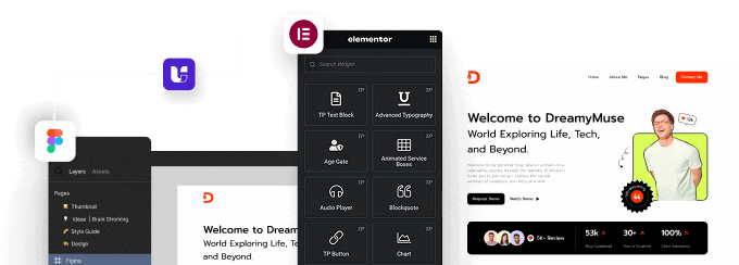
- Make sure the Progress Bar widget is activated, to verify this visit The Plus Addons → Widgets → and Search for Progress Bar and activate.
Learn via Video Tutorial:

How to Activate the Progress Bar Widget?
Go to
- The Plus Addons → Widgets
- Search the widget name and turn on the toggle.

Key Features
- Bar Progress – You can easily add linear progress bars.
- Circle Progress: You can create circular progress bars.
- Multiple Styles – You can add multiple styles for progress bars.
- Multiple Image Type – You select multiple types of Image/Icon for the progress bar.
How to Add a Progress Bar in Elementor?
Add the Progress Bar widget to the page.
Layout
From the Main Style dropdown, you have to select the style type. Here you’ll find two options –
- Progress Bar – To add a line progress bar.
- Pie Chart – To add a circle progress bar.
Based on your selection, you’ll find different options to add the content.

Let’s select Progress Bar here.
Then, from the Style section, you can select a style for the progress bar.
From the Height dropdown, you have to select the Progress Bar height. Here you’ll find three options –
- Small Height – To set a small height for the Progress Bar.
- Medium Height – To set a medium height for the Progress Bar.
- Large Height – To set a large height for the Progress Bar.
After that, in the Dynamic Value field, you have to set a value between 0% and 100% that will control how much of the progress bar is filled in.
Note: This number is only used for the animation and does not appear as text.
Content
From the Title, you can add a title for the progress bar.

From Sub Title, you can add a subtitle for the progress bar.
The Number field allows you to display a numeric value as text within the progress bar.
In the Prefix/Postfix Symbol field, you can add a symbol to the progress bar.
With the Position dropdown, you can select whether the symbol appears After Number or Before Number in the progress bar.
Icon
From here, you can add an icon for the progress bar.
From Select Icon, you can select the icon type.
Here you’ll find four options –
- None – For no icon in the info box
- Icon – You can use standard icons and text in this option.
- Image – In this option, you can use an image with text.
- Lottie – In this option, you can use Lottie animation icons with text.
Based on your selection, you’ll find different group controls for an Icon Type.
From the Icon Font dropdown, you can select and add an icon based on the chosen Icon Type. Here you’ll find three options:
- FontAwesome – To add classic icons, from the FontAwesome icon library.
- FontAwesome 5 – To add modern icons, from the FontAwesome 5 collection.
From the Use Image As Icon section, you can select an image for the Progress Bar Content.
The Image Resolution dropdown allows you to select the appropriate image size.
After that, from the Icon Position dropdown, you can select whether the icon appears before or after the progress bar.
From the Lottie URL section, you can add a Lottie animation to the number counter using a Lottie file URL.
How to Style a Progress Bar in Elementor?
To style the Progress Bar, you’ll find all the options in the Style tab.
Title Setting – From here, you can manage the title style.

Sub Title Setting – From here, you can manage the sub-title style.
Number Setting – From here, you can manage the number style. You can change the typography and the number color.
Number Prefix/Postfix – From here, you can manage the symbol style in the progress bar.
Icon/Image Setting – From here, you can manage the icon style.
Progress Bar Setting – From here, you can manage the top margin and add background color to the progress bar.
On Scroll View Animation – This is our global extension available for all our widgets, which adds scrolling animation as the widget comes into the viewport. You can learn more about this from here.
Advanced options remain common for all our widgets; you can explore all their options from here.