






A uniform grid can look repetitive when category images have different aspect ratios.
The Dynamic Categories widget’s Masonry layout packs terms into a Pinterest-style staggered grid instead, so varied image heights sit naturally next to each other.
Requirement – This widget is a part of The Plus Addons for Elementor, make sure it’s installed & activated to enjoy all its powers.
Before You Start
- Prerequisite: Elementor (free) installed and active.
- Edition: Dynamic Categories is a free widget – it works with just The Plus Addons for Elementor installed, no Pro licence required.
- Widget to enable: go to The Plus Addons > Widgets, search for Dynamic Categories and turn its toggle on.
Steps
- Add the Dynamic Categories widget to the page.
- From Layout, choose Masonry.
- Set your column counts under Columns Manage, the same as the Grid layout.
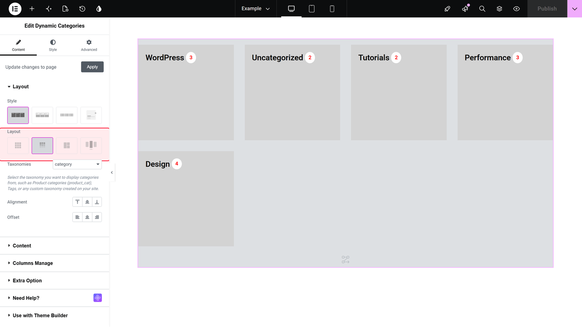
When to Use Masonry Instead of Grid
- Category images with noticeably different heights or aspect ratios.
- A more editorial, less uniform look than the strict rows of a Grid layout.
- Display Image Size is on and each term’s featured image varies in proportion.
Settings Overview
| Setting | What it does | Default |
|---|---|---|
| Layout | Masonry arrangement (this doc’s focus). | Grid (change to Masonry) |
| Display Image Size | Shows each term’s image at its natural size, useful with Masonry. | No |
