


Taxonomies in WordPress are essential for categorizing and grouping content in a structured manner. They help to classify content into specific categories or tags to create an organized site architecture. This not only improves navigation but also enhances the user experience by making it easier for visitors to discover related content.
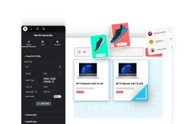
With the Dynamic Categories Widget from The Plus Addons for Elementor, you can list post categories, tags, product categories, and custom taxonomies directly in the Elementor editor.
Best Used For:
- Blog and news sites that need a browsable category index on archive pages
- WooCommerce stores displaying product categories in grid or carousel layouts
- Portfolio or agency sites using custom taxonomies to organize projects by type or industry
Required Setup
- Elementor FREE Plugin installed & activated.
- You need to have The Plus Addons for Elementor plugin installed and activated.
- Make sure the Dynamic Categories widget is activated. To verify this, Go to The Plus Addons for Elementor → Widgets and search for Dynamic Categories and turn on the toggle.
- This is a Freemium widget to unlock the extra features; you need the PRO version of The Plus Addons for Elementor.
Learn via Video Tutorial
How to Activate the Dynamic Categories Widget?
Go to
- The Plus Addons → Widgets
- Search the widget name and turn on the toggle.

Key Features
- Four Layout Types – You can choose from four layout types: Grid, Masonry, Metro, and Carousel (Pro).
- Include Taxonomy by ID – You can include taxonomy by specific ID.
- Exclude Taxonomy by ID – You can exclude specific taxonomies by their ID number.
- Hide Empty Taxonomy – You can hide blank taxonomies from the list.
- Hide Sub Taxonomy – You can hide the child taxonomies from the list.
- Hide Parent Taxonomy – You can hide the parent taxonomies from the list.
- Offset Taxonomy: You can hide taxonomies from the beginning of the listing by setting an offset number.
- Order Taxonomy by Different Parameters: You can order the taxonomy list by different parameters such as date, author, title, and more.
- Limit Description: You can easily limit the taxonomy description by word or character count.
- Unique Carousel ID – With the Unique Carousel ID, you can connect and control the category carousel with the Carousel Remote widget.
Layout
From the Style section, you have to select a style.
Note: For Style 1 and Style 2, to show the taxonomy image, you have to add a thumbnail image for each respective taxonomy in the backend.

From the Layout section, you can select different layout types for your taxonomy. Here you’ll find four options –
- Grid – For creating a grid layout.
- Masonry – For creating a masonry grid layout.
- Metro – For creating a modern metro layout.
- Carousel – For creating a taxonomy carousel slider.
Select the appropriate layout option that fits your needs.
From the Taxonomy dropdown, you have to select the taxonomy.
- category – For displaying post categories.
- post_tag – For displaying post tags.
Note: If you are using Woocommerce or have any custom taxonomy you’ll find relevant options in the dropdown as well.
From the Alignment section, you can align the listing content vertically.
Then, from the Offset section, you can align the listing content horizontally.
Content
From this tab, you can customize which taxonomy listing items to show or hide.
Hide Empty – From here, you can show or hide the empty taxonomies from the list.

Hide Sub Categories – From here, you can show or hide the child taxonomies from the list.
Include Terms ID – From here, you can include taxonomies by ID.
Exclude Terms ID – From here, you can exclude taxonomies by ID.
In the Maximum Categories Display field, you can set a maximum number of taxonomy items to be displayed on a page.
From the Offset Categories field, you can hide items from the beginning of the taxonomy list.
Then, from the Order By dropdown, you can order the posts. Here you’ll find multiple options –
- None – This will keep the list in its default order.
- ID – With this, you can order the taxonomies by ID.
- Author – With this, you can order the taxonomies by author name.
- Title – With this, you can order the taxonomies by title (alphabetical order).
- Name (slug) – With this, you can order the taxonomies by their slug (URL).
- Date – With this, you can order the taxonomies by date.
- Modified – With this, you can order the taxonomies based on the last modified date.
- Random – This will show taxonomies in a random order.
- Comment Count – With this, you can order the taxonomies based on the number of comments..
- Default Menu Order – With this option, you can order taxonomies by menu order number. However, the menu order option is available for pages only. If you want to use the menu order feature for taxonomies, you have to add some special code to your website’s files. This will allow you to give each taxonomy an order number, just like you can for pages.
Then, from the Order dropdown, you can arrange the posts in ascending or descending order based on the option selected in the Order By dropdown.
Columns Manage
From the Columns Manage tab, you can manage the number of columns of your listing for different devices.
For the Metro layout, you can select the number of columns for desktop and tablet only; you can also select different styles for each device separately.

Note: The Columns Manage tab is not available with the Carousel layout.
You can also manage the column gap from the Columns Gap/Space Between section.
Extra Option
Display Product Count – From here, you can show the number of posts on the taxonomy list.
Display Description – From here, you can show or hide the taxonomy description. When enabled, you’ll see more options.
- Limit – From here, you can limit the taxonomy description. When enabled, you can limit the description by letter or word from the Limit on dropdown. In the Description Count field, you can set the number. You can show dots after the description by enabling the Display Dots toggle.
Display Image Size – Enable this toggle to set the featured image size for the taxonomy listing using the Image Resolution dropdown.
Hide Parent Categories – From here, you can show or hide the parent taxonomies from the list.
How to Style the Dynamic Categories Widget?
To style the Dynamic Categories widget, you’ll find all the styling options under the Style tab.
Title – From here, you can manage the listing title style.

Product Count – From here, you can manage the display count style.
Description – You’ll see this option when the Display Description toggle is enabled. From here, you can manage the taxonomy description style.
Carousel Options (Pro) – This option will be visible when you use the Carousel layout. Here you’ll find many options to control the carousel.
- Unique Carousel ID – With the Unique Carousel ID, you can easily connect and control the taxonomy carousel with the Carousel Remote widget.
- Slider Mode – From here, you can choose your slider orientation, horizontal or vertical.
- Slide Speed – Control your slide transition speed from here.
Now you’ll find various device-dependent options.
Columns – You can set the number of columns for the slide for desktop, tablet, and mobile separately.
Next Previous – You can set the behavior of your next/previous slide movement from here. You can move one column at a time or all visible columns (depending on the number of columns set in the Columns dropdown).
Slide Padding – From here, you can adjust the padding of your slider.
Draggable – Make your carousel draggable or non-draggable from here.
Multi Drag – With this option, you can allow users to drag multiple slides at once.
Infinite Mode – From here, you can turn your carousel into an infinite loop slider.
Pause On Hover – Allow the users to pause the slider on mouse hover.
Adaptive Height – If you have slides with uneven height, with this option, the carousel navigation will adjust its position automatically according to the height of the slide.
Animation Type – From here, you can choose the animation type for your slider.
Autoplay – Make your carousel slider autoplay from here and adjust its speed as well.
Show Dots – From here, you can add dots, slider navigation, and you can style them as well.
Show Arrow – You can also add arrow navigation for your carousel slider and style it from here.
Center Mode – From here, you can highlight the center slide by adding padding, scale effect, or opacity.
Number Of Rows – From here, you can set the number of rows for your slider.
Content Loop – From here, you can add overlay color, border, CSS transform, CSS filter, and box shadow on each item for normal and hover states. You can also style the item content from here.
Extra Option – Here you’ll find some additional options,
- Overflow – From here, you can set the content overflow to hidden or visible.
- Tilt 3D Parallax – From here, you can add a 3d tilt parallax effect.
- Mouse Move Parallax – From here, you can add a mouse move parallax effect.
- Messy Column – From here, you can make a unique column alignment, you’ll get options to move columns up and down up to 6 columns individually for different devices.
Note: Tilt 3D Parallax and Mouse Move Parallax options work similarly to the global options available for the other widgets of The Plus Addons for Elementor.
On Scroll View Animation – This is our global extension available for all our widgets, which adds scrolling animation as the widget comes into the viewport. You
Learn more about On Scroll View Animation
Advanced options remain common for all our widgets; you can explore all their options from here.