






Are you looking to add tooltip text to an Elementor button? A tooltip is the small panel that appears when someone hovers, and it is the cleanest way to explain what a button does without cluttering the label itself — a price caveat, a delivery promise, or what happens after the click.
The Button widget in The Plus Addons for Elementor has a full Elementor tooltip built in: plain text or rich content, six positions, your own colours and typography, and no custom code.
To check the complete feature overview documentation of The Plus Addons for Elementor Button widget, click here.
Requirement – This widget is a part of The Plus Addons for Elementor, make sure it’s installed & activated to enjoy all its powers.
Before You Start
- Edition: Pro — the Tooltip toggle appears in the Free plugin, but the tooltip content and styling controls are part of The Plus Addons for Elementor Pro.
- Widget to enable: Button, switched on under ThePlus Settings > Widgets.
Where This Setting Lives
Worth reading before you go looking, because the location depends on the edition:
| Edition | Where to find it | What you get |
|---|---|---|
| Free | Style > Special | The Tooltip toggle only. Switching it on reveals a Pro notice rather than the settings. |
| Pro | Advanced > Tooltip | The full section, split into two inner tabs: Content and Style. |
The Content and Style tabs described below are the two inner tabs inside the Advanced > Tooltip section. They are not the widget’s own Content and Style tabs at the top of the panel. Everything in this guide happens in one place.
Step 1: Add the Button widget and set it up
Drag the Button widget into your container. On the Content tab, open Layout, choose a Button Style and set the Text for your label.
Step 2: Open Advanced and turn the Tooltip on
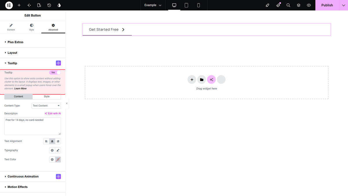
Go to the Advanced tab and open the Tooltip section. Switch Tooltip on, and the Content and Style inner tabs appear beneath it.
Step 3: Choose plain text or rich content
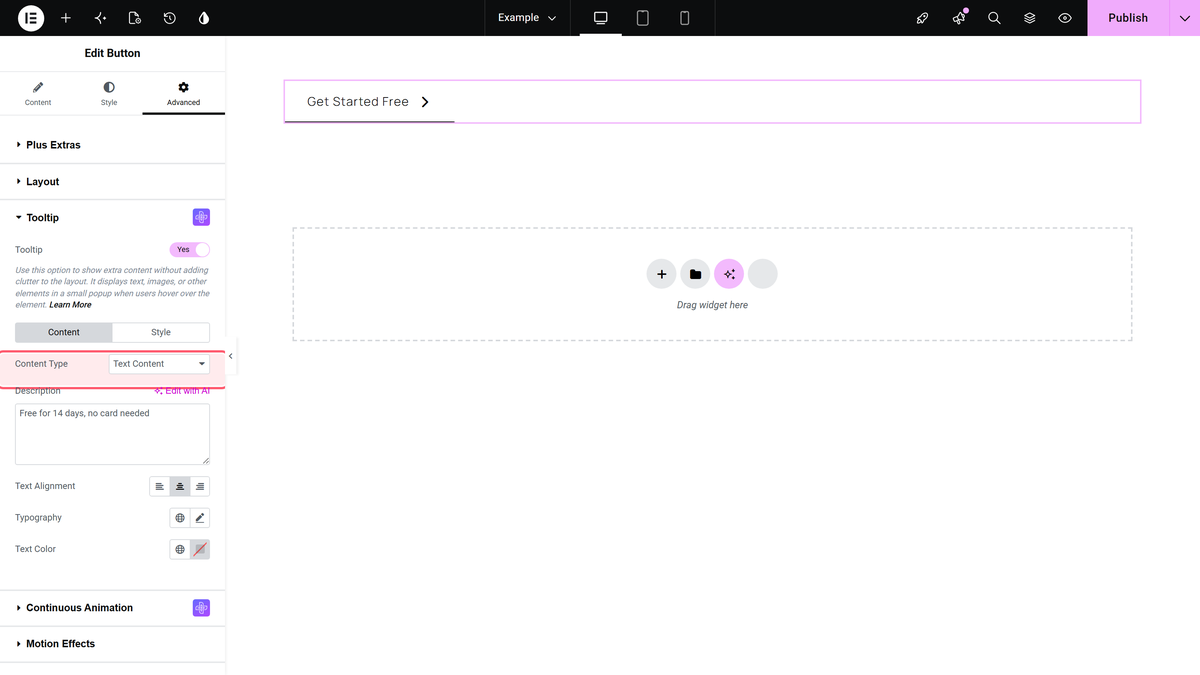
Content Type offers two options. Text Content is a plain textarea — right for a short sentence, and the one to use most of the time. WYSIWYG Editor gives you a full editor, so the tooltip can hold formatting, links, images, video or emoji.
Step 4: Write the tooltip text
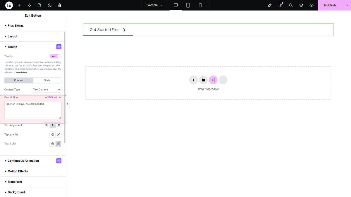
Type what the tooltip should say into Description. It ships with placeholder Latin text, so replace that or your visitors will read it. Keep it to one short sentence — a tooltip that needs two is usually a sign the information belongs on the page instead.
Step 5: Align and style it
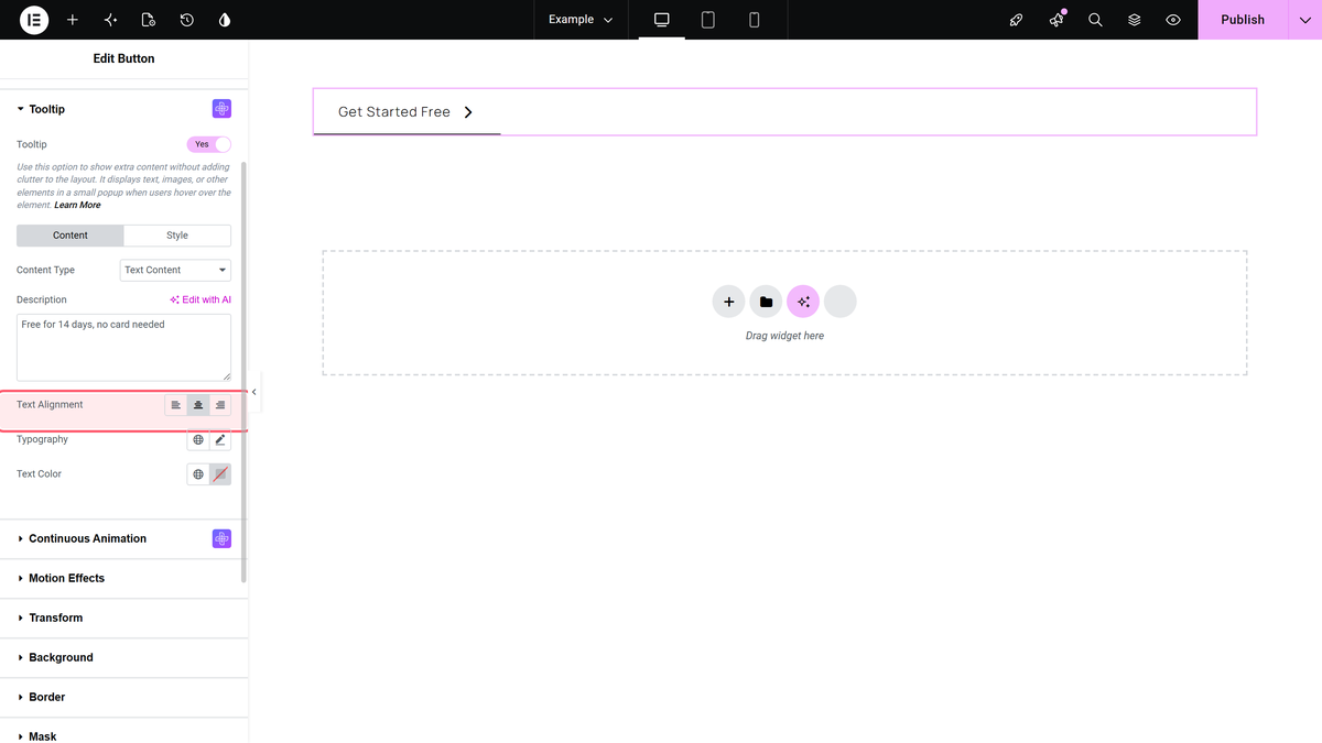
Text Alignment sets how the text sits inside the tooltip — left, center (the default) or right. Text Color and the typography controls sit right below it.
Switch to the Style inner tab for the rest: Tooltip Options holds position, trigger, arrow, animation and the in/out timings, while Style Options holds the background, border, radius, padding and shadow.
What It Looks Like
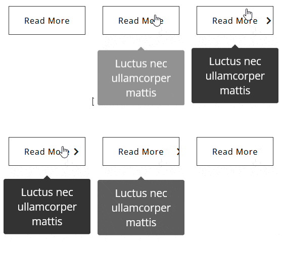
Settings Reference
| Setting | Inner tab | Options | Default |
|---|---|---|---|
| Tooltip | — | On / Off | Off |
| Content Type | Content | Text Content, WYSIWYG Editor | Text Content |
| Description | Content | Plain text | Placeholder text |
| Text Alignment | Content | Left, Center, Right | Center |
| Text Color | Content | Colour | Not set |
| Position | Style > Tooltip Options | Left, Right, Top, Top Start, Top End, Bottom | Top |
| Trigger | Style > Tooltip Options | Hover, Click | Hover |
| Theme | Style > Tooltip Options | Dark, Light, Translucent | Dark |
| Arrows | Style > Tooltip Options | None, Default, Round | Default |
| Animation | Style > Tooltip Options | Shift-Away, Shift-Toward, Fade, Scale, Perspective | Shift-Toward |
| Duration In / Out | Style > Tooltip Options | Milliseconds | 250 / 200 |
| Interactive | Style > Tooltip Options | On / Off | On |
| Background, Border, Radius, Padding, Shadow | Style > Style Options | Standard controls | Not set |
Limitations
- One tooltip per button. The controls are per widget, so a button cannot show two different tooltips.
- Hover is the default trigger, and phones have no hover. On touch devices a hover tooltip generally needs a tap first. If the tooltip carries information the visitor must see, set Trigger to Click, or put the text on the page.
- Placeholder text ships enabled. Turning the tooltip on without editing Description publishes Latin filler.
- It is per widget, not global. To reuse one tooltip across many widgets, see global tooltips in Elementor widgets.
Troubleshooting
I cannot find the Tooltip settings
On Pro they are on the Advanced tab, in the Tooltip section — not under Style > Special. On Free the toggle is under Style > Special and turning it on shows a Pro notice. Older guides pointed everyone at Style > Special, which is only correct for Free.
The tooltip shows Latin placeholder text
The Description field still holds its default. Open Advanced > Tooltip > Content and replace it.
The tooltip is cut off or sits in the wrong place
Change Position under Tooltip Options — a top-positioned tooltip on a button near the top of the viewport has nowhere to go. Reduce the tooltip width, or use the X and Y offset fields to nudge it.
Nothing happens on a phone
The default trigger is Hover, and touch devices do not hover. Set Trigger to Click.
Related Docs
Did you know? You can create a coupon code button to boost sales on your Elementor website.
Also read how to set up global tooltips in Elementor widgets.
- Button widget: settings overview — every control in the widget.
- Change button text on hover in Elementor — a different way to say more on hover.
- Add a button hover animation in Elementor
