Adding a before and after slider to your website can be an effective way to showcase the transformation of a product or service. It allows your audience to visually see the difference and can be a powerful marketing tool.
With the Before After widget from The Plus Addons for Elementor, you can easily add different types of before and after comparison sliders in Elementor.
Required Setup
- Elementor FREE Plugin installed & activated.
- You need to have The Plus Addons for Elementor plugin installed and activated.
- This is a Premium widget, and you need the PRO version of The Plus Addons for Elementor.
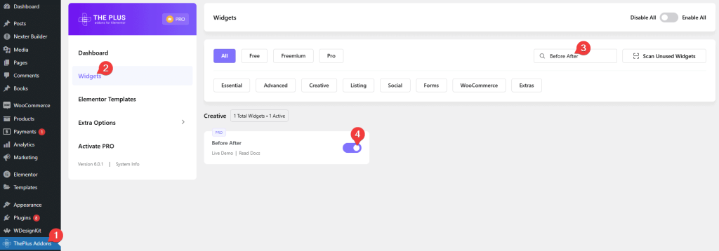
- Make sure the Heading Animation widget is activated, to verify this visit The Plus Addons → Widgets → and Search for Before After and activate.
Learn via Video Tutorial:
How to Activate the Before After Widget?
Go to
- The Plus Addons → Widgets
- Search the widget name and turn on the toggle.
Key Features
- Three Slider Styles – You can select from three different before and after slider styles.
How to Add an Elementor Before and After Slider?
Add the Before After widget from The Plus Addons for Elementor to the page.
Note: By clicking on the Import Presets button, you can import a ready-made design and customize it as per your requirements.
From the Style section, you have to select the slider style. Here you’ll find three options.
- Horizontal – To create a horizontal before and after slider.
- Vertical – To create a vertical before and after comparison slider.
- Opacity – To create a before and after opacity slider.
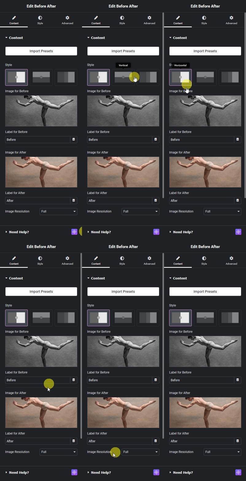
Select the option as per your requirements. Let’s select Horizontal here.
In the Image for Before section, you have to add the before image.
In the Label for Before field, you can add a label for the before image.
Then in the Image for After section, you have to add the after image.
In the Label for After field, you can add a label for the after image.
From the Image Resolution dropdown, you can manage the image size.
How to Style the Before After Widget?
To style the Before After widget, you’ll find all the options under the Style tab.
Content – Here, you’ll find different options to style the before after slider.
- Alignment – Form here, you can align the slider in the container.
- Full Width – By enabling this toggle, you can make the slider full width to its parent container.
- Mouse Hover option – By enabling this toggle, you can move the slider separator line along with the mouse cursor. When disabled you have to click on different parts of the image to move the separator line.
- Separator Line – By enabling this toggle, you’ll get options to style the separator line.
Note: For the Opacity option, you won’t see the Separator Line toggle.
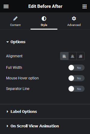
Label Options – From here, you can style the slider labels.
On Scroll View Animation – This is our global extension available for all our widgets, this adds scrolling animation as the widget comes in the viewport. You can learn more about this from here.
Advanced options remain common for all our widget, you can explore all it options from here.

