A client sent me a mood board last spring with exactly one instruction on it: “make it look like it was built by someone with an opinion.” Every reference was the same shape. Thick black outlines, a yellow that hurt slightly, buttons that looked like they had been cut out and glued on. What they were describing, without knowing the word for it, was neo-brutalism.
It is one of the few design trends of the last decade that is genuinely easy to build and genuinely accessible, and it is also the one most likely to be built wrong. The style has a reputation for being sloppy on purpose. That reputation belongs to its predecessor. Neo-brutalism is a set of about three rules, all of them measurable, and this guide covers what they are, which live sites actually run them today, and where the style quietly stops working.
What Neo-Brutalism Actually Is
The name travels through three distinct movements, and conflating them is the most common mistake in writing about this style.
Architectural brutalism came first. The term derives from béton brut, French for raw concrete, and it described mid-century buildings that left their structural materials exposed rather than cladding them. The principle was honesty about construction.
Web brutalism arrived around 2014 and borrowed the attitude without the discipline. Default blue links, Times New Roman, unstyled form controls, deliberately awkward layouts. It was a reaction against the flat, rounded, indistinguishable corporate template, and it was frequently hostile to use.
Neo-brutalism is the third pass, and it is the one that stuck. It keeps the visible structure and the refusal to soften edges, then adds saturated colour, generous type and working affordances. Buttons look like buttons. The result is loud but navigable, which is the whole reason commercial brands adopted it while web brutalism stayed a portfolio curiosity.
Also Read: Y2K Web Design covers the other revival trend of 2026, and the two pair well on the same site.
The Three Rules That Make The Style
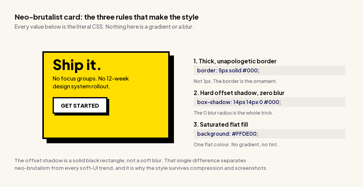
Strip away the colour choices and neo-brutalism is three CSS declarations. Everything else is taste applied on top of them.
1. A Border Thick Enough To Read As Ornament
Neo-brutalist borders run roughly 2px to 5px, and they are almost always a single flat colour, usually near-black. At 1px a border is a hairline that separates two regions. At 4px it becomes a graphic element in its own right, which is the effect the style is after.
2. A Hard Offset Shadow With Zero Blur
This is the detail that does the most work and the one most often got wrong. A conventional shadow uses a blur radius to suggest soft ambient light. A neo-brutalist shadow sets that blur to 0, which produces a solid shape offset from the element rather than a gradient beneath it. It reads as a printed drop shadow or a sticker, not as depth.
/* conventional soft shadow */
box-shadow: 0 4px 12px rgba(0, 0, 0, 0.12);

/* neo-brutalist hard shadow: note the 0 blur */
box-shadow: 6px 6px 0 #000;
3. Flat, Saturated Fills
One colour per surface, no gradient and no tint. The palette skews to high-chroma yellows, lime greens, cyans and hot pinks against white or a warm off-white page. Because each fill is flat, the border and shadow stay legible on top of it, which is not true once you introduce a gradient.
.card {
  background: #FFDE00;
  border: 4px solid #000;
  box-shadow: 6px 6px 0 #000;
  border-radius: 6px;   /* 0 to 8px. Anything more reads as a different style */
  padding: 24px;
}
Radius is the one genuinely contested value. A hard 0 reads as closer to true brutalism, while 4px to 8px is what most current component libraries ship. Beyond about 12px the style starts to read as generic playful-startup instead.
Which Live Sites Actually Run Neo-Brutalism
Trend articles about this style recycle the same list of brands, so rather than repeat it, I fetched the served HTML and CSS of each commonly cited site and grepped for the signature hard-offset shadow. The results were not what the listicles claim. All three checks below were run on 3 September 2026.
| Site | Hard-offset shadow found in served CSS | Verdict |
|---|---|---|
| neobrutalism.dev | box-shadow:4px 4px 0 0 rgba(0,0,0,1), plus 218 occurrences of the border-2 and border-4 utilities | Confirmed. A component library built specifically for the style. |
| feastables.com | box-shadow: 6px 6px 0 #000 and box-shadow: 6px 6px 0 #fff | Confirmed. A mainstream consumer brand running the pattern in production, including the inverted white shadow for dark surfaces. |
| gumroad.com | Zero box-shadow declarations of any kind in the served HTML | Not confirmed. Gumroad is the single most cited neo-brutalism example and its current homepage does not use the technique. |
That last row is worth dwelling on. Gumroad is named in almost every article about this trend, and its homepage today serves no box shadows at all. Sites redesign, and trend lists rarely re-check. If you are building a case for this style internally, verify your reference sites yourself before you present them, because at least one of the canonical examples has moved on.
The more useful signal is feastables.com, which shows the pattern surviving contact with a real commercial catalogue, and the existence of a dedicated component library, which tells you the style has stabilised enough to be systematised.
The Accessibility Argument Nobody Makes
Neo-brutalism is usually defended on taste. The stronger argument is measurable, and it is the inverse of what most people assume about a loud style.
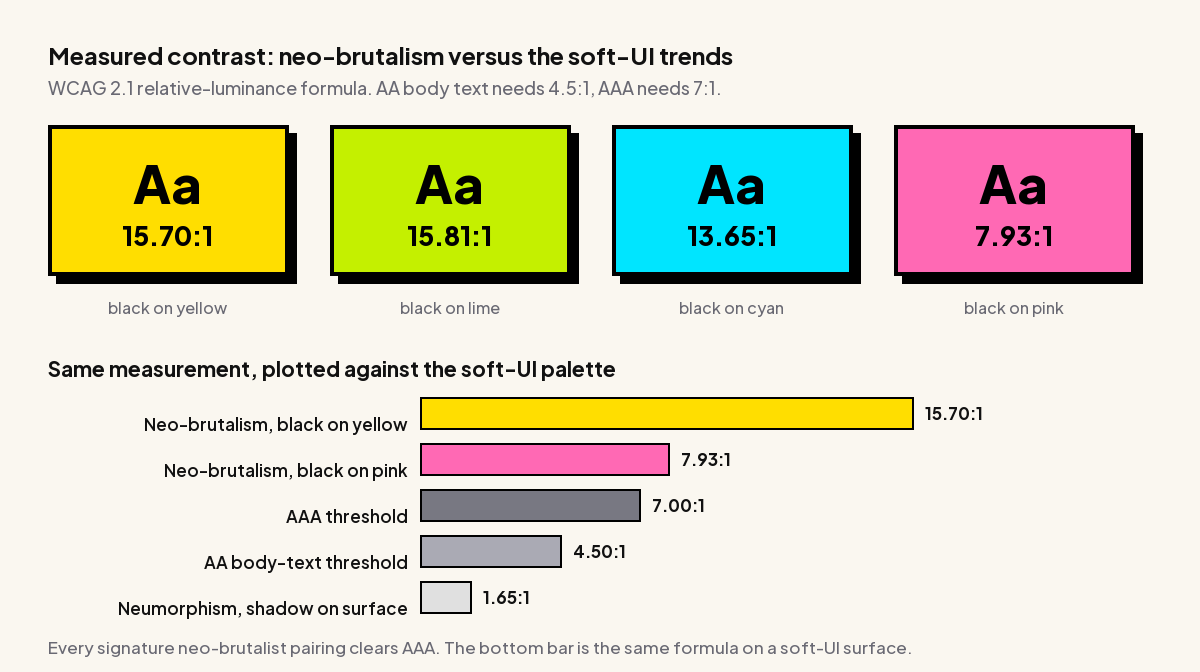
I ran the WCAG 2.1 relative-luminance formula over the signature neo-brutalist pairings. WCAG sets 4.5:1 as the minimum for normal body text at level AA, 3:1 for large text and non-text elements, and 7:1 for level AAA.
| Pairing | Contrast ratio | WCAG AA (4.5:1) | WCAG AAA (7:1) |
|---|---|---|---|
Black on white card #000 / #FFFFFF | 21.00:1 | Pass | Pass |
Black border on off-white page #000 / #FAF7F0 | 19.63:1 | Pass | Pass |
Black on lime #000 / #C4F000 | 15.81:1 | Pass | Pass |
Black on yellow #000 / #FFDE00 | 15.70:1 | Pass | Pass |
Black on cyan #000 / #00E5FF | 13.65:1 | Pass | Pass |
Black on hot pink #000 / #FF69B4 | 7.93:1 | Pass | Pass |
For comparison: neumorphic shadow on its surface #E0E0E0 / #A3B1C6 | 1.65:1 | Fail | Fail |
The weakest pairing in the set, black on hot pink, measures 7.93:1 and still clears AAA. The strongest measures 21:1, the theoretical maximum. For contrast, the soft-UI trends that dominated the preceding few years work by making a surface and its shadow nearly the same luminance, which is why a neumorphic control lands near 1.65:1 and cannot meet even the 3:1 non-text minimum.
That gap is roughly a factor of ten. A style built on flat black on saturated colour is, by construction, hard to make inaccessible on the colour axis.
Also Read: Neumorphism in 2026 documents the opposite case, where the entire aesthetic depends on contrast too low to pass WCAG.
Where It Still Fails Accessibility
Colour contrast is one criterion out of many, and passing it emphatically does not make a design accessible. Three real failure modes:
- Focus states get eaten. A 4px black border around everything means the default browser focus ring often lands on top of an existing black outline and becomes invisible. Set an explicit
:focus-visiblestyle in a contrasting colour, and do not rely on the border to communicate focus. - Large saturated fields are tiring. High chroma across a full viewport is uncomfortable for extended reading, and can be a trigger for some readers with visual sensitivities. Keep the loud fills on cards, headers and controls rather than behind body copy.
- Text on the shadow colour. The one pairing that reliably fails is white or light text placed on a mid-tone saturated fill. Black text is doing the work here. Do not invert it without measuring.
/* the focus state the style tends to swallow */
.btn:focus-visible {
  outline: 3px solid #0044FF;
  outline-offset: 3px;   /* clears the existing 4px black border */
}
The Signature Interaction: A Collapsing Shadow
Static neo-brutalism is easy. What makes a build feel authentic is the hover and active state, and there is a specific convention: the element moves into its own shadow rather than fading or glowing.
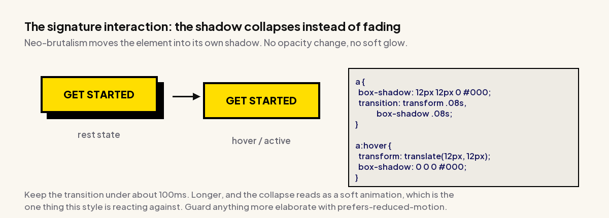
The trick is that the translate distance equals the shadow offset. Move the element 6px right and 6px down while removing a 6px 6px shadow, and it lands precisely where the shadow was.
.btn {
  box-shadow: 6px 6px 0 #000;
  transition: transform 80ms ease, box-shadow 80ms ease;
}

.btn:hover,
.btn:focus-visible {
  transform: translate(3px, 3px);
  box-shadow: 3px 3px 0 #000;   /* half-press */
}

.btn:active {
  transform: translate(6px, 6px);
  box-shadow: 0 0 0 #000;       /* fully seated */
}

@media (prefers-reduced-motion: reduce) {
  .btn { transition: none; }
}
Keep the transition at or under about 100ms. Longer and the collapse reads as a soft eased animation, which is the exact quality the style is reacting against. The prefers-reduced-motion guard matters more than it looks: the transform is a position change, and position changes are the category of motion that most affects readers with vestibular sensitivity.
Building Neo-Brutalism In Elementor
Nothing here needs a plugin. The whole style is border, box-shadow and background-color, and all three are native Elementor controls. Two practical notes for building it in the editor.
The Box Shadow Control Needs Its Blur Zeroed
Elementor’s Box Shadow control defaults to a blurred shadow, and the blur slider is the field you have to change. Open the shadow settings and set Blur to 0, Spread to 0, then set Horizontal and Vertical to the same positive value, commonly 4 to 8. Leaving even 2px of blur is the difference between the style reading as intentional and reading as a mistake.
Hover States Are Per-Widget, Which Gets Repetitive Fast
Elementor exposes hover styling per widget, so a page of twenty neo-brutalist buttons means twenty identical hover configurations. Two ways around it. Either define the transform and shadow once in a global custom-CSS block scoped to a class you add to each widget, or use a widget set that carries the hover behaviour with it.
The Plus Addons for Elementor is useful here for the second route. Its button, card and image-box widgets expose hover transform and shadow together in one panel, so the press interaction is configured once per widget type rather than rebuilt by hand, and its Custom CSS field lets you scope the shared class without touching the theme.
Also Read: CSS Hover Effects in Elementor walks through the hover and transform controls this build depends on.
Where Neo-Brutalism Stops Working
The style has a narrower useful range than its current popularity suggests. Four places it reliably underperforms:
- Long-form reading. Heavy borders and saturated blocks fragment a page into competing regions, which is the opposite of what sustained reading needs. Documentation sites and editorial almost never survive it below the header.
- Categories where trust is the conversion. Financial services, healthcare and legal all convert on perceived seriousness. A style whose entire signal is irreverence works against that, and no amount of execution quality fixes the mismatch.
- Dense data. Tables, dashboards and admin interfaces need low visual noise so the data carries the emphasis. Give every cell a 4px border and the chrome outshouts the numbers.
- Sites with an existing brand system. Neo-brutalism is not a skin you can apply to an established palette. It requires high-chroma colour and near-black outlines, so a brand built on muted tones has to change its palette to adopt it, which is a brand decision rather than a design one.
It works best where personality is the product: creator tools, consumer brands aimed at a younger audience, launch and campaign pages, portfolios, and developer tooling that wants to signal it is not enterprise software.
Should You Use It
Use it if your site converts on personality, if you can commit to the palette rather than bolting it onto an existing one, and if the bulk of your content is short-form. Skip it if you sell trust, if your primary surface is long text or dense data, or if you cannot change your brand colours.
If you do build it, the three things that separate a convincing implementation from a cargo-culted one are: zero blur on every shadow, a translate distance that exactly matches the shadow offset on press, and an explicit focus-visible style so the thick borders do not swallow keyboard focus. Everything else is colour choice.
And the measurement is worth keeping in your back pocket. When someone objects that a loud style must be an accessibility problem, the lowest-contrast pairing in the entire palette still clears WCAG AAA at 7.93:1. That is a stronger position than most restrained designs can defend.
Suggested Reading
- Neumorphism in 2026: Soft UI for WordPress, the trend at the opposite end of the contrast scale.
- Claymorphism: The Soft 3D UI Trend, for the third member of the depth-effect family.
- Glassmorphism in Elementor, which shares the layered-surface problem but solves it with blur.
- Y2K Web Design, the other 2026 revival, and a natural companion on the same project.
- Bento Grid Layouts, the layout system neo-brutalist cards sit in most comfortably.