The first time I shipped a scroll-snapping landing page, it worked perfectly on my monitor and trapped every mobile visitor on section three. The section was taller than a phone viewport, scroll-snap-type was set to mandatory, and the browser kept dragging readers back to a snap point they had already scrolled past. It took an embarrassing amount of time to work out that the bug was one keyword.
CSS Scroll Snap replaces most of what carousel libraries used to do, in about six lines and with no JavaScript. It also has two or three traps that are not obvious until a real page hits a real device. This guide is the property reference, two recipes I actually use, and the specific mistakes worth avoiding.
What CSS Scroll Snap Does
Scroll snap lets you define positions that a scroll gesture comes to rest on. Instead of a scroll ending wherever momentum happens to stop, the browser settles onto the nearest position you nominated. That gives you full-page section decks, card carousels that align properly, and image galleries that centre each item, all with native scrolling.
The important part is what it removes. Native scroll snap keeps the browser’s own scroll physics, momentum, scrollbar, keyboard behaviour and accessibility semantics. A JavaScript carousel replaces all of that with a reimplementation, which is where most carousel bugs and most carousel accessibility failures come from.
Browser Support Is Effectively Universal
Per caniuse, CSS Scroll Snap sits at 96.51% full support plus 0.29% partial, for 96.8% of tracked global usage. Full support landed in Chrome 69, Edge 79, Safari 11, Firefox 68, Opera 64 and Samsung Internet 10.1. Opera Mini is the only current browser with no support.
The practical read: this needs no fallback strategy. Without support, a snap container is just a normal scrolling container, which is a working experience rather than a broken one.
The Property Reference
Scroll snap splits across two elements, and mixing them up is the second most common mistake after the mandatory trap. Some properties go on the scroll container, others on the children.
| Property | Goes on | Values | What it does |
|---|---|---|---|
scroll-snap-type | Container | none | x | y | both, plus mandatory | proximity | Turns snapping on, sets the axis, and sets how strictly the browser must obey. |
scroll-snap-align | Child | none | start | center | end | Which edge of the child aligns to the scrollport. Accepts two values for block and inline axes. |
scroll-snap-stop | Child | normal | always | With always, a fast fling cannot skip past this child. |
scroll-padding | Container | Any length, plus the usual longhands and logical variants | Insets the snap area, so a sticky header does not cover the snapped content. |
scroll-margin | Child | Any length, plus longhands and logical variants | Adjusts one child’s own snap area without changing the container. |
overscroll-behavior | Container | auto | contain | none | Stops a scroll from chaining to the parent once the container hits its end. |
Two properties do almost all the work: scroll-snap-type on the container and scroll-snap-align on the children. Nothing snaps until both are present, which is the most common reason a first attempt does nothing at all.
Mandatory Versus Proximity: The Decision That Breaks Pages
This single keyword is the difference between a page that feels deliberate and a page that traps people.
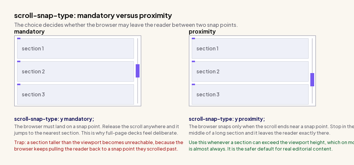
mandatory
The scroll container must always come to rest on a snap point. Release the scroll anywhere and the browser animates to the nearest one. This produces the crisp full-page deck effect, and it is the right choice when every section is guaranteed to fit the viewport.
The trap: if any section is taller than the viewport, its content below the fold becomes unreachable. The reader scrolls down, the gesture ends, and the browser pulls them back to the section’s snap point. Content exists on the page and cannot be read. This is the bug I shipped, and it appears on mobile first because viewports are shortest there while content is tallest.
proximity
The browser snaps only when a scroll ends near a snap point, and otherwise leaves the reader wherever they stopped. Sections taller than the viewport behave like normal content, and short sections still snap.
Use proximity as the default for anything with real editorial content. Reserve mandatory for cases where you control the height of every child, which in practice means fixed-height card carousels rather than full-page sections.
/* safe for content of unknown height */
.deck { scroll-snap-type: y proximity; }

/* only when every child is guaranteed to fit the viewport */
.deck { scroll-snap-type: y mandatory; }
If you do want mandatory full-page sections, guard it so that it only applies when there is vertical room, and let short viewports fall back to normal scrolling:
@media (min-height: 700px) {
  .deck { scroll-snap-type: y mandatory; }
}
Where The Card Comes To Rest
scroll-snap-align goes on the children and decides which of their edges lines up with the scrollport.
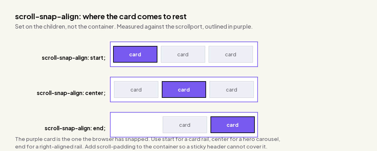
startaligns the child’s leading edge with the scrollport’s leading edge. This is what you want for a horizontal rail of cards, and for vertical full-page sections.centercentres the child in the scrollport. Correct for a hero carousel showing one item at a time, and for galleries where the active item should be visually dominant.endaligns trailing edges. Genuinely useful mostly for right-aligned rails and right-to-left layouts.
You can pass two values, block axis first, which matters for a grid that snaps on both axes: scroll-snap-align: center start;
Recipe One: Full-Page Vertical Sections
The classic scrolling deck. Note the proximity keyword and the min-height rather than a fixed height, which together prevent the trapping bug.
.deck {
  height: 100dvh;              /* dvh, not vh: accounts for mobile browser chrome */
  overflow-y: auto;
  scroll-snap-type: y proximity;
  scroll-behavior: smooth;
}

.deck > section {
  min-height: 100dvh;          /* min-height lets tall content grow */
  scroll-snap-align: start;
  display: grid;
  place-content: center;
}

@media (prefers-reduced-motion: reduce) {
  .deck { scroll-behavior: auto; }
}
Three details that are easy to miss. 100dvh rather than 100vh, because vh on mobile measures the viewport as if browser chrome were hidden and produces a section slightly taller than the visible area. min-height rather than height, so a section with more content expands instead of clipping. And scroll-behavior: smooth needs the reduced-motion guard, because a full-viewport animated scroll is exactly the motion that causes problems for readers with vestibular sensitivity.
Also Read: Scroll Animations in Elementor covers the scroll-triggered effects that pair with a snapping deck.
Recipe Two: A Horizontal Card Carousel
This is the pattern that replaces a JavaScript carousel outright, and the one where mandatory is genuinely safe, because you control the card width.
.rail {
  display: flex;
  gap: 1rem;
  overflow-x: auto;
  scroll-snap-type: x mandatory;
  overscroll-behavior-x: contain;   /* do not trigger browser back-swipe */
  scroll-padding-left: 1rem;
  scrollbar-width: thin;
}

.rail > .card {
  flex: 0 0 min(320px, 80%);        /* peek the next card on mobile */
  scroll-snap-align: start;
  scroll-snap-stop: always;         /* a fling cannot skip cards */
}
overscroll-behavior-x: contain is the line most people omit and then get bug reports about. Without it, reaching the end of a horizontal rail on a touchpad or trackpad can chain the gesture to the browser’s own back-navigation. Readers swipe through a carousel and leave the page.
scroll-snap-stop: always is the other quiet improvement. By default a fast fling can travel several cards. With always, each card is a hard stop, so the rail moves one item per gesture, which is how people expect a carousel to behave.
The min(320px, 80%) basis deliberately leaves part of the next card visible. That sliver is the only affordance telling a reader there is more content sideways, and rails that fit their cards exactly to the viewport routinely get missed entirely.
Scroll Padding: The Sticky-Header Fix
If your site has a sticky header, a snapped section will slide underneath it and the first line of every heading will be hidden. scroll-padding on the container fixes it by insetting the snap area.
:root { --header-h: 72px; }

.deck {
  scroll-snap-type: y proximity;
  scroll-padding-top: var(--header-h);
}
This also fixes in-page anchor links, which have the same problem for the same reason, so it is worth setting on html site-wide even without scroll snap. Use scroll-margin-top on an individual element when only one target needs the offset.
Also Read: Sticky Header in Elementor is the other half of this fix if your header is built in Elementor.
The Accessibility Traps
Scroll snap inherits native scrolling, which starts it well ahead of a JavaScript carousel. Two problems still need handling.
A Scrollable Region Needs To Be Keyboard Reachable
A div with overflow: auto is scrollable by mouse and touch but is not in the tab order, so a keyboard-only reader cannot reach or scroll it. Adrian Roselli documents this in Keyboard-Only Scrolling Areas, which MDN links from its own scroll snap documentation.
The fix is to make the container focusable and label it, so it is announced as a region and can be scrolled with arrow keys:
<div class="rail" tabindex="0" role="group" aria-label="Featured products">
  ...cards...
</div>
Firefox is the exception that makes this less critical than it sounds, because it puts scrollable regions in the tab order automatically. Chrome and Safari do not, so the tabindex="0" is doing real work for most of your readers.
Do Not Hide The Scrollbar
It is tempting to hide the scrollbar on a card rail for a cleaner look. The scrollbar is the primary signal that a region scrolls at all, and removing it means a reader has to guess. If you must style it, keep it visible with scrollbar-width: thin rather than removing it, and provide visible previous and next controls as an alternative affordance.
Using Scroll Snap With Elementor
Elementor has no scroll-snap control, so this goes in through CSS. The approach that survives template updates is to add a class to the container in the editor and target it from a single stylesheet rather than styling individual widgets.
Set a CSS class on the section or container under Advanced, for example deck, then apply the container rules to .deck and the child rules to its immediate children. Doing it this way means the snap behaviour survives if the inner widgets are rebuilt.
One Elementor-specific gotcha: if the snapping container is not the page scroller, it needs an explicit height and its own overflow-y: auto. Elementor containers default to height auto, so a scroll-snap rule on them does nothing until a height exists. This is the single most common reason scroll snap appears not to work inside a page builder.
The Plus Addons for Elementor is worth a look if you would rather not hand-write the rail at all. Its carousel and slider widgets give you the per-view counts, peek offsets and navigation controls as editor settings, which covers the cases where you want visible previous and next buttons alongside the snapping behaviour.
Also Read: Image Carousel in Elementor is the widget route if you want controls and pagination without writing CSS.
When Not To Use Scroll Snap
- Long-form articles. Snapping fights the reader’s own sense of pace. Editorial content should scroll freely.
- Anything with sections of unpredictable height, if you were planning to use
mandatory. Useproximity, or do not snap. - Content that must be printable or linkable mid-section. A snapping container that is not the document scroller complicates both.
- As a substitute for pagination on large sets. A rail of eighty cards is still eighty cards in the DOM. Snap is a presentation choice, not a loading strategy.
Suggested Reading
- Scroll Animations in Elementor, for the effects that trigger as each section snaps into view.
- Image Carousel in Elementor, the widget-based alternative to a hand-built rail.
- Bento Grid Layouts, which pairs well with a snapping horizontal rail on the same page.
- Masonry Grid: CSS Versus Elementor, the same build-it-yourself versus use-the-widget decision for a different layout.
- Fixing Elementor Hero Image LCP, because a full-viewport first section is almost always your LCP element.