I added skeleton screens to a client dashboard two years ago because everyone said they made pages feel faster. Nothing about the actual load time changed. When I finally went looking for the research behind the claim, I found a controlled study that reported the opposite of what I had assumed, and it had been sitting there since 2017.
Skeleton screens are worth building. The reason is not the one that gets repeated, though, and getting that reason right changes how you build them. This covers what the evidence actually says, the CSS for a skeleton that earns its place, and the specific geometry rule that decides whether it helps or hurts.
What A Skeleton Loading Screen Is
A skeleton screen is a low-fidelity placeholder that mirrors the shape of the content still loading. Grey blocks where the image will be, grey bars where the headline and body text will be, sized and positioned to match the real thing.
It sits between two older patterns. A spinner says something is happening but nothing about what. A fully rendered page with empty values says nothing is happening. A skeleton communicates structure before content, which is a genuinely different message.
What The Research Actually Found
The conventional claim is that skeleton screens reduce perceived wait time. The most-cited controlled test of that claim found the reverse.
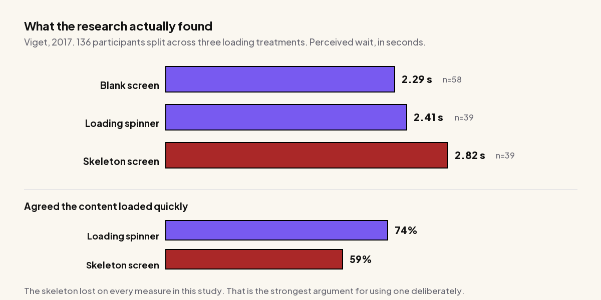
Viget ran a study with 136 participants split across three loading treatments and measured how long people thought they had waited. The results, published in A Bone to Pick with Skeleton Screens:
| Treatment | Participants | Average perceived wait | Agreed content “loaded quickly” | Task completion |
|---|---|---|---|---|
| Blank screen | 58 | 2.29 s | not reported | 9.50 s |
| Loading spinner | 39 | 2.41 s | 74% | 9.49 s |
| Skeleton screen | 39 | 2.82 s | 59% | 10.54 s |
The skeleton group perceived the longest wait, were least likely to agree the content loaded quickly at 59% against the spinner’s 74%, and were slowest to complete the task afterwards at 10.54 seconds against roughly 9.5 for the other two. The authors’ own conclusion was that skeleton screens “aren’t a silver bullet for increasing perceived performance and should be used thoughtfully.”
Their hypothesis for why is worth taking seriously: a skeleton is novel, so it attracts attention, and attention to a wait makes the wait feel longer. Their suggestion was that skeletons work better in familiar interfaces, where the reader already knows the shape being filled in, and where the wait is genuinely short.
The Contrary Evidence
This is not settled. A separate academic study, The Effect of Skeleton Screens: Users’ Perception of Speed and Ease of Navigation, reported that pages using skeleton screens scored higher on both perceived speed and ease of navigation. The same work also found that people using pages with spinners were faster at finding articles on a first visit.
Two studies pointing different directions on perceived speed, and both finding that spinners do better on first-visit task performance. The honest summary is that perceived speed is not a reliable reason to build a skeleton screen. Which leaves the question of what is.
The Real Reason To Use One: Layout Stability
Skeletons have a measurable benefit that has nothing to do with perception. They reserve space, and reserved space does not shift.
Cumulative Layout Shift is a Core Web Vital. Per web.dev, a good CLS score is 0.1 or less, above 0.25 is poor, and the measurement to optimise is the 75th percentile of page loads, segmented across mobile and desktop. Content arriving into unreserved space is one of the largest contributors to a bad score.
A correctly built skeleton makes that impossible. The box is already the right size before the content lands, so nothing below it moves. That is a real, measurable engineering benefit, and it is the one that justifies the work.
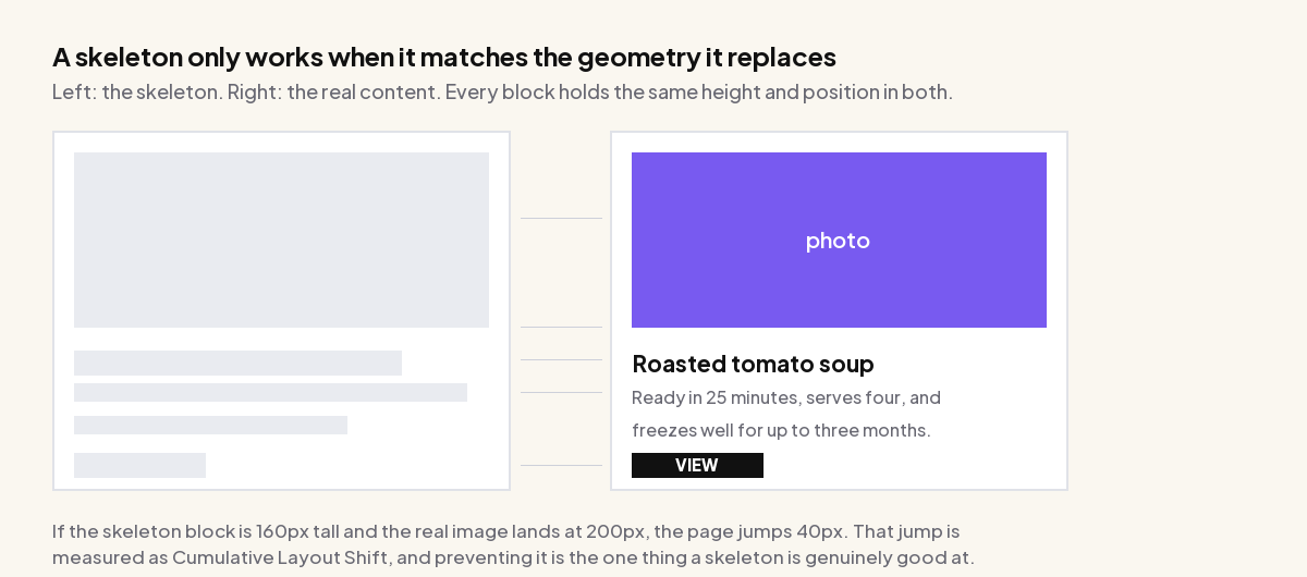
This reframes the build requirement completely. If the goal were perceived speed, an approximate skeleton would be fine. Because the goal is layout stability, the skeleton has to match the real content geometry exactly. A skeleton block 160px tall replaced by a 200px image shifts the page 40px and produces the layout shift you were trying to prevent, while also having drawn attention to the wait. That is the worst of both outcomes, and it is the most common way skeletons are implemented.
Also Read: Elementor and Core Web Vitals covers the other CLS sources on a typical page, which usually outweigh this one.
How Long A Wait Justifies A Skeleton
Jakob Nielsen’s three response time limits have held for decades and they answer this directly:
| Threshold | What it means | What to show |
|---|---|---|
| 0.1 second | The limit for the user to feel the system reacted instantaneously. | Nothing. Any placeholder is a regression. |
| 1.0 second | The limit for the user’s flow of thought to stay uninterrupted, though they notice the delay. | Still nothing, or the lightest possible feedback. |
| 10 seconds | The limit for keeping attention on the task. Beyond it, users switch to something else. | A percent-done indicator, plus an estimate of completion. |
Nielsen Norman Group’s guidance on progress indicators adds the practical middle: use an indicator for any action over about 1.0 second, reserve looped animations such as spinners for waits of 2 to 10 seconds, and use percent-done indicators for anything longer.
Read against the skeleton research, this gives a fairly narrow useful window. Under a second, a skeleton flashes and is pure noise. Past ten seconds, a skeleton is the wrong tool because it communicates no progress at all. The case for a skeleton is roughly 1 to 10 seconds, on a layout whose shape you can reproduce exactly, and its main job in that window is holding the layout still.
Always Set A Minimum Display Time
The flash problem is real and worth guarding against. If data returns in 200ms, a skeleton that appears and vanishes reads as a glitch. Either delay showing it, or guarantee a minimum duration once shown.
/* CSS-only guard: do not paint the skeleton for the first 300ms */
.skeleton {
  animation: shimmer 1.4s ease-in-out infinite,
             appear 0s linear 300ms forwards;
  opacity: 0;
}

@keyframes appear { to { opacity: 1; } }
The CSS For A Skeleton Screen
A skeleton needs no library. It is a background colour, a border radius and one optional animated gradient.
The Base Block
.skeleton {
  background-color: #e9ebf0;
  border-radius: 4px;
  /* the important part: an explicit size that matches the real content */
}

.skeleton-title  { height: 22px; width: 70%; }
.skeleton-line   { height: 16px; width: 100%; margin-block-start: 12px; }
.skeleton-line:last-of-type { width: 62%; }   /* ragged last line reads as text */
.skeleton-thumb  { aspect-ratio: 16 / 9; }    /* not a fixed height */
Two choices there do most of the work. Using aspect-ratio rather than a fixed height means the placeholder scales with its container and keeps matching the real image at every breakpoint, which is what actually prevents the shift on mobile. Making the last text line shorter is a small thing that makes a group of bars read as a paragraph rather than a table.
The Shimmer
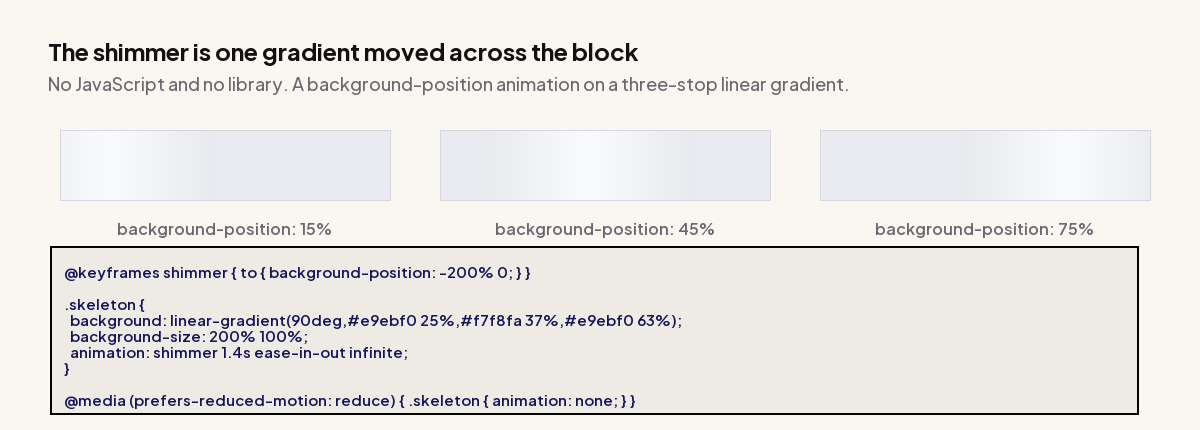
@keyframes shimmer {
  to { background-position: -200% 0; }
}

.skeleton {
  background-image: linear-gradient(
    90deg,
    #e9ebf0 25%,
    #f7f8fa 37%,
    #e9ebf0 63%
  );
  background-size: 200% 100%;
  animation: shimmer 1.4s ease-in-out infinite;
}

@media (prefers-reduced-motion: reduce) {
  .skeleton { animation: none; }
}
The background-size: 200% 100% is what makes it work. The gradient is twice the width of the block, so moving background-position from its default to -200% sweeps the light band across and off. Animating background-position is compositor-friendly, so this does not cause layout or paint work per frame.
The reduced-motion guard is not optional here. An infinite looping animation is precisely what prefers-reduced-motion exists for, and a static grey block loses nothing that matters, given the evidence that the animation is not buying you perceived speed anyway.
Accessibility: Announce The Wait
A grid of grey rectangles is invisible to a screen reader, which means the reader gets silence while sighted readers get feedback. Mark the region as busy and give it a live label.
<div class="card" aria-busy="true" aria-live="polite" aria-label="Loading results">
  <div class="skeleton skeleton-thumb"></div>
  <div class="skeleton skeleton-title"></div>
  <div class="skeleton skeleton-line"></div>
</div>
Set aria-busy="false" when the content arrives. Also make sure the placeholder blocks themselves are not focusable and carry no text, so a keyboard reader does not tab into a set of empty boxes.
Skeleton Screens On A WordPress Or Elementor Site
Worth being clear about scope. On a conventional server-rendered WordPress page, there is no skeleton phase to speak of, because the HTML arrives with its content already in it. A skeleton is for content that loads after the initial render.
That narrows it to a few real cases: an AJAX-loaded post grid or load-more button, a filtered product listing, an infinite-scroll feed, a dynamically loaded tab panel, or content fetched from an external API. If your page has none of those, a skeleton has nothing to do, and a preloader covering the initial page load is a different pattern solving a different problem.
Also Read: Best WordPress Preloader Plugins covers that initial-page-load pattern, which is often what people actually want.
Where you do have async content, the same geometry rule applies and Elementor makes it slightly easier to get wrong, because widget heights are often content-driven. Set an explicit min-height or aspect-ratio on the container that will receive the content, so the reserved space is real.
The Plus Addons for Elementor is relevant for the listing case specifically. Its dynamic listing and post-grid widgets handle the AJAX filtering and load-more behaviour that creates a skeleton phase in the first place, and because the grid geometry is set in the widget rather than derived from content, the placeholder size you reserve stays correct across breakpoints.
The Short Version
- Do not build a skeleton for perceived speed. The best-known controlled study found a skeleton produced a longer perceived wait than both a spinner and a blank screen, at 2.82 seconds against 2.41 and 2.29.
- Do build one for layout stability. Reserved space cannot shift, and CLS at the 75th percentile needs to stay at or under 0.1.
- Match the real geometry exactly. Use
aspect-ratiorather than fixed heights. A mismatched skeleton causes the shift it was meant to prevent. - Only in the 1 to 10 second window. Below that it flashes, above it you need a real progress indicator.
- Guard the animation and announce the wait.
prefers-reduced-motionplusaria-busy.
The pattern is fine. The reasoning behind it usually is not, and since the reasoning determines whether you match the geometry, it is worth getting right before you write the CSS.
Suggested Reading
- Elementor and Core Web Vitals, for the CLS sources that usually matter more than this one.
- Best WordPress Preloader Plugins, the initial-page-load pattern this is often confused with.
- Fixing Elementor Hero Image LCP, the other Core Web Vital a loading strategy affects.
- When an Elementor Page Loads Unstyled, a related first-paint problem with a different cause.
- Cleaning Up a Bloated Elementor Site, which addresses the load times a skeleton only disguises.