I rebuilt a client’s features section three times last month before I worked out what was wrong. They wanted the layout every product page seems to have now: one big tile carrying the headline feature, a couple of medium ones, a few small ones, all locked into a tidy rectangle. I kept building it as a flex row with different widths, and it kept falling apart the moment the copy in one tile ran two lines longer than the others.
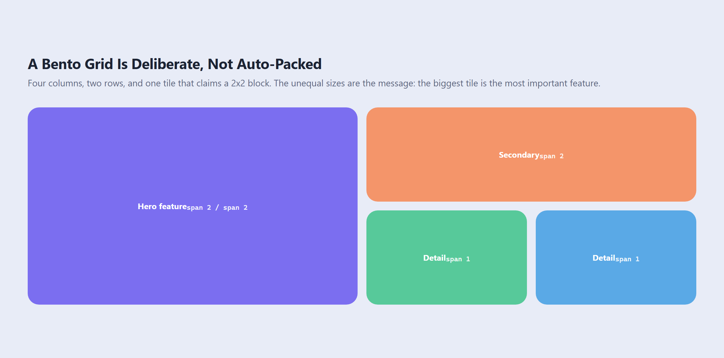
The layout has a name. It is a bento grid, after the Japanese lunchbox divided into compartments of different sizes that still add up to one neat box. And the reason my flex version kept breaking is that a bento grid is not a row of boxes. It is a grid where specific tiles deliberately claim more than one cell, and CSS has a property built for exactly that which almost nobody reaches for first.
What Makes a Grid “Bento” (and How It Differs From Masonry)
The two get confused constantly, and the difference is not cosmetic. It changes which CSS you write.
A masonry layout is automatic. You hand the browser a pile of items of unpredictable height and it packs them into columns as tightly as it can. You do not decide where any single item lands, and you do not want to, because the content changes.
A bento grid is the opposite. It is designed. The tile sizes carry meaning: the biggest tile is the most important feature, and you chose that. A bento grid has a fixed number of cells, and each tile is assigned to a specific region of it. If your content is genuinely unpredictable, you want masonry. If you are laying out six known features and one of them matters most, you want bento.
Also Read: if your items really do have unpredictable heights, masonry grid with native CSS Grid lanes vs Elementor covers the auto-packing route and where native masonry stands today.
The Named Area Map: grid-template-areas
This is the property that makes bento layouts pleasant to write instead of fiddly. Rather than telling each tile which grid lines to sit between, you draw the layout as text on the parent and let each tile claim a name.
.bento {
  display: grid;
  grid-template-columns: repeat(4, 1fr);
  grid-template-rows: 200px 200px 200px;
  gap: 14px;
  grid-template-areas:
    "hero  hero  feat  feat"
    "hero  hero  side  chip"
    "stats stats stats chip";
}

.hero  { grid-area: hero;  }
.feat  { grid-area: feat;  }
.side  { grid-area: side;  }
.chip  { grid-area: chip;  }
.stats { grid-area: stats; }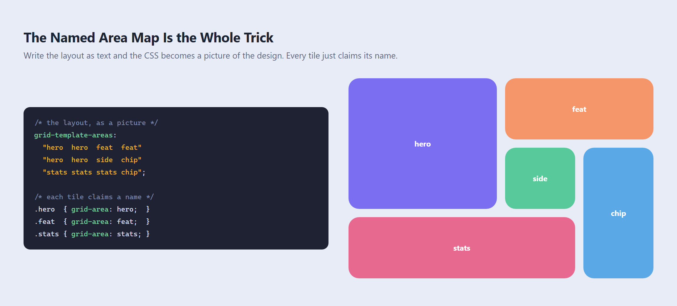
Read those three strings and you can see the finished page. The hero occupies a two by two block in the top left. The chip tile runs down the right edge across rows two and three. Nothing anywhere else in your stylesheet needs to know a single grid line number.
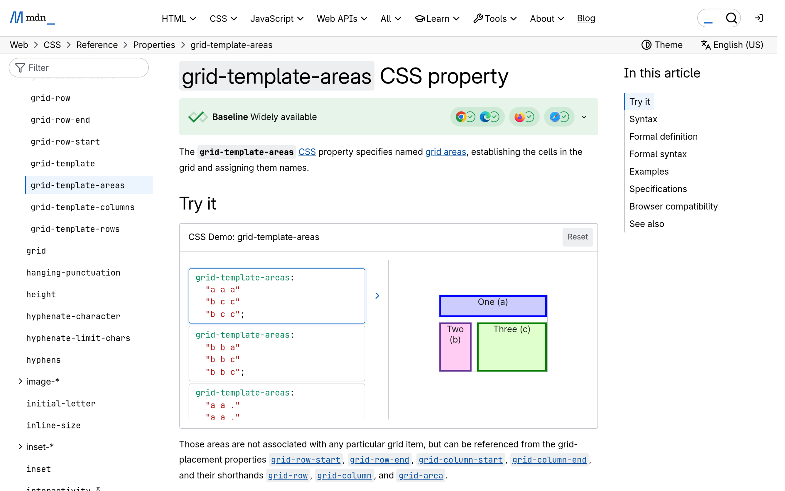
MDN describes the mechanic plainly: “Multiple cell tokens with the same name within and between rows create a single named grid area that spans the corresponding grid cells.”
The Rectangle Rule That Silently Breaks It
Here is the one that costs people an afternoon. From MDN, immediately after the sentence above: “Unless those cells form a rectangle, the declaration is invalid.”
An L-shaped tile is not possible. If you write this, hoping for a tile that wraps a corner:
/* INVALID: area "a" is an L, not a rectangle */
grid-template-areas:
  "a a b"
  "a c c";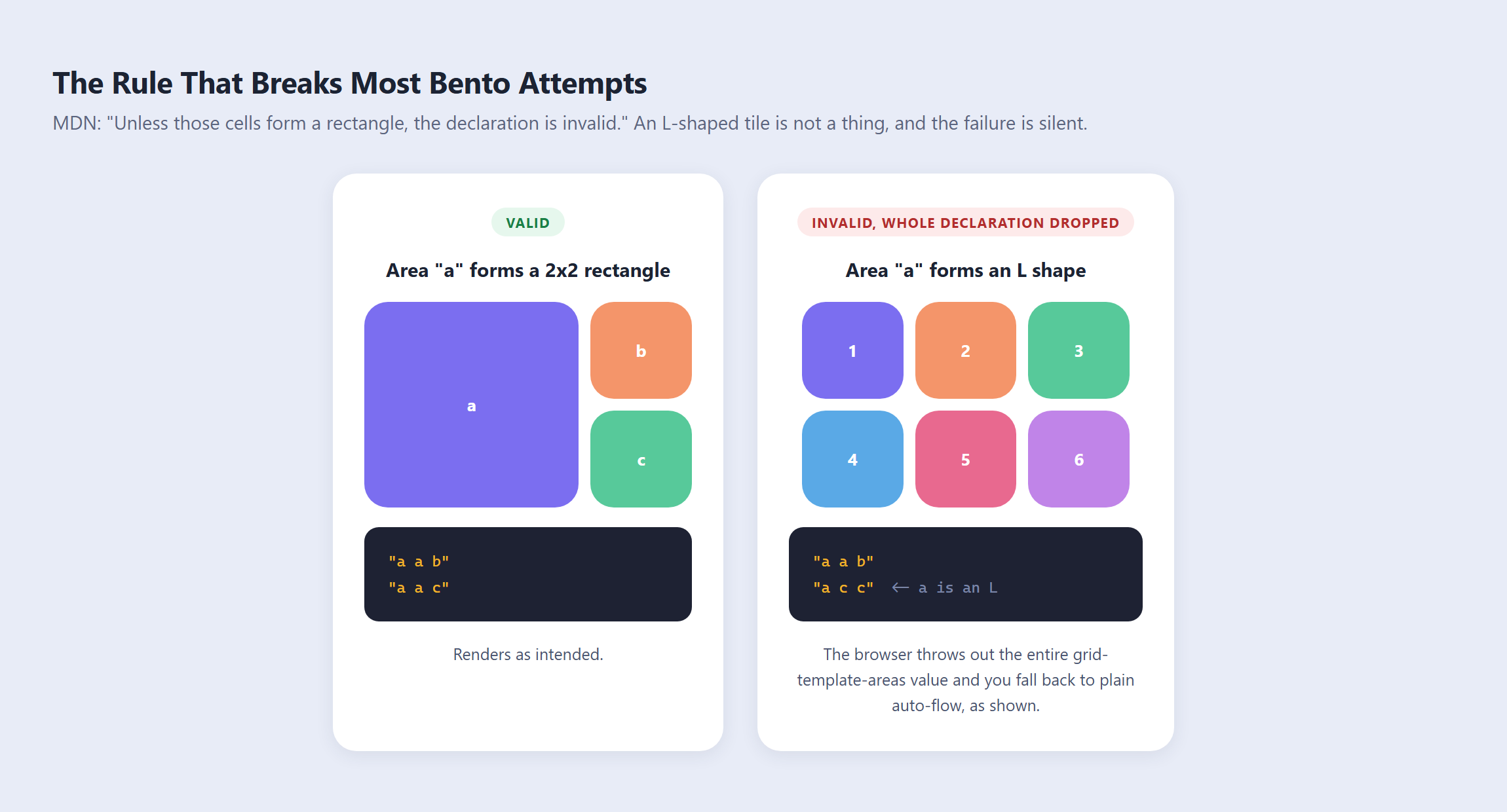
The browser does not fix it, warn you visually, or lay out the parts that were valid. It throws away the entire grid-template-areas value. Your tiles fall back to plain auto placement, every cell the same size, and the page looks like you forgot to write the CSS at all. If your bento suddenly renders as a boring uniform grid, count the corners of every named area before you look at anything else.
Leaving Cells Empty on Purpose
Bento layouts often need breathing room, and there is a token for it. MDN: “A null cell token is a sequence of one or more . (U+002E FULL STOP) characters, e.g., ., ..., or ..... etc. A null cell token can be used to create empty spaces in the grid.”
grid-template-areas:
  "hero hero ."
  "hero hero chip"
  ".    stats stats";
Using several dots instead of one is worth doing purely so your strings line up in the editor. The alignment is what makes the map readable, and a map you can read is the entire reason to use this property.
The Span Approach, and When to Prefer It
The other route skips names and puts the instruction on each tile:
.bento { display: grid; grid-template-columns: repeat(4, 1fr); gap: 14px; }

.hero { grid-column: span 2; grid-row: span 2; }
.feat { grid-column: span 2; }
.chip { grid-row: span 2; }
This is shorter, and it is the better choice when tiles come out of a loop and you do not know how many there will be. You can style “every fourth card is wide” with :nth-child(4n) and never write a map at all. If those tiles are coming from a query, Elementor Loop Grid in the V4 atomic era is worth reading first, because dynamic item styling has its own failure modes.
The trade is legibility. With spans, the layout exists only in your head, assembled from rules scattered across several selectors. With a named map, the layout is one block of text you can hand to a designer. For a fixed marketing section, use the map. For a dynamic feed, use spans.
Responsive Bento Is One Re-Drawn Map
This is where the named-area approach pulls decisively ahead, and it is the argument that usually settles it. To reflow a bento grid for mobile, you redraw the picture. You do not touch a single tile.
@media (max-width: 767px) {
  .bento {
    grid-template-columns: repeat(2, 1fr);
    grid-template-rows: auto auto auto;
    grid-template-areas:
      "hero  hero"
      "feat  side"
      "stats stats";
  }
}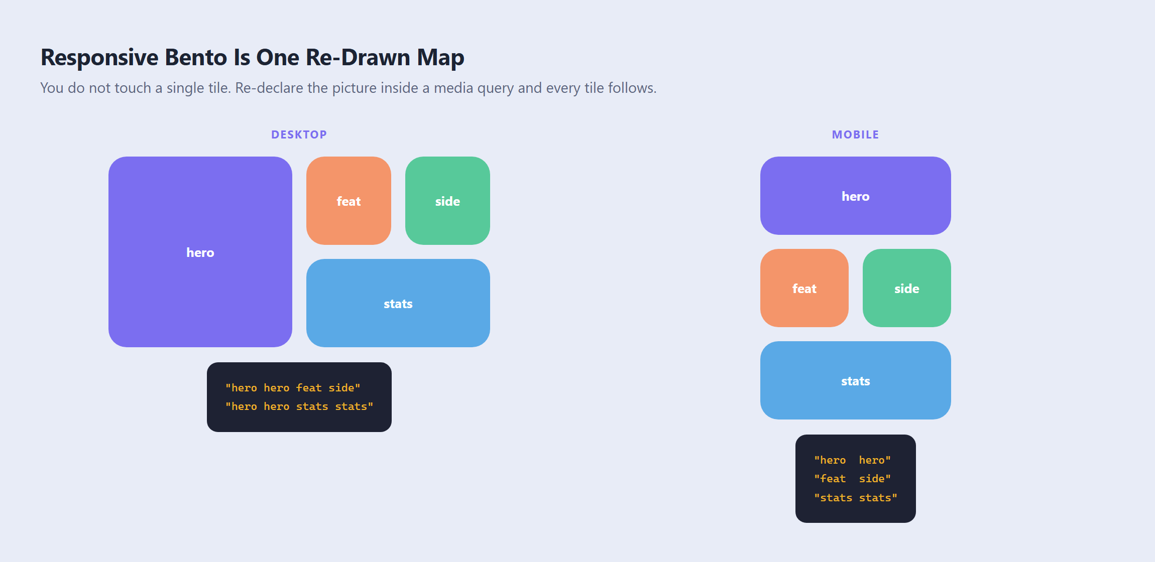
The chip tile is not in that map, so it simply is not placed by name any more. Every other tile moves because the map moved. Compare that with the span approach, where the same change means editing grid-column and grid-row on four or five separate selectors and hoping you caught them all.
One caution: on mobile, tile order becomes reading order. A tile that sat in a visually obvious spot on desktop can end up buried on a phone. Decide what the mobile sequence should be first, then write the map to produce it.
Building a Bento Grid in Elementor
Elementor’s Grid container can do this, which is a genuinely different answer from some other CSS trends where the builder simply cannot reach the effect. It is worth being precise about what it does and does not give you.
Unequal Tracks via Custom Measurement
By default a Grid container is uniform. Elementor’s own documentation says the Grid option “is created with an equal number of symmetric rows and columns,” and the Columns and Rows sliders measure in fractions.
Uniform is the opposite of bento, so the control you need is the measurement dropdown next to Rows. Elementor documents it directly: “Custom measurement is also used to create different size rows. This is done by selecting custom measurement and entering a value for each row. For example, for three rows you could enter the values 200PX 1FR 400PX.” That is grid-template-rows with a friendlier label, and it is what gets you tracks of different sizes.
Column Span and Row Span
Tile spanning lives on the tile, not the container. Select the widget, open the Advanced tab, and find the Grid Item section. Elementor is candid about why the feature exists: “Grid containers are great for creating a symmetrical design, but they can be somewhat constrictive. The span content feature gives you greater flexibility.”
Column Span and Row Span are dropdowns of plain numbers, plus a Custom option. Custom takes the line-based syntax: per the docs, “1 / 3: Span from the first line to the third line” and “2 / 5: Span from the second line to the fifth line.” Pick Custom whenever you need a tile to start somewhere other than where auto-flow would have put it.
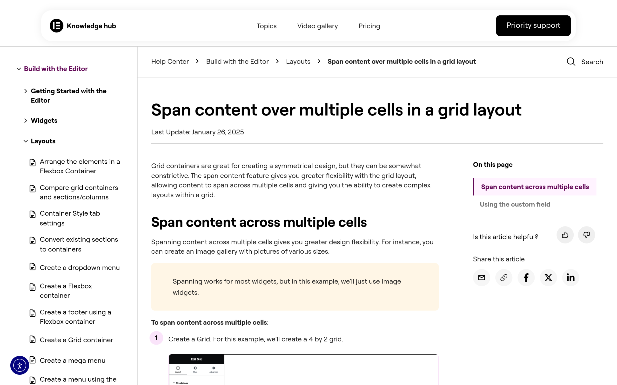
Two behaviours from the same doc are worth knowing before you start dragging. First, “all cells in a grid are the same size,” so widening one tile changes the cell size for the whole grid rather than just that tile. Second, “Normally with a grid, you can’t have blank cells, but custom spanning allows this,” which is how you get the deliberate gaps a bento layout usually needs.
What Elementor’s Grid Does Not Give You
Two real gaps, both worth knowing up front rather than discovering at the responsive stage.
There is no named-area map. Nothing in the Grid container UI corresponds to grid-template-areas. Your layout lives as span settings distributed across individual widgets, so reflowing for mobile means visiting each tile and changing its spans per breakpoint, rather than rewriting one block of text.
There is also no dense packing. Elementor’s Autoflow dropdown offers exactly two choices, Row or Column. CSS has a third setting, grid-auto-flow: row dense, which backfills gaps left by larger tiles. If you want dense behaviour, that is a custom CSS line. The rundown of how to add custom CSS in Elementor covers where to put it, and The Plus Addons for Elementor exposes a Custom CSS field in its Plus Extras panel if you are on Elementor Free.
CSS Grid vs Elementor: Which Should You Use
| Hand-written CSS Grid | Elementor Grid container | |
|---|---|---|
| Unequal tracks | grid-template-rows: 200px 1fr 400px | Yes, Rows measurement dropdown set to Custom |
| Tile spanning | grid-column: span 2 | Yes, Advanced then Grid Item then Column/Row Span |
| Start at a specific line | grid-column: 1 / 3 | Yes, via the Custom field |
| Named area map | Yes, grid-template-areas | No UI equivalent |
| Dense backfill | Yes, grid-auto-flow: row dense | No, Autoflow is Row or Column only |
| Responsive reflow | Redraw one map per breakpoint | Edit spans per tile per breakpoint |
| Best for | Fixed sections, many breakpoints | Visual iteration, client hand-off |
The honest split: if the section is a fixed marketing layout you will refine across three or four breakpoints, hand-written CSS with a named map will cost you less over time. If someone non-technical needs to reposition tiles later without touching code, build it in the Grid container and accept the per-tile span work.
Also Read: if you go the CSS route, put the tokens somewhere reusable. Building a reusable design system in Elementor V4 covers classes and variables, which is where gap and radius values belong.
The Accessibility Trap: Dense Packing and Reading Order
This is the part that gets skipped, and it is a real defect rather than a nitpick.
Bento grids tend to leave gaps, and the tempting fix is grid-auto-flow: dense. MDN explains what it actually does: the dense algorithm “attempts to fill in holes earlier in the grid, if smaller items come up later. This may cause items to appear out-of-order, when doing so would fill in holes left by larger items.”
Out of order visually, but not in the DOM. Keyboard focus and screen reader order follow the document, not the painted grid. So a keyboard user tabs through your tiles in a sequence that does not match what a sighted user sees, and the focus ring appears to jump around the section at random. The default sparse algorithm exists precisely to avoid this: MDN notes it “ensures that all of the auto-placed items appear in order, even if this leaves holes.”
The rule worth adopting: if your tiles contain links or buttons, do not use dense. Reorder the markup, or design the map so there are no holes to fill. Save dense for non-interactive tiles like images and stats.
One more, cheap to do and easy to forget: a bento grid is a set of sibling regions, not a list. If each tile is a distinct feature, give the section a heading and let each tile carry its own heading level, so the structure survives being read linearly.
Where Bento Works and Where It Does Not
It works when you have a small, known set of things and one of them deserves to be bigger. Product feature sections, a stats block, a homepage “what we do” area, an integrations showcase, a pricing comparison. Six to nine tiles is the sweet spot.
It fails when the tile sizes do not mean anything. If the biggest tile is big because the grid needed filling rather than because that feature matters most, you have decoration pretending to be hierarchy, and visitors read the emphasis you did not intend. The size is the message.
It also fails past roughly a dozen tiles. Beyond that the eye stops perceiving a composition and starts seeing a wall, and you would be better served by a uniform grid or a proper masonry layout. And if the tile contents are genuinely variable in height, this is the wrong tool: fixed rows will either clip your longest tile or leave the short ones half empty.
Frequently Asked Questions
What Is a Bento Grid Layout?
A grid layout where tiles deliberately occupy different numbers of cells, so the composition has a clear visual hierarchy. It is named after the Japanese bento box, which divides a meal into compartments of different sizes that still form one tidy rectangle.
Is a Bento Grid the Same as Masonry?
No. Masonry auto-packs items of unpredictable height and you do not control placement. A bento grid has a fixed cell structure and every tile is assigned a specific region on purpose. Masonry is automatic, bento is designed.
Can Elementor Build a Bento Grid?
Yes. Use a Grid container, set the Rows measurement to Custom for unequal track sizes, then set Column Span and Row Span per widget in the Grid Item section of the Advanced tab. The two things you cannot do from the UI are a named area map and dense auto-flow.
Why Did My grid-template-areas Stop Working?
Almost always because one named area is not a rectangle. An L or T shape makes the entire declaration invalid, and the browser discards all of it rather than part of it, so the grid falls back to uniform auto placement. Check that every repeated name forms a clean block, and that every row string has the same number of tokens.
How Do I Make a Bento Grid Responsive?
Re-declare grid-template-columns and grid-template-areas inside a media query. Every tile follows the new map automatically because tiles reference names, not positions. Decide the mobile reading order before you write the map, since on a narrow screen tile order becomes reading order.
Suggested Reading
- Masonry Grid in 2026: Native CSS Grid Lanes vs Elementor, the auto-packing counterpart to this layout.
- How to Build a Reusable Design System in Elementor V4, for the gap and radius tokens your tiles share.
- How to Add Custom CSS in Elementor for Free, including two methods that work without a paid plan.
- Claymorphism: The Three-Shadow Recipe for Soft 3D UI, a styling treatment that suits large bento tiles.
- How to Add CSS Hover Effects in Elementor, for the interaction layer on individual tiles.