A client sent over a Figma file in July with exactly one note attached to it: “make the cards feel squishy.” No spec, no reference site, nothing else. Every card in that file used the same trick, and it was not an illustration, an SVG, or a plugin. It was three box shadows stacked on a single element. Once you can see it, you cannot unsee it, and you start spotting it on fintech onboarding screens and kids’ learning apps everywhere.
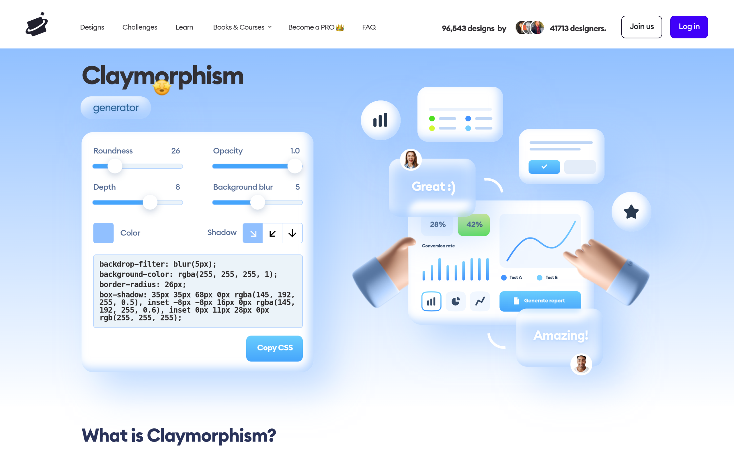
That look has a name. It is called claymorphism, and unlike most design trends that need a JavaScript library and a build step, this one is a single CSS declaration you can paste into any WordPress site today. The catch is that Elementor’s own Box Shadow control physically cannot produce it, and almost every tutorial skips that part.
What Claymorphism Actually Is
Claymorphism is a UI style built from inflated, rounded shapes that read like soft modelling clay. The term was coined in 2021 by Michal Malewicz at Hype4 Academy, as a portmanteau of “clay” and “skeuomorphism.” Malewicz is worth knowing here, because he was also the person behind the neumorphism trend a few years earlier, and claymorphism was his answer to what neumorphism got wrong.
In his original write-up he describes the shapes as “3d dome-like structures, very round, very three-dimensional and soft.” The construction is a combination of inner and outer shadows, where “the depth against the background is only done using one larger shadow.”
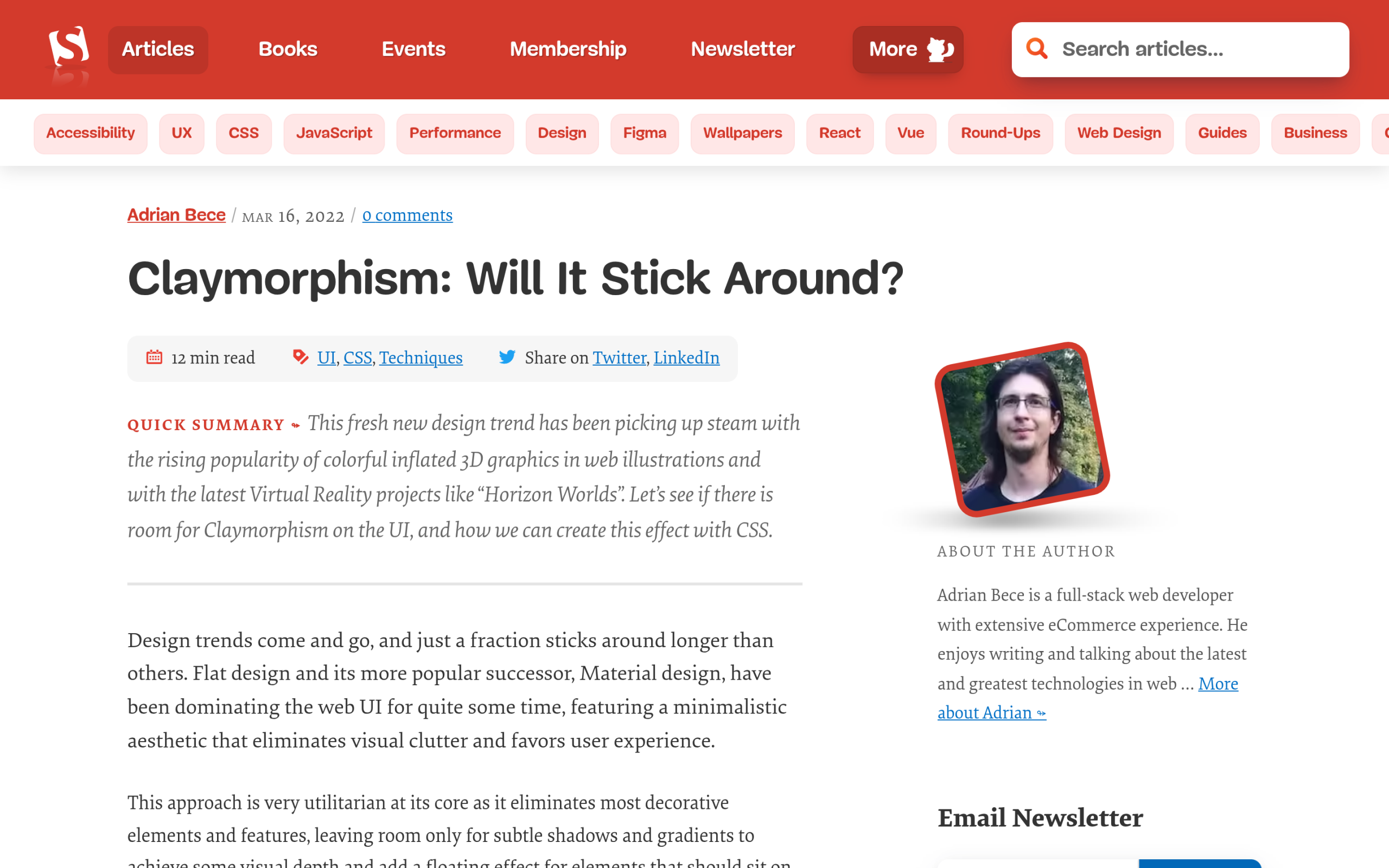
The technical definition that stuck came from Adrian Bece, writing for Smashing Magazine in March 2022. His framing is the one worth memorising, because it explains why the effect behaves the way it does:
Instead of using light and dark outer shadow to achieve the extrusion effect, Claymorphism uses two inner shadows (dark and light) and an outer (usually darker) shadow to achieve a soft 3D and floating effect. This allows for Claymorphism to have any background color, independent of the background.
That last sentence is the whole reason this style is more useful than neumorphism. Neumorphic elements have to share their fill colour with the page behind them, which caps how much contrast you can ever achieve. Claymorphic elements do not, so you can pick any fill you like and still hit a contrast ratio that passes.
The Three-Shadow Recipe
Here is the recipe from the Smashing Magazine article, unchanged. Three shadows, one declaration, comma separated:
.clay {
  border-radius: 32px;
  box-shadow:
    8px 8px 16px 0 rgba(0, 0, 0, .25),               /* outset shadow */
    inset -8px -8px 12px 0 rgba(0, 0, 0, .25),       /* dark inset  */
    inset 8px 8px 12px 0 rgba(255, 255, 255, 0.4);   /* light inset */
}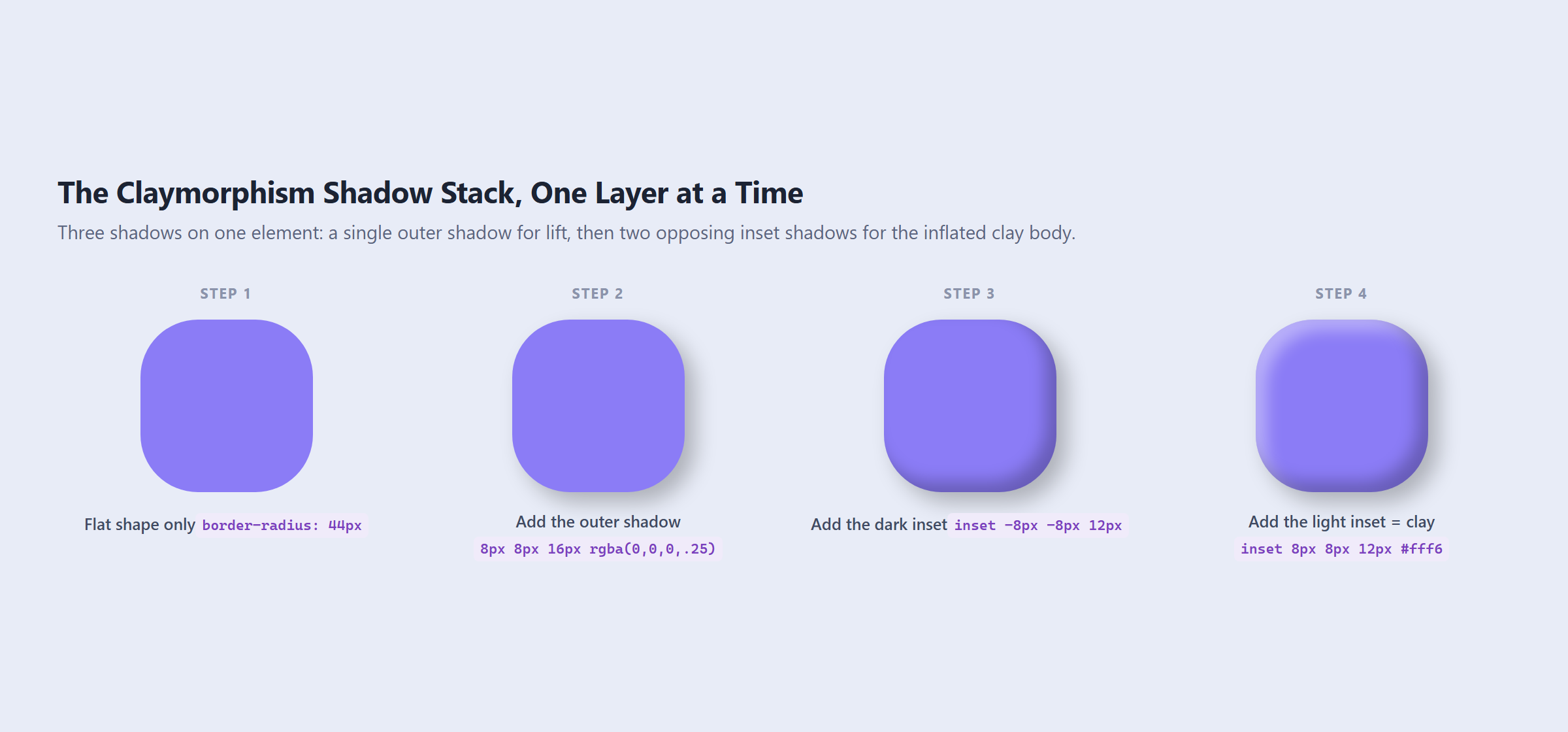
Each line does one job. The first shadow is the only one that lives outside the element, and it is what lifts the shape off the page. The second darkens the bottom right of the inside face. The third lightens the top left of the inside face. Those two opposing insets are what your eye reads as a rounded, inflated body rather than a flat rectangle.
Two rules from the CSS specification make this work, and both are documented on MDN. First, inset shadows “are clipped to the element’s padding box and appear above the background but below the content,” which is why the insets shade the fill without ever touching your text. Second, “the first specified shadow is on top,” so the order in that list is not decorative. Move the light inset above the dark one and the light source flips.
Why the Light Inset Belongs Top Left
Malewicz is specific about the direction: “The top-left inner shadow has to be slightly lighter, while the bottom-right inner shadow has to be a little bit darker.” This follows the same implied light source that every other shadow on your page already uses, coming from the upper left. If your site’s other shadows fall down and to the right, your clay shapes need to agree with them, or the section will feel subtly wrong without anyone being able to say why.
Border Radius Is Half the Effect
The shadows alone will not sell it. Malewicz’s guidance is to round the corners “usually beyond 50% roundness possible,” and the Smashing utility ships with a 32px default. In practice the radius has to scale with the element. A 32px radius on a 400px card looks tame, while the same value on a 64px icon tile looks nearly circular.
A reasonable working rule is to keep the radius somewhere between a quarter and a third of the shorter side of the element, then adjust by eye. Anything less and the shape stops reading as clay and starts reading as a slightly shaded box.
Claymorphism vs Neumorphism vs Glassmorphism
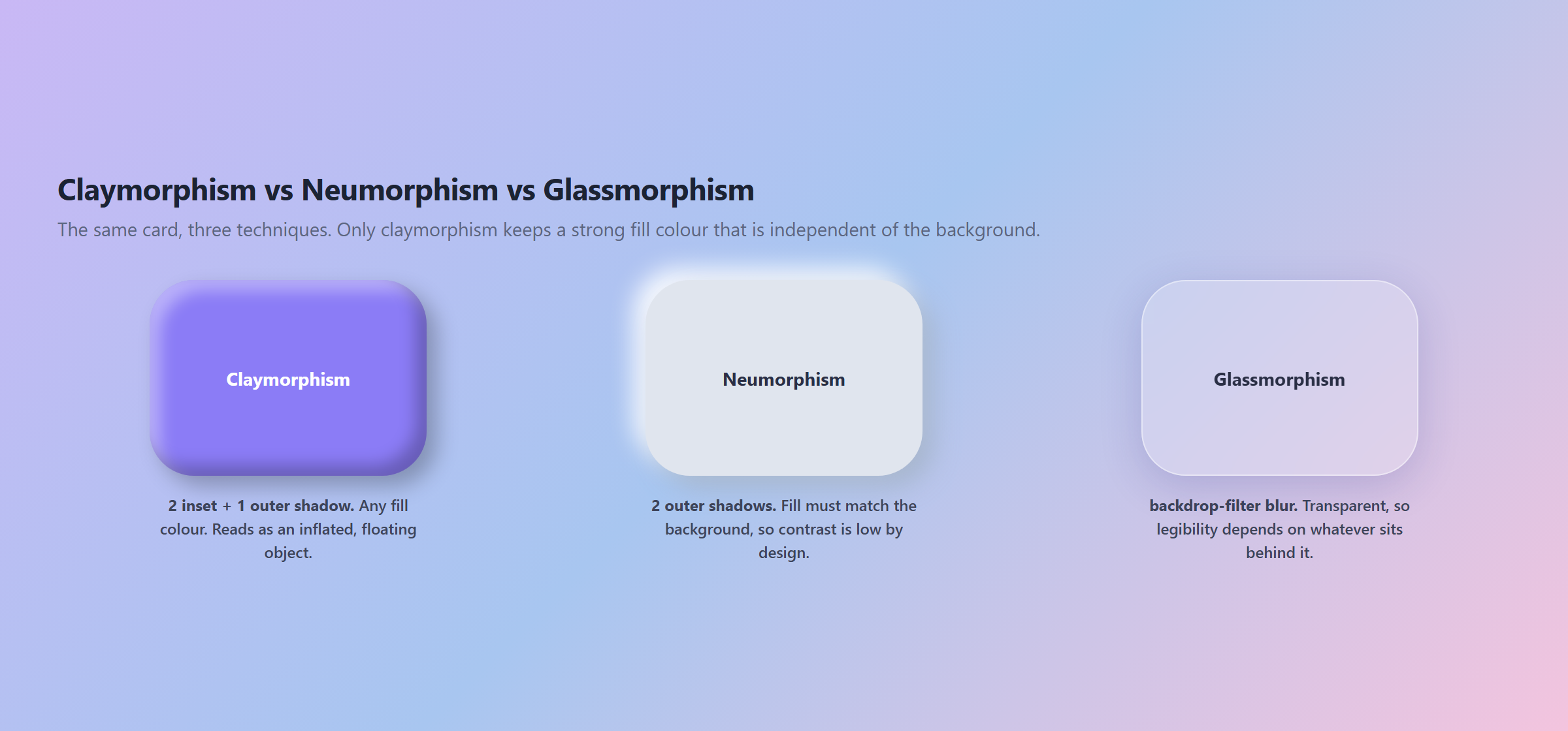
These three get lumped together constantly, and they behave nothing alike. The differences that matter are how many shadows you need, whether the fill colour is yours to choose, and what happens to legibility.
| Claymorphism | Neumorphism | Glassmorphism | |
|---|---|---|---|
| Core technique | 2 inset shadows + 1 outer | 2 outer shadows | backdrop-filter: blur() |
| Fill colour | Any colour, independent of background | Must match the background | Transparent |
| Contrast ceiling | High, you control the fill | Low by design | Depends on what sits behind |
| Needs a backdrop | No | No | Yes, needs something to blur |
| Reads as | Inflated, floating object | Pressed into the page | Frosted pane over content |
Also Read: how to build frosted glass UI with glassmorphism for the transparent alternative, including the three reasons backdrop-filter silently fails.
Why Elementor’s Box Shadow Control Cannot Do This Alone
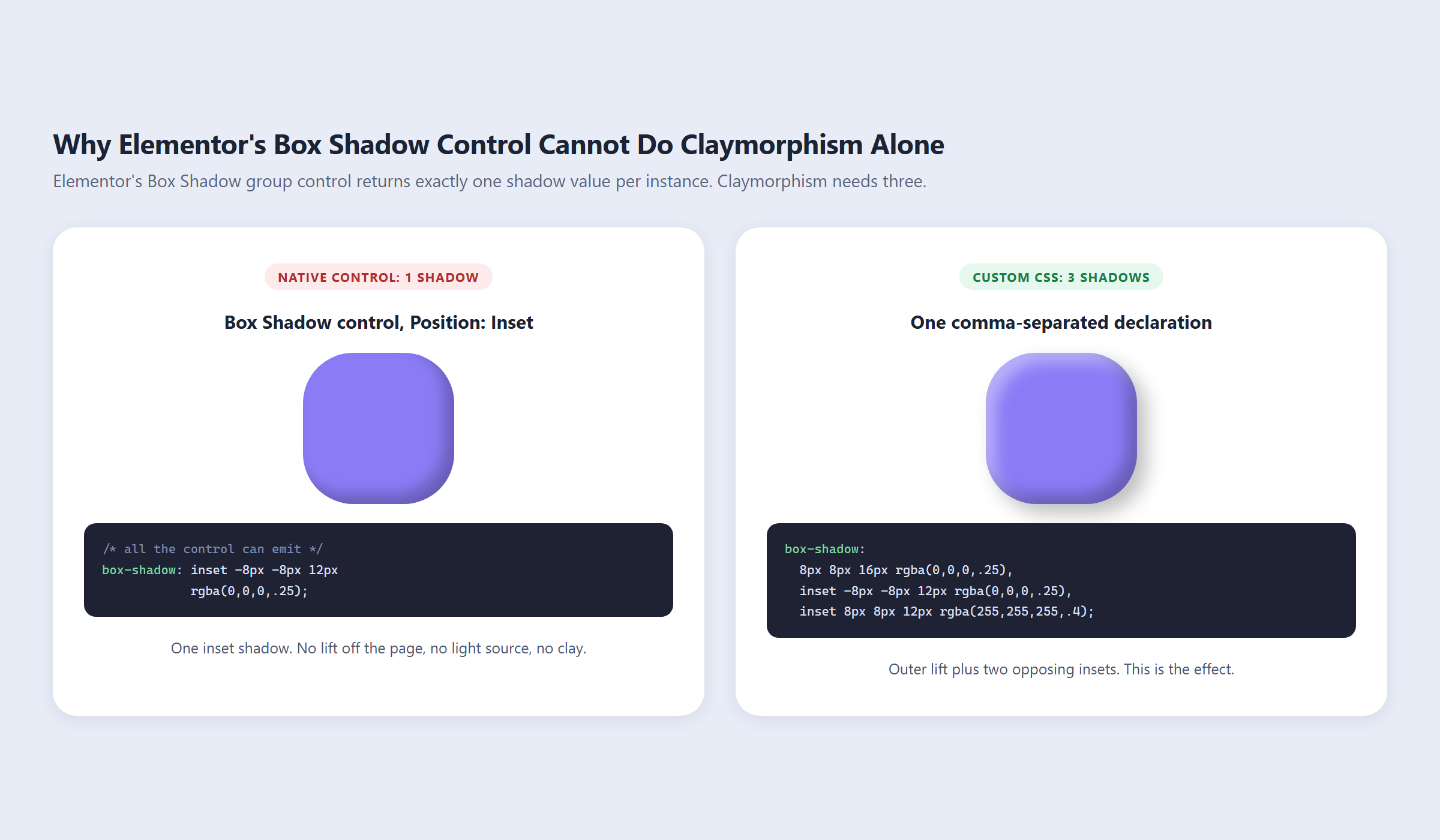
This is the part most guides leave out, and it is the reason people give up halfway. Elementor’s Box Shadow group control exposes six fields: horizontal shadow, vertical shadow, shadow blur, shadow spread, shadow colour, and position, where position switches between outset and inset. That covers everything you need for one shadow.
The problem is the word “one.” According to Elementor’s own developer documentation, each Box Shadow control instance returns a single array of box shadow values. One instance, one shadow. Claymorphism needs three on the same element, so no combination of clicks in that panel will get you there. Set position to Inset and you get exactly one third of the effect: a shaded interior with no lift and no light source.
The fix is custom CSS, which is a slightly awkward subject in Elementor because the dedicated Custom CSS field is a paid feature. There are free routes around it, and the full breakdown of how to add custom CSS in Elementor covers four of them. The Plus Addons for Elementor adds Custom CSS inside its Plus Extras panel, alongside JS, PHP, and HTML injection, so you are not installing a separate code snippets plugin just to add three shadows.
A Reusable Clay Utility Class
Do not paste the raw declaration onto individual widgets. Define it once with custom properties, then apply one class wherever you need it. This is the version worth keeping:
:root {
  --clay-radius: 32px;
  --clay-lift: 8px 8px 16px 0 rgba(0, 0, 0, .25);
  --clay-dark: inset -8px -8px 12px 0 rgba(0, 0, 0, .25);
  --clay-light: inset 8px 8px 12px 0 rgba(255, 255, 255, .4);
}

.clay {
  border-radius: var(--clay-radius);
  box-shadow: var(--clay-lift), var(--clay-dark), var(--clay-light);
}

/* Smaller elements need a tighter radius and shorter throw */
.clay--sm {
  --clay-radius: 18px;
  --clay-lift: 4px 4px 10px 0 rgba(0, 0, 0, .22);
  --clay-dark: inset -5px -5px 8px 0 rgba(0, 0, 0, .22);
  --clay-light: inset 5px 5px 8px 0 rgba(255, 255, 255, .38);
}
Now every clay surface on the site is one variable edit away from a different mood, which is the same argument for centralising any visual token. If you are already working this way, building a reusable design system in Elementor V4 with classes and variables is the natural place to put these.
How to Build a Claymorphic Card in Elementor
With the utility class in place, the build is four steps:
- Add a Container and give it a solid background colour. Solid matters here, because the insets need an opaque surface to shade.
- In Advanced, add
clayto the CSS Classes field. - Leave the native Box Shadow control switched off completely. If you set it, Elementor writes its own
box-shadowon the same selector and, depending on specificity, one of the two declarations loses. This is the single most common reason the effect appears to do nothing. - Add padding of at least 24px. Insets shade inward from the padding box, so a card with tight padding will have its shadows crawling over the text.
For hover states, animate the outer shadow and leave the insets alone. Growing the lift from 8px to 14px on hover reads as the object rising toward the cursor. Animating the insets instead just makes the surface flicker. The same restraint applies to CSS hover effects in Elementor generally, where the temptation is always to move too many properties at once.
Dark Mode: Keep the Fill Off Pure Black
Claymorphism survives dark mode, but only conditionally. Malewicz notes it works in dark mode as long as the shapes are not completely black, and the reason is mechanical: the light inset paints white at 40% opacity over the fill. On a mid-tone purple that reads as a lit upper edge. On pure black there is nothing underneath for it to lift, so the clay body collapses into a flat dark rectangle with a faint grey smudge.
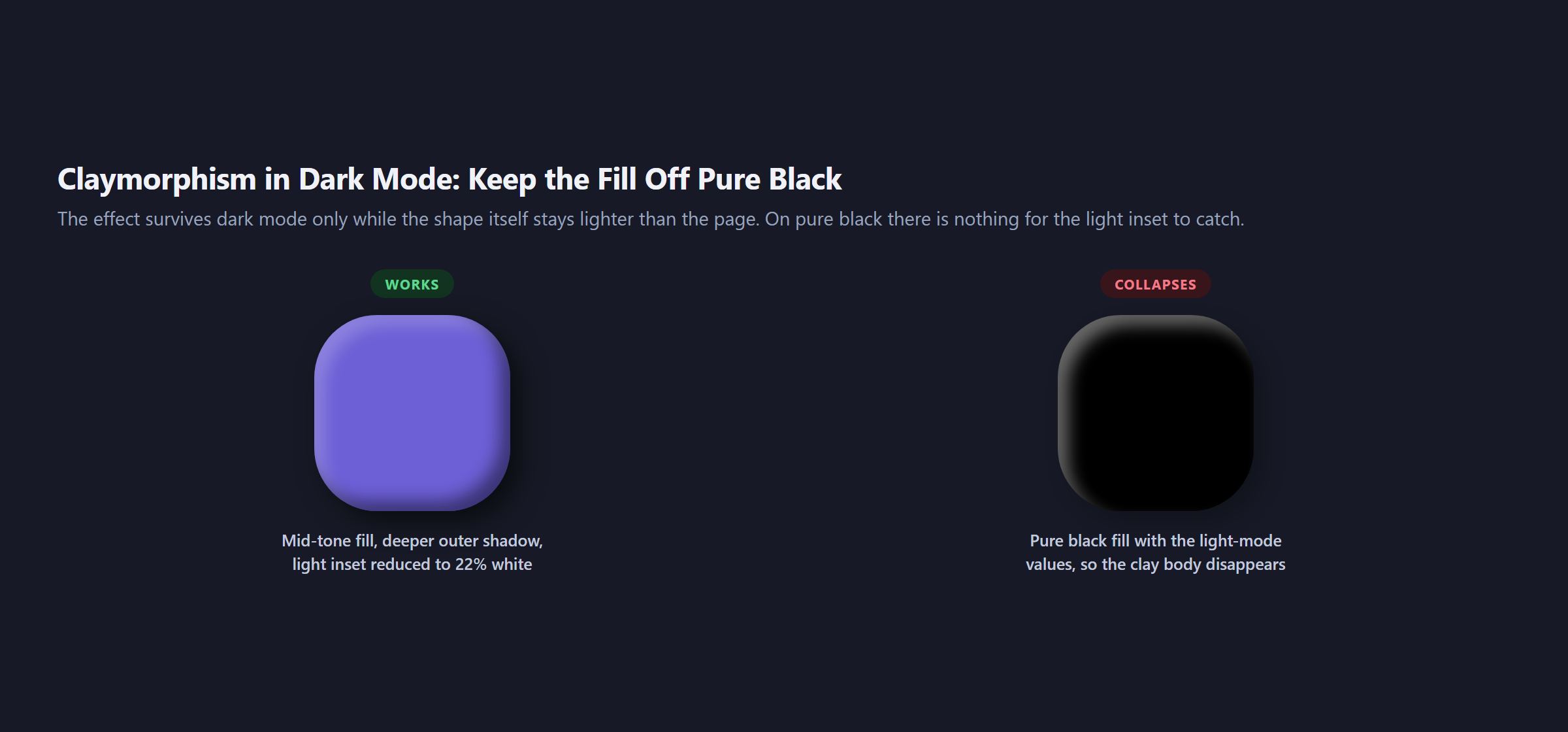
Two adjustments fix it. Deepen the outer shadow, because a 25% black shadow is invisible against a dark page. Then pull the light inset down to roughly 20% white, since 40% over a dark fill looks like a dusty film rather than a highlight.
Where Claymorphism Earns Its Place, and Where It Does Not
The style carries a lot of personality, which is either the point or the problem depending on the project.
It works when the shapes are few, large, and separated: feature cards on a landing page, pricing tiers, onboarding steps, icon tiles in a three-up row, empty states. Education, kids’ products, and consumer fintech onboarding are where it shows up most, and for good reason. Big soft shapes feel approachable and low stakes.
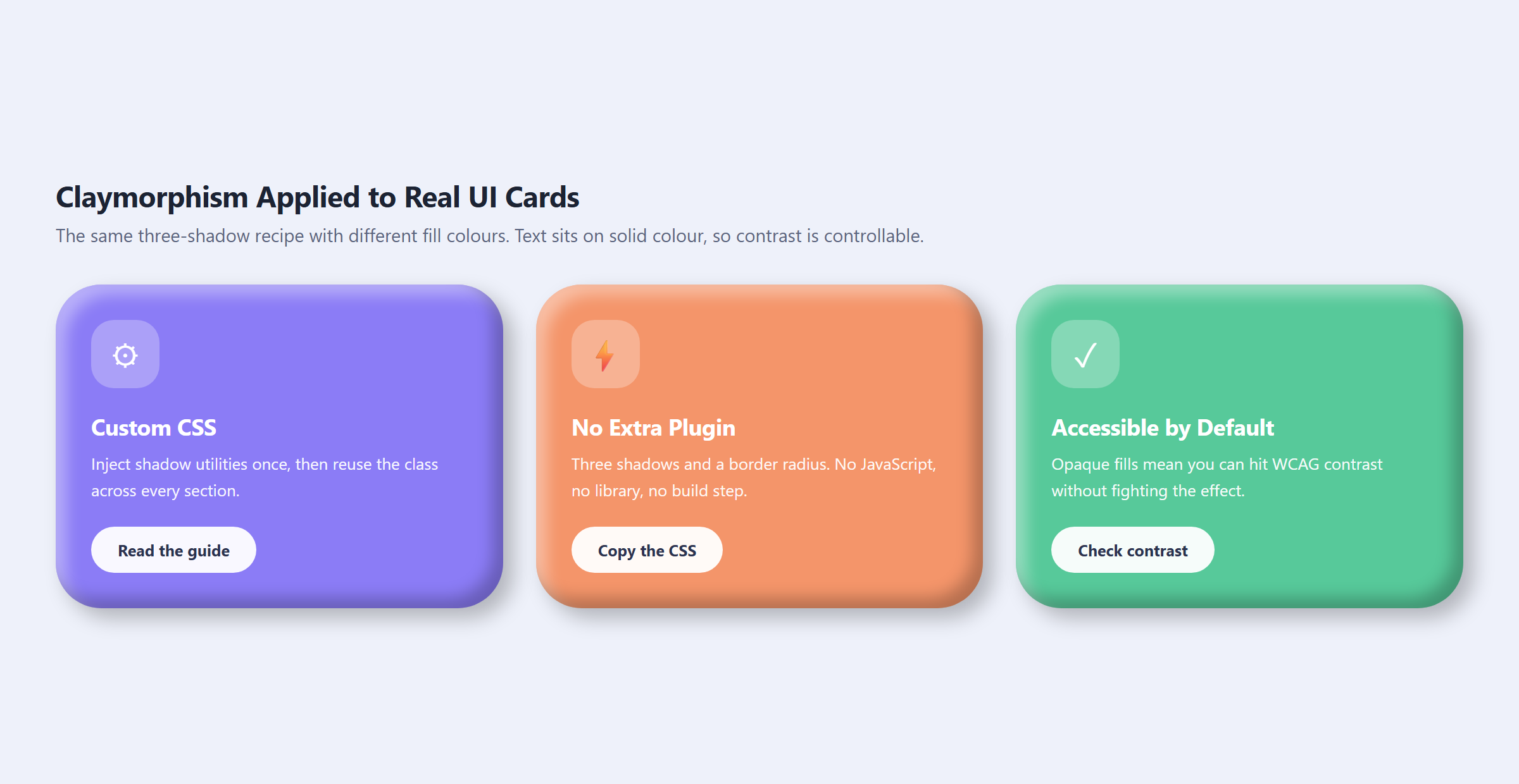
It fails on density. A data table with clay rows is unreadable. A ten-field form with clay inputs turns into a bag of marshmallows, and the generous radius eats the horizontal space your labels needed. Enterprise dashboards are the clearest no. If your interface’s job is to show a lot of information at once, every pixel the effect spends on softness is a pixel not spent on clarity.
One more honest limitation: it dates a design. A site built in this style is legible as a 2022 to 2026 site in the same way a skeuomorphic leather texture reads as 2010. That is fine for a campaign page and a real cost for a brand site you intend to leave untouched for five years.
Also Read: if you want motion instead of depth, three ways to build an animated toggle switch in CSS covers the same no-plugin approach applied to a control users actually interact with.
The Accessibility and Performance Cost
On accessibility, claymorphism is the strongest of the three morphism styles, and that is not a compliment it gets often. Because the fill is opaque and independent of the background, you can choose a colour that clears WCAG contrast for the text sitting on it. Neumorphism cannot do that without abandoning the effect, and glassmorphism’s contrast changes depending on what scrolls behind the pane.
The Smashing article still flags a real risk, which is that you “need to be careful not to disrupt visual hierarchy in the process.” When every card is inflated and floating, nothing is emphasised. Pick one element per section to carry the effect and let the rest sit flat.
On performance, a large blur radius is a paint cost, and you have three shadows per element instead of one. On a handful of cards this is unmeasurable. On a loop grid rendering forty posts with clay styling on every card, it is worth checking. Shadows are cheaper than backdrop-filter, which has to sample and blur everything behind it, so this is a milder version of the glassmorphism performance conversation.
Avoid animating box-shadow directly on many elements at once. Transition transform for the movement and swap between two predefined shadow values instead of interpolating blur radii.
Frequently Asked Questions
Is Claymorphism Just Neumorphism With Colour?
No, the construction is different. Neumorphism uses two outer shadows and requires the element’s fill to match the page background. Claymorphism uses two inner shadows plus one outer shadow, which frees the fill colour from the background entirely. Same designer, opposite constraint.
Do I Need a Plugin for Claymorphism in WordPress?
No. It is one box-shadow declaration and one border-radius. You need somewhere to put custom CSS, which on Elementor Free means a workaround or an addon that unlocks a custom CSS field, but the effect itself requires no plugin, no JavaScript, and no build step.
Can Elementor’s Box Shadow Control Do Claymorphism?
Not on its own. Each Box Shadow control instance produces exactly one shadow value, and the effect needs three on the same element. Switching position to Inset gives you one of the three. The remaining two require custom CSS.
Why Is My Claymorphism Effect Not Showing?
Three usual causes. The element has a transparent or gradient background, so the insets have nothing to shade. Elementor’s native Box Shadow control is also set and is overriding your custom declaration. Or the padding is too small, so the insets are hidden behind the content.
Is Claymorphism Still in Style?
Search interest for the term is still climbing rather than fading, up 84% year over year as of August 2026, which is unusual for a trend first named in 2021. It has settled into a niche rather than gone mainstream, and that niche is playful consumer products.
Suggested Reading
- Glassmorphism in 2026: How to Build Frosted Glass UI, the transparent counterpart to this effect.
- How to Add Custom CSS in Elementor for Free, four methods including two that work without a paid plan.
- How to Build a Reusable Design System in Elementor V4, where your clay variables should live.
- Masonry Grid in 2026: Native CSS Grid Lanes vs Elementor, the same code versus builder comparison applied to layout.
- How to Add CSS Hover Effects in Elementor, for the interaction layer on top of your clay cards.