



Search for how to rotate text in CSS and most answers stop at one line: transform: rotate(90deg). It works, and then the sidebar label overlaps the image next to it, or a heading turns into a sideways stripe that leaves a gap in the layout. The line was right. The method was wrong for the job.
CSS has five distinct ways to turn text, and each solves a different problem. Some only repaint the text at an angle. Others change how the box itself is laid out. This guide shows all five rendered in Chrome, explains which one to reach for, and ends with the no-code route in Elementor for people who would rather not write any of it.
Which Rotation Method Fits Which Job
Pick by the result you want, not by the property name. The column that matters most is the last one: whether the surrounding layout notices the rotation.
| Goal | Property | Layout Reacts? | Typical Use |
|---|---|---|---|
| Tilt text a few degrees | transform: rotate() | No | Stickers, badges, playful headings |
| Same tilt, written separately | rotate | No | Hover effects, animations |
| Run text top to bottom | writing-mode: vertical-rl | Yes | Side labels, vertical headings |
| Run text bottom to top | writing-mode plus rotate(180deg) | Yes (box), No (flip) | Spine labels, tab titles |
| Stack upright letters | text-orientation: upright | Yes | Logos, short vertical words |
Method 1: Rotate Text With transform rotate()
The classic route. rotate() turns an element around a fixed point on the 2D plane without deforming it. It accepts degrees, turns and radians, so 90deg, 0.25turn and 1.5708rad are all the same quarter turn. MDN notes that in a left-to-right context a positive angle is clockwise and a negative angle is counter-clockwise.
.badge {
  display: inline-block;          /* required, see below */
  transform: rotate(-8deg);
}

.quarter { transform: rotate(0.25turn); }
.flip    { transform: rotate(180deg); }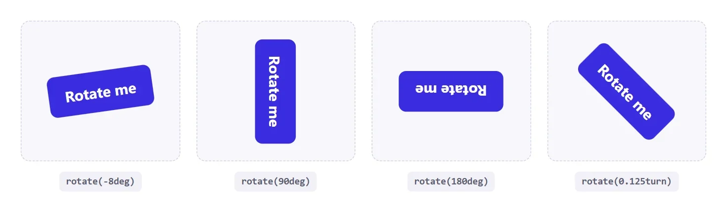
One trap catches almost everyone the first time. A transform has no effect on a plain inline element such as a bare <span>, because inline boxes are not transformable. Give it display: inline-block, block or flex first, and the rotation applies.
rotate() has been Baseline widely available since July 2015, so there is nothing to polyfill.
Method 2: The Standalone rotate Property
Since August 2022 you can write the rotation as its own property instead of burying it inside transform. It does the same visual job, but it lives separately from any other transform on the element, which is exactly what you want when a hover state should add a turn without rewriting a long transform list.
.icon {
  transition: rotate .25s ease;
}
.icon:hover { rotate: 15deg; }

/* a translate set in transform keeps working alongside it */
.icon { transform: translateY(-4px); }
When both are present, the individual properties are applied first and the transform list after them, so the result can differ from what you would get by merging everything into one declaration. If a rotation looks off after you add a standalone property, check the order before you check the angle.
Choosing The Pivot With transform-origin
Every rotation turns around a point. By default that point is the middle of the element, which MDN lists as the initial value 50% 50% 0. Move it and the same angle produces a very different result.
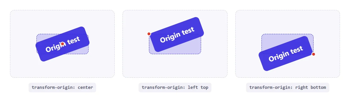
.hinge  { transform-origin: left top;     transform: rotate(-20deg); }
.swing  { transform-origin: right bottom; transform: rotate(-20deg); }
.custom { transform-origin: 20px 60%;     transform: rotate(-20deg); }
Pivot at a corner when you want something to look hinged, like a tag swinging from a nail. Keep the default when you want a spinner or an icon to turn in place.
Also Read: Hamburger menu in CSS rotates three bars around their centres to draw the close icon, which is this same pivot idea in a real component.
Method 3: Vertical Text With writing-mode
writing-mode does not draw text at an angle. It changes the direction lines are laid out, so the text is genuinely vertical and the box turns with it. With vertical-rl the lines run top to bottom and the glyphs are rotated clockwise. The property has been available across browsers since March 2017.
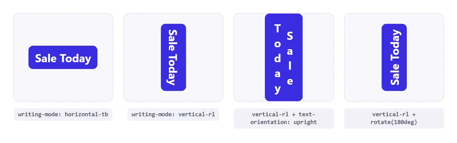
.side-label {
  writing-mode: vertical-rl;
}
Use vertical-lr instead when additional lines should stack from left to right. For a single-line label the two look identical, which is why most side labels just use vertical-rl.
Method 4: Bottom To Top Labels With writing-mode Plus rotate(180deg)
Vertical text normally reads downward. Spine labels on books and tab titles on a card usually read upward, so you flip it. Turn the text vertical first so the box has the right shape, then rotate the whole thing half a turn.
.tag {
  writing-mode: vertical-rl;
  transform: rotate(180deg);
  letter-spacing: .18em;
  text-transform: uppercase;
}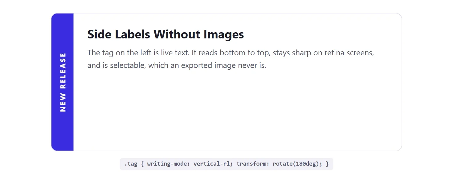
Because the label is real text, it scales with the user’s font size and a screen reader reads it in order. An exported image of the same label can do neither. Keep vertical labels short, though. Reading a full sentence with your head tilted is tiring, so save the technique for one to three words.
Method 5: Upright Letters With text-orientation
Sometimes you want the word stacked with every letter standing up, the way a vertical shop sign reads. Combine writing-mode with text-orientation: upright. This property has been available across browsers since September 2020.
.stack {
  writing-mode: vertical-rl;
  text-orientation: upright;
}
The third card in the writing-mode screenshot above shows the result. It suits logos and very short words. For anything longer it becomes hard to read, because upright Latin letters were never designed to be read top to bottom.
Why Layout Behaves Differently Between The Methods
This is the part the one-line answers skip. A transform repaints the element at an angle but leaves the layout box where it was. Neighbouring elements keep reserving the old width and height, so you get a gap, or an overlap if the rotated text is longer than its original box.
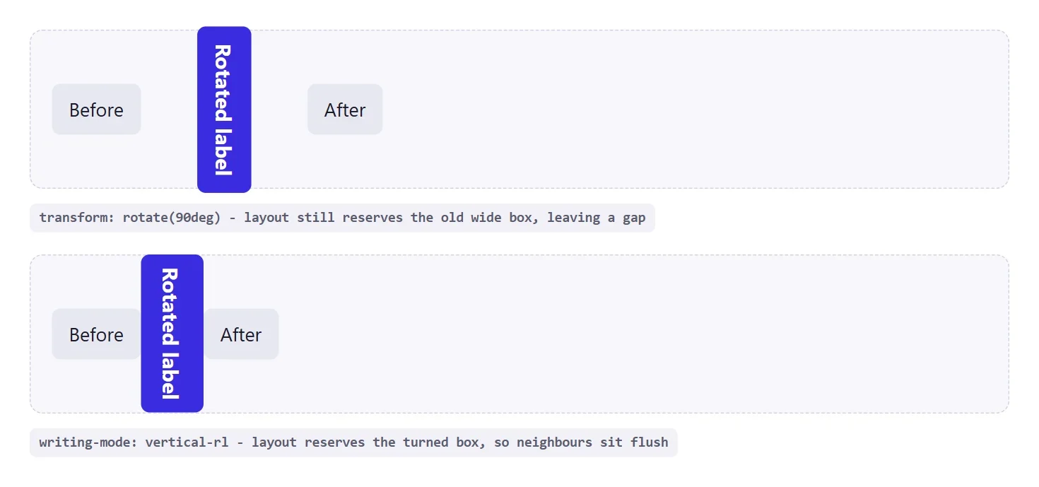
If you must use transform for a 90 degree turn, reserve the space yourself by giving the wrapper the rotated dimensions, or switch to writing-mode and let the browser do it. For small tilts such as -3deg the layout difference is invisible, so a transform is fine.
Rotating Text Animation Without Hurting Comfort
A looping spin is the quickest way to make a page feel busy. Use it on one small element, give it a purpose, and respect visitors who have asked their system for less motion.
@keyframes spin { to { rotate: 360deg; } }

.badge-ring {
  animation: spin 12s linear infinite;
}

@media (prefers-reduced-motion: reduce) {
  .badge-ring { animation: none; }
}
Animating rotate or transform is cheap compared with animating layout properties, because the browser can often handle it without re-laying out the page. A slow 12 second turn also reads as calm rather than frantic.
Also Read: CSS clamp() is the companion trick for sizing rotated headings so they never overflow on small screens.
Rotating Text On Hover And Focus
Hover rotation is where the standalone rotate property earns its place. You declare a transition once, change the angle in the state rule, and the browser animates between the two. Pair the hover rule with a focus rule so keyboard users get the same feedback as mouse users.
.link-chip {
  display: inline-block;
  transition: rotate .2s ease;
}
.link-chip:hover,
.link-chip:focus-visible {
  rotate: -4deg;
}
Keep hover angles small. A shift of three to six degrees reads as friendly. A full quarter turn on hover makes the link hard to aim at, because the target moves away from the pointer while the visitor is still trying to click it.
Keeping Rotated Text Readable And Accessible
Rotation changes how text looks, not how it is structured. A screen reader announces the words in source order whatever angle they are drawn at, so rotated text stays understandable to assistive technology as long as the markup itself is sensible. The readability problem is for sighted visitors, and it is worth a short checklist.
- Rotate labels, not paragraphs. One to three words is comfortable. A full paragraph at 90 degrees makes people tilt their heads.
- Check contrast after rotating. Thin strokes at an angle are harder to read than the same text upright, so use a slightly heavier weight.
- Do not rotate the only way to a control. A slanted button with a small hit area is frustrating on touch screens. Keep the clickable box generous.
- Let people zoom. Size vertical labels in relative units so they grow with the user’s font settings.
Responsive Rules For Rotated Labels
A vertical label that looks tidy on a wide card can crowd a narrow phone screen. The usual fix is to return to normal horizontal text below a breakpoint, which a media query handles in a few lines because writing-mode and transform are ordinary properties you can override.
.tag {
  writing-mode: vertical-rl;
  transform: rotate(180deg);
}

@media (max-width: 600px) {
  .tag {
    writing-mode: horizontal-tb;
    transform: none;
    padding: 6px 12px;
  }
}
Resetting both properties together matters. If you restore writing-mode but leave the half turn in place, the label ends up upside down in the narrow layout.
When To Skip Rotation Entirely
Rotation is a styling tool, not a default. If the text is the main content of the page, such as an article body or a form label, leave it horizontal. Rotated text slows reading, breaks the scanning pattern people use on long pages, and is awkward to select on touch devices. The best uses are small and decorative: a tab title along the edge of a card, a category stamp on an image, a tilted badge on a pricing tier. If you find yourself rotating a sentence, try a different layout first.
A Quick Decision Checklist
When you are unsure which method to use, answer these questions in order.
- Should the neighbouring layout make room for the turned text? If yes, use
writing-mode. - Is it a small tilt or a hover effect? If yes, use
rotate()or the standalonerotateproperty. - Should the text read bottom to top? Add a half turn on top of
vertical-rl. - Do you want each letter standing upright? Add
text-orientation: uprightand keep the word short. - Will the element animate? Prefer
rotateortransformand add a reduced-motion fallback.
Rotate Text In Elementor Without Writing CSS
If you build with Elementor, you can reach the same results from panel controls. The Advanced Typography widget in The Plus Addons for Elementor has a Text Direction section that turns text vertical and can rotate it with CSS transforms. According to the vertical text documentation, it needs the Pro edition.
Step-by-Step
- Add the Advanced Typography widget to the page from the Elementor panel.
- Type your text into the widget.
- Open Content, then Text Direction, and set Vertical Text to Left to Right or Right to Left.
- Optional: turn on Vertical Letters to keep every letter upright.
- Optional: use Transform Normal, Transform Hover and Transform Origin for a tilt such as
rotate(-90deg).
The controls map straight onto the CSS above. Vertical Text uses writing-mode under the hood, and the Transform fields take the same rotate() values and pivot points described earlier. That makes the widget a good fit when a client wants to adjust a label without touching a stylesheet. Read the full Advanced Typography widget page for the other text effects in the same widget.
Common Mistakes Worth Checking
- Rotating a bare inline element. Nothing happens until it is
inline-blockor another transformable display value. - Using transform for a vertical sidebar label. The layout box stays wide, so the page keeps a gap. Use
writing-mode. - Forgetting the pivot. A hinge effect needs
transform-originat a corner, not the default centre. - Mixing individual properties and transform and trusting the arithmetic. They apply in a fixed order, so test the combined result.
- Long vertical sentences. Keep rotated text to a few words so it stays readable.
- Infinite spins with no motion fallback. Wrap them in a
prefers-reduced-motionquery.
Browser Support
Every property in this guide is Baseline widely available according to MDN, so none of them needs a fallback for current browsers.
| Feature | Available Across Browsers Since |
|---|---|
transform: rotate() | July 2015 |
writing-mode | March 2017 |
rotate property | August 2022 |
text-orientation | September 2020 |
For the full reference, see MDN on rotate(), writing-mode and transform-origin.