




Drop a wide photograph into a square card and one of two things happens. The picture is squashed until everyone in it looks stretched, or a strip of empty space appears around it. Neither is what you wanted, and neither is a bug. It is what the browser does when you give an image a box that does not match its shape and say nothing else.
The object-fit property is how you say the rest. It decides whether an image fills its box, fits inside it, or gets cropped to cover it. Its companion, object-position, decides which part of the picture survives the crop. This guide walks through all five values with real renders, shows how to choose between them, and explains how to get the same result in Elementor.
Why Images Distort In Fixed Boxes
An img element is a replaced element: the browser draws the file’s pixels into whatever content box the element has. If you set both a width and a height that do not match the file’s proportions, the default behaviour is to stretch the picture to fill the box exactly. MDN confirms that fill is the initial value of object-fit, and it does just that.
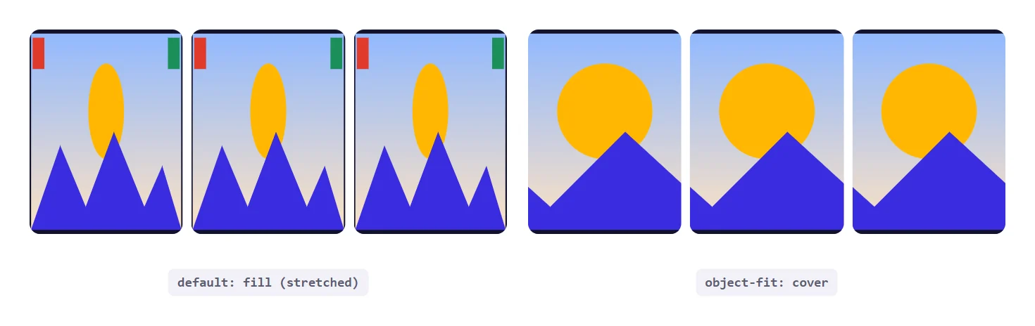
The left cards above show the damage. The sun is an oval, the mountains are steeper than the original, and the corner squares are tall rectangles. On the right, the same image in the same boxes with object-fit: cover looks like a deliberate crop. The only difference is one declaration.
.card img {
  width: 100%;
  height: 100%;
  object-fit: cover;
}
The Five object-fit Values
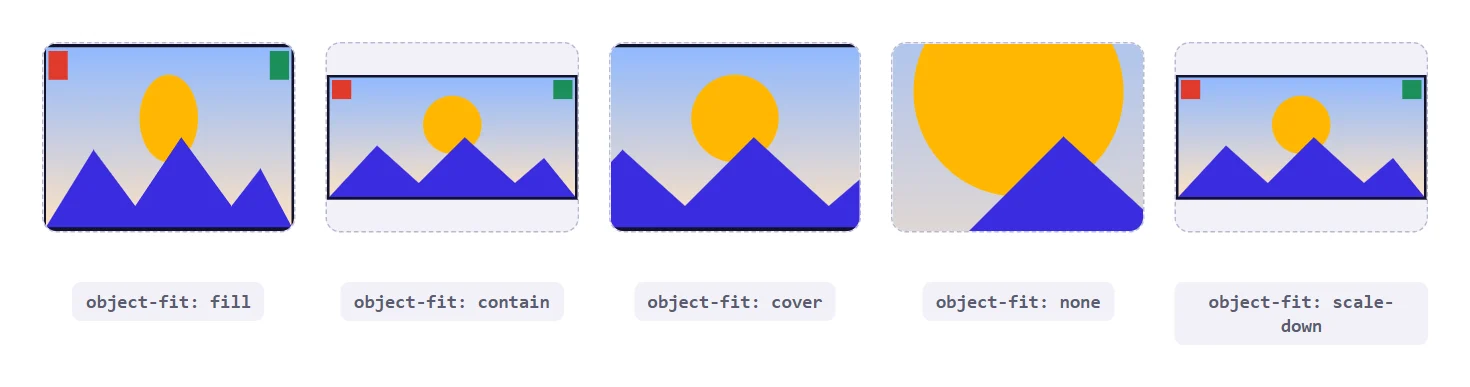
MDN documents five values. Each answers the same question, how should the picture sit inside its box, in a different way.
| Value | What It Does | Distorts? | Crops? |
|---|---|---|---|
fill | Stretches the picture to match the box. The initial value. | Yes | No |
contain | Scales the picture to fit entirely inside the box, leaving empty bands if the shapes differ. | No | No |
cover | Scales the picture until it covers the whole box, clipping the overflow. | No | Yes |
none | Ignores the box and shows the picture at its natural size, clipped to the box. | No | Yes |
scale-down | Behaves as the smaller of none and contain. | No | No |
In practice you will use two of them nearly all the time. cover is for photographs, where a cropped edge is acceptable and empty bands are not. contain is for anything that must stay whole, such as a logo, a product shot on white, or a diagram with labels near the edges. The other three have narrow uses, covered next.
Cover Versus Contain
- Use cover for blog thumbnails, team photos, hero backgrounds and any card where the image is decoration for the content beside it.
- Use contain for logos, icons, screenshots with text, charts and product images where cropping would remove something the viewer needs.
- Use fill almost never on photographs. It is acceptable for flat gradients and patterns that survive stretching.
- Use none when you want a pixel-exact view, for example a sprite or a magnified detail.
- Use scale-down when images may be smaller than the box and you do not want small images blown up. It never enlarges anything.
Controlling The Crop With object-position
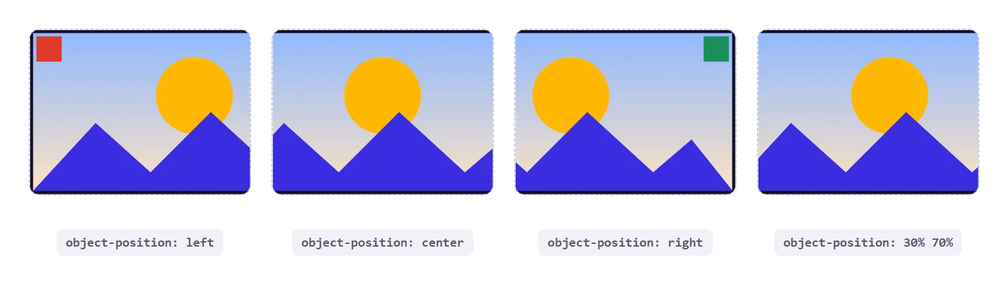
When cover crops an image, it crops equally from both sides by default, keeping the centre. MDN lists the initial value of object-position as 50% 50%, which is why a centred crop is what you get. That is fine for landscapes, but poor for portraits where the face sits near the top of the frame.
/* keep the top of a portrait photo, where faces usually are */
.team img {
  width: 100%;
  aspect-ratio: 1 / 1;
  object-fit: cover;
  object-position: 50% 20%;
}

/* keywords work too */
.banner img { object-position: left bottom; }
The two values are the horizontal and vertical position of the image within its box, in the same way as background-position. Raising the vertical percentage shows more of the bottom of the picture, lowering it shows more of the top. Because the property only matters when part of the image is cropped, it has no visible effect with contain unless the picture is smaller than the box on one axis.
A practical tip for editors: if a client can upload any photo, pick a safe default such as 50% 30% for people photography. It keeps heads in frame more often than the exact centre does, and you can override it per image when you need to.
Pairing object-fit With aspect-ratio
On their own, object-fit needs a box with a definite shape to work against. The easiest way to give an image that shape is the aspect-ratio property, which we cover in our guide to CSS aspect-ratio. Together they replace the old pattern of a fixed-height wrapper with a background image.
.gallery img {
  width: 100%;
  aspect-ratio: 3 / 2;
  object-fit: cover;
  display: block;
}
The ratio makes every tile the same shape, and cover makes every picture fill its tile without distortion. A set of mismatched uploads, some portrait and some landscape, ends up looking like one designed grid. If you want the shape to adapt to the layout, combine this with container queries and change the ratio per container width.
Logos And Product Photos
Logos are where cover does real harm. A wide logo in a short box loses its edges, which can cut the first letter off a brand name. Use contain and give the box some padding so the artwork never touches the border.

.logo-tile {
  height: 70px;
  padding: 8px;
  border: 1px solid #dcdceb;
  border-radius: 8px;
}
.logo-tile img {
  width: 100%;
  height: 100%;
  object-fit: contain;
}
The empty bands that contain leaves are a feature here. If they bother you on a coloured card, set the box background to match the artwork, or choose a ratio close to the logo’s own shape. For a row of client logos, giving every tile the same height and using contain is the standard, reliable approach.
Using object-fit With Video And Other Elements
The property is not limited to images. MDN states it applies to replaced elements, which includes video and canvas as well as img. A background video inside a hero section commonly uses object-fit: cover so the footage fills the section at any screen size, with the edges cropped instead of letterboxed.
.hero-video {
  position: absolute;
  inset: 0;
  width: 100%;
  height: 100%;
  object-fit: cover;
  object-position: center;
}
Autoplaying background video has a cost in bandwidth and battery, so keep the file small and provide a still image as a poster for slow connections. If the video is purely decorative, also make sure the text over it keeps enough contrast, because the cropped region changes with the viewport.
Cropping Does Not Shrink The Download
One thing object-fit does not do is make the image lighter. Cropping happens on the screen after the whole file has been downloaded, so a 4000 pixel wide photograph shown in a 300 pixel card still costs the full file size. The property changes how a picture looks, not how much data the visitor pays for.
Pair it with properly sized files. Export images close to the largest size they will be displayed at, and let the browser choose between several sizes with srcset and sizes. On WordPress, the registered image sizes already do this for you, which is one reason picking a sensible size matters, as we explain in our guide to the best WordPress featured image size. The crop then becomes a final layout adjustment instead of a way to hide a file that is far too large.
A last practical point concerns modern formats. A WebP or AVIF file at the right dimensions with object-fit: cover on top gives you tidy cards and fast loading together. A flat logo is a different case, and the choice between vector and raster is covered in SVG versus PNG. Whichever format you choose, the fitting rules in this guide apply to it in the same way.
object-fit Versus background-size
Before object-fit was reliable, the usual answer was to turn the image into a CSS background and use background-size. The two properties overlap, but they are not interchangeable.
| Question | object-fit On An img | background-size On A Div |
|---|---|---|
| Is it real content? | Yes. The image is in the markup. | No. It is decoration only. |
| Alt text available? | Yes, via the alt attribute. | No. Needs extra ARIA work. |
| Lazy loading | Native loading="lazy" works. | Needs a script or a technique. |
| Equivalent of cover | object-fit: cover | background-size: cover |
| Equivalent of position | object-position | background-position |
The practical rule is simple. If the picture matters to the page, keep it as an img with alt text and use object-fit. Reserve backgrounds for decoration, where being invisible to assistive technology is acceptable.
Using object-fit In Elementor
Elementor’s Image widget already includes this control. Its help page describes a Style tab with Width, Max Width and Height settings, plus an Object Fit option with Fill, Cover and Contain. So for the common cases you do not need CSS: set a Height, then choose Cover for photographs or Contain for logos.
- Select the Image widget and open the Style tab.
- Set Width to 100 percent so the image follows its container.
- Set a fixed Height, for example 240 pixels, for the card media slot.
- Choose Object Fit, then Cover for photographs or Contain for logos.
- Repeat on every card, or build one card and duplicate it so every image shares the same settings.
- Preview at tablet and mobile widths, and adjust the Height per device if the crop looks tight.
There are two limits worth knowing. The help page lists only Fill, Cover and Contain, so none and scale-down need custom CSS. It also lists no object-position control, so choosing which part of a cropped photo stays visible is a short CSS rule too. Add a class under the Advanced tab and the rule in your theme’s Additional CSS.
For galleries and carousels, The Plus Addons for Elementor takes a different route. In the Free Gallery Listing widget, the Grid, Masonry and Metro layouts have a Display Image Size option under Content, then Extra Options. It is off by default. Switch it on and choose an Image Resolution such as Tp-image-grid 700 x 700, as shown in the docs on making an Elementor image gallery of the same size in a grid.
The Carousel layout is a Pro feature. Setting Featured Image Type to Custom Size, instead of the default Full Image, gives every slide the same height, as the docs on making an Elementor image carousel of the same height explain. These options pick a fixed image size instead of fitting images with CSS, so they suit equal tiles when you want to avoid writing code.
Common Mistakes Worth Checking
- Leaving the default. Without
object-fit, an image in a mismatched box is stretched. Set it deliberately. - Forgetting the height.
coverneeds a box with a definite height or ratio. Withheight: autothe image just keeps its natural shape. - Using cover for logos. It clips artwork at the edges. Use
containwith padding. - Ignoring the focal point. A centred crop can cut off heads. Set
object-positionfor portraits. - Expecting it on backgrounds.
object-fitworks on replaced elements. Backgrounds usebackground-size. - Using one global rule for everything. A blanket
img { object-fit: cover }will crop diagrams and screenshots. Scope it to the components that need it.
Browser Support
Both properties are mature. MDN lists object-fit and object-position as Baseline widely available, with support across browsers since January 2020. You can use them on production sites without a fallback in current browsers.
| Feature | Status On MDN |
|---|---|
object-fit | Baseline widely available, since January 2020 |
object-position | Baseline widely available, since January 2020 |
aspect-ratio | Baseline widely available, since September 2021 |
For the full reference, see MDN on object-fit and object-position, and the Elementor help page for the Image widget.
Choosing The Right Value
Start with one question: would the viewer be upset if a strip of this picture disappeared? If not, use cover. If so, use contain. Then give the box a definite shape with a fixed height or an aspect-ratio, and nudge the crop with object-position when faces or key details sit off-centre.
Elementor users get the common cases from the Image widget’s own Object Fit control, and The Plus Addons for Elementor adds equal-size options for galleries and carousels, with the Grid layouts in Free and the Carousel layout in Pro.