





Add a shadow to a heading and it can look polished or look like a 2004 web page. The difference is rarely the property. It is the numbers: how far the shadow sits from the letters, how soft it is, whether there is one layer or four, and what colour it is. text-shadow is small, but it has more range than most people use.
This guide covers the syntax, then six practical effects built from it: soft depth, neon glow, hard offset, outlines, 3D extrusion and the quiet job of keeping text readable over a busy background. Every example below was rendered in Chrome, and the code is short enough to paste. For Elementor users, there is also a no-code route at the end.
What The text-shadow Property Actually Does
According to MDN, text-shadow adds shadows to text and to any text decoration, and it accepts a comma-separated list, so one element can carry several shadows at once. Each shadow is two or three lengths followed by an optional colour.
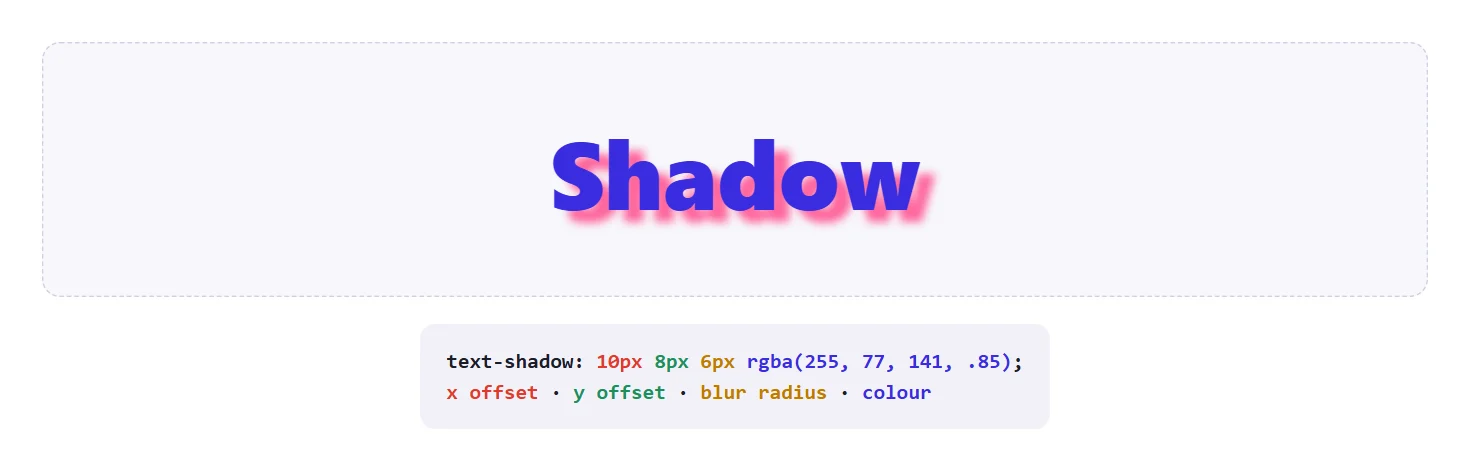
- X offset. Required. Positive moves the shadow right, negative moves it left.
- Y offset. Required. Positive moves the shadow down, negative moves it up.
- Blur radius. Optional, defaults to
0. A larger value makes the shadow wider and lighter, and0gives a crisp copy of the letters. - Colour. Optional. If you leave it out the shadow uses the text’s current colour, so it is worth stating explicitly.
Two details separate text-shadow from box-shadow. First, there is no spread radius: you cannot grow a text shadow outward evenly, you can only offset and blur it. Second, a text shadow never affects layout. It does not push neighbouring lines away or change the size of the box, so a heavy shadow can spill outside its container and be clipped by an ancestor with overflow: hidden.
Also Read: Bottom-only box shadow covers the box-level version of the same idea, where spread does exist.
Six Text Shadow Styles Worth Knowing
The image below puts six recipes side by side. They look different, but they are all the same four-part value with different numbers.
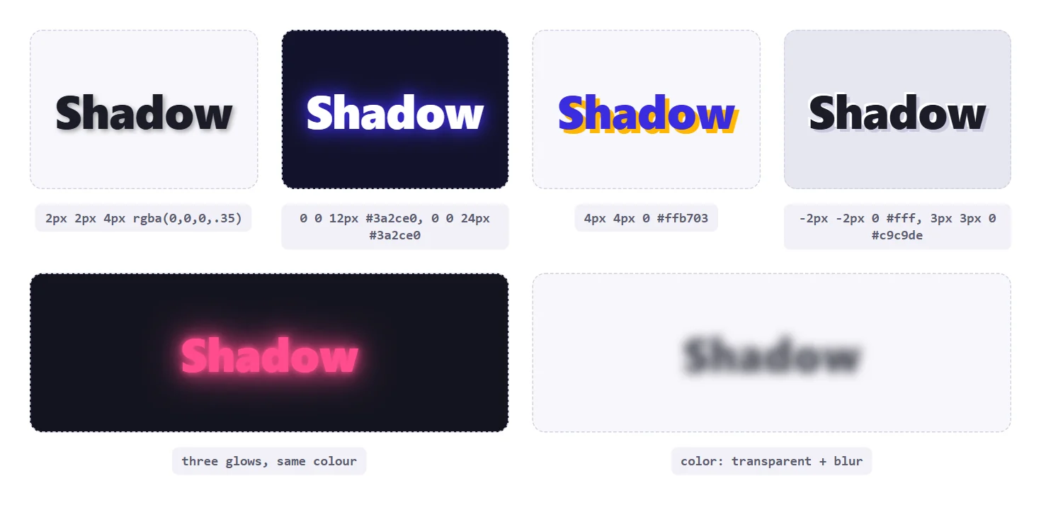
| Style | Value Pattern | Best For |
|---|---|---|
| Soft depth | 2px 2px 4px rgba(0,0,0,.35) | Headings that need a gentle lift |
| Glow | 0 0 12px colour, 0 0 24px colour | Dark backgrounds, hero text, gaming looks |
| Hard offset | 4px 4px 0 colour | Playful, poster-style headings |
| Emboss | -2px -2px 0 light, 3px 3px 0 dark | Text that looks pressed into a surface |
| Ghost | color: transparent plus a blur shadow | Soft, out-of-focus decorative text |
Soft Depth: The Everyday Drop Shadow
The most useful text shadow is also the least noticeable. A small offset, a small blur and a translucent black make a heading feel slightly raised without announcing the effect.
h1 {
  color: #1c1c28;
  text-shadow: 2px 2px 4px rgba(0, 0, 0, .35);
}
Use a translucent colour rather than a solid grey. rgba(0, 0, 0, .35) darkens whatever sits behind it, so the shadow looks natural on a tinted background, while a flat grey looks pasted on. Keep the offset proportional to the font size: 1px or 2px for body-sized text, 3px to 5px for large headings.
Glow: Layering The Same Colour
A glow is a shadow with no offset and a large blur. One layer is usually too faint, so glows are built by stacking the same colour at increasing radii. Because the first shadow in the list is drawn on top, put the tightest, brightest layer first.
.neon {
  color: #fff;
  text-shadow:
    0 0 6px  #ff4d8d,
    0 0 18px #ff4d8d,
    0 0 36px #ff4d8d;
}
Glows need contrast to work. On a white page they turn into a muddy smudge, so reserve them for dark backgrounds. They are also expensive to paint at large radii if you animate them, so test on a mid-range phone before putting a pulsing glow on a page people scroll through.
Hard Offset And Emboss Effects
Set the blur to 0 and the shadow becomes a crisp duplicate of the text. A single hard shadow in a contrasting colour gives a flat, poster look. Two shadows, one light and one dark on opposite sides, give a pressed or embossed look on a mid-tone background.
/* poster */
.poster { color: #3a2ce0; text-shadow: 4px 4px 0 #ffb703; }

/* emboss on a light grey surface */
.emboss {
  color: #1c1c28;
  text-shadow: -2px -2px 0 #fff, 3px 3px 0 #c9c9de;
}
The emboss recipe relies on the page background being close to the shadow colours. On pure white the light shadow disappears, so test it on the real surface rather than in isolation.
Text Outlines With Multiple Shadows
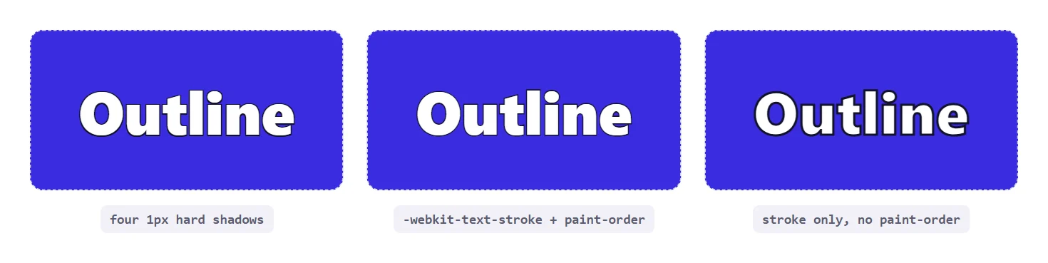
There is no text-outline property. Two techniques fill the gap. The first uses four hard shadows, one pushed in each diagonal direction, which together form an outline. The second uses -webkit-text-stroke, which draws a stroke centred on the edge of each letter, so half of it falls inside the glyph and thins the letter.
/* four-shadow outline */
.outline {
  color: #fff;
  text-shadow:
    -1px -1px 0 #12122a,
     1px -1px 0 #12122a,
    -1px  1px 0 #12122a,
     1px  1px 0 #12122a;
}

/* stroke, painted behind the fill */
.stroke {
  color: #fff;
  -webkit-text-stroke: 2px #12122a;
  paint-order: stroke fill;
}
The shadow outline keeps the letters at full weight and works on any text, but at larger widths the four shadows leave gaps at the corners. The stroke version is cleaner on large type, and paint-order: stroke fill draws the stroke first so the fill covers its inner half. Without it, the right-hand sample above shows the stroke thinning the letters.
3D Text With Stacked Shadows
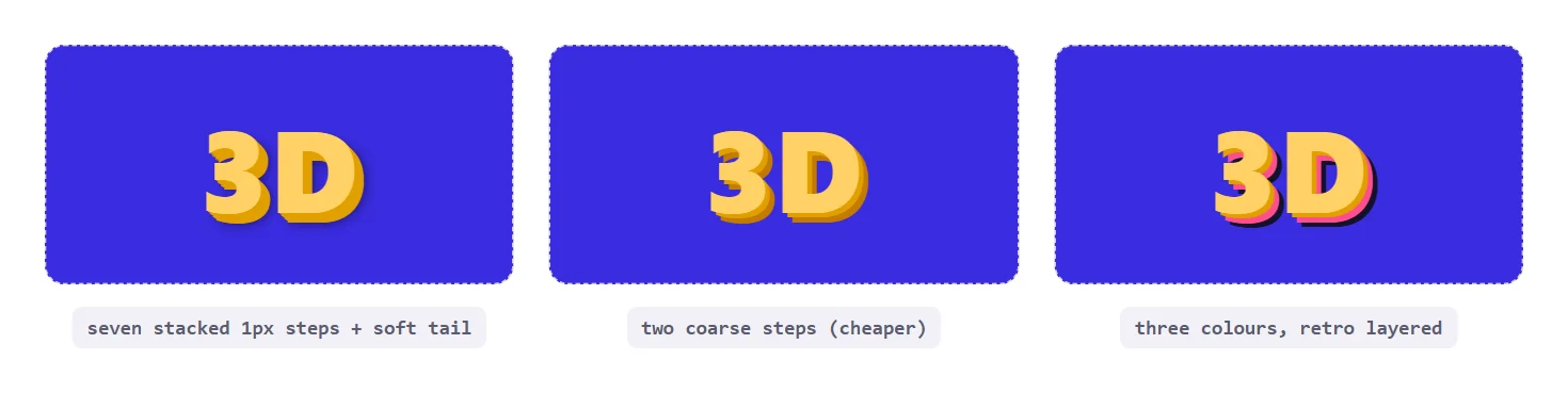
Stack a dozen shadows, each one pixel further along the same diagonal, and the gaps close up into a solid extrusion. Finish with a soft, wide shadow for a cast shadow on the ground.
.extrude {
  color: #ffd166;
  text-shadow:
    1px 1px 0 #e09f00,
    2px 2px 0 #e09f00,
    3px 3px 0 #e09f00,
    4px 4px 0 #e09f00,
    5px 5px 0 #e09f00,
    6px 6px 0 #e09f00,
    7px 7px 8px rgba(0, 0, 0, .45);
}
Every extra shadow is another paint pass over the text, so keep the stack as short as the effect allows. The middle sample above uses two coarse steps and reads as 3D at a glance, with a fraction of the work. Reserve long stacks for a single hero line, not for every heading on the page.
Readable Text Over Photos And Gradients
The least glamorous use is often the most valuable. White text over a bright photo can fail depending on which part of the picture sits behind each word, and a shadow is the quickest repair.

.hero-title {
  color: #fff;
  text-shadow:
    0 2px 3px rgba(0, 0, 0, .45),
    0 0 18px  rgba(0, 0, 0, .35);
}
Use two layers: a small, tight one that defines the edges of the letters and a wide, soft one that darkens the area around them. Treat this as a repair, not a substitute for contrast. Contrast checkers measure the text colour against the background colour and do not account for a shadow, so a design that only passes because of its shadow may still fail an audit. A dark overlay on the image itself is the sturdier fix, with the shadow as a finishing touch.
Also Read: CSS clamp() pairs well with big hero text, so the heading and its shadow can both scale smoothly across screen sizes.
Choosing Shadow Colours That Look Natural
Most ugly text shadows are a colour problem, not a geometry problem. A few habits make the difference between a shadow that looks designed and one that looks like a default.
- Derive the shadow from the background. A shadow is the surface darkened, so a warm background wants a warm, translucent brown or black, and a cool one wants a navy tint. Pure grey fights both.
- Keep opacity low for soft shadows. Values between
.15and.4read as depth. Above that the shadow starts to read as a second copy of the text. - Match glow colour to the text or an accent. A white word with a coloured glow looks intentional. A coloured word with a different coloured glow usually looks noisy.
- Use one light direction. If one heading casts its shadow down and right, every other shadow on the page should do the same, including box shadows. Mixed directions look accidental.
- Scale with the type. Offsets written in pixels stay fixed while the heading grows. For fluid headings, write offsets in
emso the shadow grows and shrinks with the font size.
.hero {
  font-size: clamp(2rem, 6vw, 4.5rem);
  /* offsets in em follow the font size */
  text-shadow: .04em .05em .08em rgba(0, 0, 0, .35);
}
The em version is worth adopting for any heading that uses fluid sizing. A fixed 4px shadow looks right at 40px and clumsy at 72px, because the ratio between the letter and its shadow has changed. Tying the offset to the font size keeps the proportion constant at every width.
Testing And Debugging Text Shadows
Because a shadow is purely decorative, it is easy to ship one that only works on your own screen. Run through a short check before you publish.
- View the text at its smallest and largest sizes. Fine, high-contrast shadows can turn text into a blur at small sizes.
- Check the shadow on the real background, not on a white test page. Emboss and glow effects depend entirely on what sits behind them.
- Open the browser inspector, select the element and look at the computed
text-shadowvalue. The inspector lists each layer, and you can edit the numbers live to find the right look before touching the stylesheet. - Look for clipping. A shadow that reaches past a parent with
overflow: hiddenis cut off, which shows up as a flat edge on one side. - Test on a phone. Large blur radii and long stacks are more noticeable on slower devices, especially when animated.
The inspector step saves the most time. Chrome and Firefox both draw a small editor next to the property where you can drag the offsets and blur, so the fastest way to dial in a shadow is to tweak it on the live page and copy the final value back into your code.
Animating A Text Shadow On Hover
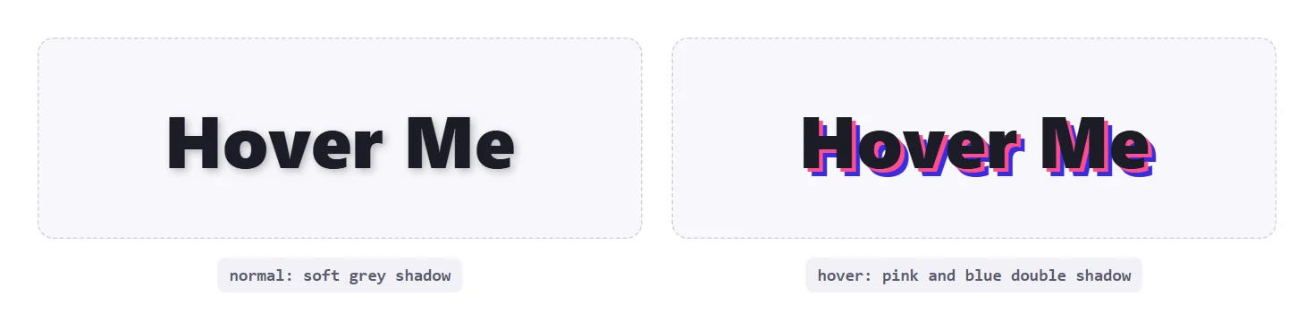
text-shadow is animatable, so a hover state can change it smoothly. The only requirement is that both states have the same number of shadows, otherwise the browser has to pad the shorter list and the motion can look odd. Declare the transition on the base state.
.link {
  text-shadow: 2px 2px 6px rgba(0, 0, 0, .25);
  transition: text-shadow .3s ease;
}
.link:hover {
  text-shadow: 3px 3px 0 #ff4d8d, 6px 6px 0 #3a2ce0;
}

@media (prefers-reduced-motion: reduce) {
  .link { transition: none; }
}
The reduced-motion block is worth keeping. A shadow that changes on hover is a small effect, but respecting the visitor’s system setting costs one rule. Also remember that hover needs a pointer, so touch visitors will not see the hover state at all and nothing important should depend on it.
Text Shadow In Elementor Without Custom CSS
If you build with Elementor and would rather not maintain CSS, the Advanced Shadows extension from The Plus Addons for Elementor can set a text shadow for the normal state and a different one for hover. According to the text shadow on hover guide, it is part of the free plugin, works the same with Pro installed, and is off until you switch it on under The Plus Addons, Extensions, in the Plus Effects group.
Step-by-Step
- Select a widget with text, such as a Heading, or a container that holds text.
- Go to Advanced, then Advanced Shadows, and switch on Text Shadows.
- Leave Apply to on Default to shadow all text, or choose Add Custom Class to target one part. Type the class name without the leading dot.
- On the Normal tab click Add Item and set X, Y, Blur and Color. Add more items to stack shadows.
- Open the Hover tab, switch on Hover Text Shadows and add the items you want while hovering.
- Enter a Transition css value such as
all .4s linearon both tabs so the change animates in both directions. - Update the page and hover the text on the published page.
Two limits from the same guide are worth knowing. The shadow may not show inside the Elementor editor canvas, so check it in Preview or on the published page. And hover needs a mouse or trackpad, which matches the CSS caveat above. The Advanced Shadows settings overview lists every control, and the drop shadow on hover guide covers the box-level equivalent.
Common Mistakes Worth Checking
- Leaving the colour out. The shadow then takes the text colour, which blends in. State a colour on every shadow.
- Using a solid grey on a tinted background. Prefer a translucent black so the shadow adapts to the surface.
- Glows on a light page. They turn into a smudge. Keep them for dark backgrounds.
- Mismatched shadow counts in a hover transition. Give both states the same number of layers.
- Relying on a shadow for contrast. Contrast tools ignore it. Fix contrast with an overlay or a darker colour first.
- Long stacks everywhere. Each layer is another paint pass. Use extruded text sparingly.
- Clipping. A shadow that extends outside a container with
overflow: hiddenis cut off. Add padding or remove the clip.
Browser Support
text-shadow is Baseline widely available, so none of the techniques above need a fallback in current browsers. The only vendor-prefixed piece is the stroke property used for the outline alternative.
| Feature | Available Across Browsers Since |
|---|---|
text-shadow | July 2015 |
For the full reference, see MDN on text-shadow, -webkit-text-stroke and paint-order.