






The first time a client asked me why their “10,000+ Happy Customers” line on their homepage felt flat, I did not have a design answer. It was not the copy. It was that the number just sat there, static, the same way it would look printed on a business card. The moment we swapped it for a counter that ticked up from zero on scroll, the same exact number read as proof instead of a claim. Nothing about the data changed. Only the motion did.
Elementor does ship its own Counter widget in the free core plugin. Per the plugin’s own WordPress.org readme, it is described in one line: “Counter: Show numbers in an escalating manner.” That description is accurate but bare, a single animated number with none of the styling, icon, or layout options most sites actually want once they start using it. The Plus Addons for Elementor includes a separate, more complete FREE Number Counter widget in the same free tier, and this guide walks through building a real animated stats section with it, prefix and suffix symbols included, step by step.
Elementor’s Core Counter Widget vs The Plus Addons’ Number Counter
Before picking a widget, it helps to know what each one actually gives you. Elementor’s own Counter widget (confirmed in the plugin’s WordPress.org readme.txt) does the core job: it counts from a starting number up to an ending number when it scrolls into view. That covers the basic use case, one number, one animation, no frills.
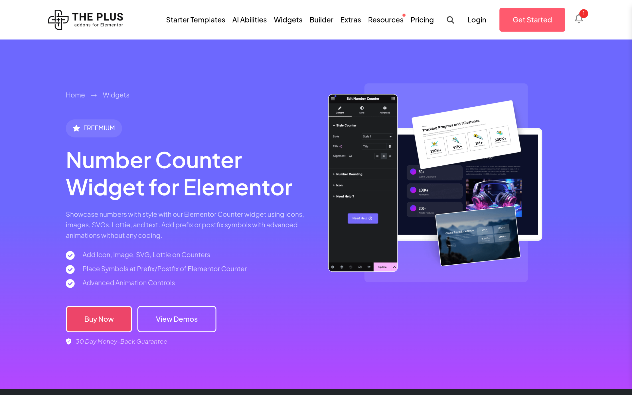
The Plus Addons for Elementor’s Number Counter widget is listed as a FREE widget on the same plugin’s WordPress.org changelog, alongside the free Pricing Table and Progress Bar widgets. Per the widget’s own feature page, it adds several things the bare core widget does not have out of the box:
- Multiple Styles – several ready layouts instead of one generic number block.
- Add Title & Alignment Control – a label above or beside the number, positioned however the layout needs it.
- Animations Controls – control over how the count-up animation behaves, not just whether it plays.
- Add Symbol at Prefix & PostFix – currency signs, plus signs, percent signs, or “+” suffixes attached directly to the number.
- Add Icons, Lottie, SVG & Image with Link – a visual marker next to the number that can itself be clickable.
- Customize Everything – full styling control over color, typography, and spacing per element.
If a single plain counter is genuinely all a page needs, Elementor’s own widget is enough. Anyone building an actual stats section, three or four counters with icons, titles, and a “+” after each number, will hit the limits of the bare version quickly. That is the gap this widget fills without needing a second plugin.
| Capability | Elementor Core Counter | The Plus Addons Number Counter |
|---|---|---|
| Count-up animation | Yes | Yes |
| Ready-made layout presets | No, one generic layout | Multiple Styles |
| Title with alignment control | Basic label only | Add Title & Alignment Control |
| Prefix / suffix symbol field | Not a dedicated field | Add Symbol at Prefix & PostFix |
| Icon, Lottie, SVG, or linked image | Not supported | Add Icons, Lottie, SVG & Image with Link |
| Per-element style controls | Limited | Customize Everything |
| Cost | Free (Elementor core) | Free (Plus Addons free tier) |
Both widgets are free, so this is not really a paywall decision. It comes down to whether the count-up animation is the whole job, or whether the number needs to sit inside an actual designed stat block with an icon, a styled title, and a symbol attached. For a single number buried in a paragraph, the core widget is the faster pick. For anything that looks like a “stats section” on a homepage or About page, the extra controls stop being optional fairly quickly.
Step-by-Step: Adding the Number Counter Widget
- Open the page in the Elementor editor and search for “Number Counter” in the widget panel.
- Drag the widget onto the canvas, into a container or column where you want the stat to sit.
- In the Content tab, set the “Starting Number” (usually 0) and the “Ending Number” (the real figure you want the count-up to land on).
- Add a title in the Title field, for example “Happy Customers” or “Projects Delivered,” and set its position relative to the number using the alignment controls.
- If the number needs a currency sign, a percent sign, or a trailing “+”, set it in the Prefix or PostFix fields rather than typing it into the number itself, since a typed symbol will not animate cleanly with the count-up.
- Add an icon, an SVG, a Lottie animation file, or an image next to the number from the Icon/Image controls, and attach a link to it if the whole block should be clickable.
- Switch to the Style tab to set typography, color, and spacing for the number, the title, and the icon independently.
- Repeat the widget for each stat, then group them in an Elementor container or the Grid Builder so they sit in a row or a responsive grid.
Getting the Animation Timing Right
The animation controls are where most counter sections go wrong. A count-up that finishes in half a second reads as a glitch, not a data point, because the eye never registers the motion. A count-up that takes eight seconds starts to feel like the page is stalling. The widget’s Animations Controls let you set how the count-up behaves once it scrolls into view, and the setting worth testing first is duration, aiming for a range a visitor can actually watch complete, roughly one and a half to two and a half seconds for most stat sizes, longer only for numbers in the tens of thousands or higher where a longer count reads as more significant rather than sluggish.
Trigger-on-scroll is the default behavior worth keeping rather than turning off. A counter that animates immediately on page load, before a visitor has scrolled anywhere near it, wastes the entire effect, since nobody is looking at it yet. Letting it fire when the section enters the viewport means the animation actually gets seen, which is the whole reason to use an animated counter over a static number in the first place.
Building a Real Stats Section (Not Just One Counter)
A single counter rarely carries a page on its own. Most sites that use this widget well are building a row of three or four: years in business, clients served, projects delivered, average rating. Here is how that comes together without the layout falling apart on smaller screens.
- Add an Elementor container set to a horizontal flex direction, or use the Grid Builder if you want equal-width columns without manually setting flex-basis on each one.
- Drop one Number Counter widget into each column, keeping the icon position, title position, and typography identical across all of them so the row reads as one design instead of four separate mismatched blocks.
- Vary only what should vary: the ending number, the title text, and the icon or image for each stat.
- Check the container’s responsive settings across desktop, tablet, and mobile. Four counters in a row on desktop should collapse to two columns on tablet and a single stacked column on mobile, the same responsive check that matters for any multi-item Elementor layout, including the Pricing Table widget’s plan columns.
- Set consistent spacing (the container’s gap setting) rather than margin on each individual widget, so the row stays evenly spaced if you add or remove a counter later.
Where an Animated Counter Actually Earns Its Place
Not every number benefits from counting up. A phone number, a price, or a date should stay static, since the point of those is instant readability, not drama. An animated counter earns its place specifically where the number itself is doing persuasive work: social proof, scale, or a milestone the visitor is meant to register as impressive.
- Milestone stats sections – “500+ Clients,” “12 Years in Business,” “98% Retention Rate” rows near the top of an About or homepage, usually right below the hero.
- Portfolio and case study pages – a project’s measurable result (visitors gained, conversion lift, revenue recovered) stated as a counted number rather than a plain sentence, so it reads as a headline result rather than a buried claim.
- Event and launch countdowns – when paired with a “days until” style counter, this is a different use case from a countdown timer, which counts down to a fixed date, not up to a fixed total; picking the wrong widget for the wrong direction is a common mix-up.
- Pricing and feature pages – “3 plans,” “40+ integrations,” or similar counts sitting next to a pricing table to reinforce scale before a visitor reads plan details.
- Team and about pages – years of combined experience, or number of completed projects, displayed near a team member widget section as supporting proof rather than the headline itself.
Common Mistakes to Avoid
A few patterns show up repeatedly once counters go live on a real site, worth checking before publishing:
- Typing the symbol into the number field. Writing “500+” directly into the ending number breaks the count-up animation on most implementations, since the animation script expects a clean numeric value. Use the dedicated Prefix/PostFix fields instead.
- Letting every counter animate at page load. If the stats row sits below the fold, an on-load animation fires before anyone scrolls there, and the visitor never sees the motion at all. Keep the scroll-trigger behavior on.
- Ignoring the mobile column count. A four-column desktop row that does not get an explicit mobile override often squeezes into a cramped single line of tiny numbers on a phone screen rather than stacking cleanly.
- Using different fonts or colors for each counter in the same row. Consistency across the row is what makes a stats section read as one deliberate design element instead of four widgets added at different times.
- Skipping the icon or image entirely. A bare number with a title underneath works, but a small icon above or beside it gives the eye a second visual anchor, which is part of why the widget supports icons, Lottie files, SVGs, and linked images rather than just plain text.
Troubleshooting: When the Counter Doesn’t Animate
A counter that just displays the ending number instantly, with no visible count-up, almost always traces back to one of a small handful of causes rather than a bug in the widget itself.
- A caching or minification plugin is stripping the animation script. Aggressive JavaScript minification or “delay JS execution” settings in a performance plugin can break the scroll-trigger listener the counter depends on. Add the relevant script to that plugin’s exclusion list if the issue only shows up after enabling a new caching or minify feature, the same category of conflict covered for animation scripts generally in the GSAP animation guide.
- The widget is above the fold on page load. If a counter sits in the very first section a visitor sees with no scrolling required, some scroll-trigger implementations fire it before the visitor has actually triggered a scroll event, so it can appear to snap straight to the end number. Test by loading the page fresh and watching that specific section rather than a section further down.
- A theme or another plugin is loading a conflicting counter script. Two different plugins both trying to animate a number in the same DOM element is a common source of a counter that flickers or jumps instead of animating smoothly. Check the browser console for a JavaScript error mentioning a counter or animation library if this happens.
- The starting and ending numbers are identical, or the ending number is set to zero. There is nothing to animate between two identical values, so double-check the Content tab fields if a specific counter looks static while the others on the same page work fine.