






A small photo, a product thumbnail or a brand marker often reads better than a generic icon – especially when the pins need to say something themselves.
The Hotspot widget’s Pin Type setting has an Image option. Pick it and the pin becomes whatever picture you choose, with an optional second picture for when the visitor points at it.
Requirement – This widget is a part of The Plus Addons for Elementor Pro, make sure it’s installed & activated to enjoy all its powers.
Before You Start
- Edition: Pro. The widget does not render on the free plugin.
- Switch it on: The Plus Addons > Widgets, search Hotspot, turn the toggle on.
- A small, square-ish image for the pin. Large images are scaled down by the Style tab, but a big file still has to download.
- New to the widget? Start with How to Add an Elementor Hotspot on an Image?
Steps
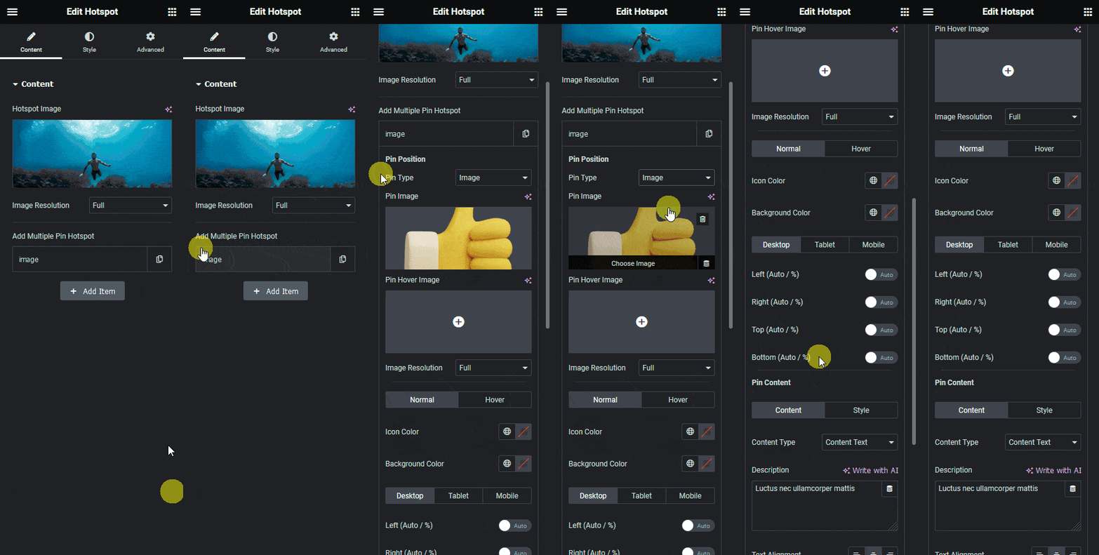
- Select the Hotspot widget and open a row of Add Multiple Pin Hotspot.
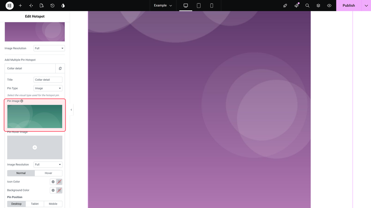
- Set Pin Type to Image.
- Choose your picture in Pin Image.
- Optionally set Pin Hover Image – a second picture shown while the pointer is on the pin.
- Size it in Style > Pin Image with Pin Image Size and Pin Image Width.
What You Will See
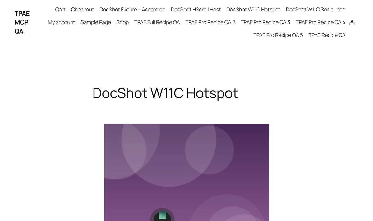
On the published page the pin is your picture. We checked the rendered pin and found an image element in place of the icon – the icon element is not output at all when Pin Type is Image. The tooltip still opened when we pointed at it, exactly as with an icon pin.
| Setting | What it does | Default |
|---|---|---|
| Pin Type | Icon, Image, Text or Lottie | Icon |
| Pin Image | The picture used as the pin | Empty |
| Pin Hover Image | Shown while the pointer is on the pin | Empty |
| Pin Image Size | Pin size, in the Style tab | Theme default |
| Pin Image Width | Pin width, in the Style tab | Theme default |
How It Behaves
- Pin Image and Pin Hover Image only appear while Pin Type is Image. Switch the type and they are hidden again – your choices are kept, not deleted.
- Positioning, tooltips and links work the same for every pin type; only the marker changes.
- An image pin sidesteps the blank-icon problem completely, because it does not need an icon font.
- Pin Type is per pin, so one image can mix picture pins and icon pins.
Limitations
- Pro only.
- There is no separate alt text for the pin image.
- Very wide or very tall pictures look lopsided as pins; the Style tab scales them but does not crop them.
Troubleshooting
I cannot see the Pin Image control
Pin Type is still Icon, Text or Lottie. Set it to Image and the control appears.
The pin is far too big
Use Pin Image Size and Pin Image Width in Style > Pin Image.
The hover image never shows
Pin Hover Image only swaps in while the pointer is on the pin. On a touch screen there is no hover, so the visitor only ever sees Pin Image.
Not verified
So you know exactly what has and has not been checked:
- Pin Hover Image swapping in on hover – we set the pin image only.
- Pin Image Size and Pin Image Width at non-default values.
- SVG files as the pin image.
