


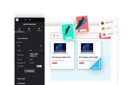
Adding hotspots on images, allows users to interact with specific areas of an image. This adds a new level of interactivity and can be used for various purposes, such as highlighting product features, providing additional information.
With the Hotspot widget from The Plus Addons for Elementor, you can easily add different types of hotspots on an image in Elementor.
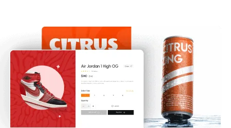
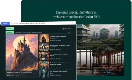
Check the Live Widget Demo
Required Setup
- Elementor FREE Plugin installed & activated.
- You need to have The Plus Addons for Elementor plugin installed and activated.
- This is a Premium widget, and you need the PRO version of The Plus Addons for Elementor.
- Make sure the Hotspot widget is activated, to verify this visit The Plus Addons → Widgets → and Search for Hotspot and activate.
Learn via Video Tutorial:
How to Activate the Hotspot Widget?
Go to
- The Plus Addons → Widgets
- Search the widget name and turn on the toggle.

Key Features
- Multiple Pin Types – You can add multiple types of hotspot pins such as an icon, image, text and Lottie Files.
- Pin Effect – You can add different types of animation to the hotspot pins.
- Link – You can add a link to the hotspot pin.
- Tooltip Trigger – You can open the hotspot tooltip on hover or click.
How to Use the Hotspot Widget in Elementor?
Add the Hotspot widget from The Plus Addons for Elementor to the page.
In the Hotspot Image section, you have to add the image on which you want to add the hotspots.

From the Image Resolution dropdown, you can manage the image size.
Then from the Add Multiple Pin Hotspot section, you have to add the hotspots. By default, you’ll find one item open it.
From the Pin Type dropdown, you have to select the pin type. Here you’ll find four options –
- Icon – To use an icon as a hotspot.
- Image – To use an image as a hotspot.
- Text – To use a text as a hotspot.
- Lottie – To use a Lottie as a hotspot.
Select the option as per your requirements, let’s select Icon here.
From the Icon Font dropdown, you have to select the icon font. Based on the selected icon font you’ll get relevant options to add the icon.
From the Normal/Hover tabs, you can add color and background color to the icon for normal and hover states.
Then you have to adjust the hotspot position from the Left (Auto / %), Right (Auto / %), Top (Auto / %), and Bottom (Auto / %) toggles for desktop, tablet and mobile separately.
In the Content tab, you have to add the hotspot tooltip content.
From the Content Type dropdown, you have to select the content type. Here you’ll find two options –
- Content Text – With this option, you can add simple text content.
- Content WYSIWYG – With this option, you can add text content with links, images, and videos.
Select the option as per your requirements.
You can manage the text content typography and color from the Typography and Color sections respectively.
From the Style tab, you can style the hotspot tooltip.
In the Tooltip Options section, you’ll find different tooltip related options –
- Tooltips Interactive – By enabling this toggle you can interact with the tooltip content i.e. you can click on links, play videos etc. inside the tooltip.
- Position – From here, you can set the tooltip position.
- Theme – From here, you can change the tooltip theme.
- Width – From here, you can set the tooltip width.
- Offset – From here, you can move the tooltip left and right direction from the hotspot.
- Distance – From here, you can move the tooltip top and bottom direction from the hotspot.
- Arrows – From here, you can select the tooltip arrow type.
- Trigger – From here, you can set the tooltip open trigger, you can open the tooltip on click or hover.
- Animation – From here, you set the tooltip animation.
- Duration In – From here, you can set the tooltip open animation duration.
- Duration Out – From here, you can set the tooltip close animation duration.
From the Style Options section, you can add padding, background color, border, box shadow etc. to the tooltip.
From the Continues Effect dropdown, you can add different continuous animation effects to the hotspot.
Then by enabling the Link toggle, you can add a link to the hotspot.
Click on the + Add Item button to add more hotspots to the image.
How to Style the Hotspot Widget?
To style the Hotspot widget, you’ll find all the options under the Style tab.
Pin Icon – From here, you can style the icon in the hotspot.

Pin Image – From here, you can style the image in the hotspot.
Pin Text – From here, you can style the text in the hotspot.
Lottie – From here, you can style the Lottie in the hotspot.
Common Styling – From here, you can set common styling for the icon/text and tooltip for all the hotspots at once.
Extra Options – From here, you can add an overlay background for the tooltip, you can set a visibility delay for the tooltip and you can also add custom CSS transform to the tooltip.
On Scroll View Animation – This is our global extension available for all our widgets, this adds scrolling animation as the widget comes in the viewport. You can learn more about this from here.
Learn more about On Scroll View Animation
Advanced options remain common for all our widget, you can explore all its options from here.